
Matplotlib 绘制疫情柱状图 动画
点击上方蓝色字体,选择星标公众号

这是「Python与算法社区」第 417 篇原创
本文使用 matplotlib,绘制 COVID-19 过去半年四个国家的每天死亡人数,获取数据的API接口为:
https://raw.githubusercontent.com/CSSEGISandData/COVID-19/master/csse_covid_19_data/csse_covid_19_time_series/time_series_covid19_deaths_global.csv
数据处理的逻辑如下,参考前几天推送的处理逻辑:
df = pd.read_csv('a.csv', delimiter=',', header='infer')
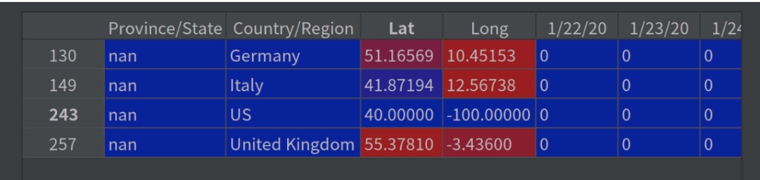
df_interest = df.loc[df['Country/Region'].isin(['United Kingdom', 'US', 'Italy', 'Germany'])& df['Province/State'].isna()]
df_interest.rename(index=lambda x: df_interest.at[x, 'Country/Region'], inplace=True)
df1 = df_interest.transpose()
df1 = df1.drop(['Province/State', 'Country/Region', 'Lat', 'Long'])
df1 = df1.loc[(df1 != 0).any(1)]
df1.index = pd.to_datetime(df1.index)
为了更方便大家理解,展示df_interest的部分数据:
整理后df1的部分数据:

可以看到截止昨天,美国COVID-19死亡人数已有:219286
绘制水平柱状图动画展示的逻辑如下:
fig = plt.figure(figsize=(9,16))


def buildbarh(i=int):
    iv = min(i, len(df1.index)-1)
    objects = df1.max().index
    y_pos = np.arange(len(objects))
    performance = df1.iloc[[iv]].values.tolist()[0]

    plt.barh(y_pos, performance, align='center', color=['red', 'green', 'blue', 'orange'])
    plt.subplots_adjust(left=0.2)
    plt.yticks(y_pos, objects)
    plt.xlabel('Deaths')
    plt.ylabel('Countries')
展示录制的gif图:

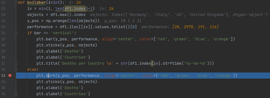
第26帧时,各个变量的取值,放上这个图方便大家迅速掌握这些代码:
绘制动画只有这一行,调用FuncAnimation,它的第二个参数为上面定义的函数getmepie:
animator = ani.FuncAnimation(fig, getmepie, interval = 200)
plt.show()
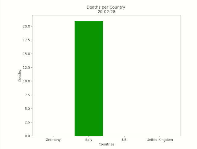
绘制竖直柱状图:
def buildbar(i=int):
    iv = min(i, len(df1.index)-1)
    objects = df1.max().index
    y_pos = np.arange(len(objects))
    performance = df1.iloc[[iv]].values.tolist()[0]

    plt.bar(y_pos, performance, align='center', color=['red', 'green', 'blue', 'orange'])
    plt.subplots_adjust(left=0.2)
    plt.xticks(y_pos, objects)
    plt.ylabel('Deaths')
    plt.xlabel('Countries')
    plt.title('Deaths per Country \n' + str(df1.index[iv].strftime('%y-%m-%d')))
绘制后的gif图:
关于本文有任何疑问欢迎留言或加入讨论群,在群里统一发放COVID-19数据文件:
评论