
科研论文绘图实操干货汇总,11类Matplotlib图表,含代码

作者丨数据派THU
来源丨DataScience
编辑丨极市平台
极市导读
导读
numpy:1.18.5 pandas:1.0.5 matplotlib:3.2.1
1.简单的折线图
%matplotlib inline
import matplotlib.pyplot as plt
plt.style.use('seaborn-whitegrid')
import numpy as np
fig = plt.figure()
ax = plt.axes()
fig = plt.figure()
ax = plt.axes()
x = np.linspace(0, 10, 1000)
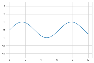
ax.plot(x, np.sin(x));
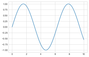
plt.plot(x, np.sin(x));
plot函数即可:plt.plot(x, np.sin(x))
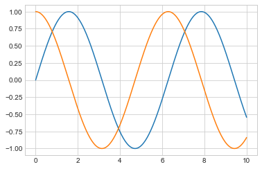
plt.plot(x, np.cos(x));
调整折线图:线条颜色和风格
plt.plot(x, np.sin(x - 0), color='blue')        # 通过颜色名称指定
plt.plot(x, np.sin(x - 1), color='g')           # 通过颜色简写名称指定(rgbcmyk)
plt.plot(x, np.sin(x - 2), color='0.75')        # 介于0-1之间的灰阶值
plt.plot(x, np.sin(x - 3), color='#FFDD44')     # 16进制的RRGGBB值
plt.plot(x, np.sin(x - 4), color=(1.0,0.2,0.3)) # RGB元组的颜色值,每个值介于0-1
plt.plot(x, np.sin(x - 5), color='chartreuse'); # 能支持所有HTML颜色名称值
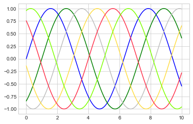
如果没有指定颜色,Matplotlib 会在一组默认颜色值中循环使用来绘制每一条线条。
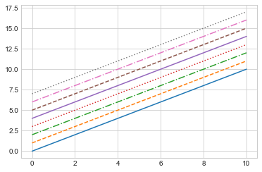
plt.plot(x, x + 0, linestyle='solid')
plt.plot(x, x + 1, linestyle='dashed')
plt.plot(x, x + 2, linestyle='dashdot')
plt.plot(x, x + 3, linestyle='dotted');

# 还可以用形象的符号代表线条风格
plt.plot(x, x + 4, linestyle='-')  # 实线
plt.plot(x, x + 5, linestyle='--') # 虚线
plt.plot(x, x + 6, linestyle='-.') # 长短点虚线
plt.plot(x, x + 7, linestyle=':');  # 点线
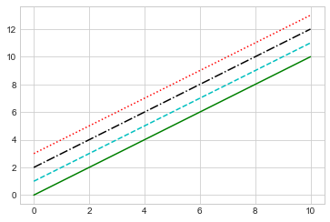
plt.plot(x, x + 0, '-g')  # 绿色实线
plt.plot(x, x + 1, '--c') # 天青色虚线
plt.plot(x, x + 2, '-.k') # 黑色长短点虚线
plt.plot(x, x + 3, ':r');  # 红色点线
调整折线图:坐标轴范围
plt.plot(x, np.sin(x))

plt.xlim(-1, 11)
plt.ylim(-1.5, 1.5);
plt.plot(x, np.sin(x))

plt.xlim(10, 0)
plt.ylim(1.2, -1.2);
plt.plot(x, np.sin(x))
plt.axis([-1, 11, -1.5, 1.5]);
plt.plot(x, np.sin(x))
plt.axis('tight');
plt.plot(x, np.sin(x))
plt.axis('equal');
折线图标签
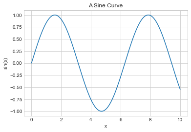
plt.plot(x, np.sin(x))
plt.title("A Sine Curve")
plt.xlabel("x")
plt.ylabel("sin(x)");
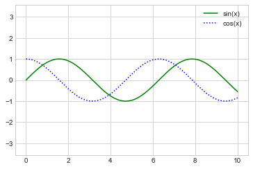
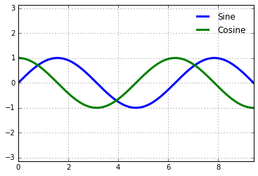
plt.plot(x, np.sin(x), '-g', label='sin(x)')
plt.plot(x, np.cos(x), ':b', label='cos(x)')
plt.axis('equal')

plt.legend();
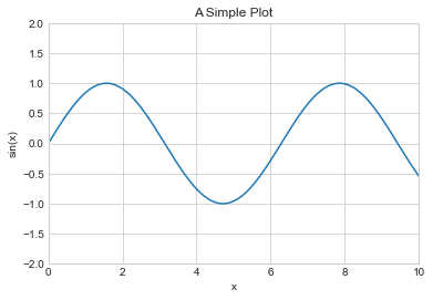
plt.xlabel() → ax.set_xlabel() plt.ylabel() → ax.set_ylabel() plt.xlim() → ax.set_xlim() plt.ylim() → ax.set_ylim() plt.title() → ax.set_title()
ax = plt.axes()
ax.plot(x, np.sin(x))
ax.set(xlim=(0, 10), ylim=(-2, 2),
       xlabel='x', ylabel='sin(x)',
       title='A Simple Plot');
2.简单散点图
%matplotlib inline
import matplotlib.pyplot as plt
plt.style.use('seaborn-whitegrid')
import numpy as np
使用 plt.plot 绘制散点图
x = np.linspace(0, 10, 30)
y = np.sin(x)
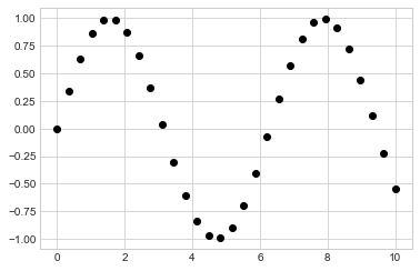
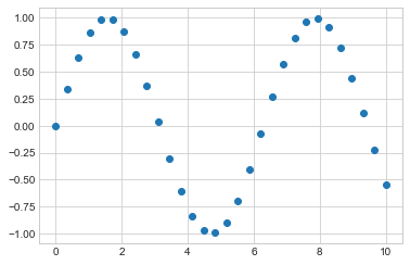
plt.plot(x, y, 'o', color='black');
rng = np.random.RandomState(0)
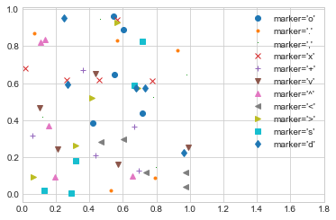
for marker in ['o', '.', ',', 'x', '+', 'v', '^', '<', '>', 's', 'd']:
plt.plot(rng.rand(5), rng.rand(5), marker,
label="marker='{0}'".format(marker))
plt.legend(numpoints=1)
plt.xlim(0, 1.8);
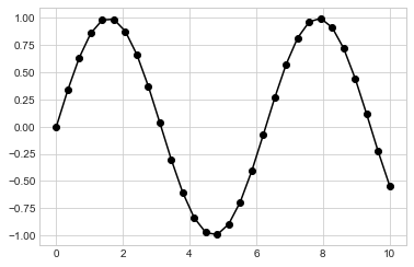
plt.plot(x, y, '-ok');
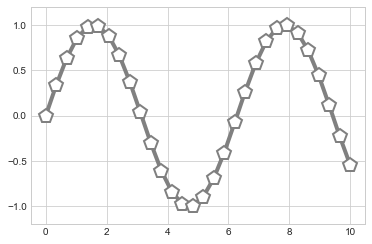
plt.plot(x, y, '-p', color='gray',
         markersize=15, linewidth=4,
         markerfacecolor='white',
         markeredgecolor='gray',
         markeredgewidth=2)
plt.ylim(-1.2, 1.2);
使用plt.scatter绘制散点图
plt.scatter(x, y, marker='o');
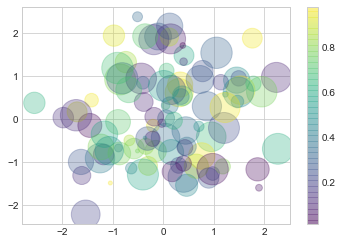
rng = np.random.RandomState(0)
x = rng.randn(100)
y = rng.randn(100)
colors = rng.rand(100)
sizes = 1000 * rng.rand(100)

plt.scatter(x, y, c=colors, s=sizes, alpha=0.3,
            cmap='viridis')
plt.colorbar();  # 显示颜色对比条
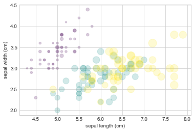
from sklearn.datasets import load_iris
iris = load_iris()
features = iris.data.T

plt.scatter(features[0], features[1], alpha=0.2,
            s=100*features[3], c=iris.target, cmap='viridis')
plt.xlabel(iris.feature_names[0])
plt.ylabel(iris.feature_names[1]);
plot 和 scatter 对比:性能提醒
3.误差可视化
基础误差条
%matplotlib inline
import matplotlib.pyplot as plt
plt.style.use('seaborn-whitegrid')
import numpy as np
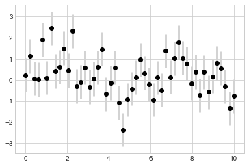
x = np.linspace(0, 10, 50)
dy = 0.8
y = np.sin(x) + dy * np.random.randn(50)

plt.errorbar(x, y, yerr=dy, fmt='.k');

plt.errorbar(x, y, yerr=dy, fmt='o', color='black',
             ecolor='lightgray', elinewidth=3, capsize=0);
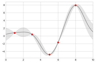
连续误差
from sklearn.gaussian_process import GaussianProcessRegressor

# 定义模型和一些符合模型的点
model = lambda x: x * np.sin(x)
xdata = np.array([1, 3, 5, 6, 8])
ydata = model(xdata)

# 计算高斯过程回归,使其符合 fit 数据点
gp = GaussianProcessRegressor()
gp.fit(xdata[:, np.newaxis], ydata)

xfit = np.linspace(0, 10, 1000)
yfit, std = gp.predict(xfit[:, np.newaxis], return_std=True)
dyfit = 2 * std  # 两倍sigma ~ 95% 确定区域
# 可视化结果
plt.plot(xdata, ydata, 'or')
plt.plot(xfit, yfit, '-', color='gray')

plt.fill_between(xfit, yfit - dyfit, yfit + dyfit,
                 color='gray', alpha=0.2)
plt.xlim(0, 10);
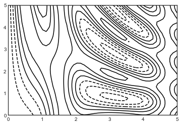
4.密度和轮廓图
%matplotlib inline
import matplotlib.pyplot as plt
plt.style.use('seaborn-white')
import numpy as np
三维可视化函数
def f(x, y):
    return np.sin(x) ** 10 + np.cos(10 + y * x) * np.cos(x)
x = np.linspace(0, 5, 50)
y = np.linspace(0, 5, 40)

X, Y = np.meshgrid(x, y)
Z = f(X, Y)
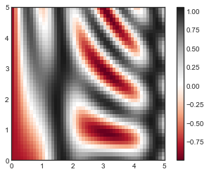
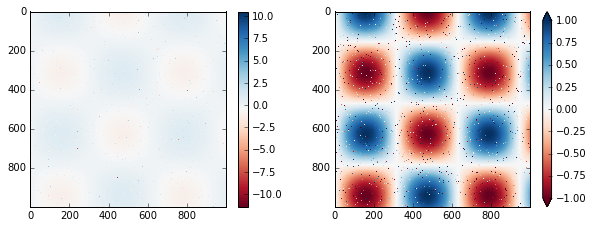
plt.contour(X, Y, Z, colors='black');
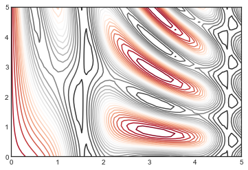
plt.contour(X, Y, Z, 20, cmap='RdGy');
plt.cm.
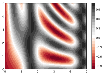
plt.contourf(X, Y, Z, 20, cmap='RdGy')
plt.colorbar();
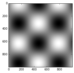
plt.imshow(Z, extent=[0, 5, 0, 5], origin='lower',
           cmap='RdGy')
plt.colorbar()
plt.axis(aspect='image');
C:\Users\gdc\Anaconda3\lib\site-packages\ipykernel_launcher.py:4: MatplotlibDeprecationWarning: Passing unsupported keyword arguments to axis() will raise a TypeError in 3.3.
  after removing the cwd from sys.path.
plt.imshow()不接受 x 和 y 网格值作为参数,因此你需要手动指定extent参数[xmin, xmax, ymin, ymax]来设置图表的数据范围。 plt.imshow()使用的是默认的图像坐标,即左上角坐标点是原点,而不是通常图表的左下角坐标点。这可以通过设置origin参数来设置。 plt.imshow()会自动根据输入数据调整坐标轴的比例;这可以通过参数来设置,例如,plt.axis(aspect='image')能让 x 和 y 轴的单位一致。
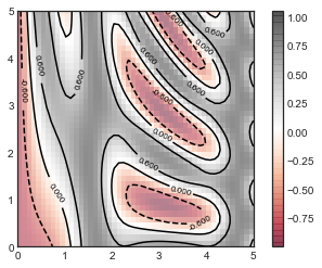
contours = plt.contour(X, Y, Z, 3, colors='black')
plt.clabel(contours, inline=True, fontsize=8)

plt.imshow(Z, extent=[0, 5, 0, 5], origin='lower',
           cmap='RdGy', alpha=0.5)
plt.colorbar();
5.直方图,分桶和密度
%matplotlib inline
import numpy as np
import matplotlib.pyplot as plt
plt.style.use('seaborn-white')
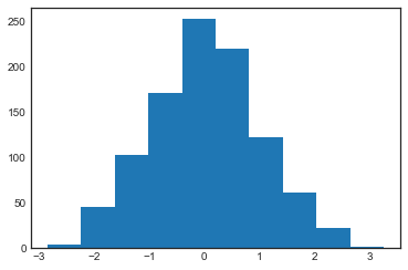
data = np.random.randn(1000)
plt.hist(data);
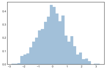
plt.hist(data, bins=30, density=True, alpha=0.5,
         histtype='stepfilled', color='steelblue',
         edgecolor='none');
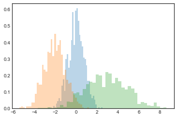
x1 = np.random.normal(0, 0.8, 1000)
x2 = np.random.normal(-2, 1, 1000)
x3 = np.random.normal(3, 2, 1000)

kwargs = dict(histtype='stepfilled', alpha=0.3, density=True, bins=40)

plt.hist(x1, **kwargs)
plt.hist(x2, **kwargs)
plt.hist(x3, **kwargs);
counts, bin_edges = np.histogram(data, bins=5)
print(counts)
[ 49 273 471 183 24]
二维直方图和分桶
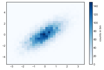
mean = [0, 0]
cov = [[1, 1], [1, 2]]
x, y = np.random.multivariate_normal(mean, cov, 10000).T
plt.hist2d:二维直方图
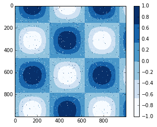
plt.hist2d(x, y, bins=30, cmap='Blues')
cb = plt.colorbar()
cb.set_label('counts in bin')
counts, xedges, yedges = np.histogram2d(x, y, bins=30)
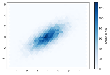
plt.hexbin:六角形分桶
plt.hexbin(x, y, gridsize=30, cmap='Blues')
cb = plt.colorbar(label='count in bin')
核密度估计
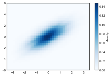
from scipy.stats import gaussian_kde

# 产生和处理数据,初始化KDE
data = np.vstack([x, y])
kde = gaussian_kde(data)

# 在通用的网格中计算得到Z的值
xgrid = np.linspace(-3.5, 3.5, 40)
ygrid = np.linspace(-6, 6, 40)
Xgrid, Ygrid = np.meshgrid(xgrid, ygrid)
Z = kde.evaluate(np.vstack([Xgrid.ravel(), Ygrid.ravel()]))

# 将图表绘制成一张图像
plt.imshow(Z.reshape(Xgrid.shape),
           origin='lower', aspect='auto',
           extent=[-3.5, 3.5, -6, 6],
           cmap='Blues')
cb = plt.colorbar()
cb.set_label("density")
6.自定义图标图例
import matplotlib.pyplot as plt
plt.style.use('classic')
%matplotlib inline
import numpy as np
x = np.linspace(0, 10, 1000)
fig, ax = plt.subplots()
ax.plot(x, np.sin(x), '-b', label='Sine')
ax.plot(x, np.cos(x), '--r', label='Cosine')
ax.axis('equal')
leg = ax.legend();
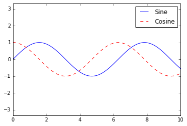
ax.legend(loc='upper left', frameon=False)
fig
ax.legend(frameon=False, loc='lower center', ncol=2)
fig
ax.legend(fancybox=True, framealpha=1, shadow=True, borderpad=1)
fig
选择设置图例的元素
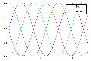
y = np.sin(x[:, np.newaxis] + np.pi * np.arange(0, 2, 0.5))
lines = plt.plot(x, y)

# lines是一个线条实例的列表
plt.legend(lines[:2], ['first', 'second']);
plt.plot(x, y[:, 0], label='first')
plt.plot(x, y[:, 1], label='second')
plt.plot(x, y[:, 2:])
plt.legend(framealpha=1, frameon=True);
散点大小的图例
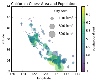
import pandas as pd
cities = pd.read_csv(r'D:\python\Github学习材料\Python数据科学手册\data\california_cities.csv')

# 提取我们感兴趣的数据
lat, lon = cities['latd'], cities['longd']
population, area = cities['population_total'], cities['area_total_km2']

# 绘制散点图,使用尺寸代表面积,颜色代表人口,不带标签
plt.scatter(lon, lat, label=None,
            c=np.log10(population), cmap='viridis',
            s=area, linewidth=0, alpha=0.5)
plt.axis('scaled')
plt.xlabel('longitude')
plt.ylabel('latitude')
plt.colorbar(label='log$_{10}$(population)')
plt.clim(3, 7)

# 下面我们创建图例:
# 使用空列表绘制图例中的散点,使用不同面积和标签,带透明度
for area in [100, 300, 500]:
    plt.scatter([], [], c='k', alpha=0.3, s=area,
                label=str(area) + ' km$^2$')
plt.legend(scatterpoints=1, frameon=False, labelspacing=1, title='City Area')

plt.title('California Cities: Area and Population');
多重图例
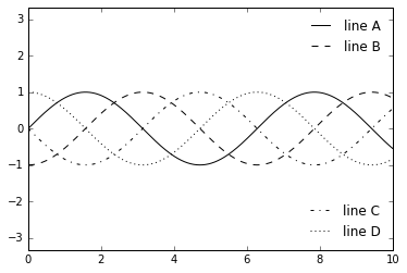
fig, ax = plt.subplots()

lines = []
styles = ['-', '--', '-.', ':']
x = np.linspace(0, 10, 1000)

for i in range(4):
    lines += ax.plot(x, np.sin(x - i * np.pi / 2),
                     styles[i], color='black')
ax.axis('equal')

# 指定第一个图例的线条和标签
ax.legend(lines[:2], ['line A', 'line B'],
          loc='upper right', frameon=False)

# 手动创建第二个图例,并将作者添加到图表中
from matplotlib.legend import Legend
leg = Legend(ax, lines[2:], ['line C', 'line D'],
             loc='lower right', frameon=False)
ax.add_artist(leg);
7.个性化颜色条
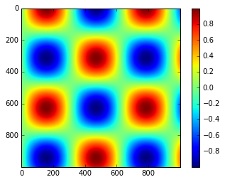
import matplotlib.pyplot as plt
plt.style.use('classic')
%matplotlib inline
import numpy as np
x = np.linspace(0, 10, 1000)
I = np.sin(x) * np.cos(x[:, np.newaxis])

plt.imshow(I)
plt.colorbar();
自定义颜色条
plt.imshow(I, cmap='gray');
plt.cm.
选择色图
序列色图:这类型的色谱只包括一个连续序列的色系(例如binary或viridis)。 分化色图:这类型的色谱包括两种独立的色系,这两种颜色有着非常大的对比度(例如RdBu或PuOr)。 定性色图:这类型的色图混合了非特定连续序列的颜色(例如rainbow或jet)。
from matplotlib.colors import LinearSegmentedColormap

def grayscale_cmap(cmap):
    """返回给定色图的灰度版本"""
    cmap = plt.cm.get_cmap(cmap) # 使用名称获取色图对象
    colors = cmap(np.arange(cmap.N)) # 将色图对象转为RGBA矩阵,形状为N×4

    # 将RGBA颜色转换为灰度
    # 参考 http://alienryderflex.com/hsp.html
    RGB_weight = [0.299, 0.587, 0.114] # RGB三色的权重值
    luminance = np.sqrt(np.dot(colors[:, :3] ** 2, RGB_weight)) # RGB平方值和权重的点积开平方根
    colors[:, :3] = luminance[:, np.newaxis] # 得到灰度值矩阵
    # 返回相应的灰度值色图
    return LinearSegmentedColormap.from_list(cmap.name + "_gray", colors, cmap.N)


def view_colormap(cmap):
    """将色图对应的灰度版本绘制出来"""
    cmap = plt.cm.get_cmap(cmap)
    colors = cmap(np.arange(cmap.N))

    cmap = grayscale_cmap(cmap)
    grayscale = cmap(np.arange(cmap.N))

    fig, ax = plt.subplots(2, figsize=(6, 2),
                           subplot_kw=dict(xticks=[], yticks=[]))
    ax[0].imshow([colors], extent=[0, 10, 0, 1])
    ax[1].imshow([grayscale], extent=[0, 10, 0, 1])
view_colormap('jet')

view_colormap('viridis')

view_colormap('cubehelix')

view_colormap('RdBu')

颜色限制和扩展
# 在I数组中人为生成不超过1%的噪声
speckles = (np.random.random(I.shape) < 0.01)
I[speckles] = np.random.normal(0, 3, np.count_nonzero(speckles))

plt.figure(figsize=(10, 3.5))
# 不考虑去除噪声时的颜色分布
plt.subplot(1, 2, 1)
plt.imshow(I, cmap='RdBu')
plt.colorbar()
# 设置去除噪声时的颜色分布
plt.subplot(1, 2, 2)
plt.imshow(I, cmap='RdBu')
plt.colorbar(extend='both')
plt.clim(-1, 1);
离散颜色条
plt.imshow(I, cmap=plt.cm.get_cmap('Blues', 6))
plt.colorbar()
plt.clim(-1, 1);
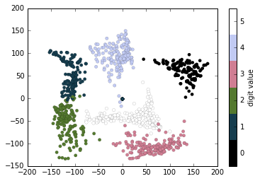
例子:手写数字
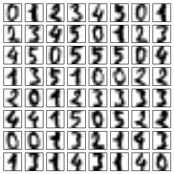
# 读取数字0-5的手写图像,然后使用Matplotlib展示头64张缩略图
from sklearn.datasets import load_digits
digits = load_digits(n_class=6)

fig, ax = plt.subplots(8, 8, figsize=(6, 6))
for i, axi in enumerate(ax.flat):
    axi.imshow(digits.images[i], cmap='binary')
    axi.set(xticks=[], yticks=[])
# 使用Isomap将手写数字图像映射到二维流形学习中
from sklearn.manifold import Isomap
iso = Isomap(n_components=2)
projection = iso.fit_transform(digits.data)
# 绘制图表结果
plt.scatter(projection[:, 0], projection[:, 1], lw=0.1,
            c=digits.target, cmap=plt.cm.get_cmap('cubehelix', 6))
plt.colorbar(ticks=range(6), label='digit value')
plt.clim(-0.5, 5.5)
8.多个子图表
%matplotlib inline
import matplotlib.pyplot as plt
plt.style.use('seaborn-white')
import numpy as np
plt.axes:手动构建子图表
ax1 = plt.axes()  # 标准图表
ax2 = plt.axes([0.65, 0.65, 0.2, 0.2]) #子图表
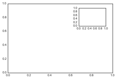
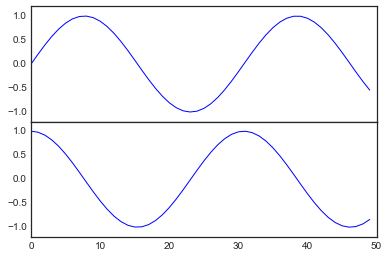
fig = plt.figure() # 获得figure对象
ax1 = fig.add_axes([0.1, 0.5, 0.8, 0.4],
                   xticklabels=[], ylim=(-1.2, 1.2)) # 左边10% 底部50% 宽80% 高40%
ax2 = fig.add_axes([0.1, 0.1, 0.8, 0.4],
                   ylim=(-1.2, 1.2)) # 左边10% 底部10% 宽80% 高40%

x = np.linspace(0, 10)
ax1.plot(np.sin(x))
ax2.plot(np.cos(x));
plt.subplot:简单网格的子图表
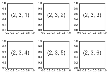
for i in range(1, 7):
    plt.subplot(2, 3, i)
    plt.text(0.5, 0.5, str((2, 3, i)),
             fontsize=18, ha='center')
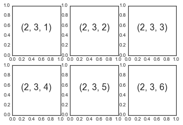
fig = plt.figure()
fig.subplots_adjust(hspace=0.4, wspace=0.4)
for i in range(1, 7):
    ax = fig.add_subplot(2, 3, i)
    ax.text(0.5, 0.5, str((2, 3, i)),
           fontsize=18, ha='center')
plt.subplots:一句代码设置所有网格子图表
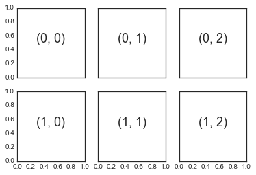
fig, ax = plt.subplots(2, 3, sharex='col', sharey='row')

# axes是一个2×3的数组,可以通过[row, col]进行索引访问
for i in range(2):
    for j in range(3):
        ax[i, j].text(0.5, 0.5, str((i, j)),
                      fontsize=18, ha='center')
fig
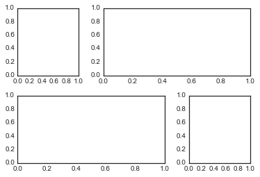
plt.GridSpec:更复杂的排列
grid = plt.GridSpec(2, 3, wspace=0.4, hspace=0.3)
plt.subplot(grid[0, 0])
plt.subplot(grid[0, 1:])
plt.subplot(grid[1, :2])
plt.subplot(grid[1, 2]);
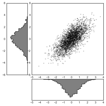
# 构建二维正态分布数据
mean = [0, 0]
cov = [[1, 1], [1, 2]]
x, y = np.random.multivariate_normal(mean, cov, 3000).T

# 使用GridSpec创建网格并加入子图表
fig = plt.figure(figsize=(6, 6))
grid = plt.GridSpec(4, 4, hspace=0.2, wspace=0.2)
main_ax = fig.add_subplot(grid[:-1, 1:])
y_hist = fig.add_subplot(grid[:-1, 0], xticklabels=[], sharey=main_ax)
x_hist = fig.add_subplot(grid[-1, 1:], yticklabels=[], sharex=main_ax)

# 在主图表中绘制散点图
main_ax.plot(x, y, 'ok', markersize=3, alpha=0.2)

# 分别在x轴和y轴方向绘制直方图
x_hist.hist(x, 40, histtype='stepfilled',
            orientation='vertical', color='gray')
x_hist.invert_yaxis() # x轴方向(右下)直方图倒转y轴方向

y_hist.hist(y, 40, histtype='stepfilled',
            orientation='horizontal', color='gray')
y_hist.invert_xaxis() # y轴方向(左上)直方图倒转x轴方向
9.文本和标注
%matplotlib inline
import matplotlib.pyplot as plt
import matplotlib as mpl
plt.style.use('seaborn-whitegrid')
import numpy as np
import pandas as pd
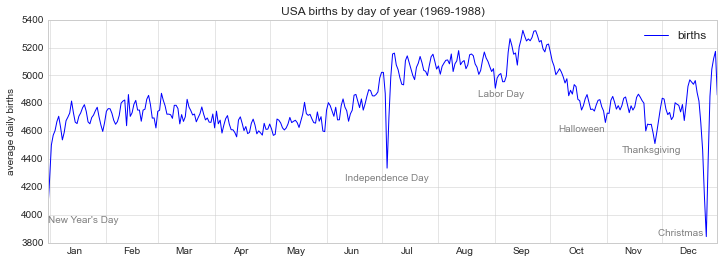
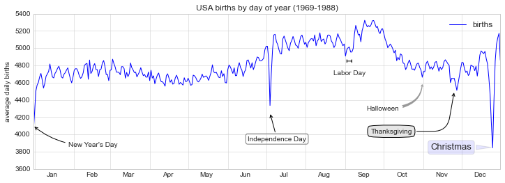
例子:节假日对美国出生率的影响
births = pd.read_csv(r'D:\python\Github学习材料\Python数据科学手册\data\births.csv')

quartiles = np.percentile(births['births'], [25, 50, 75])
mu, sig = quartiles[1], 0.74 * (quartiles[2] - quartiles[0])
births = births.query('(births > @mu - 5 * @sig) & (births < @mu + 5 * @sig)')

births['day'] = births['day'].astype(int)

births.index = pd.to_datetime(10000 * births.year +
                              100 * births.month +
                              births.day, format='%Y%m%d')
births_by_date = births.pivot_table('births',
                                    [births.index.month, births.index.day])
births_by_date.index = [pd.datetime(2012, month, day)
                        for (month, day) in births_by_date.index]
C:\Users\gdc\Anaconda3\lib\site-packages\ipykernel_launcher.py:15: FutureWarning: The pandas.datetime class is deprecated and will be removed from pandas in a future version. Import from datetime module instead.
  from ipykernel import kernelapp as app
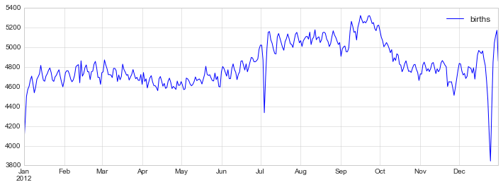
fig, ax = plt.subplots(figsize=(12, 4))
births_by_date.plot(ax=ax);
fig, ax = plt.subplots(figsize=(12, 4))
births_by_date.plot(ax=ax)

# 在折线的特殊位置标注文字
style = dict(size=10, color='gray')

ax.text('2012-1-1', 3950, "New Year's Day", **style)
ax.text('2012-7-4', 4250, "Independence Day", ha='center', **style)
ax.text('2012-9-4', 4850, "Labor Day", ha='center', **style)
ax.text('2012-10-31', 4600, "Halloween", ha='right', **style)
ax.text('2012-11-25', 4450, "Thanksgiving", ha='center', **style)
ax.text('2012-12-25', 3850, "Christmas ", ha='right', **style)

# 设置标题和y轴标签
ax.set(title='USA births by day of year (1969-1988)',
       ylabel='average daily births')

# 设置x轴标签月份居中
ax.xaxis.set_major_locator(mpl.dates.MonthLocator())
ax.xaxis.set_minor_locator(mpl.dates.MonthLocator(bymonthday=15))
ax.xaxis.set_major_formatter(plt.NullFormatter())
ax.xaxis.set_minor_formatter(mpl.dates.DateFormatter('%h'));
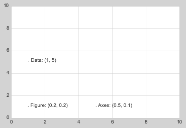
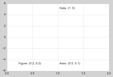
转换和文本位置
ax.transData:与数据坐标相关的转换 ax.tranAxes:与 Axes 尺寸相关的转换(单位是 axes 的宽和高) ax.tranFigure:与 figure 尺寸相关的转换(单位是 figure 的宽和高)
fig, ax = plt.subplots(facecolor='lightgray')
ax.axis([0, 10, 0, 10])

# transform=ax.transData是默认的,这里写出来是为了明确对比
ax.text(1, 5, ". Data: (1, 5)", transform=ax.transData)
ax.text(0.5, 0.1, ". Axes: (0.5, 0.1)", transform=ax.transAxes)
ax.text(0.2, 0.2, ". Figure: (0.2, 0.2)", transform=fig.transFigure);
ax.set_xlim(0, 2)
ax.set_ylim(-6, 6)
fig
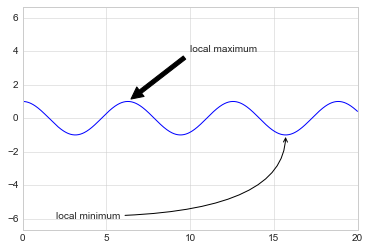
箭头和标注
%matplotlib inline

fig, ax = plt.subplots()

x = np.linspace(0, 20, 1000)
ax.plot(x, np.cos(x))
ax.axis('equal')

ax.annotate('local maximum', xy=(6.28, 1), xytext=(10, 4),
            arrowprops=dict(facecolor='black', shrink=0.05))

ax.annotate('local minimum', xy=(5 * np.pi, -1), xytext=(2, -6),
            arrowprops=dict(arrowstyle="->",
                            connectionstyle="angle3,angleA=0,angleB=-90"));
fig, ax = plt.subplots(figsize=(12, 4))
births_by_date.plot(ax=ax)

# 为图表添加标注
ax.annotate("New Year's Day", xy=('2012-1-1', 4100),  xycoords='data',
            xytext=(50, -30), textcoords='offset points',
            arrowprops=dict(arrowstyle="->",
                            connectionstyle="arc3,rad=-0.2"))

ax.annotate("Independence Day", xy=('2012-7-4', 4250),  xycoords='data',
            bbox=dict(boxstyle="round", fc="none", ec="gray"),
            xytext=(10, -40), textcoords='offset points', ha='center',
            arrowprops=dict(arrowstyle="->"))

ax.annotate('Labor Day', xy=('2012-9-4', 4850), xycoords='data', ha='center',
            xytext=(0, -20), textcoords='offset points')
ax.annotate('', xy=('2012-9-1', 4850), xytext=('2012-9-7', 4850),
            xycoords='data', textcoords='data',
            arrowprops={'arrowstyle': '|-|,widthA=0.2,widthB=0.2', })

ax.annotate('Halloween', xy=('2012-10-31', 4600),  xycoords='data',
            xytext=(-80, -40), textcoords='offset points',
            arrowprops=dict(arrowstyle="fancy",
                            fc="0.6", ec="none",
                            connectionstyle="angle3,angleA=0,angleB=-90"))

ax.annotate('Thanksgiving', xy=('2012-11-25', 4500),  xycoords='data',
            xytext=(-120, -60), textcoords='offset points',
            bbox=dict(boxstyle="round4,pad=.5", fc="0.9"),
            arrowprops=dict(arrowstyle="->",
                            connectionstyle="angle,angleA=0,angleB=80,rad=20"))


ax.annotate('Christmas', xy=('2012-12-25', 3850),  xycoords='data',
             xytext=(-30, 0), textcoords='offset points',
             size=13, ha='right', va="center",
             bbox=dict(boxstyle="round", alpha=0.1),
             arrowprops=dict(arrowstyle="wedge,tail_width=0.5", alpha=0.1));

# 设置图表标题和坐标轴标记
ax.set(title='USA births by day of year (1969-1988)',
       ylabel='average daily births')

# 设置月份坐标居中显示
ax.xaxis.set_major_locator(mpl.dates.MonthLocator())
ax.xaxis.set_minor_locator(mpl.dates.MonthLocator(bymonthday=15))
ax.xaxis.set_major_formatter(plt.NullFormatter())
ax.xaxis.set_minor_formatter(mpl.dates.DateFormatter('%h'));

ax.set_ylim(3600, 5400);
10.自定义刻度
主要的和次要的刻度
import matplotlib.pyplot as plt
plt.style.use('classic')
%matplotlib inline
import numpy as np
ax = plt.axes(xscale='log', yscale='log', xlim=[10e-5, 10e5], ylim=[10e-5, 10e5])
ax.grid();
print(ax.xaxis.get_major_locator())
print(ax.xaxis.get_minor_locator())
print(ax.xaxis.get_major_formatter())
print(ax.xaxis.get_minor_formatter())
隐藏刻度和标签
ax = plt.axes()
ax.plot(np.random.rand(50))

ax.yaxis.set_major_locator(plt.NullLocator())
ax.xaxis.set_major_formatter(plt.NullFormatter())
fig, ax = plt.subplots(5, 5, figsize=(5, 5))
fig.subplots_adjust(hspace=0, wspace=0)

# 从scikit-learn载入头像数据集
from sklearn.datasets import fetch_olivetti_faces
faces = fetch_olivetti_faces().images

for i in range(5):
    for j in range(5):
        ax[i, j].xaxis.set_major_locator(plt.NullLocator())
        ax[i, j].yaxis.set_major_locator(plt.NullLocator())
        ax[i, j].imshow(faces[10 * i + j], cmap="bone")
downloading Olivetti faces from
https://ndownloader.figshare.com/files/5976027
to C:\Users\gdc\scikit_learn_data

减少或增加刻度的数量
fig, ax = plt.subplots(4, 4, sharex=True, sharey=True)

# 对x和y轴设置刻度最大数量
for axi in ax.flat:
    axi.xaxis.set_major_locator(plt.MaxNLocator(3))
    axi.yaxis.set_major_locator(plt.MaxNLocator(3))
fig

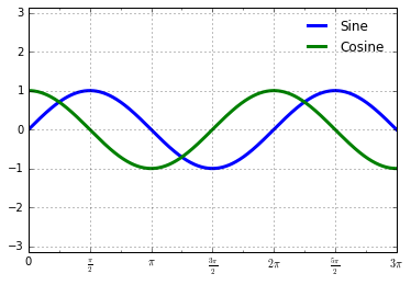
复杂的刻度格式
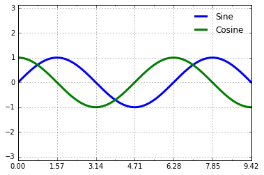
# 绘制正弦和余弦图表
fig, ax = plt.subplots()
x = np.linspace(0, 3 * np.pi, 1000)
ax.plot(x, np.sin(x), lw=3, label='Sine')
ax.plot(x, np.cos(x), lw=3, label='Cosine')

# 设置网格、图例和轴极限
ax.grid(True)
ax.legend(frameon=False)
ax.axis('equal')
ax.set_xlim(0, 3 * np.pi);
ax.xaxis.set_major_locator(plt.MultipleLocator(np.pi / 2))
ax.xaxis.set_minor_locator(plt.MultipleLocator(np.pi / 4))
fig
plt.FuncFormatter,这个对象能够接受一个用户自定义的函数来提供对于刻度标签的精细控制:def format_func(value, tick_number):
# N是pi/2的倍数
N = int(np.round(2 * value / np.pi))
if N == 0:
return "0" # 0点
elif N == 1:
return r"$\frac{\pi}{2}$" # pi/2
elif N == 2:
return r"$\pi$" # pi
elif N % 2 > 0:
return r"$\frac{{%d}\pi}{2}$" %N # n*pi/2 n是奇数
else:
return r"${0}\pi$".format(N // 2) # n*pi n是整数
ax.xaxis.set_major_formatter(plt.FuncFormatter(format_func))
fig
Formatter 和 Locator 总结
NullLocator | |
FixedLocator | |
IndexLocator | |
LinearLocator | |
LogLocator | |
MultipleLocator | |
MaxNLocator | |
AutoLocator | |
AutoMinorLocator |
NullFormatter | |
IndexFormatter | |
FixedFormatter | |
FuncFormatter | |
FormatStrFormatter | |
ScalarFormatter | |
LogFormatter |
11.在 matplotlib 中创建三维图表
from mpl_toolkits import mplot3d
%matplotlib inline
import numpy as np
import matplotlib.pyplot as plt
fig = plt.figure()
ax = plt.axes(projection='3d')
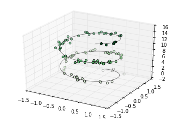
三维的点和线
ax = plt.axes(projection='3d')

# 三维螺旋线的数据
zline = np.linspace(0, 15, 1000)
xline = np.sin(zline)
yline = np.cos(zline)
ax.plot3D(xline, yline, zline, 'gray')

# 三维散点的数据
zdata = 15 * np.random.random(100)
xdata = np.sin(zdata) + 0.1 * np.random.randn(100)
ydata = np.cos(zdata) + 0.1 * np.random.randn(100)
ax.scatter3D(xdata, ydata, zdata, c=zdata, cmap='Greens');
def f(x, y):
    return np.sin(np.sqrt(x ** 2 + y ** 2))

x = np.linspace(-6, 6, 30)
y = np.linspace(-6, 6, 30)

X, Y = np.meshgrid(x, y)
Z = f(X, Y)
fig = plt.figure()
ax = plt.axes(projection='3d')
ax.contour3D(X, Y, Z, 50, cmap='binary')
ax.set_xlabel('x')
ax.set_ylabel('y')
ax.set_zlabel('z');
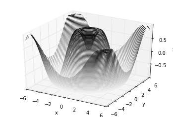
ax.view_init(60, 35)
fig
框线图和表面图
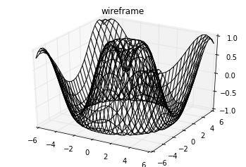
fig = plt.figure()
ax = plt.axes(projection='3d')
ax.plot_wireframe(X, Y, Z, color='black')
ax.set_title('wireframe');
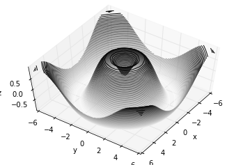
ax = plt.axes(projection='3d')
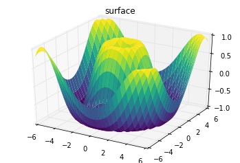
ax.plot_surface(X, Y, Z, rstride=1, cstride=1,
cmap='viridis', edgecolor='none')
ax.set_title('surface');
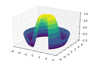
r = np.linspace(0, 6, 20)
theta = np.linspace(-0.9 * np.pi, 0.8 * np.pi, 40)
r, theta = np.meshgrid(r, theta)

X = r * np.sin(theta)
Y = r * np.cos(theta)
Z = f(X, Y)

ax = plt.axes(projection='3d')
ax.plot_surface(X, Y, Z, rstride=1, cstride=1,
                cmap='viridis', edgecolor='none');
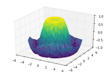
表面三角剖分
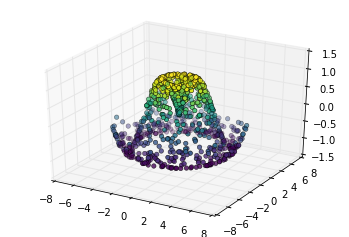
theta = 2 * np.pi * np.random.random(1000)
r = 6 * np.random.random(1000)
x = np.ravel(r * np.sin(theta))
y = np.ravel(r * np.cos(theta))
z = f(x, y)
ax = plt.axes(projection='3d')
ax.scatter(x, y, z, c=z, cmap='viridis', linewidth=0.5);
ax = plt.axes(projection='3d')
ax.plot_trisurf(x, y, z,
                cmap='viridis', edgecolor='none');
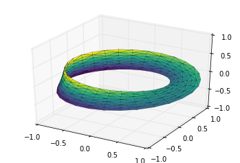
例子:绘制莫比乌斯环
theta = np.linspace(0, 2 * np.pi, 30)
w = np.linspace(-0.25, 0.25, 8)
w, theta = np.meshgrid(w, theta)
phi = 0.5 * theta
# r是坐标点距离环形中心的距离值
r = 1 + w * np.cos(phi)
# 利用简单的三角函数知识算得x,y,z坐标值
x = np.ravel(r * np.cos(theta))
y = np.ravel(r * np.sin(theta))
z = np.ravel(w * np.sin(phi))
# 在底层参数的基础上进行三角剖分
from matplotlib.tri import Triangulation
tri = Triangulation(np.ravel(w), np.ravel(theta))

ax = plt.axes(projection='3d')
ax.plot_trisurf(x, y, z, triangles=tri.triangles,
                cmap='viridis', linewidths=0.2);

ax.set_xlim(-1, 1); ax.set_ylim(-1, 1); ax.set_zlim(-1, 1);
参考资料
[1]PythonDataScienceHandbook:https://github.com/jakevdp/PythonDataScienceHandbook/tree/master/notebooks
首届珠港澳人工智能算法大赛即将开赛
赛题一:短袖短裤识别
赛题二:小摊贩占道识别
即将开赛 等你加入

评论