
收藏!万字Matplotlib实操总结,几行代码实现数据绘图
本文约24000字,建议阅读10分钟
通过 Matplotlib,开发者可以仅需要几行代码,便可以生成绘图,直方图,功率谱,条形图,错误图,散点图等。
导读
Matplotlib 是一个 Python 的 2D绘图库,它以各种硬拷贝格式和跨平台的交互式环境生成出版质量级别的图形。通过 Matplotlib,开发者可以仅需要几行代码,便可以生成绘图,直方图,功率谱,条形图,错误图,散点图等。
以下内容来自Github,为《PythonDataScienceHandbook[1]》(Python 数据科学手册[2])第四章Matplotlib介绍部分。全部内容都在以下环境演示通过:
numpy:1.18.5
pandas:1.0.5
matplotlib:3.2.1
1.简单的折线图
%matplotlib inline
import matplotlib.pyplot as plt
plt.style.use('seaborn-whitegrid')
import numpy as np
对于所有的 Matplotlib 图表来说,我们都需要从创建图形和维度开始。图形和维度可以使用下面代码进行最简形式的创建:
fig = plt.figure()
ax = plt.axes()
在 Matplotlib 中,图形(类plt.Figure的一个实例)可以被认为是一个包括所有维度、图像、文本和标签对象的容器。维度(类plt.Axes的一个实例)就是你上面看到的图像,一个有边界的格子包括刻度和标签,最终还有我们画在上面的图表元素。在本书中,我们会使用变量名fig来指代图形对象,以及变量名ax来指代维度变量。
fig = plt.figure()
ax = plt.axes()
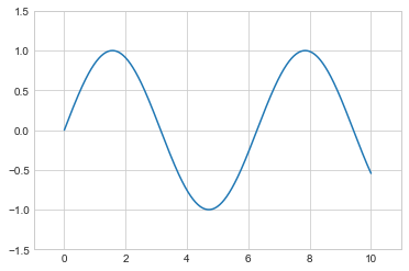
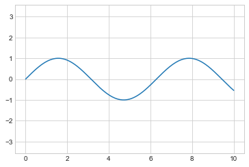
x = np.linspace(0, 10, 1000)
ax.plot(x, np.sin(x));
plt.plot(x, np.sin(x));
如果我们需要在同一幅图形中绘制多根线条,只需要多次调用plot函数即可:
plt.plot(x, np.sin(x))
plt.plot(x, np.cos(x));
调整折线图:线条颜色和风格
所有 HTML 颜色名称可以在这里[3]找到。
plt.plot(x, np.sin(x - 0), color='blue')        # 通过颜色名称指定
plt.plot(x, np.sin(x - 1), color='g')           # 通过颜色简写名称指定(rgbcmyk)
plt.plot(x, np.sin(x - 2), color='0.75')        # 介于0-1之间的灰阶值
plt.plot(x, np.sin(x - 3), color='#FFDD44')     # 16进制的RRGGBB值
plt.plot(x, np.sin(x - 4), color=(1.0,0.2,0.3)) # RGB元组的颜色值,每个值介于0-1
plt.plot(x, np.sin(x - 5), color='chartreuse'); # 能支持所有HTML颜色名称值
如果没有指定颜色,Matplotlib 会在一组默认颜色值中循环使用来绘制每一条线条。
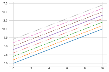
plt.plot(x, x + 0, linestyle='solid')
plt.plot(x, x + 1, linestyle='dashed')
plt.plot(x, x + 2, linestyle='dashdot')
plt.plot(x, x + 3, linestyle='dotted');

# 还可以用形象的符号代表线条风格
plt.plot(x, x + 4, linestyle='-')  # 实线
plt.plot(x, x + 5, linestyle='--') # 虚线
plt.plot(x, x + 6, linestyle='-.') # 长短点虚线
plt.plot(x, x + 7, linestyle=':');  # 点线
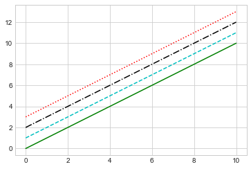
如果你喜欢更简洁的代码,这些linestyle和color参数能够合并成一个非关键字参数,传递给plt.plot()函数:
plt.plot(x, x + 0, '-g')  # 绿色实线
plt.plot(x, x + 1, '--c') # 天青色虚线
plt.plot(x, x + 2, '-.k') # 黑色长短点虚线
plt.plot(x, x + 3, ':r');  # 红色点线
调整折线图:坐标轴范围
plt.plot(x, np.sin(x))

plt.xlim(-1, 11)
plt.ylim(-1.5, 1.5);
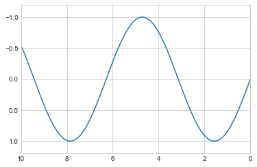
plt.plot(x, np.sin(x))

plt.xlim(10, 0)
plt.ylim(1.2, -1.2);
相关的函数还有plt.axis()(注意:这不是plt.axes()函数,函数名称是 i 而不是 e)。这个函数可以在一个函数调用中就完成 x 轴和 y 轴范围的设置,传递一个[xmin, xmax, ymin, ymax]的列表参数即可:
plt.plot(x, np.sin(x))
plt.axis([-1, 11, -1.5, 1.5]);
当然plt.axis()函数不仅能设置范围,还能像下面代码一样将坐标轴压缩到刚好足够绘制折线图像的大小:
plt.plot(x, np.sin(x))
plt.axis('tight');
还可以通过设置'equal'参数设置x轴与y轴使用相同的长度单位:
plt.plot(x, np.sin(x))
plt.axis('equal');
折线图标签
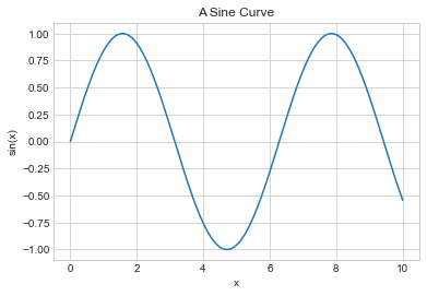
plt.plot(x, np.sin(x))
plt.title("A Sine Curve")
plt.xlabel("x")
plt.ylabel("sin(x)");
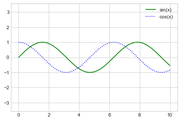
plt.plot(x, np.sin(x), '-g', label='sin(x)')
plt.plot(x, np.cos(x), ':b', label='cos(x)')
plt.axis('equal')

plt.legend();
额外内容:Matplotlib 的坑
plt.xlabel() → ax.set_xlabel()
plt.ylabel() → ax.set_ylabel()
plt.xlim() → ax.set_xlim()
plt.ylim() → ax.set_ylim()
plt.title() → ax.set_title()
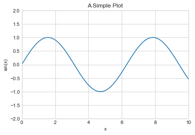
ax = plt.axes()
ax.plot(x, np.sin(x))
ax.set(xlim=(0, 10), ylim=(-2, 2),
       xlabel='x', ylabel='sin(x)',
       title='A Simple Plot');
2.简单散点图
%matplotlib inline
import matplotlib.pyplot as plt
plt.style.use('seaborn-whitegrid')
import numpy as np
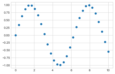
使用 plt.plot 绘制散点图
x = np.linspace(0, 10, 30)
y = np.sin(x)
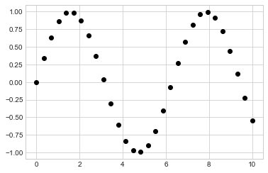
plt.plot(x, y, 'o', color='black');
rng = np.random.RandomState(0)
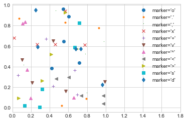
for marker in ['o', '.', ',', 'x', '+', 'v', '^', '<', '>', 's', 'd']:
plt.plot(rng.rand(5), rng.rand(5), marker,
label="marker='{0}'".format(marker))
plt.legend(numpoints=1)
plt.xlim(0, 1.8);
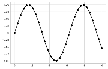
plt.plot(x, y, '-ok');
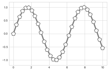
plt.plot(x, y, '-p', color='gray',
         markersize=15, linewidth=4,
         markerfacecolor='white',
         markeredgecolor='gray',
         markeredgewidth=2)
plt.ylim(-1.2, 1.2);
使用plt.scatter绘制散点图
plt.scatter(x, y, marker='o');
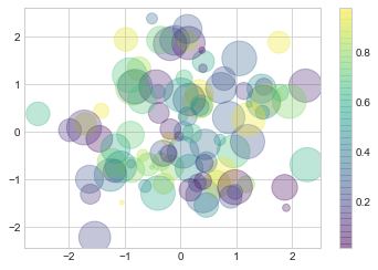
rng = np.random.RandomState(0)
x = rng.randn(100)
y = rng.randn(100)
colors = rng.rand(100)
sizes = 1000 * rng.rand(100)

plt.scatter(x, y, c=colors, s=sizes, alpha=0.3,
            cmap='viridis')
plt.colorbar();  # 显示颜色对比条
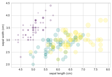
from sklearn.datasets import load_iris
iris = load_iris()
features = iris.data.T

plt.scatter(features[0], features[1], alpha=0.2,
            s=100*features[3], c=iris.target, cmap='viridis')
plt.xlabel(iris.feature_names[0])
plt.ylabel(iris.feature_names[1]);
plot 和 scatter 对比:性能提醒
3.误差可视化
基础误差条
%matplotlib inline
import matplotlib.pyplot as plt
plt.style.use('seaborn-whitegrid')
import numpy as np
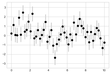
x = np.linspace(0, 10, 50)
dy = 0.8
y = np.sin(x) + dy * np.random.randn(50)

plt.errorbar(x, y, yerr=dy, fmt='.k');

plt.errorbar(x, y, yerr=dy, fmt='o', color='black',
             ecolor='lightgray', elinewidth=3, capsize=0);
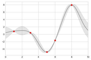
连续误差
from sklearn.gaussian_process import GaussianProcessRegressor

# 定义模型和一些符合模型的点
model = lambda x: x * np.sin(x)
xdata = np.array([1, 3, 5, 6, 8])
ydata = model(xdata)

# 计算高斯过程回归,使其符合 fit 数据点
gp = GaussianProcessRegressor()
gp.fit(xdata[:, np.newaxis], ydata)

xfit = np.linspace(0, 10, 1000)
yfit, std = gp.predict(xfit[:, np.newaxis], return_std=True)
dyfit = 2 * std  # 两倍sigma ~ 95% 确定区域
# 可视化结果
plt.plot(xdata, ydata, 'or')
plt.plot(xfit, yfit, '-', color='gray')

plt.fill_between(xfit, yfit - dyfit, yfit + dyfit,
                 color='gray', alpha=0.2)
plt.xlim(0, 10);
4.密度和轮廓图
%matplotlib inline
import matplotlib.pyplot as plt
plt.style.use('seaborn-white')
import numpy as np
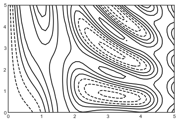
三维可视化函数
我们首先使用一个简单的函数 绘制一个轮廓图来进行说明,我们用来作为数组广播运算的例子:
def f(x, y):
    return np.sin(x) ** 10 + np.cos(10 + y * x) * np.cos(x)
x = np.linspace(0, 5, 50)
y = np.linspace(0, 5, 40)

X, Y = np.meshgrid(x, y)
Z = f(X, Y)
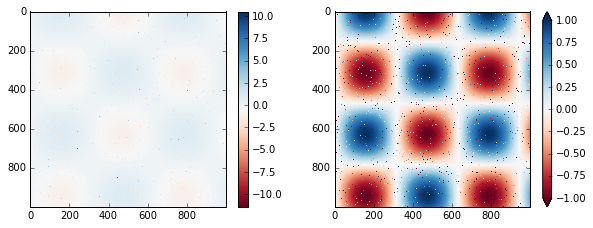
plt.contour(X, Y, Z, colors='black');
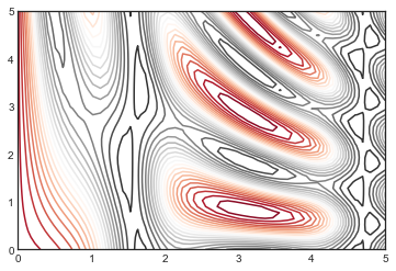
plt.contour(X, Y, Z, 20, cmap='RdGy');
plt.cm.
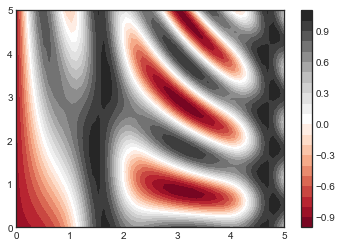
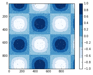
plt.contourf(X, Y, Z, 20, cmap='RdGy')
plt.colorbar();
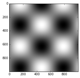
plt.imshow(Z, extent=[0, 5, 0, 5], origin='lower',
           cmap='RdGy')
plt.colorbar()
plt.axis(aspect='image');
C:\Users\gdc\Anaconda3\lib\site-packages\ipykernel_launcher.py:4: MatplotlibDeprecationWarning: Passing unsupported keyword arguments to axis() will raise a TypeError in 3.3.
  after removing the cwd from sys.path.
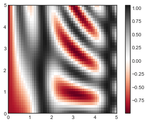
plt.imshow()不接受 x 和 y 网格值作为参数,因此你需要手动指定extent参数[xmin, xmax, ymin, ymax]来设置图表的数据范围。 plt.imshow()使用的是默认的图像坐标,即左上角坐标点是原点,而不是通常图表的左下角坐标点。这可以通过设置origin参数来设置。 plt.imshow()会自动根据输入数据调整坐标轴的比例;这可以通过参数来设置,例如,plt.axis(aspect='image')能让 x 和 y 轴的单位一致。
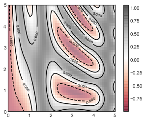
contours = plt.contour(X, Y, Z, 3, colors='black')
plt.clabel(contours, inline=True, fontsize=8)

plt.imshow(Z, extent=[0, 5, 0, 5], origin='lower',
           cmap='RdGy', alpha=0.5)
plt.colorbar();
5.直方图,分桶和密度
%matplotlib inline
import numpy as np
import matplotlib.pyplot as plt
plt.style.use('seaborn-white')
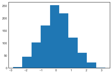
data = np.random.randn(1000)
plt.hist(data);
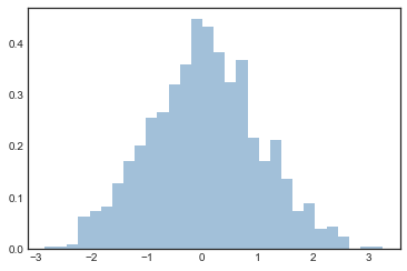
plt.hist(data, bins=30, density=True, alpha=0.5,
         histtype='stepfilled', color='steelblue',
         edgecolor='none');
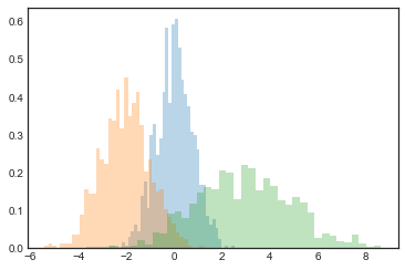
x1 = np.random.normal(0, 0.8, 1000)
x2 = np.random.normal(-2, 1, 1000)
x3 = np.random.normal(3, 2, 1000)

kwargs = dict(histtype='stepfilled', alpha=0.3, density=True, bins=40)

plt.hist(x1, **kwargs)
plt.hist(x2, **kwargs)
plt.hist(x3, **kwargs);
counts, bin_edges = np.histogram(data, bins=5)
print(counts)
[ 49 273 471 183 24]
二维直方图和分桶
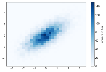
mean = [0, 0]
cov = [[1, 1], [1, 2]]
x, y = np.random.multivariate_normal(mean, cov, 10000).T
plt.hist2d:二维直方图
plt.hist2d(x, y, bins=30, cmap='Blues')
cb = plt.colorbar()
cb.set_label('counts in bin')
counts, xedges, yedges = np.histogram2d(x, y, bins=30)
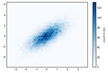
plt.hexbin:六角形分桶
plt.hexbin(x, y, gridsize=30, cmap='Blues')
cb = plt.colorbar(label='count in bin')
核密度估计
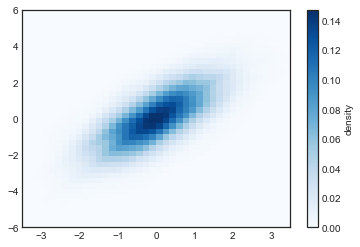
from scipy.stats import gaussian_kde

# 产生和处理数据,初始化KDE
data = np.vstack([x, y])
kde = gaussian_kde(data)

# 在通用的网格中计算得到Z的值
xgrid = np.linspace(-3.5, 3.5, 40)
ygrid = np.linspace(-6, 6, 40)
Xgrid, Ygrid = np.meshgrid(xgrid, ygrid)
Z = kde.evaluate(np.vstack([Xgrid.ravel(), Ygrid.ravel()]))

# 将图表绘制成一张图像
plt.imshow(Z.reshape(Xgrid.shape),
           origin='lower', aspect='auto',
           extent=[-3.5, 3.5, -6, 6],
           cmap='Blues')
cb = plt.colorbar()
cb.set_label("density")
6.自定义图标图例
import matplotlib.pyplot as plt
plt.style.use('classic')
%matplotlib inline
import numpy as np
x = np.linspace(0, 10, 1000)
fig, ax = plt.subplots()
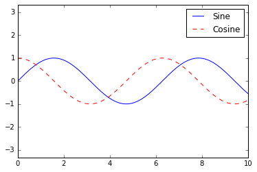
ax.plot(x, np.sin(x), '-b', label='Sine')
ax.plot(x, np.cos(x), '--r', label='Cosine')
ax.axis('equal')
leg = ax.legend();
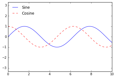
ax.legend(loc='upper left', frameon=False)
fig
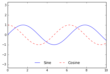
ax.legend(frameon=False, loc='lower center', ncol=2)
fig
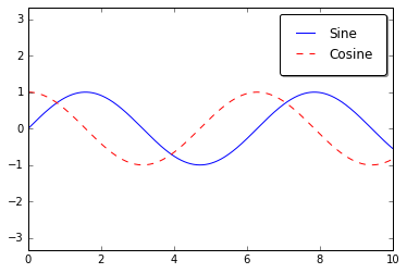
ax.legend(fancybox=True, framealpha=1, shadow=True, borderpad=1)
fig
选择设置图例的元素
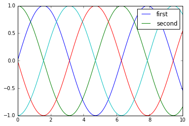
y = np.sin(x[:, np.newaxis] + np.pi * np.arange(0, 2, 0.5))
lines = plt.plot(x, y)

# lines是一个线条实例的列表
plt.legend(lines[:2], ['first', 'second']);
plt.plot(x, y[:, 0], label='first')
plt.plot(x, y[:, 1], label='second')
plt.plot(x, y[:, 2:])
plt.legend(framealpha=1, frameon=True);
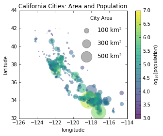
散点大小的图例
import pandas as pd
cities = pd.read_csv(r'D:\python\Github学习材料\Python数据科学手册\data\california_cities.csv')

# 提取我们感兴趣的数据
lat, lon = cities['latd'], cities['longd']
population, area = cities['population_total'], cities['area_total_km2']

# 绘制散点图,使用尺寸代表面积,颜色代表人口,不带标签
plt.scatter(lon, lat, label=None,
            c=np.log10(population), cmap='viridis',
            s=area, linewidth=0, alpha=0.5)
plt.axis('scaled')
plt.xlabel('longitude')
plt.ylabel('latitude')
plt.colorbar(label='log$_{10}$(population)')
plt.clim(3, 7)

# 下面我们创建图例:
# 使用空列表绘制图例中的散点,使用不同面积和标签,带透明度
for area in [100, 300, 500]:
    plt.scatter([], [], c='k', alpha=0.3, s=area,
                label=str(area) + ' km$^2$')
plt.legend(scatterpoints=1, frameon=False, labelspacing=1, title='City Area')

plt.title('California Cities: Area and Population');
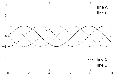
多重图例
fig, ax = plt.subplots()

lines = []
styles = ['-', '--', '-.', ':']
x = np.linspace(0, 10, 1000)

for i in range(4):
    lines += ax.plot(x, np.sin(x - i * np.pi / 2),
                     styles[i], color='black')
ax.axis('equal')

# 指定第一个图例的线条和标签
ax.legend(lines[:2], ['line A', 'line B'],
          loc='upper right', frameon=False)

# 手动创建第二个图例,并将作者添加到图表中
from matplotlib.legend import Legend
leg = Legend(ax, lines[2:], ['line C', 'line D'],
             loc='lower right', frameon=False)
ax.add_artist(leg);
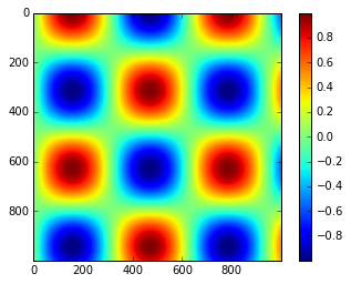
7.个性化颜色条
import matplotlib.pyplot as plt
plt.style.use('classic')
%matplotlib inline
import numpy as np
x = np.linspace(0, 10, 1000)
I = np.sin(x) * np.cos(x[:, np.newaxis])

plt.imshow(I)
plt.colorbar();
自定义颜色条
plt.imshow(I, cmap='gray');
plt.cm.
选择色图
序列色图:这类型的色谱只包括一个连续序列的色系(例如binary或viridis)。 分化色图:这类型的色谱包括两种独立的色系,这两种颜色有着非常大的对比度(例如RdBu或PuOr)。 定性色图:这类型的色图混合了非特定连续序列的颜色(例如rainbow或jet)。
from matplotlib.colors import LinearSegmentedColormap

def grayscale_cmap(cmap):
    """返回给定色图的灰度版本"""
    cmap = plt.cm.get_cmap(cmap) # 使用名称获取色图对象
    colors = cmap(np.arange(cmap.N)) # 将色图对象转为RGBA矩阵,形状为N×4

    # 将RGBA颜色转换为灰度
    # 参考 http://alienryderflex.com/hsp.html
    RGB_weight = [0.299, 0.587, 0.114] # RGB三色的权重值
    luminance = np.sqrt(np.dot(colors[:, :3] ** 2, RGB_weight)) # RGB平方值和权重的点积开平方根
    colors[:, :3] = luminance[:, np.newaxis] # 得到灰度值矩阵
    # 返回相应的灰度值色图
    return LinearSegmentedColormap.from_list(cmap.name + "_gray", colors, cmap.N)


def view_colormap(cmap):
    """将色图对应的灰度版本绘制出来"""
    cmap = plt.cm.get_cmap(cmap)
    colors = cmap(np.arange(cmap.N))

    cmap = grayscale_cmap(cmap)
    grayscale = cmap(np.arange(cmap.N))

    fig, ax = plt.subplots(2, figsize=(6, 2),
                           subplot_kw=dict(xticks=[], yticks=[]))
    ax[0].imshow([colors], extent=[0, 10, 0, 1])
    ax[1].imshow([grayscale], extent=[0, 10, 0, 1])
view_colormap('jet')

view_colormap('viridis')

view_colormap('cubehelix')

view_colormap('RdBu')

颜色限制和扩展
# 在I数组中人为生成不超过1%的噪声
speckles = (np.random.random(I.shape) < 0.01)
I[speckles] = np.random.normal(0, 3, np.count_nonzero(speckles))

plt.figure(figsize=(10, 3.5))
# 不考虑去除噪声时的颜色分布
plt.subplot(1, 2, 1)
plt.imshow(I, cmap='RdBu')
plt.colorbar()
# 设置去除噪声时的颜色分布
plt.subplot(1, 2, 2)
plt.imshow(I, cmap='RdBu')
plt.colorbar(extend='both')
plt.clim(-1, 1);
离散颜色条
plt.imshow(I, cmap=plt.cm.get_cmap('Blues', 6))
plt.colorbar()
plt.clim(-1, 1);
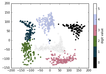
例子:手写数字
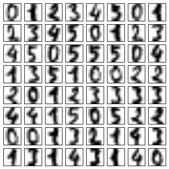
首先,我们下载这个数据集,然后使用plt.imshow()将其中部分数据展示出来:
# 读取数字0-5的手写图像,然后使用Matplotlib展示头64张缩略图
from sklearn.datasets import load_digits
digits = load_digits(n_class=6)

fig, ax = plt.subplots(8, 8, figsize=(6, 6))
for i, axi in enumerate(ax.flat):
    axi.imshow(digits.images[i], cmap='binary')
    axi.set(xticks=[], yticks=[])
# 使用Isomap将手写数字图像映射到二维流形学习中
from sklearn.manifold import Isomap
iso = Isomap(n_components=2)
projection = iso.fit_transform(digits.data)
# 绘制图表结果
plt.scatter(projection[:, 0], projection[:, 1], lw=0.1,
            c=digits.target, cmap=plt.cm.get_cmap('cubehelix', 6))
plt.colorbar(ticks=range(6), label='digit value')
plt.clim(-0.5, 5.5)
8.多个子图表
%matplotlib inline
import matplotlib.pyplot as plt
plt.style.use('seaborn-white')
import numpy as np
plt.axes:手动构建子图表
ax1 = plt.axes()  # 标准图表
ax2 = plt.axes([0.65, 0.65, 0.2, 0.2]) #子图表
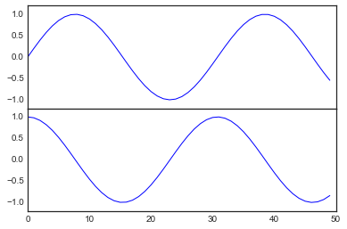
fig = plt.figure() # 获得figure对象
ax1 = fig.add_axes([0.1, 0.5, 0.8, 0.4],
                   xticklabels=[], ylim=(-1.2, 1.2)) # 左边10% 底部50% 宽80% 高40%
ax2 = fig.add_axes([0.1, 0.1, 0.8, 0.4],
                   ylim=(-1.2, 1.2)) # 左边10% 底部10% 宽80% 高40%

x = np.linspace(0, 10)
ax1.plot(np.sin(x))
ax2.plot(np.cos(x));
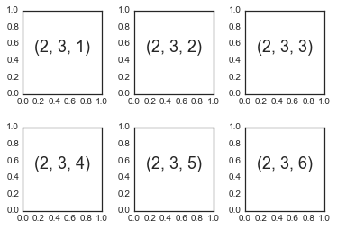
plt.subplot:简单网格的子图表
for i in range(1, 7):
    plt.subplot(2, 3, i)
    plt.text(0.5, 0.5, str((2, 3, i)),
             fontsize=18, ha='center')
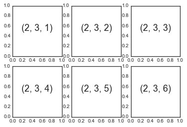
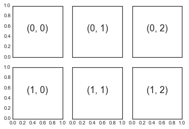
fig = plt.figure()
fig.subplots_adjust(hspace=0.4, wspace=0.4)
for i in range(1, 7):
    ax = fig.add_subplot(2, 3, i)
    ax.text(0.5, 0.5, str((2, 3, i)),
           fontsize=18, ha='center')
plt.subplots:一句代码设置所有网格子图表
下面我们来创建一个 网格的子图表,其中每一行的子图表共享它们的 y 轴,而每一列的子图表共享它们的 x 轴:
fig, ax = plt.subplots(2, 3, sharex='col', sharey='row')
注意上面我们设置了sharex和sharey之后,内部子图表的 x 轴和 y 轴的标签就自动被去掉了。返回值中 ax 是一个 NumPy 数组,里面含有每一个子图表的实例,你可以使用 NumPy 索引的语法很简单的获得它们:
# axes是一个2×3的数组,可以通过[row, col]进行索引访问
for i in range(2):
    for j in range(3):
        ax[i, j].text(0.5, 0.5, str((i, j)),
                      fontsize=18, ha='center')
fig
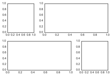
plt.GridSpec:更复杂的排列
grid = plt.GridSpec(2, 3, wspace=0.4, hspace=0.3)
plt.subplot(grid[0, 0])
plt.subplot(grid[0, 1:])
plt.subplot(grid[1, :2])
plt.subplot(grid[1, 2]);
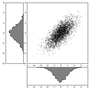
# 构建二维正态分布数据
mean = [0, 0]
cov = [[1, 1], [1, 2]]
x, y = np.random.multivariate_normal(mean, cov, 3000).T

# 使用GridSpec创建网格并加入子图表
fig = plt.figure(figsize=(6, 6))
grid = plt.GridSpec(4, 4, hspace=0.2, wspace=0.2)
main_ax = fig.add_subplot(grid[:-1, 1:])
y_hist = fig.add_subplot(grid[:-1, 0], xticklabels=[], sharey=main_ax)
x_hist = fig.add_subplot(grid[-1, 1:], yticklabels=[], sharex=main_ax)

# 在主图表中绘制散点图
main_ax.plot(x, y, 'ok', markersize=3, alpha=0.2)

# 分别在x轴和y轴方向绘制直方图
x_hist.hist(x, 40, histtype='stepfilled',
            orientation='vertical', color='gray')
x_hist.invert_yaxis() # x轴方向(右下)直方图倒转y轴方向

y_hist.hist(y, 40, histtype='stepfilled',
            orientation='horizontal', color='gray')
y_hist.invert_xaxis() # y轴方向(左上)直方图倒转x轴方向
9.文本和标注
%matplotlib inline
import matplotlib.pyplot as plt
import matplotlib as mpl
plt.style.use('seaborn-whitegrid')
import numpy as np
import pandas as pd
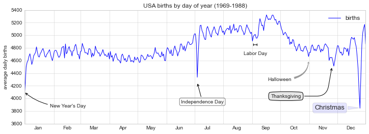
例子:节假日对美国出生率的影响
births = pd.read_csv(r'D:\python\Github学习材料\Python数据科学手册\data\births.csv')

quartiles = np.percentile(births['births'], [25, 50, 75])
mu, sig = quartiles[1], 0.74 * (quartiles[2] - quartiles[0])
births = births.query('(births > @mu - 5 * @sig) & (births < @mu + 5 * @sig)')

births['day'] = births['day'].astype(int)

births.index = pd.to_datetime(10000 * births.year +
                              100 * births.month +
                              births.day, format='%Y%m%d')
births_by_date = births.pivot_table('births',
                                    [births.index.month, births.index.day])
births_by_date.index = [pd.datetime(2012, month, day)
                        for (month, day) in births_by_date.index]
C:\Users\gdc\Anaconda3\lib\site-packages\ipykernel_launcher.py:15: FutureWarning: The pandas.datetime class is deprecated and will be removed from pandas in a future version. Import from datetime module instead.
  from ipykernel import kernelapp as app
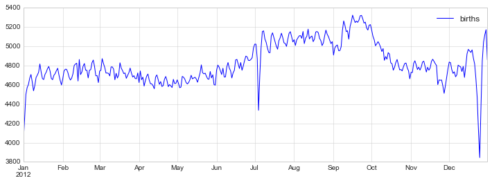
fig, ax = plt.subplots(figsize=(12, 4))
births_by_date.plot(ax=ax);
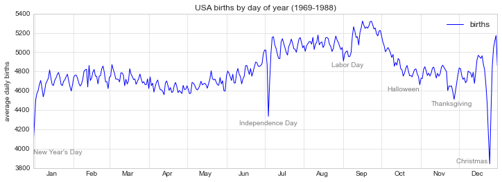
fig, ax = plt.subplots(figsize=(12, 4))
births_by_date.plot(ax=ax)

# 在折线的特殊位置标注文字
style = dict(size=10, color='gray')

ax.text('2012-1-1', 3950, "New Year's Day", **style)
ax.text('2012-7-4', 4250, "Independence Day", ha='center', **style)
ax.text('2012-9-4', 4850, "Labor Day", ha='center', **style)
ax.text('2012-10-31', 4600, "Halloween", ha='right', **style)
ax.text('2012-11-25', 4450, "Thanksgiving", ha='center', **style)
ax.text('2012-12-25', 3850, "Christmas ", ha='right', **style)

# 设置标题和y轴标签
ax.set(title='USA births by day of year (1969-1988)',
       ylabel='average daily births')

# 设置x轴标签月份居中
ax.xaxis.set_major_locator(mpl.dates.MonthLocator())
ax.xaxis.set_minor_locator(mpl.dates.MonthLocator(bymonthday=15))
ax.xaxis.set_major_formatter(plt.NullFormatter())
ax.xaxis.set_minor_formatter(mpl.dates.DateFormatter('%h'));
转换和文本位置
一般来说,用户很少需要关注这些转换的细节,但是当考虑将文本在图表上展示时,这些知识却比较有用。在这种情况中,下面三种定义好的转换是比较有用的:
ax.transData:与数据坐标相关的转换 ax.tranAxes:与 Axes 尺寸相关的转换(单位是 axes 的宽和高) ax.tranFigure:与 figure 尺寸相关的转换(单位是 figure 的宽和高)
fig, ax = plt.subplots(facecolor='lightgray')
ax.axis([0, 10, 0, 10])

# transform=ax.transData是默认的,这里写出来是为了明确对比
ax.text(1, 5, ". Data: (1, 5)", transform=ax.transData)
ax.text(0.5, 0.1, ". Axes: (0.5, 0.1)", transform=ax.transAxes)
ax.text(0.2, 0.2, ". Figure: (0.2, 0.2)", transform=fig.transFigure);
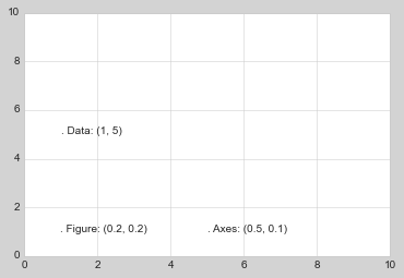
ax.set_xlim(0, 2)
ax.set_ylim(-6, 6)
fig

箭头和标注
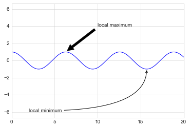
在 Matplotlib 中绘制箭头通常比你想象的难得多。虽然有plt.arrow()函数,作者不建议使用它:这个函数绘制的箭头是一个 SVG 对象,因此在图表使用不同的比例的情况会产生问题,结果通常不能让用户满意。因此,作者建议使用plt.annotate()函数。这个函数会绘制一些文字以及一个箭头,并且箭头可以非常灵活的进行配置。
%matplotlib inline

fig, ax = plt.subplots()

x = np.linspace(0, 20, 1000)
ax.plot(x, np.cos(x))
ax.axis('equal')

ax.annotate('local maximum', xy=(6.28, 1), xytext=(10, 4),
            arrowprops=dict(facecolor='black', shrink=0.05))

ax.annotate('local minimum', xy=(5 * np.pi, -1), xytext=(2, -6),
            arrowprops=dict(arrowstyle="->",
                            connectionstyle="angle3,angleA=0,angleB=-90"));
fig, ax = plt.subplots(figsize=(12, 4))
births_by_date.plot(ax=ax)

# 为图表添加标注
ax.annotate("New Year's Day", xy=('2012-1-1', 4100),  xycoords='data',
            xytext=(50, -30), textcoords='offset points',
            arrowprops=dict(arrowstyle="->",
                            connectionstyle="arc3,rad=-0.2"))

ax.annotate("Independence Day", xy=('2012-7-4', 4250),  xycoords='data',
            bbox=dict(boxstyle="round", fc="none", ec="gray"),
            xytext=(10, -40), textcoords='offset points', ha='center',
            arrowprops=dict(arrowstyle="->"))

ax.annotate('Labor Day', xy=('2012-9-4', 4850), xycoords='data', ha='center',
            xytext=(0, -20), textcoords='offset points')
ax.annotate('', xy=('2012-9-1', 4850), xytext=('2012-9-7', 4850),
            xycoords='data', textcoords='data',
            arrowprops={'arrowstyle': '|-|,widthA=0.2,widthB=0.2', })

ax.annotate('Halloween', xy=('2012-10-31', 4600),  xycoords='data',
            xytext=(-80, -40), textcoords='offset points',
            arrowprops=dict(arrowstyle="fancy",
                            fc="0.6", ec="none",
                            connectionstyle="angle3,angleA=0,angleB=-90"))

ax.annotate('Thanksgiving', xy=('2012-11-25', 4500),  xycoords='data',
            xytext=(-120, -60), textcoords='offset points',
            bbox=dict(boxstyle="round4,pad=.5", fc="0.9"),
            arrowprops=dict(arrowstyle="->",
                            connectionstyle="angle,angleA=0,angleB=80,rad=20"))


ax.annotate('Christmas', xy=('2012-12-25', 3850),  xycoords='data',
             xytext=(-30, 0), textcoords='offset points',
             size=13, ha='right', va="center",
             bbox=dict(boxstyle="round", alpha=0.1),
             arrowprops=dict(arrowstyle="wedge,tail_width=0.5", alpha=0.1));

# 设置图表标题和坐标轴标记
ax.set(title='USA births by day of year (1969-1988)',
       ylabel='average daily births')

# 设置月份坐标居中显示
ax.xaxis.set_major_locator(mpl.dates.MonthLocator())
ax.xaxis.set_minor_locator(mpl.dates.MonthLocator(bymonthday=15))
ax.xaxis.set_major_formatter(plt.NullFormatter())
ax.xaxis.set_minor_formatter(mpl.dates.DateFormatter('%h'));

ax.set_ylim(3600, 5400);
10.自定义刻度
主要的和次要的刻度
import matplotlib.pyplot as plt
plt.style.use('classic')
%matplotlib inline
import numpy as np
ax = plt.axes(xscale='log', yscale='log', xlim=[10e-5, 10e5], ylim=[10e-5, 10e5])
ax.grid();
print(ax.xaxis.get_major_locator())
print(ax.xaxis.get_minor_locator())
print(ax.xaxis.get_major_formatter())
print(ax.xaxis.get_minor_formatter())
隐藏刻度和标签
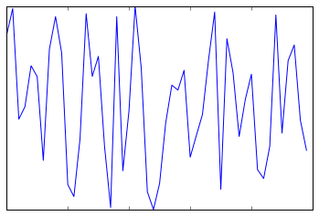
ax = plt.axes()
ax.plot(np.random.rand(50))

ax.yaxis.set_major_locator(plt.NullLocator())
ax.xaxis.set_major_formatter(plt.NullFormatter())
fig, ax = plt.subplots(5, 5, figsize=(5, 5))
fig.subplots_adjust(hspace=0, wspace=0)

# 从scikit-learn载入头像数据集
from sklearn.datasets import fetch_olivetti_faces
faces = fetch_olivetti_faces().images

for i in range(5):
    for j in range(5):
        ax[i, j].xaxis.set_major_locator(plt.NullLocator())
        ax[i, j].yaxis.set_major_locator(plt.NullLocator())
        ax[i, j].imshow(faces[10 * i + j], cmap="bone")
downloading Olivetti faces from
https://ndownloader.figshare.com/files/5976027
to C:\Users\gdc\scikit_learn_data

减少或增加刻度的数量
fig, ax = plt.subplots(4, 4, sharex=True, sharey=True)
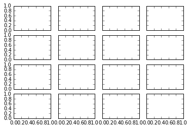
# 对x和y轴设置刻度最大数量
for axi in ax.flat:
    axi.xaxis.set_major_locator(plt.MaxNLocator(3))
    axi.yaxis.set_major_locator(plt.MaxNLocator(3))
fig
复杂的刻度格式
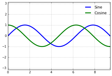
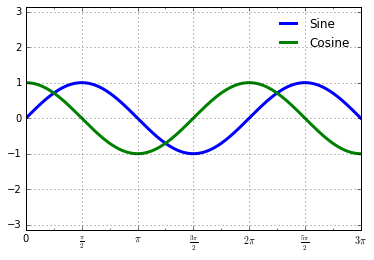
# 绘制正弦和余弦图表
fig, ax = plt.subplots()
x = np.linspace(0, 3 * np.pi, 1000)
ax.plot(x, np.sin(x), lw=3, label='Sine')
ax.plot(x, np.cos(x), lw=3, label='Cosine')

# 设置网格、图例和轴极限
ax.grid(True)
ax.legend(frameon=False)
ax.axis('equal')
ax.set_xlim(0, 3 * np.pi);
这里有几个我们希望进行的改变。首先,如果刻度的间距和网格线是 的倍数会显得更加自然。我们可以通过MultipleLocator来设置它,这个对象用来设置刻度的配置。为了更直观,我们设置主要刻度为 位置,设置次要刻度为 位置:
ax.xaxis.set_major_locator(plt.MultipleLocator(np.pi / 2))
ax.xaxis.set_minor_locator(plt.MultipleLocator(np.pi / 4))
fig
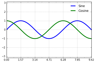
plt.FuncFormatter,这个对象能够接受一个用户自定义的函数来提供对于刻度标签的精细控制:def format_func(value, tick_number):
# N是pi/2的倍数
N = int(np.round(2 * value / np.pi))
if N == 0:
return "0" # 0点
elif N == 1:
return r"$\frac{\pi}{2}$" # pi/2
elif N == 2:
return r"$\pi$" # pi
elif N % 2 > 0:
return r"$\frac{{%d}\pi}{2}$" %N # n*pi/2 n是奇数
else:
return r"${0}\pi$".format(N // 2) # n*pi n是整数
ax.xaxis.set_major_formatter(plt.FuncFormatter(format_func))
fig
plt.FuncFomatter()提供了对于图表刻度最高级的自定义和精细控制,并且当你需要创建需要印刷或出版的图表时非常方便。
Formatter 和 Locator 总结
我们已经介绍了一些 formatter 和 locator。在最后我们通过将內建的 locator 和 formatter 参数列出来对本节做一个总结。要获得更多相关内容,请参阅文档或 Matplotlib 的在线文档。下表中列出的对象在plt命名空间中都是有效的:
| Locator 对象 | 描述 |
|---|---|
NullLocator | 无刻度 |
FixedLocator | 固定刻度位置 |
IndexLocator | 序号图表刻度 (例如 x = range(len(y))) |
LinearLocator | 从最小到最大值的均匀分割刻度 |
LogLocator | 从最小到最大值的对数分割刻度 |
MultipleLocator | 某个基数的倍数刻度 |
MaxNLocator | 刻度数量最大值 |
AutoLocator | 默认的刻度数量最大值 |
AutoMinorLocator | 默认的次要刻度 |
| Formatter 对象 | 描述 |
|---|---|
NullFormatter | 无标签 |
IndexFormatter | 从一个列表获得标签 |
FixedFormatter | 从固定的字符串设置标签 |
FuncFormatter | 使用自定义函数设置标签 |
FormatStrFormatter | 使用一个格式化字符串设置标签 |
ScalarFormatter | 默认的标量标签 |
LogFormatter | 默认的对数标签 |
11.在 matplotlib 中创建三维图表
from mpl_toolkits import mplot3d
%matplotlib inline
import numpy as np
import matplotlib.pyplot as plt
fig = plt.figure()
ax = plt.axes(projection='3d')
三维的点和线
ax = plt.axes(projection='3d')

# 三维螺旋线的数据
zline = np.linspace(0, 15, 1000)
xline = np.sin(zline)
yline = np.cos(zline)
ax.plot3D(xline, yline, zline, 'gray')

# 三维散点的数据
zdata = 15 * np.random.random(100)
xdata = np.sin(zdata) + 0.1 * np.random.randn(100)
ydata = np.cos(zdata) + 0.1 * np.random.randn(100)
ax.scatter3D(xdata, ydata, zdata, c=zdata, cmap='Greens');
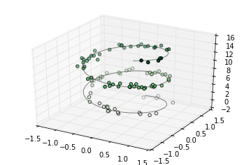
注意默认情况下,图中的散点会有透明度的区别,用于体现在图中散点的深度。虽然三维效果在静态图像中难以显示,你可以使用交互式的视图来获得更佳的三维直观效果。
三维轮廓图
类似于我们在[密度和轮廓图]中介绍的内容,mplot3d也包含着能够创建三维浮雕图像的工具。就像二维的ax.contour图表,ax.contour3D要求输入数据的格式是二维普通网格上计算得到的 Z 轴的数据值。下面我们展示一个三维的正弦函数轮廓图:
def f(x, y):
    return np.sin(np.sqrt(x ** 2 + y ** 2))

x = np.linspace(-6, 6, 30)
y = np.linspace(-6, 6, 30)

X, Y = np.meshgrid(x, y)
Z = f(X, Y)
fig = plt.figure()
ax = plt.axes(projection='3d')
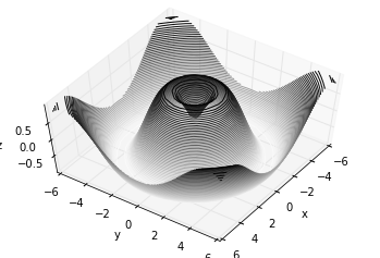
ax.contour3D(X, Y, Z, 50, cmap='binary')
ax.set_xlabel('x')
ax.set_ylabel('y')
ax.set_zlabel('z');
ax.view_init(60, 35)
fig
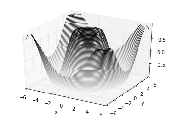
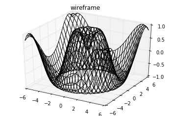
框线图和表面图
fig = plt.figure()
ax = plt.axes(projection='3d')
ax.plot_wireframe(X, Y, Z, color='black')
ax.set_title('wireframe');
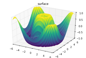
ax = plt.axes(projection='3d')
ax.plot_surface(X, Y, Z, rstride=1, cstride=1,
                cmap='viridis', edgecolor='none')
ax.set_title('surface');
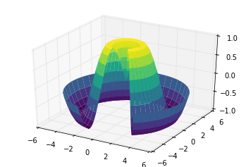
r = np.linspace(0, 6, 20)
theta = np.linspace(-0.9 * np.pi, 0.8 * np.pi, 40)
r, theta = np.meshgrid(r, theta)

X = r * np.sin(theta)
Y = r * np.cos(theta)
Z = f(X, Y)

ax = plt.axes(projection='3d')
ax.plot_surface(X, Y, Z, rstride=1, cstride=1,
                cmap='viridis', edgecolor='none');
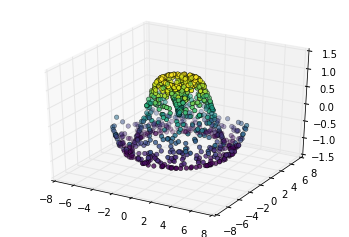
表面三角剖分
theta = 2 * np.pi * np.random.random(1000)
r = 6 * np.random.random(1000)
x = np.ravel(r * np.sin(theta))
y = np.ravel(r * np.cos(theta))
z = f(x, y)
ax = plt.axes(projection='3d')
ax.scatter(x, y, z, c=z, cmap='viridis', linewidth=0.5);
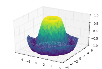
ax = plt.axes(projection='3d')
ax.plot_trisurf(x, y, z,
                cmap='viridis', edgecolor='none');
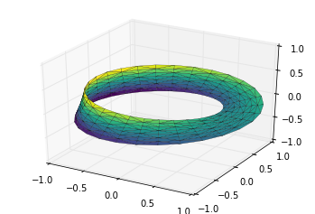
例子:绘制莫比乌斯环
theta = np.linspace(0, 2 * np.pi, 30)
w = np.linspace(-0.25, 0.25, 8)
w, theta = np.meshgrid(w, theta)
phi = 0.5 * theta
现在我们已经有了所有需要获得三维坐标值的参数了。我们定义 为每个坐标点距离环形中间的位置,使用它来计算最终 三维坐标系的坐标值:
# r是坐标点距离环形中心的距离值
r = 1 + w * np.cos(phi)
# 利用简单的三角函数知识算得x,y,z坐标值
x = np.ravel(r * np.cos(theta))
y = np.ravel(r * np.sin(theta))
z = np.ravel(w * np.sin(phi))
# 在底层参数的基础上进行三角剖分
from matplotlib.tri import Triangulation
tri = Triangulation(np.ravel(w), np.ravel(theta))

ax = plt.axes(projection='3d')
ax.plot_trisurf(x, y, z, triangles=tri.triangles,
                cmap='viridis', linewidths=0.2);

ax.set_xlim(-1, 1); ax.set_ylim(-1, 1); ax.set_zlim(-1, 1);
结合这些技巧,能够为你提供在 Matplotlib 创建和展现大量三维对象和模式的能力。