
8则未必知道且超级实用的纯CSS布局排版技巧 | 网易4年实践
「链接和长图失效,请大家点击阅读原文查看详情」
前言
开发每一张网页都离不开布局排版,基于良好布局排版打下基础,才能使后续的开发更顺利。当然不能停留在IExplorer时代那种局限思维上,没办法解决的布局排版都用JS实现😂。今时不同往日,现代CSS属性能更好地快速实现各种布局排版,节约更多时间去摸鱼😉。
不过按照笔者目前了解的情况来看,大部分同学即使在无需兼容IExplorer的情况下还是遵循CSS+JS的方式完成一些常见或特殊的布局排版。从HTML/CSS/JS前端三剑客的定位来看,HTML映射网页的「结构」,CSS映射网页的「表现」,JS映射网页的「行为」。
「布局排版」指将图形、文本、图像、媒体等可视化信息元素在页面布局上调整位置、尺寸等属性使页面布局变得条理化的过程。大部分同学认为布局排版就是几个合理的CSS属性随便拼凑在一起,但多数情况即使实现也会存在瑕疵,此时就可能使用JS介入。
从布局排版的特征可知它属于表现范畴,因此笔者认为大部分布局排版都能使用纯CSS完成,无需JS介入。
本文秉承「能使用CSS实现的效果都优先使用CSS」的原则,为大家讲解笔者如何巧妙运用各种纯CSS开发技巧完成一些常见或特殊的布局排版。因此笔者建议大家认真看一遍以下内容,绝对让你有所收货和惊喜。
若对CSS无特别想法,建议体验以下网站,相信你会认真踏实地阅读本文。
个人官网:暂时支持 PC端浏览,拒绝支持IExplorer特效专辑:暂时支持 PC端浏览,拒绝支持IExplorer
属性
在进入主题前,笔者总结出布局排版一些必备属性,这些属性能快速搭建整体效果,再通过一些常用选择器加以修饰达到完美效果。看似简单,但使用起来不一定完全驾驭。
必备属性都是一些几何属性,主要用于声明位置和尺寸。
「浮动布局」: float「定位布局」: position/left/right/top/bottom/z-index「弹性布局」: display:flex/inline-flex、flex系列属性「盒子模型」: box-sizing/margin/padding/border/width/height
选择器因CSS模块众多而派生出的数量也众多,若无特别方式记熟这些选择器对应的功能,也很难将其发挥到最大作用。
笔者根据选择器的功能划分出八大类,每个类别的选择器都能在一个应用场景里互相组合,记熟这些类别的选择器,相信就能将选择器发挥到最大作用,也能游刃有余将其应用到一些常见或特殊的布局排版里。
布局排版可能只应用到某些选择器,但也不妨碍大家通过以下归类方式记忆。选择器作为CSS的重要组成部分,比起属性组合会有更多的玩法。
基础选择器
| 选择器 | 别名 | 说明 | 版本 | 常用 |
|---|---|---|---|---|
tag | 标签选择器 | 指定类型的标签 | 1 | √ |
#id | ID选择器 | 指定身份的标签 | 1 | √ |
.class | 类选择器 | 指定类名的标签 | 1 | √ |
* | 通配选择器 | 所有类型的标签 | 2 | √ |
层次选择器
| 选择器 | 别名 | 说明 | 版本 | 常用 |
|---|---|---|---|---|
elemP elemC | 后代选择器 | 元素的后代元素 | 1 | √ |
elemP>elemC | 子代选择器 | 元素的子代元素 | 2 | √ |
elem1+elem2 | 相邻同胞选择器 | 元素相邻的同胞元素 | 2 | √ |
elem1~elem2 | 通用同胞选择器 | 元素后面的同胞元素 | 3 | √ |
集合选择器
| 选择器 | 别名 | 说明 | 版本 | 常用 |
|---|---|---|---|---|
elem1,elem2 | 并集选择器 | 多个指定的元素 | 1 | √ |
elem.class | 交集选择器 | 指定类名的元素 | 1 | √ |
条件选择器
| 选择器 | 说明 | 版本 | 常用 |
|---|---|---|---|
:lang | 指定标记语言的元素 | 2 | × |
:dir() | 指定编写方向的元素 | 4 | × |
:has | 包含指定元素的元素 | 4 | × |
:is | 指定条件的元素 | 4 | × |
:not | 非指定条件的元素 | 4 | √ |
:where | 指定条件的元素 | 4 | × |
:scope | 指定元素作为参考点 | 4 | × |
:any-link | 所有包含href的链接元素 | 4 | × |
:local-link | 所有包含href且属于绝对地址的链接元素 | 4 | × |
状态选择器
| 选择器 | 说明 | 版本 | 常用 |
|---|---|---|---|
:active | 鼠标激活的元素 | 1 | × |
:hover | 鼠标悬浮的元素 | 1 | √ |
:link | 未访问的链接元素 | 1 | × |
:visited | 已访问的链接元素 | 1 | × |
:target | 当前锚点的元素 | 3 | × |
:focus | 输入聚焦的表单元素 | 2 | √ |
:required | 输入必填的表单元素 | 3 | √ |
:valid | 输入合法的表单元素 | 3 | √ |
:invalid | 输入非法的表单元素 | 3 | √ |
:in-range | 输入范围以内的表单元素 | 3 | × |
:out-of-range | 输入范围以外的表单元素 | 3 | × |
:checked | 选项选中的表单元素 | 3 | √ |
:optional | 选项可选的表单元素 | 3 | × |
:enabled | 事件启用的表单元素 | 3 | × |
:disabled | 事件禁用的表单元素 | 3 | √ |
:read-only | 只读的表单元素 | 3 | × |
:read-write | 可读可写的表单元素 | 3 | × |
:target-within | 内部锚点元素处于激活状态的元素 | 4 | × |
:focus-within | 内部表单元素处于聚焦状态的元素 | 4 | √ |
:focus-visible | 输入聚焦的表单元素 | 4 | × |
:blank | 输入为空的表单元素 | 4 | × |
:user-invalid | 输入合法的表单元素 | 4 | × |
:indeterminate | 选项未定的表单元素 | 4 | × |
:placeholder-shown | 占位显示的表单元素 | 4 | √ |
:current() | 浏览中的元素 | 4 | × |
:past() | 已浏览的元素 | 4 | × |
:future() | 未浏览的元素 | 4 | × |
:playing | 开始播放的媒体元素 | 4 | × |
:paused | 暂停播放的媒体元素 | 4 | × |
结构选择器
| 选择器 | 说明 | 版本 | 常用 |
|---|---|---|---|
:root | 文档的根元素 | 3 | × |
:empty | 无子元素的元素 | 3 | √ |
:nth-child(n) | 元素中指定顺序索引的元素 | 3 | √ |
:nth-last-child(n) | 元素中指定逆序索引的元素 | 3 | × |
:first-child | 元素中为首的元素 | 2 | √ |
:last-child | 元素中为尾的元素 | 3 | √ |
:only-child | 父元素仅有该元素的元素 | 3 | √ |
:nth-of-type(n) | 标签中指定顺序索引的标签 | 3 | √ |
:nth-last-of-type(n) | 标签中指定逆序索引的标签 | 3 | × |
:first-of-type | 标签中为首的标签 | 3 | √ |
:last-of-type | 标签中为尾标签 | 3 | √ |
:only-of-type | 父元素仅有该标签的标签 | 3 | √ |
属性选择器
| 选择器 | 说明 | 版本 | 常用 |
|---|---|---|---|
[attr] | 指定属性的元素 | 2 | √ |
[attr=val] | 属性等于指定值的元素 | 2 | √ |
[attr*=val] | 属性包含指定值的元素 | 3 | √ |
[attr^=val] | 属性以指定值开头的元素 | 3 | √ |
[attr$=val] | 属性以指定值结尾的元素 | 3 | √ |
[attr~=val] | 属性包含指定值(完整单词)的元素(不推荐使用) | 2 | × |
[attr\|=val] | 属性以指定值(完整单词)开头的元素(不推荐使用) | 2 | × |
伪元素
| 选择器 | 说明 | 版本 | 常用 |
|---|---|---|---|
::before | 在元素前插入的内容 | 2 | √ |
::after | 在元素后插入的内容 | 2 | √ |
::first-letter | 元素的首字母 | 1 | × |
::first-line | 元素的首行 | 1 | × |
::selection | 鼠标选中的元素 | 3 | × |
::backdrop | 全屏模式的元素 | 4 | × |
::placeholder | 表单元素的占位 | 4 | √ |
技巧
有了上述前置知识,接下来跟着笔者体验一次如何巧妙运用各种纯CSS开发技巧完成一些常见或特殊的布局排版吧。为了方便浏览器自动计算某些样式,需全局设置box-sizing:border-box,编码前请引入笔者整理的reset.css。
主体布局
「主体布局」指在大部分情况下通用且具备统一特征的占位布局。掌握主体布局是一个前端必不可少的技能,养成看设计图就能大概规划出整体布局的前提是必须熟悉这些主体布局的特点与构造。
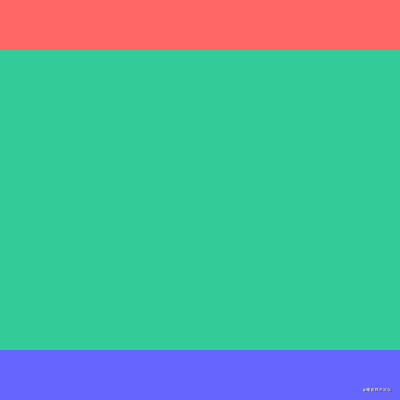
全屏布局
经典的「全屏布局」由顶部、底部和主体三部分组成,其特点为三部分左右满屏拉伸、顶部底部高度固定和主体高度自适应。该布局很常见,也是大部分Web应用主体的主流布局。通常使用和三个标签语义化排版,内还可插入侧栏或其他语义化标签。
<div class="fullscreen-layout">
    <header>header>
    <main>main>
    <footer>footer>
div>
position + left/right/top/bottom
三部分统一声明left:0和right:0将其左右满屏拉伸;顶部和底部分别声明top:0和bottom:0将其吸顶和吸底,并声明俩高度为固定值;将主体的top和bottom分别声明为顶部高度和底部高度。通过绝对定位的方式将三部分固定在特定位置,使其互不影响。
.fullscreen-layout {
    position: relative;
    width: 400px;
    height: 400px;
    header,
    footer,
    main {
        position: absolute;
        left: 0;
        right: 0;
    }
    header {
        top: 0;
        height: 50px;
        background-color: #f66;
    }
    footer {
        bottom: 0;
        height: 50px;
        background-color: #66f;
    }
    main {
        top: 50px;
        bottom: 50px;
        background-color: #3c9;
    }
}
flex
使用flex实现会更简洁。display:flex默认会令子节点横向排列,需声明flex-direction:column改变子节点排列方向为纵向排列;顶部和底部高度固定,所以主体需声明flex:1让高度自适应。
.fullscreen-layout {
    display: flex;
    flex-direction: column;
    width: 400px;
    height: 400px;
    header {
        height: 50px;
        background-color: #f66;
    }
    footer {
        height: 50px;
        background-color: #66f;
    }
    main {
        flex: 1;
        background-color: #3c9;
    }
}
若 经典的「两列布局」由 float + margin-left/right 左列声明 overflow + float 左列声明同上,右列声明 flex 使用 经典的「三列布局」由 为了让右列宽度自适应计算,就不使用 overflow + float flex 经典的「圣杯布局」和「双飞翼布局」都是由 圣杯布局float + margin-left/right + padding-left/right 由于浮动节点在位置上不能高于前面或平级的非浮动节点,否则会导致浮动节点下沉。因此在编写HTML结构时,将中间列节点挪到右列节点后面。 双飞翼布局float + margin-left/right HTML结构大体同上,只是在中间列里插入一个子节点 圣杯布局/双飞翼布局flex 使用flex实现 经典的「均分布局」由 float + width 每列宽度声明为相等的百分比,若有4列则声明 flex 使用flex实现会更简洁。节点声明 「居中布局」由 在此直接上一个目前最简单最高效的居中方式。 「自适布局」指相对视窗任何尺寸都能占据特定百分比的占位布局。 搭建 视窗宽高在JS里分别对应 上述代码使用 第三点尤为重要,若未能遵守,浏览器直接忽略该属性。 上述 在SPA里有遇过因为有滚动条或无滚动条而导致页面路由在跳转过程里发生向左或向右的抖动吗?这让强迫症患者很难受,此时可用 不直接声明 有了 当然使用 「吸附布局」指相对视窗任何滚动都能占据特定位置的占位布局。视窗滚动到特定位置,布局固定在该位置,后续不随视窗滚动而滚动。该布局产生的效果俗称 在 JS实现吸附效果的代码在网上一搜一大堆,更何况笔者喜欢耍CSS,在此就不贴相关的JS代码了。在此推荐一个很少见很少用的CSS属性 简单回顾 当值为 两行核心CSS代码分别是 细心的同学可能发现这些节点在 当然,换成 值得注意, 兼容性勉强还行,近2年发版的浏览器都能支持, 「横向布局」指容器内节点以水平方向排列且溢出部分被隐藏的占位布局。 为了方便使用多种方式实现 有些同学可能会使用 上述方式在笔者在开发认知里觉得太繁琐,实质上将所有节点当成文本排列,也是醉了。笔者推荐使用 「凸显布局」指容器内节点以同一方向排列且存在一个节点在某个方向上较突出的占位布局。该布局描述起来可能比较拗口,直接看以下效果吧,这是一个横向列表,节点从左往右排列,最右边的节点特别突出。这就是 这里巧妙运用 在此同样原理,当节点声明 在此还有一个小技巧,那就是 「间距布局」指容器内节点从左往右从上往下排列且以特定间距间隔的占位布局。 在进入编码环节前,笔者想重点讲解 分析 全部步骤串联起来理解可能会产生混乱,但结合以下代码理解相信就能很快熟悉。以一行排列3个节点总共8个节点为例,最终效果为三行三列。 「空载布局」指容器内无任何节点时使用其他形式代替的占位布局。还有使用JS判断列表集合为空时显示占位符吗?相信很多使用MVVM框架开发的同学都会使用条件判断的方式渲染虚拟DOM,若列表长度不为0则渲染列表,否则渲染占位符。 然而CSS提供一个空判断的选择器 CSS CSS 另外还存在一种特殊的 没事, 「多格布局」指容器内节点以动态数量的格子形式排列的占位布局。微信朋友圈的相册就是最常见的 在此留个悬念,不讲解如何实现,看看大家能不能根据笔者列出的提示尝试将该效果复原。主要原理是 很多同学可能觉得CSS很简单,但真正玩起来也能与JS有得一比。笔者从事前端领域多年,一直致力于CSS技术的研究与应用,当然真的不是为了玩,而是在玩的过程里将实践到的知识充分应用于工作上。 JS重要但CSS同样重要,希望喜欢CSS的同学多多关注笔者,相信你一定会有更多CSS方面的收获。在你不太愿意学习CSS时,请浏览以下网站,相信你会有不同的体验。 笔者更多的CSS开发经验已撰写成掘金小册《玩转CSS的艺术之美》,作为一本小众的小册同时也是掘金社区里唯一一本关于CSS的小册,相信关注CSS的你一定会喜欢。笔者已向小册姐姐申请了 「❤️关注+点赞+收藏+评论+转发❤️」,原创不易,鼓励笔者创作更多高质量文章需表现成可滚动状态,千万不要声明overflow:auto让容器自适应滚动,这样做有可能因为其他格式化上下文的影响而导致自适应滚动失效或产生其他未知效果。需在内插入一个div {
overflow: hidden;
height: 100%;
}两列布局
左右两列组成,其特点为一列宽度固定、另一列宽度自适应和两列高度固定且相等。以下以左列宽度固定和右列宽度自适应为例,反之同理。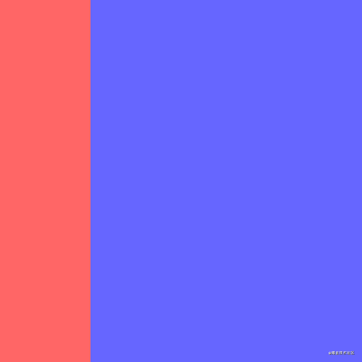
<div class="two-column-layout">
<div class="left">div>
<div class="right">div>
div>float:left和固定宽度,由于float使节点脱流,右列需声明margin-left为左列宽度,以保证两列不会重叠。.two-column-layout {
width: 400px;
height: 400px;
.left {
float: left;
width: 100px;
height: 100%;
background-color: #f66;
}
.right {
margin-left: 100px;
height: 100%;
background-color: #66f;
}
}overflow:hidden使其形成BFC区域与外界隔离。.two-column-layout {
width: 400px;
height: 400px;
.left {
float: left;
width: 100px;
height: 100%;
background-color: #f66;
}
.right {
overflow: hidden;
height: 100%;
background-color: #66f;
}
}flex实现会更简洁。左列声明固定宽度,右列声明flex:1自适应宽度。.two-column-layout {
display: flex;
width: 400px;
height: 400px;
.left {
width: 100px;
background-color: #f66;
}
.right {
flex: 1;
background-color: #66f;
}
}三列布局
左中右三列组成,其特点为连续两列宽度固定、剩余一列宽度自适应和三列高度固定且相等。以下以左中列宽度固定和右列宽度自适应为例,反之同理。整体的实现原理与上述两列布局一致。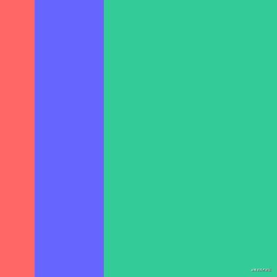
<div class="three-column-layout">
<div class="left">div>
<div class="center">div>
<div class="right">div>
div>float + margin-left的方式了,若使用margin-left还得结合左中列宽度计算。.three-column-layout {
width: 400px;
height: 400px;
.left {
float: left;
width: 50px;
height: 100%;
background-color: #f66;
}
.center {
float: left;
width: 100px;
height: 100%;
background-color: #66f;
}
.right {
overflow: hidden;
height: 100%;
background-color: #3c9;
}
}.three-column-layout {
display: flex;
width: 400px;
height: 400px;
.left {
width: 50px;
background-color: #f66;
}
.center {
width: 100px;
background-color: #66f;
}
.right {
flex: 1;
background-color: #3c9;
}
}圣杯布局/双飞翼布局
左中右三列组成,其特点为左右两列宽度固定、中间一列宽度自适应和三列高度固定且相等。其实也是上述两列布局和三列布局的变体,整体的实现原理与上述N列布局一致,可能就是一些细节需注意。圣杯布局和双飞翼布局在大体相同下也存在一点不同,区别在于双飞翼布局中间列需插入一个子节点。在常规实现方式里也是在这个中间列里做文章,如何使中间列内容不被左右列遮挡。float和margin负值将其拉回与中间列处在同一水平线上padding为左右列留出空位,将左右列固定在空位上margin为左右列让出空位,将左右列固定在空位上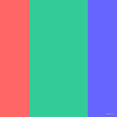
<div class="grail-layout-x">
<div class="left">div>
<div class="right">div>
<div class="center">div>
div>.grail-layout-x {
padding: 0 100px;
width: 400px;
height: 400px;
.left {
float: left;
margin-left: -100px;
width: 100px;
height: 100%;
background-color: #f66;
}
.right {
float: right;
margin-right: -100px;
width: 100px;
height: 100%;
background-color: #66f;
}
.center {
height: 100%;
background-color: #3c9;
}
}<div class="grail-layout-y">
<div class="left">div>
<div class="right">div>
<div class="center">
<div>div>
div>
div>.grail-layout-y {
width: 400px;
height: 400px;
.left {
float: left;
width: 100px;
height: 100%;
background-color: #f66;
}
.right {
float: right;
width: 100px;
height: 100%;
background-color: #66f;
}
.center {
margin: 0 100px;
height: 100%;
background-color: #3c9;
}
}圣杯布局/双飞翼布局可忽略上述分析,左右两列宽度固定,中间列宽度自适应。<div class="grail-layout">
<div class="left">div>
<div class="center">div>
<div class="right">div>
div>.grail-layout {
display: flex;
width: 400px;
height: 400px;
.left {
width: 100px;
background-color: #f66;
}
.center {
flex: 1;
background-color: #3c9;
}
.right {
width: 100px;
background-color: #66f;
}
}均分布局
多列组成,其特点为每列宽度相等和每列高度固定且相等。总体来说也是最简单的经典布局,由于每列宽度相等,所以很易找到合适的方式处理。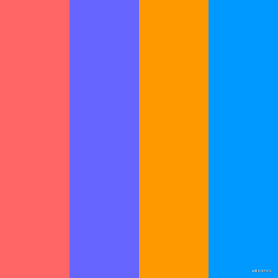
<div class="average-layout">
<div class="one">div>
<div class="two">div>
<div class="three">div>
<div class="four">div>
div>.one {
background-color: #f66;
}
.two {
background-color: #66f;
}
.three {
background-color: #f90;
}
.four {
background-color: #09f;
}width:25%。N列就用公式100 / n求出最终百分比宽度,记得保留2位小数,懒人还可用width:calc(100% / n)自动计算呢。.average-layout {
width: 400px;
height: 400px;
div {
float: left;
width: 25%;
height: 100%;
}
}display:flex后,生成的FFC容器里所有子节点的高度都相等,因为容器的align-items默认为stretch,所有子节点将占满整个容器的高度。每列声明flex:1自适应宽度。.average-layout {
display: flex;
width: 400px;
height: 400px;
div {
flex: 1;
}
}居中布局
父容器与若干个子容器组成,子容器在父容器中横向排列或竖向排列且呈水平居中或垂直居中。居中布局是一个很经典的问题,相信大家都会经常遇到。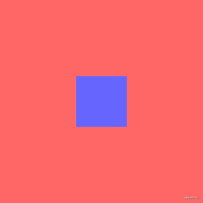
display:flex与margin:auto的强行组合,同学们自行体会。<div class="center-layout">
<div>div>
div>.center-layout {
display: flex;
width: 400px;
height: 400px;
background-color: #f66;
div {
margin: auto;
width: 100px;
height: 100px;
background-color: #66f;
}
}自适布局
自适布局的容器都是根据视窗尺寸计算,即使父节点或祖先节点的尺寸发生变化也不会影响自适布局的容器尺寸。自适布局就离不开「视窗比例单位」。在CSS3里增加了与viewport相关的四个长度单位,随着时间推移,目前大部分浏览器对这四个长度单位都有较好的兼容性,这也是未来最建议在伸缩方案里使用的长度单位。1vw表示1%视窗宽度1vh表示1%视窗高度1vmin表示1%视窗宽度和1%视窗高度里最小者1vmax表示1%视窗宽度和1%视窗高度里最大者window.innerWdith和window.innerHeight。若不考虑低版本浏览器兼容性,完全可用一行CSS代码秒杀所有移动端的伸缩方案。/* 基于UI width=750px DPR=2的网页 */
html {
font-size: calc(100vw / 7.5);
}calc()实现font-size的动态计算。calc()是自适布局里的核心存在,无它就不能愉快地实现自适布局所有动态计算了。calc()用于动态计算单位,数值、长度、角度、时间和百分比都能作为参数。由于执行数学表达式后返回运算后的计算值,所以可减少大量人工计算甚至无需人工计算。calc()饥不择食,所有计量单位都能作为参数参加整个动态计算。整数、浮点数px、em、rem、vw、vh等deg、turns、ms%calc()虽然好用,但新手难免会遇到一些坑,谨记以下特点,相信就能玩转calc()了。+、-、*、/作为运算符号()提升运算等级空格间隔起来font-size:calc(100vw / 7.5)其实就是根据设计图与浏览器视窗的比例动态计算的font-size:100/750 = x/100vw。calc()巧妙解决该问题。.elem {
padding-right: calc(100vw - 100%);
}padding-right为滚动条宽度是因为每个浏览器的默认滚动条宽度都可能不一致。100vw是视窗宽度,100%内容宽度,那么100vw - 100%就是滚动条宽度,声明padding-right用于保留滚动条出现的位置,这样滚动条出不出现都不会让页面抖动了。calc()做保障就可迅速实现一些与视窗尺寸相关的布局了。例如实现一个视窗宽度都为50%的弹窗。
<div class="modal">
<div class="modal-wrapper">div>
div>.modal {
display: flex;
position: fixed;
left: 0;
right: 0;
top: 0;
bottom: 0;
justify-content: center;
align-items: center;
background-color: rgba(0, 0, 0, .5);
&-wrapper {
width: 50vw;
height: 200px;
background-color: #f66;
}
}calc()也不一定结合视窗比例单位计算。例如自适布局已知部分节点高度,不想手动计算最后节点高度但又想其填充布局剩余空间。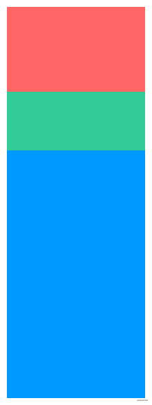
<ul class="selfadaption-layout">
<div class="box-1">div>
<div class="box-2">div>
<div class="box-3">div>
ul>.selfadaption-layout {
width: 200px;
height: 567px;
.box-1 {
height: 123px;
background-color: #f66;
}
.box-2 {
height: 15%;
background-color: #3c9;
}
.box-3 {
height: calc(100% - 123px - 15%);
background-color: #09f;
}
}吸附布局
吸附效果,是一种常见网页效果。譬如吸顶效果和吸底效果都是该范畴,经常在跟随导航、移动广告和悬浮提示等应用场景里出现。jQuery时代就有很多吸附效果插件,现在三大前端框架也有自身第三方的吸附效果组件。它们都有着共通的实现原理:监听scroll事件,判断scrollTop和目标节点的位置范围,符合条件则将目标节点的position声明为fixed使目标节点相对于视窗定位,让用户看上去就像钉在视窗指定位置上。position:sticky。简单的「两行核心CSS代码」就能完成「十多行核心JS代码」的功能,何乐而不为呢。position属性值,怎样用就不说了,大家应该都熟悉。取值 功能 版本 「inherit」 继承2 「static」 标准流2 「relative」 相对定位2 「absolute」 绝对定位2 「fixed」 固定定位2 「sticky」 粘性定位3 sticky时将节点变成粘性定位。「粘性定位」是相对定位和固定定位的结合体,节点在特定阈值跨越前为相对定位,跨越后为固定定位。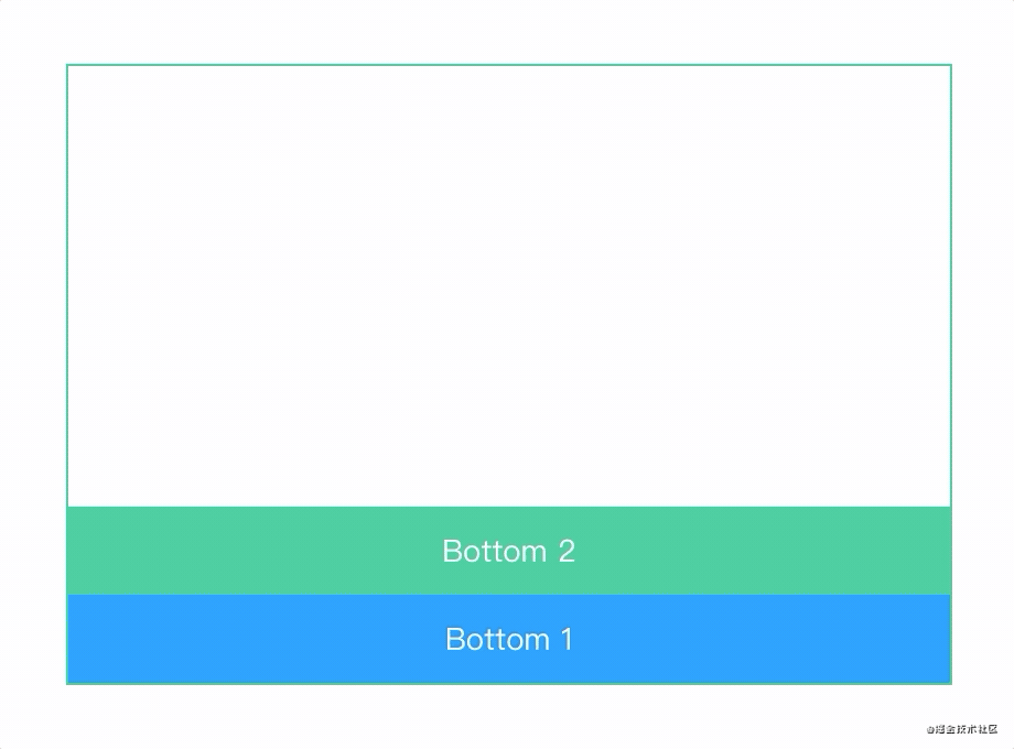
<div class="adsorption-position">
<ul>
<li>Top 1li>
<li>Top 2li>
<li>Normalli>
<li>Bottom 1li>
<li>Bottom 2li>
ul>
div>.adsorption-position {
overflow: auto;
position: relative;
width: 400px;
height: 280px;
outline: 1px solid #3c9;
ul {
padding: 200px 0;
}
li {
position: sticky;
height: 40px;
line-height: 40px;
text-align: center;
color: #fff;
&:nth-child(1) {
top: 0;
z-index: 9;
background-color: #f66;
}
&:nth-child(2) {
top: 40px;
z-index: 9;
background-color: #66f;
}
&:nth-child(3) {
background-color: #f90;
}
&:nth-child(4) {
bottom: 0;
z-index: 9;
background-color: #09f;
}
&:nth-child(5) {
bottom: 40px;
z-index: 9;
background-color: #3c9;
}
}
}position:sticky和top/bottom:npx。上述5个节点都声明position:sticky,但由于top/bottom赋值有所不同就产生不同吸附效果。某些滚动时刻处于相对定位,在特定滚动时刻处于固定定位。:top为0px,滚动到容器顶部就固定:top为40px,滚动到距离容器顶部40px就固定:未声明top/bottom,就一直保持相对定位:bottom为40px,滚动到距离容器底部40px就固定:bottom为0px,滚动到容器底部就固定left或right也一样能实现横向的吸附效果。粘性定位的参照物并不一定是position:fixed。当目标节点的任意祖先节点都未声明position:relative|absolute|fixed|sticky,才与position:fixed表现一致。当离目标节点最近的祖先节点声明position:relative|absolute|fixed|sticky,目标节点就相对该祖先节点产生粘性定位。简单来说确认参照物的方式与position:absolute一致。Safari和Firefox的兼容性还是挺赞的。有吸附效果需求的同学建议一试,要兼容IExplorer就算了。期待该属性有更好的发展,毕竟吸附布局真的是一种常见布局。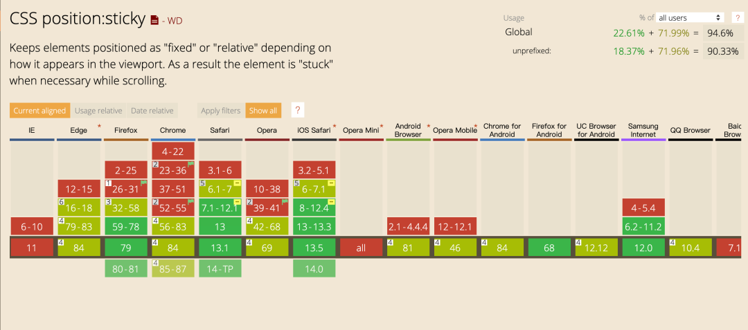
横向布局
竖向布局很常见,声明overflow:hidden;width:xpx;height:ypx就能实现,但横向布局却不能使用类似方式实现。横向布局,以下将通用代码拆分出来。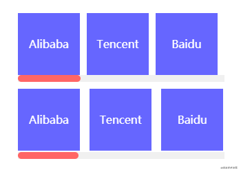
<div class="horizontal-layout">
<ul>
<li>Alibabali>
<li>Tencentli>
<li>Baiduli>
<li>Jingdongli>
<li>Antli>
<li>Neteaseli>
<li>Meituanli>
<li>ByteDanceli>
<li>360li>
<li>Sinali>
ul>
div>.horizontal-layout {
overflow: hidden;
width: 300px;
height: 100px;
ul {
overflow-x: auto;
cursor: pointer;
&::-webkit-scrollbar {
height: 10px;
}
&::-webkit-scrollbar-track {
background-color: #f0f0f0;
}
&::-webkit-scrollbar-thumb {
border-radius: 5px;
background-color: #f66;
}
}
li {
overflow: hidden;
height: 90px;
background-color: #66f;
line-height: 90px;
text-align: center;
font-size: 16px;
color: #fff;
&:not(:first-child) {
margin-left: 10px;
}
}
}行内元素实现横向排版,但必须声明overflow-y:hidden使容器在Y轴方向隐藏溢出部分。由于行内元素在当前行排版产生溢出会自动将其余节点排版到下一行,因此还需声明white-space:nowrap使所有行内元素在一行内排版完毕。若产生滚动条,还需对容器的height做适当的微调。.horizontal-layout.inline {
height: 102px;
ul {
overflow-y: hidden;
white-space: nowrap;
}
li {
display: inline-block;
width: 90px;
}
}flex布局完成上述布局,flex布局作为目前最常见的布局方式,相信也不用笔者多说。以下实现方式不知大家是否见过呢?在移动端上体验会更棒喔!.horizontal-layout.flex {
ul {
display: flex;
flex-wrap: nowrap;
justify-content: space-between;
}
li {
flex-shrink: 0;
flex-basis: 90px;
}
}凸显布局
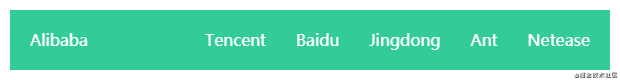
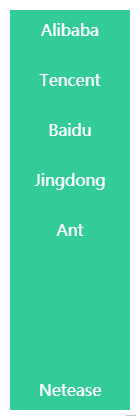
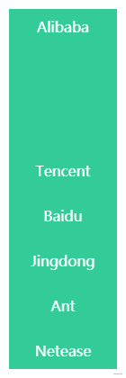
凸显布局的特征,凸显的节点可在凸显布局任意位置,上下左右,左上左下右上右下都行。
margin-*:auto实现了凸显布局。相信大家实现水平居中固定宽度的块元素都会使用margin:0 auto。margin-*:auto时,浏览器会自动计算剩余空间并将该值赋值给该节点。在使用该技巧时必须基于flex布局。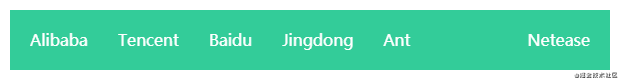
<ul class="highlight-layout">
<li>Alibabali>
<li>Tencentli>
<li>Baiduli>
<li>Jingdongli>
<li>Antli>
<li>Neteaseli>
ul>.highlight-layout {
display: flex;
align-items: center;
padding: 0 10px;
width: 600px;
height: 60px;
background-color: #3c9;
li {
padding: 0 10px;
height: 40px;
background-color: #3c9;
line-height: 40px;
font-size: 16px;
color: #fff;
}
&.left li {
&:not(:first-child) {
margin-left: 10px;
}
&:last-child {
margin-left: auto;
}
}
&.right li {
&:not(:last-child) {
margin-right: 10px;
}
&:first-child {
margin-right: auto;
}
}
&.top {
flex-direction: column;
width: 120px;
height: 400px;
li {
&:not(:first-child) {
margin-top: 10px;
}
&:last-child {
margin-top: auto;
}
}
}
&.bottom {
flex-direction: column;
width: 120px;
height: 400px;
li {
&:not(:last-child) {
margin-bottom: 10px;
}
&:first-child {
margin-bottom: auto;
}
}
}
}:not()与:first-child和:last-child的巧妙运用。这样组合让特殊位置的节点直接减少属性覆盖的问题,不仅易读还能装逼。间距布局
间距布局常见于各大列表,是笔者认为最重要的布局之一。为何如此简单的布局还是花费一些篇幅讲解呢?最近笔者查看了Github上很多与间隔布局相关的CSS代码,虽然整体效果看上去无大碍,但margin/padding和结构选择器却乱用,因此笔者想从零到一纠正间距布局的正确编码方式。:nth-child()的点睛之笔。大部分同学可能只认得:nth-child(n)、:nth-child(2n-1)、:nth-child(2n)和:nth-child(xn)的日常用法,但其实还有一些你可能未见过的用法。在此笔者借这次机会将:nth-child()所有用法总结下,n/x/y代表正整数,最小值为1。n个元素奇数位置元素,相当于:nth-child(2n-1)偶数位置元素,相当于:nth-child(2n)x*n个元素x个元素x~y个元素间距布局的一切特点,捕获特征很有利于将特征转换成CSS代码。margin声明padding声明,后续方便声明background-color(该步骤很易与上一步骤混淆,请特别注意)padding声明容器而不是使用margin声明节点(该步骤说明上一步骤的处理结果)margin-left/margin-right(二选一)声明节点margin-left:0声明最左列节点或使用margin-right:0声明最右列节点margin-top声明其余节点border-top/border-bottom代替padding-top/padding-bottom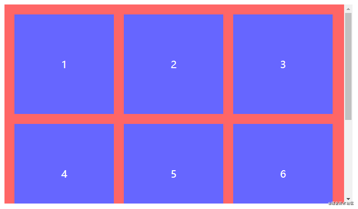
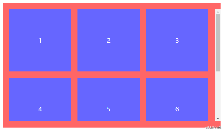
<ul class="spacing-layout">
<li>1li>
<li>2li>
<li>3li>
<li>4li>
<li>5li>
<li>6li>
<li>7li>
<li>8li>
ul>.spacing-layout {
display: flex;
overflow: auto;
flex-wrap: wrap;
margin-top: 20px; // 对应A
padding: 20px; // 对应B和C
// padding-top: 0; // 对应G
// padding-bottom: 0; // 对应G
// border-top: 20px solid #f66; // 对应G
// border-bottom: 20px solid #f66; // 对应G
width: 700px; // 稍微留空用于显示滚动条
height: 400px;
background-color: #f66;
li {
width: 200px;
height: 200px;
background-color: #66f;
line-height: 200px;
text-align: center;
font-size: 20px;
color: #fff;
&:not(:nth-child(3n)) {
margin-right: 20px; // 对应D和E
}
&:nth-child(n+4) {
margin-top: 20px; // 对应F
}
}
}空载布局
<div>
<ul v-if="list.length">...ul>
<div v-esle>Emptydiv>
div>:empty,这应该很少同学会注意到吧。:empty作用于无子节点的节点,该子节点也包括行内匿名盒(单独的文本内容)。以下三种情况均视为非空状态,若不出现这三种状态则视为空状态,此时:empty才会触发。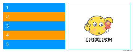
<ul class="empty-layout">
<li>1li>
<li>2li>
<li>3li>
<li>4li>
<li>5li>
<li>6li>
<li>7li>
<li>8li>
<li>9li>
ul>
<ul class="empty-layout">ul>$empty: "https://yangzw.vip/img/empty.svg";
.empty-layout {
overflow: auto;
width: 200px;
height: 150px;
outline: 1px solid #3c9;
&:empty {
display: flex;
justify-content: center;
align-items: center;
background: url($empty) no-repeat center/100px auto;
&::after {
margin-top: 90px;
font-weight: bold;
content: "没钱就没数据";
}
}
li {
padding: 0 10px;
height: 30px;
background-color: #09f;
line-height: 30px;
color: #fff;
&:nth-child(even) {
background-color: #f90;
}
}
}空载布局,就是不做任何处理。这样最终渲染的DOM只有容器,若已声明margin/padding/border但未声明width/height的情况下,就会出现以下占位效果。无任何子节点的容器还声明着margin/padding/border,看着都尴尬。
:empty帮你搞掂!对于无任何子节点的容器直接声明display:none解决所有无效占位,当然也可作用于指定节点。一招制敌,劲!// 作用于所有节点
:empty {
display: none;
}
// 作用于指定节点
.empty-layout:empty {
display: none;
}多格布局
多格布局了,当单张照片排列、两张照片排列、三张照片排列等等,每种情况下照片的尺寸都可能不一致。笔者制作了一个动态多格相册怀念我家狗狗「AB」。大家感受下纯CSS实现动态数量的多格布局吧。根据结构选择器限制节点范围实现,在本文也可找到原理的答案喔!记得实现完再看以下源码哈!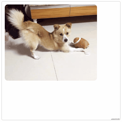
<ul class="multigrid-layout">
<li class="item"><img src="https://static.yangzw.vip/codepen/ab-3.jpg">li>
<li class="item"><img src="https://static.yangzw.vip/codepen/ab-3.jpg">li>
<li class="item"><img src="https://static.yangzw.vip/codepen/ab-3.jpg">li>
<li class="item"><img src="https://static.yangzw.vip/codepen/ab-3.jpg">li>
<li class="item"><img src="https://static.yangzw.vip/codepen/ab-3.jpg">li>
<li class="item"><img src="https://static.yangzw.vip/codepen/ab-3.jpg">li>
<li class="item"><img src="https://static.yangzw.vip/codepen/ab-3.jpg">li>
<li class="item"><img src="https://static.yangzw.vip/codepen/ab-3.jpg">li>
<li class="item"><img src="https://static.yangzw.vip/codepen/ab-3.jpg">li>
ul>@mixin square($count: 2) {
$length: calc((100% - #{$count} * 10px) / #{$count});
width: $length;
height: $length;
}
.multigrid-layout {
display: flex;
flex-wrap: wrap;
justify-content: flex-start;
align-content: flex-start;
padding: 5px;
border: 1px solid #ccc;
border-radius: 5px;
width: 400px;
height: 400px;
li {
display: flex;
overflow: hidden;
justify-content: center;
margin: 5px;
background-color: #f0f0f0;
@include square(3);
}
img {
width: 100%;
height: 100%;
object-fit: cover;
}
}
// 一个元素
.item:only-child {
border-radius: 10px;
width: auto;
max-width: 80%;
height: auto;
max-height: 80%;
}
// 两个元素
.item:first-child:nth-last-child(2),
.item:first-child:nth-last-child(2) ~ .item:nth-child(2) {
@include square(2);
}
.item:first-child:nth-last-child(2) {
border-radius: 10px 0 0 10px;
}
.item:first-child:nth-last-child(2) ~ .item:nth-child(2) {
border-radius: 0 10px 10px 0;
}
// 三个元素
.item:first-child:nth-last-child(3),
.item:first-child:nth-last-child(3) ~ .item:nth-child(2),
.item:first-child:nth-last-child(3) ~ .item:nth-child(3) {
@include square(2);
}
.item:first-child:nth-last-child(3) {
border-top-left-radius: 10px;
}
.item:first-child:nth-last-child(3) ~ .item:nth-child(2) {
border-top-right-radius: 10px;
}
.item:first-child:nth-last-child(3) ~ .item:nth-child(3) {
border-bottom-left-radius: 10px;
}
// 四个元素
.item:first-child:nth-last-child(4),
.item:first-child:nth-last-child(4) ~ .item:nth-child(2),
.item:first-child:nth-last-child(4) ~ .item:nth-child(3),
.item:first-child:nth-last-child(4) ~ .item:nth-child(4) {
@include square(2);
}
.item:first-child:nth-last-child(4) {
border-top-left-radius: 10px;
}
.item:first-child:nth-last-child(4) ~ .item:nth-child(2) {
border-top-right-radius: 10px;
}
.item:first-child:nth-last-child(4) ~ .item:nth-child(3) {
border-bottom-left-radius: 10px;
}
.item:first-child:nth-last-child(4) ~ .item:nth-child(4) {
border-bottom-right-radius: 10px;
}
// 五个元素
.item:first-child:nth-last-child(5) {
border-top-left-radius: 10px;
}
.item:first-child:nth-last-child(5) ~ .item:nth-child(3) {
border-top-right-radius: 10px;
}
.item:first-child:nth-last-child(5) ~ .item:nth-child(4) {
border-bottom-left-radius: 10px;
}
// 六个元素
.item:first-child:nth-last-child(6) {
border-top-left-radius: 10px;
}
.item:first-child:nth-last-child(6) ~ .item:nth-child(3) {
border-top-right-radius: 10px;
}
.item:first-child:nth-last-child(6) ~ .item:nth-child(4) {
border-bottom-left-radius: 10px;
}
.item:first-child:nth-last-child(6) ~ .item:nth-child(6) {
border-bottom-right-radius: 10px;
}
// 七个元素
.item:first-child:nth-last-child(7) {
border-top-left-radius: 10px;
}
.item:first-child:nth-last-child(7) ~ .item:nth-child(3) {
border-top-right-radius: 10px;
}
.item:first-child:nth-last-child(7) ~ .item:nth-child(7) {
border-bottom-left-radius: 10px;
}
// 八个元素
.item:first-child:nth-last-child(8) {
border-top-left-radius: 10px;
}
.item:first-child:nth-last-child(8) ~ .item:nth-child(3) {
border-top-right-radius: 10px;
}
.item:first-child:nth-last-child(8) ~ .item:nth-child(7) {
border-bottom-left-radius: 10px;
}
// 九个元素
.item:first-child:nth-last-child(9) {
border-top-left-radius: 10px;
}
.item:first-child:nth-last-child(9) ~ .item:nth-child(3) {
border-top-right-radius: 10px;
}
.item:first-child:nth-last-child(9) ~ .item:nth-child(7) {
border-bottom-left-radius: 10px;
}
.item:first-child:nth-last-child(9) ~ .item:nth-child(9) {
border-bottom-right-radius: 10px;
}总结
PC端浏览,拒绝支持IExplorerPC端浏览,拒绝支持IExplorer,查看源码请戳这里100份小册「6折」优惠码「OGecoefC」,喜欢CSS的同学可了解下喔。结语