
有趣且实用的 CSS 小技巧
1. 打字效果
代码实现:
<div class="wrapper">
    <div class="typing-demo">
      有趣且实用的 CSS 小技巧
    div>
div>
.wrapper {
  height: 100vh;
  display: flex;
  align-items: center;
  justify-content: center;
}

.typing-demo {
  width: 22ch;
  animation: typing 2s steps(22), blink .5s step-end infinite alternate;
  white-space: nowrap;
  overflow: hidden;
  border-right: 3px solid;
  font-family: monospace;
  font-size: 2em;
}

@keyframes typing {
  from {
    width: 0
  }
}

@keyframes blink {
  50% {
    border-color: transparent
  }
}
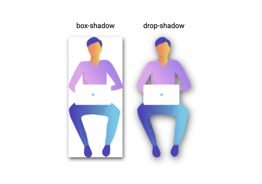
实现效果:

2. 设置阴影
当使用透明图像时,可以使用 drop-shadow() 函数在图像上创建阴影,而不是使用 box shadow 属性在元素的整个框后面创建矩形阴影:
<div class="wrapper">
  <div class="mr-2">
    <div class="mb-1 text-center">
      box-shadow
    div>

    <img class="box-shadow" src="https://markodenic.com/man_working.png" alt="Image with box-shadow">
  div>

  <div>
    <div class="mb-1 text-center">
      drop-shadow
    div>

    <img class="drop-shadow" src="https://markodenic.com/man_working.png" alt="Image with drop-shadow">
  div>
div>
.wrapper {
  height: 100vh;
  display: flex;
  align-items: center;
  justify-content: center;
}

.mr-2 {
  margin-right: 2em;
}

.mb-1 {
  margin-bottom: 1em;
}

.text-center {
  text-align: center;
}

.box-shadow {
  box-shadow: 2px 4px 8px #585858;
}

.drop-shadow {
  filter: drop-shadow(2px 4px 8px #585858);
}
对比效果:
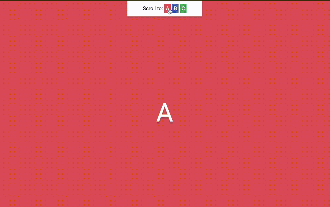
3. 平滑滚动
无需 JavaScript 即可实现平滑滚动,只需一行 CSS:scroll-behavior: smooth;
<nav>
  Scroll to:
  <a href="#sectionA" class="link bg-red">Aa>

  <a href="#sectionB" class="link bg-blue">Ba>

  <a href="#sectionC" class="link bg-green">Ca>
nav>

<div class="wrapper">
  <div id="sectionA" class="section bg-red">Adiv>

  <div id="sectionB" class="section bg-blue">Bdiv>

  <div id="sectionC" class="section bg-green">Cdiv>
div>
html {
  scroll-behavior: smooth;
}

nav {
  position: fixed;
  left: calc(50vw - 115px);
  top: 0;
  width: 200px;
  text-align: center;
  padding: 15px;
  background: #fff;
  box-shadow: 0 2px 5px 1px rgba(0, 0, 0, 0.2);
}

nav .link {
  padding: 5px;
  color: white;
}

.section {
  height: 100vh;
  display: flex;
  align-items: center;
  justify-content: center;
  color: #fff;
  font-size: 5em;
  text-shadow:
    0px 2px 0px #b2a98f,
    0px 4px 3px rgba(0,0,0,0.15),
    0px 8px 1px rgba(0,0,0,0.1);
}

.bg-red {
  background: #de5448;
}

.bg-blue {
  background: #4267b2;
}

.bg-green {
  background: #4CAF50;
}
实现效果:
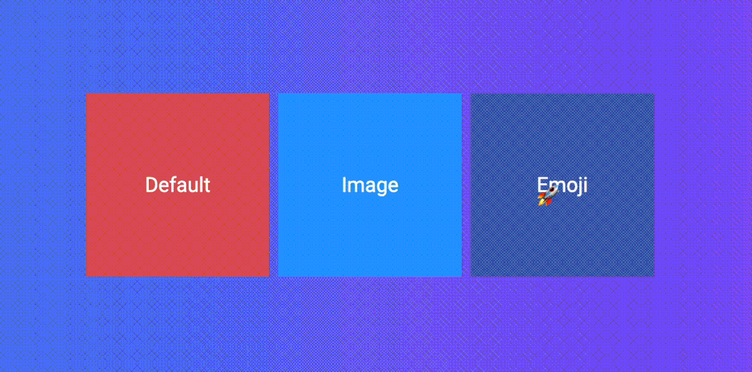
4. 自定义光标
可以使用自定义图像,甚至表情符号来作为光标。
<div class="wrapper">
  <div class="tile">
    Default
  div>

  <div class="tile tile-image-cursor">
    Image
  div>

  <div class="tile tile-emoji-cursor">
    Emoji
  div>
div>
.wrapper {
display: flex;
height: 100vh;
align-items: center;
justify-content: center;
background: #4776e6;
background: linear-gradient(to right, #4776e6, #8e54e9);
padding: 0 10px;
}
.tile {
width: 200px;
height: 200px;display: flex;
align-items: center;
justify-content: center;
background-color: #de5448;
margin-right: 10px;color: #fff;
font-size: 1.4em;
text-align: center;
}
.tile-image-cursor {
background-color: #1da1f2;
cursor: url(https://picsum.photos/20/20), auto;
}
.tile-emoji-cursor {
background-color: #4267b2;
cursor: url("data:image/svg+xml;utf8,🚀"
}
实现效果:
5. 截断文本
一行文本溢出隐藏:
<div>
 白日依山尽,黄河入海流。欲穷千里目,更上一层楼。
div>
div {
  width: 200px;
  background-color: #fff;
  padding: 15px;
  white-space: nowrap;
  overflow: hidden;
  text-overflow: ellipsis;
}
实现效果:

还可以使用“-webkit-line-clamp”属性将文本截断为特定的行数。文本将在截断的地方会显示省略号:
div {
  width: 200px;
  display: -webkit-box;
  -webkit-box-orient: vertical;
  -webkit-line-clamp: 2;
  overflow: hidden;
}
实现效果:

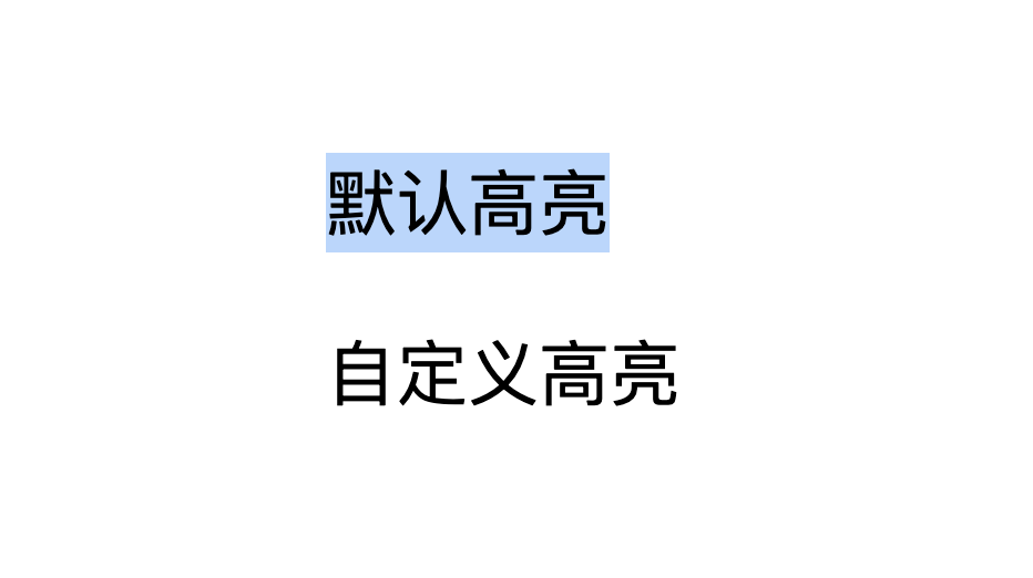
6. 自定义选中样式
CSS 伪元素::selection,可以用来自定义用户选中文档的高亮样式。
<div class="wrapper">
  <div>
    <p>
     默认高亮
    p>
    <p class="custom-highlighting">
      自定义高亮
    p>
  div>
div>
.wrapper {
  height: 100vh;
  display: flex;
  align-items: center;
  justify-content: center;
}

p {
  font-size: 2rem;
  font-family: sans-serif;
}

.custom-highlighting::selection {
  background-color: #8e44ad;
  color: #fff;
}
实现效果:

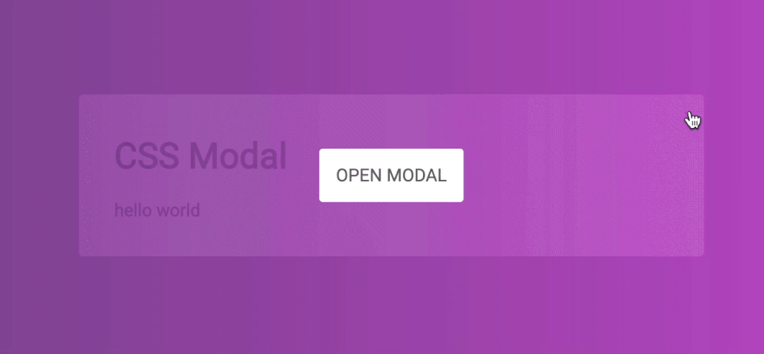
7. CSS 模态框
我们可以使用 CSS 中的 :target 伪元素来创建一个模态框。
<div class="wrapper">
    <a href="#demo-modal">Open Modala>
div>

<div id="demo-modal" class="modal">
    <div class="modal__content">
        <h1>CSS Modalh1>
        <p>hello worldp>
        <a href="#" class="modal__close">×a>
    div>
div>
.wrapper {
  height: 100vh;
  display: flex;
  align-items: center;
  justify-content: center;
  background: linear-gradient(to right, #834d9b, #d04ed6);
}

.wrapper a {
  display: inline-block;
  text-decoration: none;
  padding: 15px;
  background-color: #fff;
  border-radius: 3px;
  text-transform: uppercase;
  color: #585858;
  font-family: 'Roboto', sans-serif;
}

.modal {
  visibility: hidden;
  opacity: 0;
  position: absolute;
  top: 0;
  right: 0;
  bottom: 0;
  left: 0;
  display: flex;
  align-items: center;
  justify-content: center;
  background: rgba(77, 77, 77, .7);
  transition: all .4s;
}

.modal:target {
  visibility: visible;
  opacity: 1;
}

.modal__content {
  border-radius: 4px;
  position: relative;
  width: 500px;
  max-width: 90%;
  background: #fff;
  padding: 1em 2em;
}

.modal__close {
  position: absolute;
  top: 10px;
  right: 10px;
  color: #585858;
  text-decoration: none;
}
实现效果:
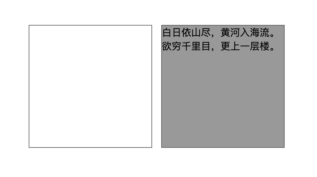
8. 空元素样式
可以使用 :empty 选择器来设置完全没有子元素或文本的元素的样式:
<div class="wrapper">
  <div class="box">div>
  <div class="box">白日依山尽,黄河入海流。欲穷千里目,更上一层楼。div>
div>
.wrapper {
  height: 100vh;
  display: flex;
  justify-content: center;
  align-items: center;
}

.box {
  display: inline-block;
  background: #999;
  border: 1px solid #585858;
  height: 200px;
  width: 200px;
  margin-right: 15px;
}

.box:empty {
  background: #fff;
}
实现效果:
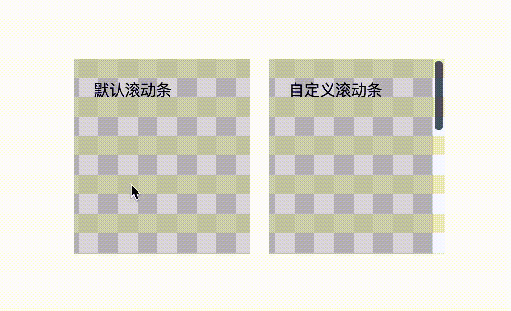
9. 创建自定义滚动条
<div class="wrapper">
    <div>
      <div class="tile mr-1">
        <div class="tile-content">
          默认滚动条
        div>
      div>

      <div class="tile tile-custom-scrollbar">
        <div class="tile-content">
          自定义滚动条
        div>
      div>
    div>
div>
.wrapper {
  height: 100vh;
  display: flex;
  align-items: center;
  justify-content: center;
}

.mr-1 {
  margin-right: 1em;
}

.tile {
  overflow: auto;
  display: inline-block;
  background-color: #ccc;
  height: 200px;
  width: 180px;
}

.tile-custom-scrollbar::-webkit-scrollbar {
  width: 12px;
  background-color: #eff1f5;
}

.tile-custom-scrollbar::-webkit-scrollbar-track{
  border-radius: 3px;
  background-color: transparent;
}

.tile-custom-scrollbar::-webkit-scrollbar-thumb{
  border-radius:5px;
  background-color:#515769;
  border:2px solid #eff1f5
}

.tile-content {
  padding: 20px;
  height: 500px;
}
实现效果:
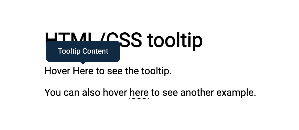
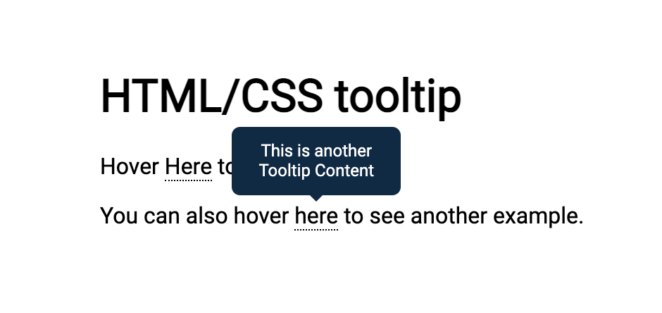
10. 动态工具提示
可以使用 CSS 函数 attr() 来创建动态的纯 CSS 工具提示 。
<h1>
  HTML/CSS tooltip
h1>
<p>
  Hover <span class="tooltip" data-tooltip="Tooltip Content">Herespan> to see the tooltip.
p>
<p>
  You can also hover <span class="tooltip" data-tooltip="This is another Tooltip Content">herespan> to see another example.
p>
.tooltip {
  position: relative;
  border-bottom: 1px dotted black;
}

.tooltip:before {
  content: attr(data-tooltip);
  position: absolute;
  width: 100px;
  background-color: #062B45;
  color: #fff;
  text-align: center;
  padding: 10px;
  line-height: 1.2;
  border-radius: 6px;
  z-index: 1;
  opacity: 0;
  transition: opacity .6s;
  bottom: 125%;
  left: 50%;
  margin-left: -60px;
  font-size: 0.75em;
  visibility: hidden;
}

.tooltip:after {
  content: "";
  position: absolute;
  bottom: 75%;
  left: 50%;
  margin-left: -5px;
  border-width: 5px;
  border-style: solid;
  opacity: 0;
  transition: opacity .6s;
  border-color: #062B45 transparent transparent transparent;
  visibility: hidden;
}

.tooltip:hover:before,
.tooltip:hover:after {
  opacity: 1;
  visibility: visible;
}
实现效果:
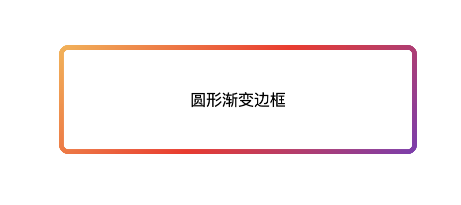
11. 圆形渐变边框
<div class="box gradient-border">
  炫酷渐变边框
div>
.gradient-border {
  border: solid 5px transparent;
  border-radius: 10px;
  background-image: linear-gradient(white, white),
    linear-gradient(315deg,#833ab4,#fd1d1d 50%,#fcb045);
  background-origin: border-box;
  background-clip: content-box, border-box;
}

.box {
  width: 350px;
  height: 100px;
  display: flex;
  align-items: center;
  justify-content: center;
  margin: 100px auto;
}
实现效果:
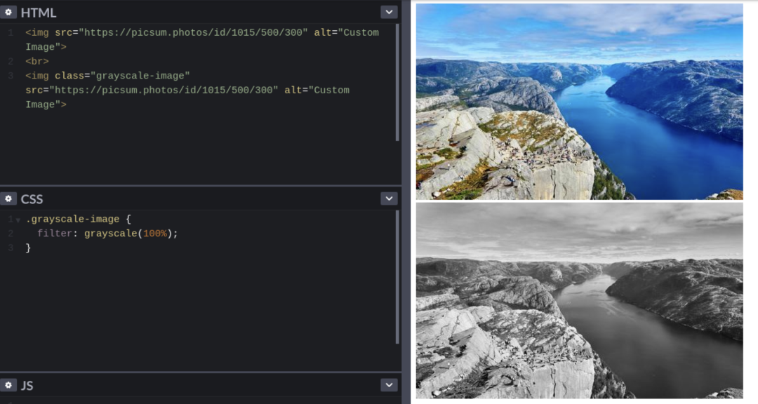
12. 灰度图片
可以使用 grayscale() 过滤器功能将输入图像转换为灰度。
往期推荐
结语
「关注公众号IQ前端,一个专注于CSS/JS开发技巧的前端公众号,更多前端小干货等着你喔」
评论