
8种纯CSS实现的炫酷HOVER效果,你应该在网站中尝试使用
英文 | https://www.blog.duomly.com/html-button-hover-effects/
作者 | Anna Danilec
翻译 | web前端开发(ID:web_qdkf)
按钮悬停效果简介
按钮是每个页面,Web应用程序或移动应用程序中经常使用的基本元素。
按钮是CSS布局中必不可少的元素,因为在很多情况下,它是用户在呼吁采取行动并说服单击时必须注意到的元素。
前端开发人员和设计人员经常尝试以任何不错的方式突出显示按钮,尤其是当用户与它们交互时,例如悬停或聚焦时。
因此,今天我决定向你展示8种出色的按钮悬停效果,你可以在项目中使用它们,让客户感到惊讶。
我希望你会发现这些示例很有用,并分享你喜欢的方法以使按钮更加出色。
和往常一样,还有一件事,我为您提供了一个视频教程,因此,如果您是喜欢观看而不是阅读的人,请跳到我们的Youtube频道,您可以观看所有内容。
Youtube频道地址:https://www.youtube.com/watch?v=zWagGz7H--I&feature=youtu.be
你准备好了一起来变魔术了吗?
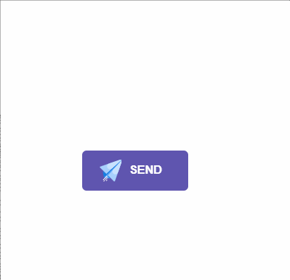
1、发送按钮悬停效果
最终实现效果如下:
// 这里是一个svg的占位Send
#send-btn{display: flex;align-items: center;justify-content: center;height: 100vh;}button {background: #5f55af;border: 0;border-radius: 5px;padding: 10px 30px 10px 20px;color: white;text-transform: uppercase;font-weight: bold;}button svg {display: inline-block;vertical-align: middle;padding-right: 5px;}button:hover svg {animation: fly 2s ease 1;}@keyframes fly {0% {transform: translateX(0%);}50% {transform: translateX(300%);}100% {transform: translateX(0);}}
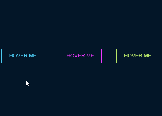
2、霓虹灯按钮悬停效果
#neon-btn {display: flex;align-items: center;justify-content: space-around;height: 100vh;background: #031628;}.btn {border: 1px solid;background-color: transparent;text-transform: uppercase;font-size: 14px;padding: 10px 20px;font-weight: 300;}.one {color: #4cc9f0;}.two {color: #f038ff;}.three {color: #b9e769;}.btn:hover {color: white;border: 0;}.one:hover {background-color: #4cc9f0;-webkit-box-shadow: 10px 10px 99px 6px rgba(76,201,240,1);-moz-box-shadow: 10px 10px 99px 6px rgba(76,201,240,1);box-shadow: 10px 10px 99px 6px rgba(76,201,240,1);}.two:hover {background-color: #f038ff;-webkit-box-shadow: 10px 10px 99px 6px rgba(240, 56, 255, 1);-moz-box-shadow: 10px 10px 99px 6px rgba(240, 56, 255, 1);box-shadow: 10px 10px 99px 6px rgba(240, 56, 255, 1);}.three:hover {background-color: #b9e769;-webkit-box-shadow: 10px 10px 99px 6px rgba(185, 231, 105, 1);-moz-box-shadow: 10px 10px 99px 6px rgba(185, 231, 105, 1);box-shadow: 10px 10px 99px 6px rgba(185, 231, 105, 1);}
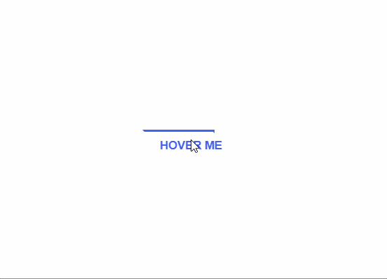
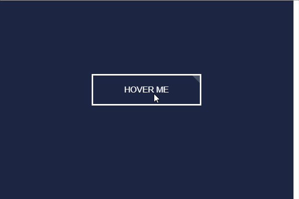
3、绘制边框按钮悬停效果
#draw-border {display: flex;align-items: center;justify-content: center;height: 100vh;}button {border: 0;background: none;text-transform: uppercase;color: #4361ee;font-weight: bold;position: relative;outline: none;padding: 10px 20px;box-sizing: border-box;}button::before, button::after {box-sizing: inherit;position: absolute;content: '';border: 2px solid transparent;width: 0;height: 0;}button::after {bottom: 0;right: 0;}button::before {top: 0;left: 0;}button:hover::before, button:hover::after {width: 100%;height: 100%;}button:hover::before {border-top-color: #4361ee;border-right-color: #4361ee;transition: width 0.3s ease-out, height 0.3s ease-out 0.3s;}button:hover::after {border-bottom-color: #4361ee;border-left-color: #4361ee;transition: border-color 0s ease-out 0.6s, width 0.3s ease-out 0.6s, height 0.3s ease-out 1s;}
4、圆形按钮悬停效果
// 这里有一个svg元素
#circle-btn {display: flex;align-items: center;justify-content: center;height: 100vh;}.btn-container {position: relative;}button {border: 0;border-radius: 50px;color: white;background: #5f55af;padding: 15px 20px 16px 60px;text-transform: uppercase;background: linear-gradient(to right, #f72585 50%, #5f55af 50%);background-size: 200% 100%;background-position: right bottom;transition:all 2s ease;}svg {background: #f72585;padding: 8px;border-radius: 50%;position: absolute;left: 0;top: 0%;}button:hover {background-position: left bottom;}
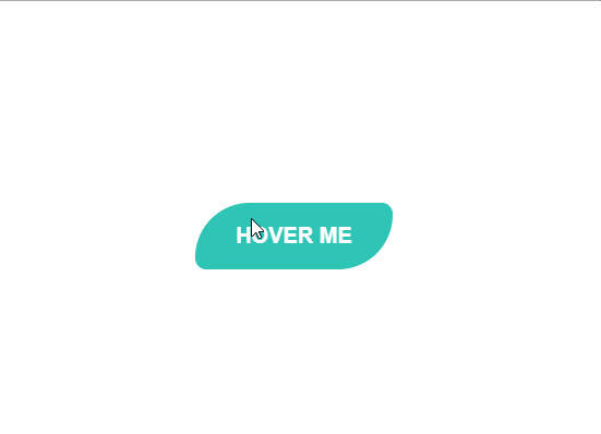
5、边框半径按钮悬停效果
#border-btn {display: flex;align-items: center;justify-content: center;height: 100vh;}button {border: 0;border-radius: 10px;background: #2ec4b6;text-transform: uppercase;color: white;font-size: 16px;font-weight: bold;padding: 15px 30px;outline: none;position: relative;transition: border-radius 3s;-webkit-transition: border-radius 3s;}button:hover {border-bottom-right-radius: 50px;border-top-left-radius: 50px;border-bottom-left-radius: 10px;border-top-right-radius: 10px;}
6、冻结按钮悬停效果
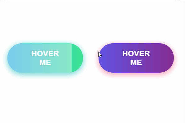
#frozen-btn {display: flex;align-items: center;justify-content: center;height: 100vh;}button {border: 0;margin: 20px;text-transform: uppercase;font-size: 20px;font-weight: bold;padding: 15px 50px;border-radius: 50px;color: white;outline: none;position: relative;}button:before{content: '';display: block;background: linear-gradient(to left, rgba(255, 255, 255, 0) 50%, rgba(255, 255, 255, 0.4) 50%);background-size: 210% 100%;background-position: right bottom;height: 100%;width: 100%;position: absolute;top: 0;bottom:0;right:0;left: 0;border-radius: 50px;transition: all 1s;-webkit-transition: all 1s;}.green {background-image: linear-gradient(to right, #25aae1, #40e495);box-shadow: 0 4px 15px 0 rgba(49, 196, 190, 0.75);}.purple {background-image: linear-gradient(to right, #6253e1, #852D91);box-shadow: 0 4px 15px 0 rgba(236, 116, 149, 0.75);}.purple:hover:before {background-position: left bottom;}.green:hover:before {background-position: left bottom;}
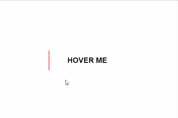
7、闪亮的阴影元素按钮悬停效果
#shiny-shadow {display: flex;align-items: center;justify-content: center;height: 100vh;background: #1c2541;}button {border: 2px solid white;background: transparent;text-transform: uppercase;color: white;padding: 15px 50px;outline: none;overflow: hidden;position: relative;}span {z-index: 20;}button:after {content: '';display: block;position: absolute;top: -36px;left: -100px;background: white;width: 50px;height: 125px;opacity: 20%;transform: rotate(-45deg);}button:hover:after {left: 120%;transition: all 600ms cubic-bezier(0.3, 1, 0.2, 1);-webkit-transition: all 600ms cubic-bezier(0.3, 1, 0.2, 1);}
8、加载按钮悬停效果
#loading-btn {display: flex;align-items: center;justify-content: center;height: 100vh;}button {background: transparent;border: 0;border-radius: 0;text-transform: uppercase;font-weight: bold;font-size: 20px;padding: 15px 50px;position: relative;}button:before {transition: all 0.8s cubic-bezier(0.7, -0.5, 0.2, 2);content: '';width: 1%;height: 100%;background: #ff5964;position: absolute;top: 0;left: 0;}button span {mix-blend-mode: darken;}button:hover:before {background: #ff5964;width: 100%;}
总结

评论