
【CSS】767- 我写炫酷 CSS 效果的常用套路
作者:alphardex链接:https://juejin.im/post/6881546676188741645
前言
前篇传送门:https://juejin.im/post/6844904033405108232
其实大多数的技巧前篇都已经讲完了,本文算是具有补充性质的番外篇吧0.0
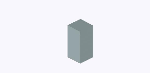
3D 方块
如何在 CSS 中创建立体的方块呢?用以下的 SCSS mixin 即可
方块的长度、高度、深度都可以通过 CSS 变量自由调节
@mixin cube($width, $height, $depth) {
  &__front {
    @include cube-front($width, $height, $depth);
  }
  &__back {
    @include cube-back($width, $height, $depth);
  }
  &__right {
    @include cube-right($width, $height, $depth);
  }
  &__left {
    @include cube-left($width, $height, $depth);
  }
  &__top {
    @include cube-top($width, $height, $depth);
  }
  &__bottom {
    @include cube-bottom($width, $height, $depth);
  }
  .face {
    position: absolute;
  }
}

@mixin cube-front($width, $height, $depth) {
  width: var($width);
  height: var($height);
  transform-origin: bottom left;
  transform: rotateX(-90deg) translateZ(calc(calc(var(#{$depth}) * 2) - var(#{$height})));
}

@mixin cube-back($width, $height, $depth) {
  width: var($width);
  height: var($height);
  transform-origin: top left;
  transform: rotateX(-90deg) rotateY(180deg) translateX(calc(var(#{$width}) * -1)) translateY(
      calc(var(#{$height}) * -1)
    );
}

@mixin cube-right($width, $height, $depth) {
  width: calc(var(#{$depth}) * 2);
  height: var($height);
  transform-origin: top left;
  transform: rotateY(90deg) rotateZ(-90deg) translateZ(var(#{$width})) translateX(calc(var(#{$depth}) * -2)) translateY(calc(var(
            #{$height}
          ) * -1));
}

@mixin cube-left($width, $height, $depth) {
  width: calc(var(#{$depth}) * 2);
  height: var($height);
  transform-origin: top left;
  transform: rotateY(-90deg) rotateZ(90deg) translateY(calc(var(#{$height}) * -1));
}

@mixin cube-top($width, $height, $depth) {
  width: var($width);
  height: calc(var(#{$depth}) * 2);
  transform-origin: top left;
  transform: translateZ(var($height));
}

@mixin cube-bottom($width, $height, $depth) {
  width: var($width);
  height: calc(var(#{$depth}) * 2);
  transform-origin: top left;
  transform: rotateY(180deg) translateX(calc(var(#{$width}) * -1));
}

.cube {
  --cube-width: 3rem;
  --cube-height: 3rem;
  --cube-depth: 1.5rem;

  @include cube(--cube-width, --cube-height, --cube-depth);
  width: 3rem;
  height: 3rem;
}
交错旋转
给多个方块应用交错动画会产生如下效果
.spiral-tower {
  display: grid;
  grid-auto-flow: row;
  transform: rotateX(-30deg) rotateY(45deg);

  .cube {
    @for $i from 1 through 48 {
      &:nth-child(#{$i}) {
        animation-delay: 0.015s * ($i - 1);
      }
    }
  }
}

@keyframes spin {
  0%,
  15% {
    transform: rotateY(0);
  }

  85%,
  100% {
    transform: rotateY(1turn);
  }
}
本 demo 地址:Spiral Tower
伸缩长度
在 CSS 动画中,我们无法直接使变量动起来(其实能动,但很生硬)
这时我们就得求助于 CSS Houdini,将变量声明为长度单位类型即可,因为长度单位是可以动起来的
CSS.registerProperty({
name: "--cube-width",
syntax: "" ,
initialValue: 0,
inherits: true,
});
CSS.registerProperty({
name: "--cube-height",
syntax: "" ,
initialValue: 0,
inherits: true,
});
CSS.registerProperty({
name: "--cube-depth",
syntax: "" ,
initialValue: 0,
inherits: true,
});
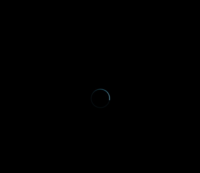
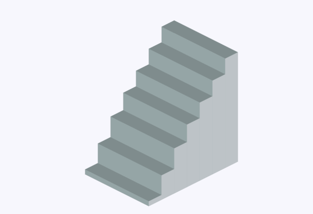 本 demo 地址:3D Stair Loading
文本分割
在上一篇我们提到了如何用 JS 来分割文本,本篇将介绍一种更简洁的实现方法——gsap 的 SplitText 插件,利用它我们能用更少的代码来实现下图的效果
<div class="staggered-land-in font-bold text-2xl">Fushigi no Monogataridiv>

const t1 = gsap.timeline();
const staggeredLandInText = new SplitText(".staggered-land-in", {
  type: "chars",
});
t1.from(staggeredLandInText.chars, {
  duration: 0.8,
  opacity: 0,
  y: "-20%",
  stagger: 0.05,
});
简化版 demo 地址:SplitText Starterhttps://codepen.io/alphardex/pen/ZEWRBJp)
关键帧
简单的动画固然可以实现,那么相对复杂一点的动画呢?这时候还是要依靠强大的@keyframes 和 CSS 变量
注:尽管 gsap 目前也支持 keyframes,但是无法和交错动画结合起来,因此用@keyframes 作为替代方案
<div class="staggered-scale-in font-bold text-6xl">Never Never Give Updiv>

.scale-in-bounce {
  animation: scale-in-bounce 0.4s both;
  animation-delay: calc(0.1s * var(--i));
}

@keyframes scale-in-bounce {
  0% {
    opacity: 0;
    transform: scale(2);
  }

  40% {
    opacity: 1;
    transform: scale(0.8);
  }

  100% {
    opacity: 1;
    transform: scale(1);
  }
}

const t1 = gsap.timeline();
const staggeredScaleInText = new SplitText(".staggered-scale-in", {
  type: "chars",
});
const staggeredScaleInChars = staggeredScaleInText.chars;
staggeredScaleInChars.forEach((item, i) => {
  item.style.setProperty("--i", `${i}`);
});
t1.to(staggeredScaleInChars, {
  className: "scale-in-bounce",
});

本 demo 地址:Staggered Scale In Text
SVG 滤镜
CSS 的滤镜其实都是 SVG 滤镜的封装版本,方便我们使用而已
SVG 滤镜则更加灵活强大,以下是几个常见的滤镜使用场景
附在线调试 SVG 滤镜的网站:SVG Filters
粘滞效果
<svg width="0" height="0" class="absolute">
  <filter id="goo">
    <feGaussianBlur stdDeviation="10 10" in="SourceGraphic" result="blur" />
    <feColorMatrix
      type="matrix"
      values="1 0 0 0 0
    0 1 0 0 0
    0 0 1 0 0
    0 0 0 18 -7"
      in="blur"
      result="colormatrix"
    />
    <feComposite in="SourceGraphic" in2="colormatrix" operator="over" result="composite" />
  filter>
svg>

.gooey {
  filter: url("#goo");
}
本 demo 地址:SVG Filter Gooey Menu
故障效果
<svg width="0" height="0" class="absolute">
  <filter id="glitch">
    <feTurbulence type="fractalNoise" baseFrequency="0.00001 0.000001" numOctaves="1" result="turbulence1">
      <animate
        attributeName="baseFrequency"
        from="0.00001 0.000001"
        to="0.00001 0.4"
        dur="0.4s"
        id="glitch1"
        fill="freeze"
        repeatCount="indefinite"
      >animate>
      <animate
        attributeName="baseFrequency"
        from="0.00001 0.4"
        to="0.00001 0.2"
        dur="0.2s"
        begin="glitch1.end"
        fill="freeze"
        repeatCount="indefinite"
      >animate>
    feTurbulence>
    <feDisplacementMap
      in="SourceGraphic"
      in2="turbulence1"
      scale="30"
      xChannelSelector="R"
      yChannelSelector="G"
      result="displacementMap"
    />
  filter>
svg>

.glitch {
  filter: url("#glitch");
}
本 demo 地址:SVG Filter Glitch Button
动态模糊
CSS 滤镜的 blur 是全方位模糊,而 SVG 滤镜的 blur 可以控制单方向的模糊
<svg width="0" height="0" class="absolute">
  <filter id="motion-blur" filterUnits="userSpaceOnUse">
    <feGaussianBlur stdDeviation="100 0" in="SourceGraphic" result="blur">
      <animate dur="0.6s" attributeName="stdDeviation" from="100 0" to="0 0" fill="freeze">animate>
    feGaussianBlur>
  filter>
svg>

.motion-blur {
  filter: url("#motion-blur");
}
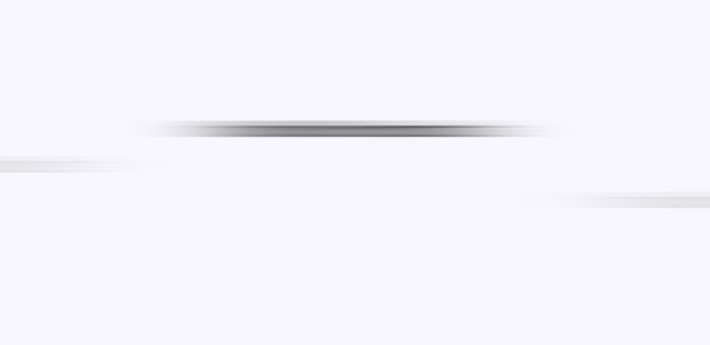
本 demo 地址:SVG Filter Motion Blur
mask 遮罩
有时候我们想做出一种过渡式的半透明效果,类似下图这样的
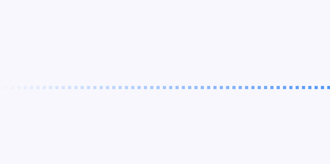
这时候就得借助 mask 属性了,因为图片与 mask 生成的渐变的 transparent 的重叠部分会变透明
.divider-grad-mask {
  background: linear-gradient(90deg, var(--blue-color) 0 50%, transparent 0 100%) 0 0 / 2rem 1rem;
  mask: linear-gradient(-90deg, black, transparent);
}
demo 地址:Gradient Mask Divider
和 clip-path 结合也会相当有意思,如下图所示的加载特效
demo 地址:Mask Loader
CSS 变量
鼠标跟踪
上篇提到了利用 Web Animations API 实现鼠标悬浮跟踪的效果,但其实 CSS 变量也能实现,而且更加简洁高效
在 CSS 中定义 x 和 y 变量,然后在 JS 中监听鼠标移动事件并获取鼠标坐标,更新对应的 x 和 y 变量即可
:root {
  --mouse-x: 0;
  --mouse-y: 0;
}

.target {
  transform: translate(var(--mouse-x), var(--mouse-y));
}

let mouseX = 0;
let mouseY = 0;
let x = 0;
let y = 0;
let offset = 50; // center
let windowWidth = window.innerWidth;
let windowHeight = window.innerHeight;
const percentage = (value, total) => (value / total) * 100;

window.addEventListener("mousemove", (e) => {
  mouseX = e.clientX;
  mouseY = e.clientY;
  x = percentage(mouseX, windowWidth) - offset;
  y = percentage(mouseY, windowHeight) - offset;
  document.documentElement.style.setProperty("--mouse-x", `${x}%`);
  document.documentElement.style.setProperty("--mouse-y", `${y}%`);
});

window.addEventListener("resize", () => {
  windowWidth = window.innerWidth;
  windowHeight = window.innerHeight;
});
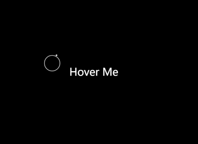
简化版地址:Mousemove Starter
残影效果
如果将鼠标跟踪和交错动画结合起来,再加点模糊滤镜,就能创作出帅气的残影效果

本 demo 地址:Motion Table - Delay
图片分割
为了做出一个图片碎片运动相关的动画,或者是一个拼图游戏,我们就要对一张图片进行分割,且块数、大小等都能随意控制,这时CSS变量就能发挥它的用场了
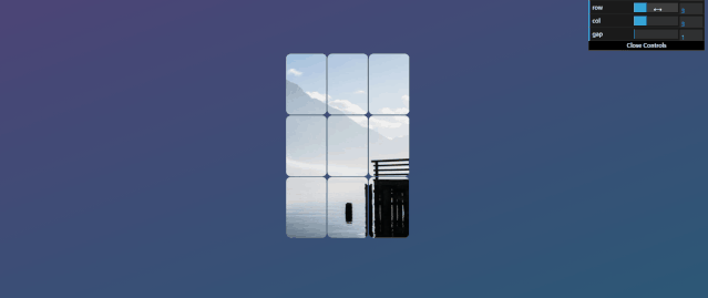
.puzzle {
  --puzzle-width: 16rem;
  --puzzle-height: 24rem;
  --puzzle-row: 3;
  --puzzle-col: 4;
  --puzzle-gap: 1px;
  --puzzle-frag-width: calc(var(--puzzle-width) / var(--puzzle-col));
  --puzzle-frag-height: calc(var(--puzzle-height) / var(--puzzle-row));
  --puzzle-img: url(...);

  display: flex;
  flex-wrap: wrap;
  width: calc(var(--puzzle-width) + calc(var(--puzzle-col) * var(--puzzle-gap) * 2));
  height: calc(var(--puzzle-height) + calc(var(--puzzle-row) * var(--puzzle-gap) * 2));

  .fragment {
    --x-offset: calc(var(--x) * var(--puzzle-frag-width) * -1);
    --y-offset: calc(var(--y) * var(--puzzle-frag-height) * -1);

    width: var(--puzzle-frag-width);
    height: var(--puzzle-frag-height);
    margin: var(--puzzle-gap);
    background: var(--puzzle-img) var(--x-offset) var(--y-offset) / var(--puzzle-width) var(--puzzle-height) no-repeat;
  }
}
设定好分割的行列,根据行列来动态计算切片的大小 拼图的总宽|高=拼图宽|高+列|行数 * 间隙 * 2 切片的显示利用背景定位的xy轴偏移,偏移量的计算方式:x|y坐标 * 切片宽|高 * -1
在JS中,设定好变量值并动态生成切片的xy坐标,即可完成图片的分割
class Puzzle {
  constructor(el, width = 16, height = 24, row = 3, col = 3, gap = 1) {
    this.el = el;
    this.fragments = el.children;
    this.width = width;
    this.height = height;
    this.row = row;
    this.col = col;
    this.gap = gap;
  }

  create() {
    this.ids = [...Array(this.row * this.col).keys()];
    const puzzle = this.el;
    const fragments = this.fragments;
    if (fragments.length) {
      Array.from(fragments).forEach((item) => item.remove());
    }
    puzzle.style.setProperty("--puzzle-width", this.width + "rem");
    puzzle.style.setProperty("--puzzle-height", this.height + "rem");
    puzzle.style.setProperty("--puzzle-row", this.row);
    puzzle.style.setProperty("--puzzle-col", this.col);
    puzzle.style.setProperty("--puzzle-gap", this.gap + "px");
    for (let i = 0; i < this.row; i++) {
      for (let j = 0; j < this.col; j++) {
        const fragment = document.createElement("div");
        fragment.className = "fragment";
        fragment.style.setProperty("--x", j);
        fragment.style.setProperty("--y", i);
        fragment.style.setProperty("--i", j + i * this.col);
        puzzle.appendChild(fragment);
      }
    }
  }
}

const puzzle = new Puzzle(document.querySelector(".puzzle"));
本demo地址:Split Image With CSS Variable
复杂动画
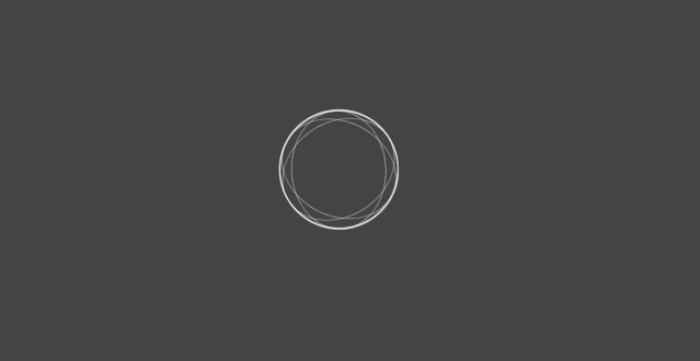
案例1
本demo地址:Elastic Love
案例2
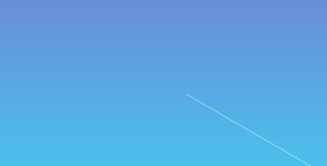
本demo地址:Infinite Line Animation
案例3
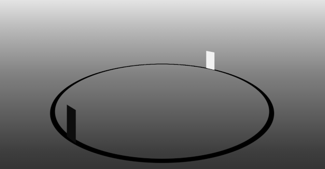
本demo地址:Orbit Reverse
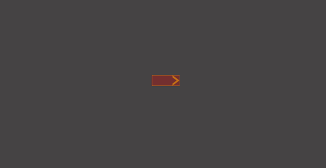
案例4
本demo地址:Motion Table - Solid Rotation
案例5
本demo地址:Motion Table - Symmetric Move
小结
以上几个复杂的动画或多或少都有以下的特征:
div很多,对布局的要求很高@keyframes很多,对动画的要求很高有的动画有较多的3d变换
案例5的教程已经写在之前的博文“画物语——CSS动画之美”里了,其余案例亦可以用此文提到的方法进行研究
笔者的CSS动画作品全放在这个集合里了:CSS Animation Collection
彩蛋
螺旋阶梯动画(灵感来自灰色的果实OP)
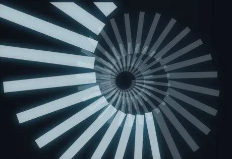
本demo地址:Spiral Stair Loading
❝外链演示效果,请点击阅读原文查看
❞

回复“加群”与大佬们一起交流学习~