
Python时间序列分析指南!
本文约7500字,建议阅读20+分钟
本文介绍了时间序列的定义、特征并结合实例给出了时间序列在Python中评价指标和方法。
时间序列是在规律性时间间隔上记录的观测值序列。本指南将带你了解在Python中分析给定时间序列的特征的全过程。
1. 什么是时间序列?
2. 如何在Python中导入时间序列?
3. 什么是面板数据?
4. 时间序列可视化
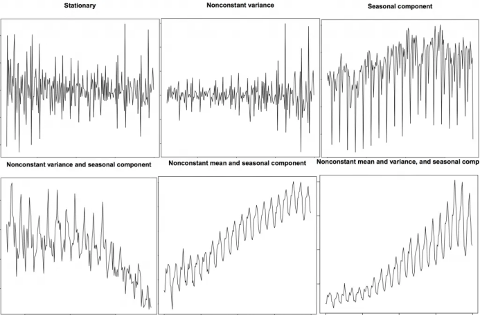
5. 时间序列的模式
6. 时间序列的加法和乘法
7. 如何将时间序列分解?
8. 平稳和非平稳时间序列
9. 如何获取平稳的时间序列?
10. 如何检验平稳性?
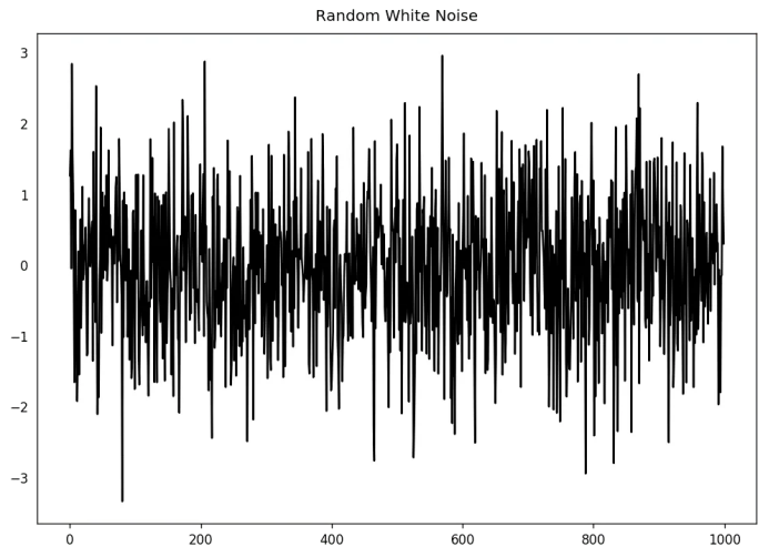
11. 白噪音和平稳序列的差异是什么?
12. 如何去除时间序列的线性分量?
13. 如何消除时间序列的季节性?
14. 如何检验时间序列的季节性?
15. 如何处理时间序列中的缺失值?
16. 什么是自回归和偏自回归函数?
17. 如何计算偏自回归函数?
18. 滞后图
19. 如何估计时间序列的预测能力?
20. 为什么以及怎样使时间序列平滑?
21. 如何使用Granger因果检验来获知时间序列是否对预测另一个序列帮助?
22. 下一步是什么?
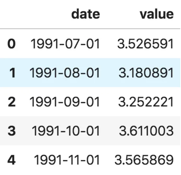
2. 如何在Python中导入时间序列?
from dateutil.parser import parseimport matplotlib as mplimport matplotlib.pyplot as pltimport seaborn as snsimport numpy as npimport pandas as pdplt.rcParams.update({'figure.figsize': (10, 7), 'figure.dpi': 120})# Import as Dataframedf = pd.read_csv('https://raw.githubusercontent.com/selva86/datasets/master/a10.csv', parse_dates=['date'])df.head()
ser = pd.read_csv('https://raw.githubusercontent.com/selva86/datasets/master/a10.csv', parse_dates=['date'], index_col='date')ser.head()
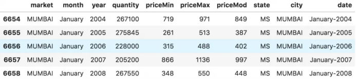
# dataset source: https://github.com/rouseguydf = pd.read_csv('https://raw.githubusercontent.com/selva86/datasets/master/MarketArrivals.csv')df = df.loc[df.market=='MUMBAI', :]df.head()
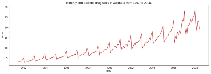
4. 时间序列可视化
# Time series data source: fpp pacakge in R.import matplotlib.pyplot as pltdf = pd.read_csv('https://raw.githubusercontent.com/selva86/datasets/master/a10.csv', parse_dates=['date'], index_col='date')# Draw Plotdef plot_df(df, x, y, title="", xlabel='Date', ylabel='Value', dpi=100):plt.figure(figsize=(16,5), dpi=dpi)plt.plot(x, y, color='tab:red')plt.gca().set(title=title, xlabel=xlabel, ylabel=ylabel)plt.show()plot_df(df, x=df.index, y=df.value, title='Monthly anti-diabetic drug sales in Australia from 1992 to 2008.')
 时间序列可视化
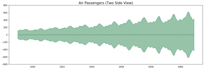
# Import datadf = pd.read_csv('datasets/AirPassengers.csv', parse_dates=['date'])x = df['date'].valuesy1 = df['value'].values# Plotfig, ax = plt.subplots(1, 1, figsize=(16,5), dpi= 120)plt.fill_between(x, y1=y1, y2=-y1, alpha=0.5, linewidth=2, color='seagreen')plt.ylim(-800, 800)plt.title('Air Passengers (Two Side View)', fontsize=16)plt.hlines(y=0, xmin=np.min(df.date), xmax=np.max(df.date), linewidth=.5)plt.show()
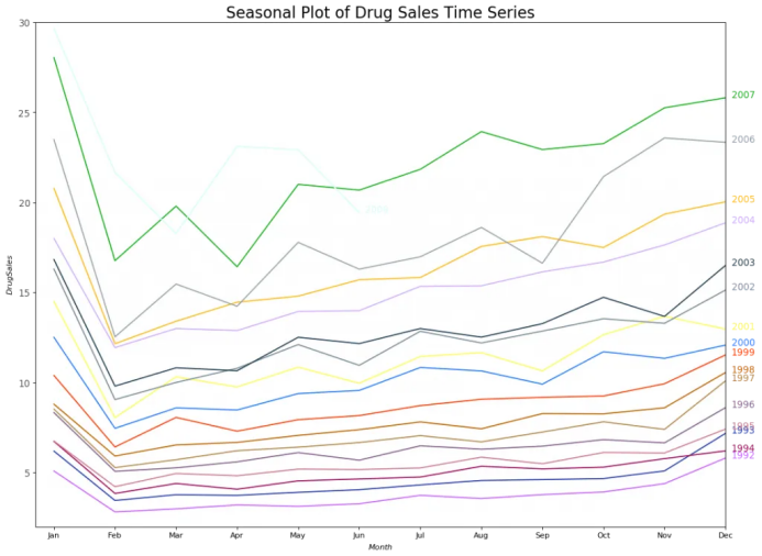
# Import Datadf = pd.read_csv('https://raw.githubusercontent.com/selva86/datasets/master/a10.csv', parse_dates=['date'], index_col='date')df.reset_index(inplace=True)# Prepare datadf['year'] = [d.year for d in df.date]df['month'] = [d.strftime('%b') for d in df.date]years = df['year'].unique()# Prep Colorsnp.random.seed(100)mycolors = np.random.choice(list(mpl.colors.XKCD_COLORS.keys()), len(years), replace=False)# Draw Plotplt.figure(figsize=(16,12), dpi= 80)for i, y in enumerate(years):if i > 0:plt.plot('month', 'value', data=df.loc[df.year==y, :], color=mycolors[i], label=y)plt.text(df.loc[df.year==y, :].shape[0]-.9, df.loc[df.year==y, 'value'][-1:].values[0], y, fontsize=12, color=mycolors[i])# Decorationplt.gca().set(xlim=(-0.3, 11), ylim=(2, 30), ylabel='$Drug Sales$', xlabel='$Month$')plt.yticks(fontsize=12, alpha=.7)plt.title("Seasonal Plot of Drug Sales Time Series", fontsize=20)plt.show()
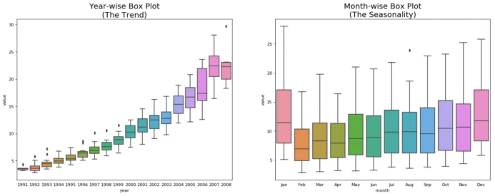
# Import Datadf = pd.read_csv('https://raw.githubusercontent.com/selva86/datasets/master/a10.csv', parse_dates=['date'], index_col='date')df.reset_index(inplace=True)# Prepare datadf['year'] = [d.year for d in df.date]df['month'] = [d.strftime('%b') for d in df.date]years = df['year'].unique()# Draw Plotfig, axes = plt.subplots(1, 2, figsize=(20,7), dpi= 80)sns.boxplot(x='year', y='value', data=df, ax=axes[0])sns.boxplot(x='month', y='value', data=df.loc[~df.year.isin([1991, 2008]), :])# Set Titleaxes[0].set_title('Year-wise Box Plot\n(The Trend)', fontsize=18);axes[1].set_title('Month-wise Box Plot\n(The Seasonality)', fontsize=18)plt.show()
5. 时间序列的模式
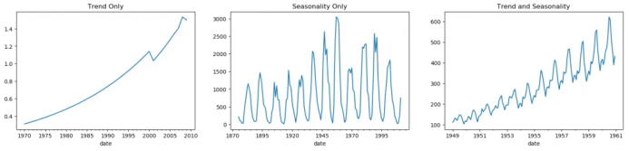
fig, axes = plt.subplots(1,3, figsize=(20,4), dpi=100)pd.read_csv('https://raw.githubusercontent.com/selva86/datasets/master/guinearice.csv', parse_dates=['date'], index_col='date').plot(title='Trend Only', legend=False, ax=axes[0])pd.read_csv('https://raw.githubusercontent.com/selva86/datasets/master/sunspotarea.csv', parse_dates=['date'], index_col='date').plot(title='Seasonality Only', legend=False, ax=axes[1])pd.read_csv('https://raw.githubusercontent.com/selva86/datasets/master/AirPassengers.csv', parse_dates=['date'], index_col='date').plot(title='Trend and Seasonality', legend=False, ax=axes[2])
6. 时间序列的加法和乘法
7. 怎样分解时间序列的成分?
from statsmodels.tsa.seasonal import seasonal_decomposefrom dateutil.parser import parse# Import Datadf = pd.read_csv('https://raw.githubusercontent.com/selva86/datasets/master/a10.csv', parse_dates=['date'], index_col='date')# Multiplicative Decompositionresult_mul = seasonal_decompose(df['value'], model='multiplicative', extrapolate_trend='freq')# Additive Decompositionresult_add = seasonal_decompose(df['value'], model='additive', extrapolate_trend='freq')# Plotplt.rcParams.update({'figure.figsize': (10,10)})result_mul.plot().suptitle('Multiplicative Decompose', fontsize=22)result_add.plot().suptitle('Additive Decompose', fontsize=22)plt.show()
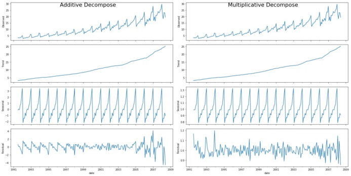
# Extract the Components ----# Actual Values = Product of (Seasonal * Trend * Resid)df_reconstructed = pd.concat([result_mul.seasonal, result_mul.trend, result_mul.resid, result_mul.observed], axis=1)df_reconstructed.columns = ['seas', 'trend', 'resid', 'actual_values']df_reconstructed.head()
8. 平稳和非平稳时间序列
9. 如何获取平稳的时间序列?
9.2 为什么要在预测之前将非平稳数据平稳化?
10. 怎样检验平稳性?
from statsmodels.tsa.stattools import adfuller, kpssdf = pd.read_csv('https://raw.githubusercontent.com/selva86/datasets/master/a10.csv', parse_dates=['date'])# ADF Testresult = adfuller(df.value.values, autolag='AIC')print(f'ADF Statistic: {result[0]}')print(f'p-value: {result[1]}')for key, value in result[4].items():print('Critial Values:')print(f' {key}, {value}')# KPSS Testresult = kpss(df.value.values, regression='c')print('\nKPSS Statistic: %f' % result[0])print('p-value: %f' % result[1])for key, value in result[3].items():print('Critial Values:')print(f' {key}, {value}')ADF Statistic: 3.14518568930674p-value: 1.0Critial Values:1%, -3.465620397124192Critial Values:5%, -2.8770397560752436Critial Values:10%, -2.5750324547306476KPSS Statistic: 1.313675p-value: 0.010000Critial Values:10%, 0.347Critial Values:5%, 0.463Critial Values:2.5%, 0.574Critial Values:1%, 0.739
11. 白噪音和平稳序列的差异是什么?
randvals = np.random.randn(1000)pd.Series(randvals).plot(title='Random White Noise', color='k')
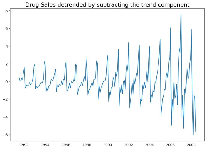
12. 怎样将时间序列去趋势化?
# Using scipy: Subtract the line of best fitfrom scipy import signaldf = pd.read_csv('https://raw.githubusercontent.com/selva86/datasets/master/a10.csv', parse_dates=['date'])detrended = signal.detrend(df.value.values)plt.plot(detrended)plt.title('Drug Sales detrended by subtracting the least squares fit', fontsize=16)

# Using statmodels: Subtracting the Trend Component.from statsmodels.tsa.seasonal import seasonal_decomposedf = pd.read_csv('https://raw.githubusercontent.com/selva86/datasets/master/a10.csv', parse_dates=['date'], index_col='date')result_mul = seasonal_decompose(df['value'], model='multiplicative', extrapolate_trend='freq')detrended = df.value.values - result_mul.trendplt.plot(detrended)plt.title('Drug Sales detrended by subtracting the trend component', fontsize=16)
13. 怎样对时间序列去季节化?
# Subtracting the Trend Component.df = pd.read_csv('https://raw.githubusercontent.com/selva86/datasets/master/a10.csv', parse_dates=['date'], index_col='date')# Time Series Decompositionresult_mul = seasonal_decompose(df['value'], model='multiplicative', extrapolate_trend='freq')# Deseasonalizedeseasonalized = df.value.values / result_mul.seasonal# Plotplt.plot(deseasonalized)plt.title('Drug Sales Deseasonalized', fontsize=16)plt.plot()

14. 怎样检验时间序列的季节性?
from pandas.plotting import autocorrelation_plotdf = pd.read_csv('https://raw.githubusercontent.com/selva86/datasets/master/a10.csv')# Draw Plotplt.rcParams.update({'figure.figsize':(9,5), 'figure.dpi':120})autocorrelation_plot(df.value.tolist())

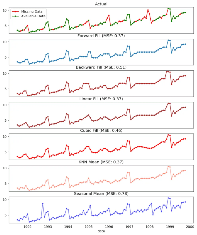
15. 如何处理时间序列当中的缺失值?
向后填充;
线性内插;
二次内插;
最邻近平均值;
对应季节的平均值。
# # Generate datasetfrom scipy.interpolate import interp1dfrom sklearn.metrics import mean_squared_errordf_orig = pd.read_csv('https://raw.githubusercontent.com/selva86/datasets/master/a10.csv', parse_dates=['date'], index_col='date').head(100)df = pd.read_csv('datasets/a10_missings.csv', parse_dates=['date'], index_col='date')fig, axes = plt.subplots(7, 1, sharex=True, figsize=(10, 12))plt.rcParams.update({'xtick.bottom' : False})## 1. Actual -------------------------------df_orig.plot(title='Actual', ax=axes[0], label='Actual', color='red', style=".-")df.plot(title='Actual', ax=axes[0], label='Actual', color='green', style=".-")axes[0].legend(["Missing Data", "Available Data"])## 2. Forward Fill --------------------------df_ffill = df.ffill()error = np.round(mean_squared_error(df_orig['value'], df_ffill['value']), 2)df_ffill['value'].plot(title='Forward Fill (MSE: ' + str(error) +")", ax=axes[1], label='Forward Fill', style=".-")## 3. Backward Fill -------------------------df_bfill = df.bfill()error = np.round(mean_squared_error(df_orig['value'], df_bfill['value']), 2)df_bfill['value'].plot(title="Backward Fill (MSE: " + str(error) +")", ax=axes[2], label='Back Fill', color='firebrick', style=".-")## 4. Linear Interpolation ------------------df['rownum'] = np.arange(df.shape[0])df_nona = df.dropna(subset = ['value'])f = interp1d(df_nona['rownum'], df_nona['value'])df['linear_fill'] = f(df['rownum'])error = np.round(mean_squared_error(df_orig['value'], df['linear_fill']), 2)df['linear_fill'].plot(title="Linear Fill (MSE: " + str(error) +")", ax=axes[3], label='Cubic Fill', color='brown', style=".-")## 5. Cubic Interpolation --------------------f2 = interp1d(df_nona['rownum'], df_nona['value'], kind='cubic')df['cubic_fill'] = f2(df['rownum'])error = np.round(mean_squared_error(df_orig['value'], df['cubic_fill']), 2)df['cubic_fill'].plot(title="Cubic Fill (MSE: " + str(error) +")", ax=axes[4], label='Cubic Fill', color='red', style=".-")# Interpolation References:# https://docs.scipy.org/doc/scipy/reference/tutorial/interpolate.html# https://docs.scipy.org/doc/scipy/reference/interpolate.html## 6. Mean of 'n' Nearest Past Neighbors ------def knn_mean(ts, n):out = np.copy(ts)for i, val in enumerate(ts):if np.isnan(val):n_by_2 = np.ceil(n/2)lower = np.max([0, int(i-n_by_2)])upper = np.min([len(ts)+1, int(i+n_by_2)])ts_near = np.concatenate([ts[lower:i], ts[i:upper]])out[i] = np.nanmean(ts_near)return outdf['knn_mean'] = knn_mean(df.value.values, 8)error = np.round(mean_squared_error(df_orig['value'], df['knn_mean']), 2)df['knn_mean'].plot(title="KNN Mean (MSE: " + str(error) +")", ax=axes[5], label='KNN Mean', color='tomato', alpha=0.5, style=".-")## 7. Seasonal Mean ----------------------------def seasonal_mean(ts, n, lr=0.7):"""Compute the mean of corresponding seasonal periodsts: 1D array-like of the time seriesn: Seasonal window length of the time series"""out = np.copy(ts)for i, val in enumerate(ts):if np.isnan(val):ts_seas = ts[i-1::-n] # previous seasons onlyif np.isnan(np.nanmean(ts_seas)):ts_seas = np.concatenate([ts[i-1::-n], ts[i::n]]) # previous and forwardout[i] = np.nanmean(ts_seas) * lrreturn outdf['seasonal_mean'] = seasonal_mean(df.value, n=12, lr=1.25)error = np.round(mean_squared_error(df_orig['value'], df['seasonal_mean']), 2)df['seasonal_mean'].plot(title="Seasonal Mean (MSE: " + str(error) +")", ax=axes[6], label='Seasonal Mean', color='blue', alpha=0.5, style=".-")
 缺失值处理
缺失值处理
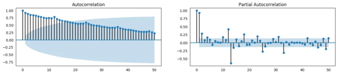
16. 什么是自相关和偏自相关函数?
from statsmodels.tsa.stattools import acf, pacffrom statsmodels.graphics.tsaplots import plot_acf, plot_pacfdf = pd.read_csv('https://raw.githubusercontent.com/selva86/datasets/master/a10.csv')# Calculate ACF and PACF upto 50 lags# acf_50 = acf(df.value, nlags=50)# pacf_50 = pacf(df.value, nlags=50)# Draw Plotfig, axes = plt.subplots(1,2,figsize=(16,3), dpi= 100)plot_acf(df.value.tolist(), lags=50, ax=axes[0])plot_pacf(df.value.tolist(), lags=50, ax=axes[1])
17. 怎样计算偏自相关函数?
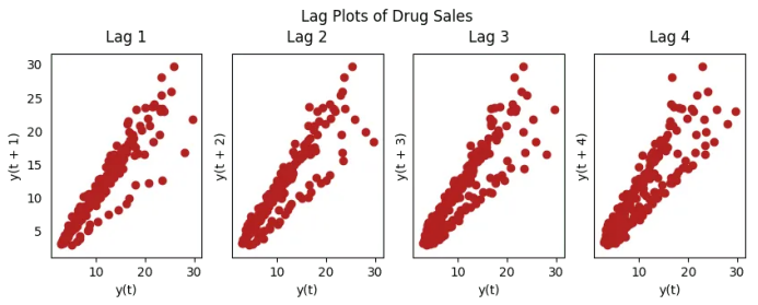
18. 滞后图
from pandas.plotting import lag_plotplt.rcParams.update({'ytick.left' : False, 'axes.titlepad':10})# Importss = pd.read_csv('https://raw.githubusercontent.com/selva86/datasets/master/sunspotarea.csv')a10 = pd.read_csv('https://raw.githubusercontent.com/selva86/datasets/master/a10.csv')# Plotfig, axes = plt.subplots(1, 4, figsize=(10,3), sharex=True, sharey=True, dpi=100)for i, ax in enumerate(axes.flatten()[:4]):lag_plot(ss.value, lag=i+1, ax=ax, c='firebrick')ax.set_title('Lag ' + str(i+1))fig.suptitle('Lag Plots of Sun Spots Area \n(Points get wide and scattered with increasing lag -> lesser correlation)\n', y=1.15)fig, axes = plt.subplots(1, 4, figsize=(10,3), sharex=True, sharey=True, dpi=100)for i, ax in enumerate(axes.flatten()[:4]):lag_plot(a10.value, lag=i+1, ax=ax, c='firebrick')ax.set_title('Lag ' + str(i+1))fig.suptitle('Lag Plots of Drug Sales', y=1.05)plt.show()

19. 怎样估计时间序列的预测能力?
# https://en.wikipedia.org/wiki/Approximate_entropyss = pd.read_csv('https://raw.githubusercontent.com/selva86/datasets/master/sunspotarea.csv')a10 = pd.read_csv('https://raw.githubusercontent.com/selva86/datasets/master/a10.csv')rand_small = np.random.randint(0, 100, size=36)rand_big = np.random.randint(0, 100, size=136)def ApEn(U, m, r):"""Compute Aproximate entropy"""def _maxdist(x_i, x_j):return max([abs(ua - va) for ua, va in zip(x_i, x_j)])def _phi(m):x = [[U[j] for j in range(i, i + m - 1 + 1)] for i in range(N - m + 1)]C = [len([1 for x_j in x if _maxdist(x_i, x_j) <= r]) / (N - m + 1.0) for x_i in x]return (N - m + 1.0)**(-1) * sum(np.log(C))N = len(U)return abs(_phi(m+1) - _phi(m))print(ApEn(ss.value, m=2, r=0.2*np.std(ss.value))) # 0.651print(ApEn(a10.value, m=2, r=0.2*np.std(a10.value))) # 0.537print(ApEn(rand_small, m=2, r=0.2*np.std(rand_small))) # 0.143print(ApEn(rand_big, m=2, r=0.2*np.std(rand_big))) # 0.7160.65147049703335340.53747752249734890.08983769407988440.7369242960384561# https://en.wikipedia.org/wiki/Sample_entropydef SampEn(U, m, r):"""Compute Sample entropy"""def _maxdist(x_i, x_j):return max([abs(ua - va) for ua, va in zip(x_i, x_j)])def _phi(m):x = [[U[j] for j in range(i, i + m - 1 + 1)] for i in range(N - m + 1)]C = [len([1 for j in range(len(x)) if i != j and _maxdist(x[i], x[j]) <= r]) for i in range(len(x))]return sum(C)N = len(U)return -np.log(_phi(m+1) / _phi(m))print(SampEn(ss.value, m=2, r=0.2*np.std(ss.value))) # 0.78print(SampEn(a10.value, m=2, r=0.2*np.std(a10.value))) # 0.41print(SampEn(rand_small, m=2, r=0.2*np.std(rand_small))) # 1.79print(SampEn(rand_big, m=2, r=0.2*np.std(rand_big))) # 2.420.78533113663800390.41887013457621214inf2.181224235989778del sys.path[0]
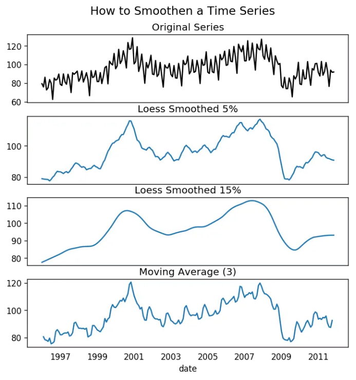
20. 为何要以及怎样对时间序列进行平滑处理?
在信号当中减小噪声的影响从而得到一个经过噪声滤波的序列近似。
平滑版的序列可用于解释原始序列本身的特征。
趋势更好地可视化。
from statsmodels.nonparametric.smoothers_lowess import lowessplt.rcParams.update({'xtick.bottom' : False, 'axes.titlepad':5})# Importdf_orig = pd.read_csv('datasets/elecequip.csv', parse_dates=['date'], index_col='date')# 1. Moving Averagedf_ma = df_orig.value.rolling(3, center=True, closed='both').mean()# 2. Loess Smoothing (5% and 15%)df_loess_5 = pd.DataFrame(lowess(df_orig.value, np.arange(len(df_orig.value)), frac=0.05)[:, 1], index=df_orig.index, columns=['value'])df_loess_15 = pd.DataFrame(lowess(df_orig.value, np.arange(len(df_orig.value)), frac=0.15)[:, 1], index=df_orig.index, columns=['value'])# Plotfig, axes = plt.subplots(4,1, figsize=(7, 7), sharex=True, dpi=120)df_orig['value'].plot(ax=axes[0], color='k', title='Original Series')df_loess_5['value'].plot(ax=axes[1], title='Loess Smoothed 5%')df_loess_15['value'].plot(ax=axes[2], title='Loess Smoothed 15%')df_ma.plot(ax=axes[3], title='Moving Average (3)')fig.suptitle('How to Smoothen a Time Series', y=0.95, fontsize=14)plt.show()
21. 如何使用Granger因果检验得知是否一个时间序列有助于预测另一个序列?
from statsmodels.tsa.stattools import grangercausalitytestsdf = pd.read_csv('https://raw.githubusercontent.com/selva86/datasets/master/a10.csv', parse_dates=['date'])df['month'] = df.date.dt.monthgrangercausalitytests(df[['value', 'month']], maxlag=2)Granger Causalitynumber of lags (no zero) 1ssr based F test: F=54.7797 , p=0.0000 , df_denom=200, df_num=1ssr based chi2 test: chi2=55.6014 , p=0.0000 , df=1likelihood ratio test: chi2=49.1426 , p=0.0000 , df=1parameter F test: F=54.7797 , p=0.0000 , df_denom=200, df_num=1Granger Causalitynumber of lags (no zero) 2ssr based F test: F=162.6989, p=0.0000 , df_denom=197, df_num=2ssr based chi2 test: chi2=333.6567, p=0.0000 , df=2likelihood ratio test: chi2=196.9956, p=0.0000 , df=2parameter F test: F=162.6989, p=0.0000 , df_denom=197, df_num=2
22. 下一步是什么?
这就是我们现在要说的。我们从非常基础的内容开始,理解了时间序列不同特征。一旦分析完成之后,接下来的一步是预测。
原文标题:
Time Series Analysis in Python – A Comprehensive Guide with Examples
原文链接:
https://www.machinelearningplus.com/time-series/time-series-analysis-python/
编辑:黄继彦