
R-ggTimeSeries | ggplot2: 热力日历图

我们平常的日历也可以当作可视化工具,适用于显示不同时间段,以及活动事件的组织情况。时间段通常以不同单位显示,例如日、周、月和年。今天我们最常用的日历形式是公历,每个月份的月历由7个垂直列组成(代表每周7天),如图所示。

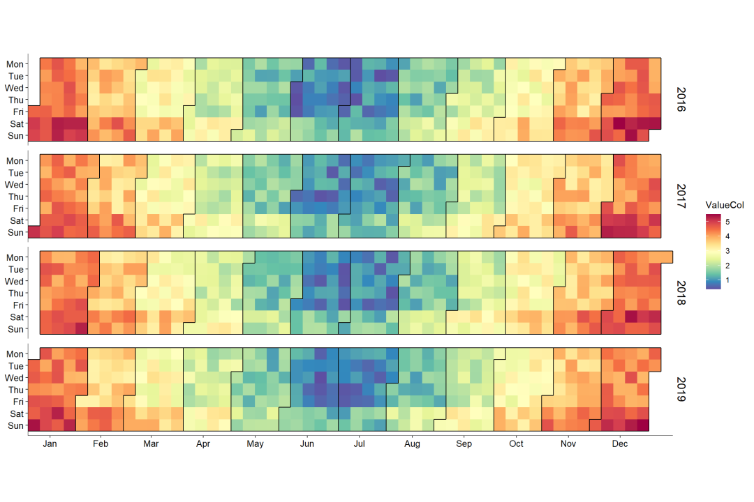
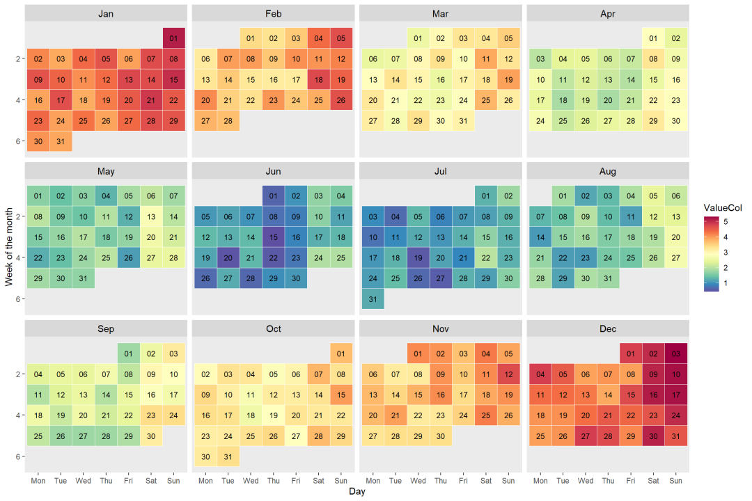
日历图的主要可视化形式有如图6-2-2所示的两种:以年为单位的日历图(见图6-2-2 (a))和以月为单位的日历图(见图6-2-2 (b))。日历图的数据结构一般为(Date,Value),将Value按照Date(日期)在日历上展示,其中Value映射到颜色。
1. ggTimeSeries绘图
R中ggTimeSeries 包[1]的ggplot_calendar_heatmap()函数可以绘制如图6-2-2(a)所示的日历图,但是不能设定日历图每个时间单元的边框格式。
使用stat_calendar_heatmap()函数和ggplot2包的ggplot()函数可以调整日历图每个时间单元的边框格式,具体代码如下所示。其关键是使用as.integer(strftime())日期型处理组合函数获取某天对应所在的年份、月份、周数等数据信息。
#setwd("D:/R/working_documents1")library(ggplot2)library(data.table) # 数据格式依赖library(ggTimeSeries)library(RColorBrewer)
# 构造随机数据set.seed(2134)dat <- data.table(date = seq(as.Date("2016-01-01"), as.Date("2019-12-31"), "days"),ValueCol = runif(1461))dat[, ValueCol := ValueCol + (strftime(date, "%u") %in% c(6,7)*runif(1)*0.75)][, ValueCol := ValueCol + (abs(as.numeric(strftime(date, "%m")) - 6.5))*runif(1)*0.75][, ':='(Year = as.integer(strftime(date, "%Y")), # add new columnmonth = as.integer(strftime(date, "%m")),week = as.integer(strftime(date, "%W")))] # 添加列MonthLabels <- dat[, list(meanWkofYr = mean(week)), by = c("month")][, month := month.abb[month]]
ggplot(data = dat, aes(date = date, fill = ValueCol)) +stat_calendar_heatmap() +scale_fill_gradientn(colours = rev(brewer.pal(11, "Spectral"))) +scale_y_continuous(name = NULL,breaks = seq(7, 1, -1),labels = c("Mon", "Tue", "Wed","Thu", "Fri", "Sat", "Sun")) +scale_x_continuous(name = NULL,breaks = MonthLabels$meanWkofYr,labels = MonthLabels$month,expand = c(0,0)) +facet_wrap(~Year, ncol = 1, strip.position = "right") +theme(panel.background = element_blank(),panel.border = element_blank(),strip.background = element_blank(),strip.text = element_text(size = 13, face = "plain", color = "black"),axis.line = element_line(colour = "black", size = 0.25),axis.title = element_text(size = 10, face = "plain", color = "black"),axis.text = element_text(size = 10, face = "plain", color = "black"))
2.geom_tile()
使用R中ggplot2包的geom_tile()函数,借助facet_wrap()函数分面,就可以绘制如图6-2-2(b)所示的以月为单位的日历图,具体代码如下所示。
label_mons <- c("Jan", "Feb", "Mar", "Apr", "May", "Jun", "Jul","Aug", "Sep", "Oct", "Nov", "Dec")label_wik <- c("Mon", "Tue", "Wed", "Thu", "Fri", "Sat", "Sun")dat19 <- dat[Year == 2017, list(date, ValueCol, month, week)][, ':='(weekday = as.integer(strftime(date, "%u")), # 周数yearmonth = strftime(date, "%m%Y"), # 月数day = strftime(date, "%d")) # 天数][, ':='(monthf = factor(x = month, levels = as.character(1:12),labels = label_mons, ordered = TRUE),weekdayf = factor(x = weekday, levels = 1:7,labels = label_wik, ordered = TRUE),yearmonthf = factor(x = yearmonth))][, ':='(monthweek = 1 + week - min(week)), by = .(monthf)] # 分组聚合
label_mons <- c("Jan", "Feb", "Mar", "Apr", "May", "Jun", "Jul","Aug", "Sep", "Oct", "Nov", "Dec")label_wik <- c("Mon", "Tue", "Wed", "Thu", "Fri", "Sat", "Sun")dat19 <- dat[Year == 2017, list(date, ValueCol, month, week)][, ':='(weekday = as.integer(strftime(date, "%u")), # 周数day = strftime(date, "%d")) # 天数][, ':='(monthf = factor(x = month, levels = as.character(1:12),labels = label_mons, ordered = TRUE),weekdayf = factor(x = weekday, levels = 1:7,labels = label_wik, ordered = TRUE))][, ':='(monthweek = 1 + week - min(week)), by = .(monthf)] # 分组聚合
ggplot(dat19, aes(weekdayf, monthweek, fill = ValueCol)) +geom_tile(color = "white") +geom_text(aes(label = day), size = 3) +scale_fill_gradientn(colours = rev(brewer.pal(11, "Spectral"))) +facet_wrap(~monthf, nrow = 3) +scale_y_reverse(name = "Week of the month") +xlab("Day") +theme(strip.text = element_text(size = 11, face = "plain", color = "black"),panel.grid = element_blank())
感谢誉辉优化《R语言数据可视化之美》关于热力日历图的代码
参考:
[1] ggTimeSeries 包的参考网址:http://www.ggplot2-exts.org/ggTimeSeries.html

如需联系EasyShu团队
请加微信:EasyCharts
微信公众号【EasyShu】博文代码集合地址
https://github.com/Easy-Shu/EasyShu-WeChat
《R语言数据可视化之美》增强版

增强版配套源代码下载地址
Github
https://github.com/Easy-Shu/Beautiful-Visualization-with-R
百度云下载
https://pan.baidu.com/s/1ZBKQCXW9TDnpM_GKRolZ0w
提取码:jpou