
Matplotlib 绘制疫情饼状 动图
点击上方蓝色字体,选择星标公众号

这是「Python与算法社区」第 416 篇原创
本文使用 matplotlib,绘制 COVID-19 过去半年四个国家的每天死亡人数,获取数据的API接口为:
https://raw.githubusercontent.com/CSSEGISandData/COVID-19/master/csse_covid_19_data/csse_covid_19_time_series/time_series_covid19_deaths_global.csv
数据处理的逻辑如下,参考前几天推送的处理逻辑:
df = pd.read_csv('a.csv', delimiter=',', header='infer')
df_interest = df.loc[df['Country/Region'].isin(['United Kingdom', 'US', 'Italy', 'Germany'])& df['Province/State'].isna()]
df_interest.rename(index=lambda x: df_interest.at[x, 'Country/Region'], inplace=True)
df1 = df_interest.transpose()
df1 = df1.drop(['Province/State', 'Country/Region', 'Lat', 'Long'])
df1 = df1.loc[(df1 != 0).any(1)]
df1.index = pd.to_datetime(df1.index)
为了更方便大家理解,展示df_interest的部分数据:

整理后df1的部分数据:

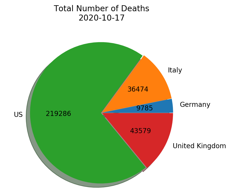
可以看到截止昨天,美国COVID-19死亡人数已有:219286
绘制饼图动画展示的逻辑如下:
fig,ax = plt.subplots()
explode=[0.01,0.01,0.01,0.01]


def getmepie(i):
    def absolute_value(val):
        a = np.round(val/100.*df1.head(i).max().sum(), 0)
        return int(a)
    ax.clear()
    plot = df1.head(i).max().plot.pie(y=df1.columns,autopct=absolute_value, label='',explode = explode, shadow = True)
    plot.set_title('Total Number of Deaths\n' + str(df1.index[min( i, len(df1.index)-1 )].strftime('%Y-%m-%d')), fontsize=12)


animator = ani.FuncAnimation(fig, getmepie, interval = 200)
plt.show()绘制动画只有这一行,调用FuncAnimation,它的第二个参数为上面定义的函数getmepie:
animator = ani.FuncAnimation(fig, getmepie, interval = 200)
plt.show()
绘制后的饼图部分 gif 动画,录制效果如下:

最后一帧饼图形状:
关于本文有任何疑问欢迎留言或加入讨论群,在群里统一发放COVID-19数据文件:
长按加群讨论+数据文件发放
评论