
如何用纯 CSS 创作一支诱人的冰棍
问:如何用css实现一支诱人的冰棍
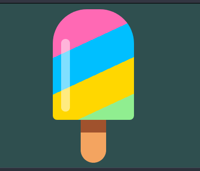
动态效果预览
复制跳转下方连接可以去查看动态效果
https://codepen.io/comehope/pen/vrxzMw点击预览
源代码下载
https://github.com/comehope/front-end-daily-challenges
代码解读
定义 dom,容器中包含 2 个元素:
<div class="ice-lolly">
    <div class="flavors"></div>
    <div class="stick"></div>
</div>
居中显示:
body {
    margin: 0;
    height: 100vh;
    display: flex;
    align-items: center;
    justify-content: center;
    background-color: darkslategray;
}
绘制出冰棍的外形:
.flavors {
    width: 19em;
    height: 26em;
    font-size: 10px;
    border-radius: 8em 8em 1em 1em;
}
给冰棍上色:
.flavors {
    position: relative;
    overflow: hidden;
}

.flavors::before {
    content: '';
    position: absolute;
    width: 140%;
    height: 120%;
    background: linear-gradient(
        hotpink 0%,
        hotpink 25%,
        deepskyblue 25%,
        deepskyblue 50%,
        gold 50%,
        gold 75%,
        lightgreen 75%,
        lightgreen 100%);
    z-index: -1;
    left: -20%;
    transform: rotate(-25deg);
}

来一点光照效果:
.flavors::after {
    content: '';
    position: absolute;
    width: 2em;
    height: 17em;
    background-color: rgba(255, 255, 255, 0.5);
    left: 2em;
    bottom: 2em;
    border-radius: 1em;
}

画出冰棍筷子:
.stick {
    position: relative;
    width: 6em;
    height: 8em;
    background-color: sandybrown;
    left: calc(50% - 6em / 2);
    border-radius: 0 0 3em 3em;
}

给冰棍筷子加一点阴影,增加立体感:
.stick::after {
    content: '';
    position: absolute;
    width: inherit;
    height: 2.5em;
    background-color: sienna;
}
让冰棍的色彩滚动起来:
.flavors::before {
    animation: moving 100s linear infinite;
}

@keyframes moving {
    to {
        background-position: 0 1000vh;
    }
}
最后,增加交互效果,当鼠标悬停时才播放动画:
.flavors::before {
    animation-play-state: paused;
}

.ice-lolly:hover .flavors::before {
    animation-play-state: running;
}
大功告成!
原文出处:https://segmentfault.com/a/1190000015257561
CSS真是神秘~
针对这个题目,你的解决方案又是什么呢?
不妨在下面的留言给出,学习共勉下~
码字不易,走过路过可否点个 在看,点个赞👍先谢谢了!
ε=ε=ε=┏(゜ロ゜;)┛
最后
❝有疑问的同学 欢迎 评论区讨论,也欢迎大家加入我的前端技术交流群 来讨论。搜索《前端阳光》公众号,回复加群吧!
评论