
用css实现转动的阴阳太极图

问:如何用css和html画出旋转的阴阳太极图
需要的知识
1.div标签的运用 2.id选择器,后代选择器, 3.简单的css样式长,宽,高,背景颜色,浮动,绝对定位,边框弧度 4.div的布局特点
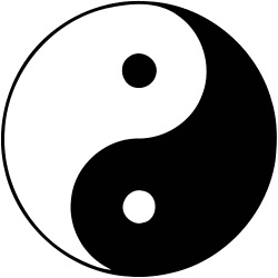
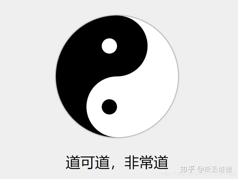
静态的完成效果
开始
HTML部分
<!DOCTYPE html>
<html lang="zh">
<head>
    <meta charset="UTF-8">
    <meta name="viewport" content="width=device-width, initial-scale=1.0">
    <title>太极页面</title>
</head>
<body>
    <div id="八卦-wrapper">
        <div id="八卦">
            <div></div>
            <div></div>
            <div></div>
            <div></div>
            <div></div>
            <div></div>
        </div>
        <div id="八卦-描述">道可道,非常道</div>
    </div>
</body>
</html>
HTML部分说明(不要吐槽中文id哈哈哈,纯属为了方便讲解)
1.其中最外面的id为八卦-wrapper为包住八卦的最大的div 2.id 为八卦的div为上图中的八卦 3.八卦里面的div为 下图指示部分 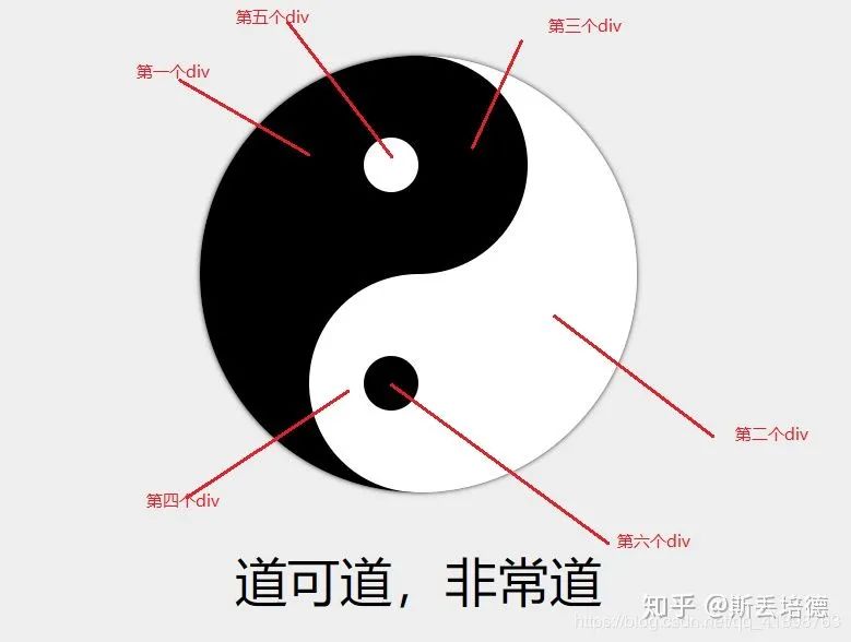
CSS部分
CSS部分说明
通过改变每个div的大小颜色,浮动的left,top值,改变每个div的border-redius的值来画这个八卦图
<style>
        * {
            box-sizing: border-box;
            margin: 0px;
            padding: 0px;
        }
        body {
            background-color: #eeeeee;
        }
        #八卦 {

            width: 400px;
            height: 400px;
            border-radius: 200px;
            position: relative;
            overflow: hidden;
            animation: x 10s linear infinite;
            box-shadow: 0px 0px 5px 0px rgba(0, 0, 0, 1);
        }
        #八卦>div:first-child {
            width: 50%;
            height: 100%;
            position: absolute;
            left: 0;
            background-color: black;
        }

        #八卦>div:nth-child(2) {
            width: 50%;
            height: 100%;
            position: absolute;
            right: 0;
            background-color: white;
        }
        #八卦>div:nth-child(3) {
            width: 200px;
            height: 200px;
            position: absolute;
            left: 50%;
            margin-left: -100px;
            border-radius: 50%;
            background-color: black;
        }
        #八卦>div:nth-child(4) {
            width: 200px;
            height: 200px;
            position: absolute;
            left: 50%;
            top: 50%;
            margin-left: -100px;
            border-radius: 50%;
            background-color: white;
        }
        #八卦>div:nth-child(5) {
            width: 50px;
            height: 50px;
            position: absolute;
            left: 50%;
            top: 75px;
            margin-left: -50px;
            border-radius: 50%;
            background-color: white;
        }
        #八卦>div:nth-child(6) {
            width: 50px;
            height: 50px;
            position: absolute;
            left: 50%;
            bottom: 75px;
            margin-left: -50px;
            border-radius: 50%;
            background-color: black;
        }
        #八卦-wrapper {
            height: 100vh;
            display: flex;
            justify-content: center;
            align-items: center;
            flex-direction: column;
        }
        #八卦-描述 {
            margin-top: 1em;
            font-size: 3em;
        }
   </style>
完整代码
<!DOCTYPE html>
<html lang="zh">

<head>
    <meta charset="UTF-8">
    <meta name="viewport" content="width=device-width, initial-scale=1.0">
    <title>太极页面</title>
    <style>
        * {
            box-sizing: border-box;
            margin: 0px;
            padding: 0px;
        }

        body {
            background-color: #eeeeee;
        }


        #八卦 {

            width: 400px;
            height: 400px;
            border-radius: 200px;
            position: relative;
            overflow: hidden;
            animation: x 10s linear infinite;
            box-shadow: 0px 0px 5px 0px rgba(0, 0, 0, 1);
        }


        #八卦>div:first-child {
            width: 50%;
            height: 100%;
            position: absolute;
            left: 0;
            background-color: black;
        }

        #八卦>div:nth-child(2) {

            width: 50%;
            height: 100%;
            position: absolute;
            right: 0;
            background-color: white;
        }

        #八卦>div:nth-child(3) {
            width: 200px;
            height: 200px;
            position: absolute;
            left: 50%;
            margin-left: -100px;
            border-radius: 50%;
            background-color: black;
        }


        #八卦>div:nth-child(4) {
            width: 200px;
            height: 200px;
            position: absolute;
            left: 50%;
            top: 50%;
            margin-left: -100px;
            border-radius: 50%;
            background-color: white;
        }


        #八卦>div:nth-child(5) {
            width: 50px;
            height: 50px;
            position: absolute;
            left: 50%;
            top: 75px;
            margin-left: -50px;
            border-radius: 50%;
            background-color: white;
        }


        #八卦>div:nth-child(6) {
            width: 50px;
            height: 50px;
            position: absolute;
            left: 50%;
            bottom: 75px;
            margin-left: -50px;
            border-radius: 50%;
            background-color: black;
        }


        #八卦-wrapper {
            height: 100vh;
            display: flex;
            justify-content: center;
            align-items: center;
            flex-direction: column;
        }


        #八卦-描述 {
            margin-top: 1em;
            font-size: 3em;
        }

    </style>
</head>

<body>
    <div id="八卦-wrapper">
        <div id="八卦">
            <div></div>
            <div></div>
            <div></div>
            <div></div>
            <div></div>
            <div></div>
        </div>
        <div id="八卦-描述">道可道,非常道</div>
    </div>
</body>

</html>
注意事项
1.id可以用中文 ,但是文件名和路径不能(最好不要) 2.一定要注意清楚浏览其的默认样式 3.能不写死就千万不要写死,最好用百分比代替像素(防止用户改变分辨率造成的bug) 4.父元素relative,子元素absolute 5.注意几个div的偏移位置,可以加boder: 1px,solid,red;来确定位置后调试 6.第27行代码为让八卦转起来在静态八卦中不起作用
让八卦转起来
/*先定义一个@keyframes 命名为x*/
 @keyframes x {
            from {
                transform: rotate(0deg);
            }
            to {
                transform: rotate(360deg);
            }
        }
/*在id="八卦"中添加样式  animation: x 10s linear infinite;*/
 #八卦 {

            width: 400px;
            height: 400px;
            border-radius: 200px;
            position: relative;
            overflow: hidden;
            animation: x 10s linear infinite;/*添加此行*/
            box-shadow: 0px 0px 5px 0px rgba(0, 0, 0, 1);
        }
转动的八卦完整代码
<!DOCTYPE html>
<html lang="zh">

<head>
    <meta charset="UTF-8">
    <meta name="viewport" content="width=device-width, initial-scale=1.0">
    <title>太极页面</title>
    <style>
        * {
            box-sizing: border-box;
            margin: 0px;
            padding: 0px;
        }

        body {
            background-color: #eeeeee;
        }

  @keyframes x {
            from {
                transform: rotate(0deg);
            }

            to {
                transform: rotate(360deg);
            }
        }
        #八卦 {

            width: 400px;
            height: 400px;
            border-radius: 200px;
            position: relative;
            overflow: hidden;
            animation: x 10s linear infinite;
            box-shadow: 0px 0px 5px 0px rgba(0, 0, 0, 1);
        }


        #八卦>div:first-child {
            width: 50%;
            height: 100%;
            position: absolute;
            left: 0;
            background-color: black;
        }

        #八卦>div:nth-child(2) {

            width: 50%;
            height: 100%;
            position: absolute;
            right: 0;
            background-color: white;
        }

        #八卦>div:nth-child(3) {
            width: 200px;
            height: 200px;
            position: absolute;
            left: 50%;
            margin-left: -100px;
            border-radius: 50%;
            background-color: black;
        }


        #八卦>div:nth-child(4) {
            width: 200px;
            height: 200px;
            position: absolute;
            left: 50%;
            top: 50%;
            margin-left: -100px;
            border-radius: 50%;
            background-color: white;
        }


        #八卦>div:nth-child(5) {
            width: 50px;
            height: 50px;
            position: absolute;
            left: 50%;
            top: 75px;
            margin-left: -50px;
            border-radius: 50%;
            background-color: white;
        }


        #八卦>div:nth-child(6) {
            width: 50px;
            height: 50px;
            position: absolute;
            left: 50%;
            bottom: 75px;
            margin-left: -50px;
            border-radius: 50%;
            background-color: black;
        }


        #八卦-wrapper {
            height: 100vh;
            display: flex;
            justify-content: center;
            align-items: center;
            flex-direction: column;
        }


        #八卦-描述 {
            margin-top: 1em;
            font-size: 3em;
        }

    </style>
</head>

<body>
    <div id="八卦-wrapper">
        <div id="八卦">
            <div></div>
            <div></div>
            <div></div>
            <div></div>
            <div></div>
            <div></div>
        </div>
        <div id="八卦-描述">道可道,非常道</div>
    </div>
</body>

</html>
拓展:手机端的转动的八卦
在原代码不变的情况下使用
@media(max-width:500px){ }来设置移动端的样式。
(其中设置的样式为当在移动端的时候所展现的样式,没有在其中设置的样式默认使用客户端的样式)
移动端完整代码
<!DOCTYPE html>
<html lang="zh">

<head>
    <meta charset="UTF-8">
    <meta name="viewport" content="width=device-width, initial-scale=1.0">
    <title>太极页面</title>
    <style>
        * {
            box-sizing: border-box;
            margin: 0px;
            padding: 0px;
        }

        body {
            background-color: #eeeeee;
        }

        @keyframes x {
            from {
                transform: rotate(0deg);
            }

            to {
                transform: rotate(360deg);
            }
        }

        #八卦 {

            width: 400px;
            height: 400px;
            border-radius: 200px;
            position: relative;
            overflow: hidden;
            animation: x 10s linear infinite;
            box-shadow: 0px 0px 5px 0px rgba(0, 0, 0, 1);
        }

        @media (max-width:500px) {
            #八卦 {
                width: 200px;
                height: 200px;
            }
        }

        #八卦>div:first-child {
            width: 50%;
            height: 100%;
            position: absolute;
            left: 0;
            background-color: black;
        }

        #八卦>div:nth-child(2) {

            width: 50%;
            height: 100%;
            position: absolute;
            right: 0;
            background-color: white;
        }

        #八卦>div:nth-child(3) {
            width: 200px;
            height: 200px;
            position: absolute;
            left: 50%;
            margin-left: -100px;
            border-radius: 50%;
            background-color: black;
        }

        @media (max-width:500px) {
            #八卦>div:nth-child(3) {
                width: 100px;
                height: 100px;
                margin-left: -50px;
            }
        }

        #八卦>div:nth-child(4) {
            width: 200px;
            height: 200px;
            position: absolute;
            left: 50%;
            top: 50%;
            margin-left: -100px;
            border-radius: 50%;
            background-color: white;
        }

        @media (max-width:500px) {
            #八卦>div:nth-child(4) {
                width: 100px;
                height: 100px;
                margin-left: -50px;
            }
        }

        #八卦>div:nth-child(5) {
            width: 50px;
            height: 50px;
            position: absolute;
            left: 50%;
            top: 75px;
            margin-left: -50px;
            border-radius: 50%;
            background-color: white;
        }

        @media (max-width:500px) {
            #八卦>div:nth-child(5) {
                width: 25px;
                height: 25px;
                top: 37.5px;
                margin-left: -25px;
            }
        }

        #八卦>div:nth-child(6) {
            width: 50px;
            height: 50px;
            position: absolute;
            left: 50%;
            bottom: 75px;
            margin-left: -50px;
            border-radius: 50%;
            background-color: black;
        }

        @media (max-width:500px) {
            #八卦>div:nth-child(6) {
                width: 25px;
                height: 25px;
                bottom: 37.5px;
                margin-left: -25px;
            }

        }

        #八卦-wrapper {
            height: 100vh;
            display: flex;
            justify-content: center;
            align-items: center;
            flex-direction: column;
        }


        #八卦-描述 {
            margin-top: 1em;
            font-size: 3em;
        }

        @media (max-width:500px) {
            #八卦-描述 {
                margin-top: 0.5em;
                font-size: 1.5em;
            }
        }
    </style>
</head>

<body>
    <div id="八卦-wrapper">
        <div id="八卦">
            <div></div>
            <div></div>
            <div></div>
            <div></div>
            <div></div>
            <div></div>
        </div>
        <div id="八卦-描述">道可道,非常道</div>
    </div>
</body>

</html>
CSS真是神秘~
针对这个题目,你的解决方案又是什么呢?
不妨在下面的留言给出,学习共勉下~
码字不易,走过路过来个赞可否👍先谢谢了!
ε=ε=ε=┏(゜ロ゜;)┛
最后
❝有疑问的同学 欢迎 评论区讨论,也欢迎大家加入我的前端技术交流群 来讨论。搜索《前端阳光》公众号,回复加群吧!
评论