
可爱极了,用 CSS 实现一个超可爱的猫咪!

介绍
本期我们通过vite+scss去完成一个橘猫心情变化的创意动画,这里的逻辑我们将不使用任何js代码,仅依靠css来完成,所以,通过本期的动画,你可以到一些css动画和绘制的一些技巧。
正文
1.搭建与结构
yarn add vite sass sass-loader
复制代码
我们是用vite和sass去完成项目的构建,和样式的书写,所以我们先安装下他们。
<div id="app">
    <div class="warrper">
        <div class="sun">div>
        <div class="cloud">div>
        <div class="cat">
            <div class="eye left"><div class="eye-hide">div>div>
            <div class="eye right"><div class="eye-hide">div>div>
            <div class="nose">div>
            <div class="mouth">div>
        div>
    div>
div>
复制代码
在html我们先写出结构来。div#app作为主界面去填满一屏,而div.warrper就作为主要内容的展示区域也就是那个圆圈。然后,在圆圈里面我们放太阳div.sun,云朵div.cloud,猫div.cat,当然猫里面还有眼睛鼻子嘴巴这些,至于猫的耳朵就用两个伪类做个三角形去实现。
2.变量与界面
$cat:rgb(252, 180, 125);
:root{
--bgColor:rgb(81, 136, 168);
--eyeHideTop:0px;
--cloudLeft:45%;
--mouthRadius:10px 10px 0 0;
}
#app{
width: 100%;
height: 100vh;
position: relative;
display: flex;
justify-content: center;
align-items: center;
background-image: repeating-linear-gradient(0deg, hsla(340,87%,75%,0.2) 0px, hsla(340,87%,75%,0.2) 30px,transparent 30px, transparent 60px),repeating-linear-gradient(90deg, hsla(340,87%,75%,0.2) 0px, hsla(340,87%,75%,0.2) 30px,transparent 30px, transparent 60px),linear-gradient(90deg, rgb(255,255,255),rgb(255,255,255));
}
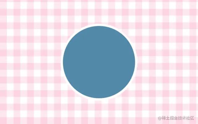
.warrper{
width: 320px;
height: 320px;
border-radius: 50%;
border: 10px solid white;
position: relative;
overflow: hidden;
background-color: var(--bgColor);
transition: background-color 1s linear;
cursor:url("./assets/fish.png"),default;
&:hover{
--bgColor:rgb(178, 222, 247);
--eyeHideTop:-20px;
--cloudLeft:100%;
--mouthRadius:0 0 10px 10px;
}
}
复制代码
我们先定义猫的主色调,还有一些要变化的颜色和距离,因为我们移入将通过css3去改变这些属性,来达到某些动画的实现。
我们期望的是,当鼠标移入圆圈后,天空变晴,云朵退散,猫开心充满精神,所以,bgColor:天空颜色,eyeHideTop猫的眼皮y轴距离,cloudLeft云朵x轴偏移距离,mouthRadius猫嘴巴的圆角值。目前来说,当鼠标移入div.warrper后,这些值都会发生变化。另外,我自定义了鼠标图标移入圆圈变成了一条鱼(即cursor:url(图片地址))。这里的hover后的值是我事先算好的,如果大家重新开发别的动画可以一边做一边算。
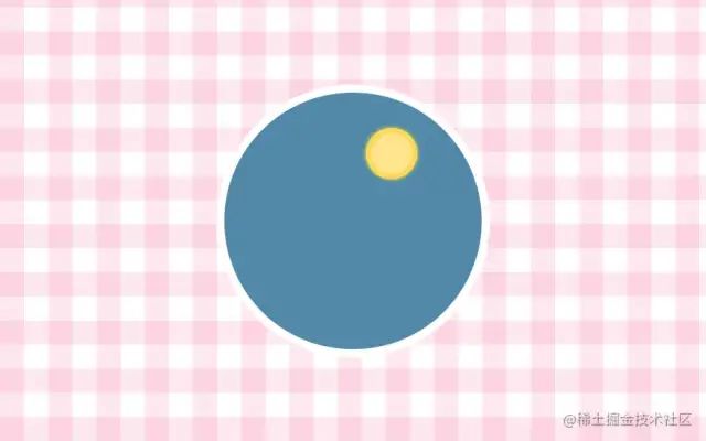
3.太阳与云朵
.sun{
    width: 50px;
    height: 50px;
    position: absolute;
    background-color: rgb(255, 229, 142);
    border:7px solid rgb(253, 215, 91);
    border-radius: 50%;
    left: 55%;
    top: 14%;
    box-shadow: 0 0 6px rgb(255, 241, 48);
}
复制代码
太阳我们就画个圆圈定好位置,然后用box-shadow投影去完成一点发光的效果。
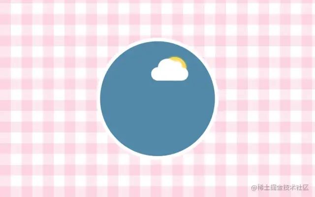
然后,我们再开始画云朵~
.cloud{
    width: 100px;
    height: 36px;
    background-color: white;
    position: absolute;
    transition: left .6s linear;
    left: var(--cloudLeft);
    top: 23%;
    border-radius: 36px;
    animation: bouncy 2s ease-in-out infinite;
    &::before{
        content: '';
        width: 50px;
        height: 50px;
        background-color: white;
        border-radius: 50%;
        position: absolute;
        top: -23px;
        left: 18px;
    }
    &::after{
        content: '';
        width: 26px;
        height: 26px;
        background-color: white;
        border-radius: 50%;
        position: absolute;
        top: -16px;
        left: 56px;
    }
}

@keyframes bouncy {
    0% {
      transform: scale(1);
    }
    50% {
        transform: scale(1.05);
    }
    100% {
        transform: scale(1);
    }
}
复制代码
云朵很简单,我们就是画一个圆角矩形,然后用两个伪类画一个大圆和小圆叠在一起就非常像云了,另外,我们再加个animation动画,让他时大时小,有动的感觉。
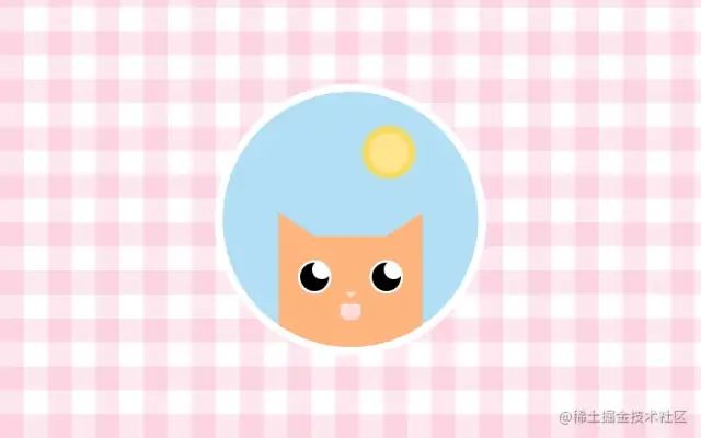
4.橘猫与动画
.cat{
    width: 180px;
    height: 160px;
    background-color: $cat;
    position: absolute;
    bottom: -20px;
    left: 50%;
    margin-left: -90px;
    animation: wait 2s ease-in-out infinite;
    &::after,
    &::before{
        content: '';
        display: block;
        border-style: solid;
        border-width: 20px 30px;
        position: absolute;
        top: -30px;
    }
    &::after{
        right: 0;
        border-color: transparent $cat $cat transparent;
    }
    &::before{
        left: 0;
        border-color: transparent transparent $cat $cat;
    }
    .eye{
        width: 42px;
        height: 42px;
        border-radius: 50%;
        position: absolute;
        top: 30px;
        background:white;
        overflow: hidden;
        display: flex;
        justify-content: center;
        align-items: center;
        .eye-hide{
            height: 20px;
            position: absolute;
            top: var(--eyeHideTop);
            left: -2px;
            right:-2px;
            background-color: $cat;
            transition: top .5s ease-in-out;
            z-index: 2;
        }
        &::before{
            content: "";
            height: 36px;
            width: 36px;
            background-color:black;
            border-radius: 50%;
        }
        &::after{
            content: "";
            width: 24px;
            height: 24px;
            background-color: white;
            border-radius: 50%;
            position: absolute;
            right: 0px;
            top: 0px;
        }
        &.left{
            left: 24px;
        }
        &.right{
            right: 24px;
        }
    }
    .nose{
        width: 0;
        height: 0;
        border-top: 7px solid rgb(248, 226, 226);
        border-left: 7px solid transparent;
        border-right: 7px solid transparent;
        position: absolute;
        left: 50%;
        margin-left: -7px;
        top: 70px;
    }
    .mouth{
        width: 26px;
        height: 20px;
        background-color: rgb(255, 217, 217);
        position: absolute;
        top: 85px;
        left: 50%;
        margin-left: -13px;
        border-radius: var(--mouthRadius);
        transition: border-radius .2s linear;
        overflow: hidden;
        &::after,
        &::before{
            content: "";
            position: absolute;
            display: block;
            top: 0;
            border-top: 7px solid white;
            border-left: 2px solid transparent;
            border-right: 2px solid transparent;
        }
        &::after{
            right: 5px;
        }
        &::before{
            left: 5px;
        }
    }
}

@keyframes wait{
    0% {
        bottom: -20px;
    }
    50% {
        bottom: -25px;
    }
    100% {
        bottom: -20px;
    }
}
复制代码
我们可以实现分解出,耳朵(伪类)+ 一双眼睛 + 鼻子 + 嘴(包含两颗尖牙) = 猫。
通过以上代码就不难看出主要都是在使用绝对定位来完成,面部器官的摆放。绝大部分都是css基础代码来实现的。唯一可以注意的点,就是耳朵这个三角形,我们是通过伪类实现,将它不设置宽高,而主是通过border-width+boder-color这个技巧去绘制出三角形的,算是个css小技巧吧,后面的鼻子和嘴巴里的尖牙都是这个小技巧来实现的。
另外,还要说的是那双眼睛,我们用先填充白底再分别用伪类去实现里面的黑底圆和白色小圆,肯定有同学问了为什么不用border是实现白色圆框,就不用浪费一个伪类去完成黑底圆了?因为我们用了overflow: hidden,他多余隐藏的内容是border以下的元素,而border边框可以无损,那么他的伪类能盖不住他的border,这样显得眼皮垂下的圆圈还是很大不自然,所以我们又造了一个伪类去实现他的黑底,让外圆不使用border了。
剩下的就是做一个等待的animation动画给猫,让他上下移动着,来实现不停的呼吸的效果。

这样一直无精打采的橘猫就完成了。因为在第一部分,我们事先已经把移入后改变的变量算好了,现在把鼠标移入,效果就出现咯~
结语
讲到这里我们就已经完成了这个动画了,不得不说,看见食物这么激动不愧都叫他胖橘!
这里有我这个动画【I Like Fish】[2]codepen地址可以看到演示和代码,有兴趣的小伙伴可以康康。
本期还是比较侧重基础和动画创意的,主要是新手向,大佬勿喷,经常用css写写动画挺有意思的,不仅可以熟悉基本功,而且会迸发出很多创意来,也是一种锻炼自己的学习方式吧,多练习下,大家一起加油鸭~
关于本文
作者:jsmask
https://juejin.cn/post/7025456902322520101
往期干货: 26个经典微信小程序+35套微信小程序源码+微信小程序合集源码下载(免费) 干货~~~2021最新前端学习视频~~速度领取
 前端书籍-前端290本高清pdf电子书打包下载
点赞和在看就是最大的支持❤️