
Python 数据科学中的 Seaborn 绘图可视化

pip install seabornhttps://seaborn.pydata.org/
https://seaborn.pydata.org/api.html
Financial Sample.xlsx
import pandas as pdimport seaborn as sns#如果使用 Jupyter Notebooks,下面的行允许我们在浏览器中显示图表%matplotlib inline#在 Pandas DataFrame 中加载我们的数据df = pd.read_excel('Financial Sample.xlsx')#打印前 5 行数据以确保正确加载df.head()
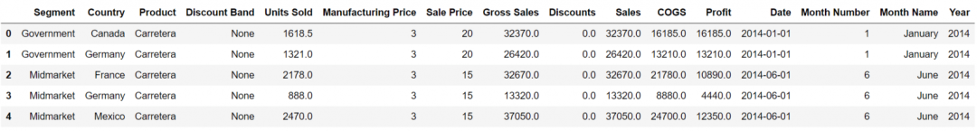
#绘制 DataFrame "Profit" 列的分布sns.displot(df['Profit'])
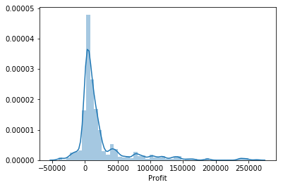
#设置我们希望用于绘图的样式sns.set_style("darkgrid")#绘制 DataFrame "Profit" 列的分布sns.displot(df['Profit'])
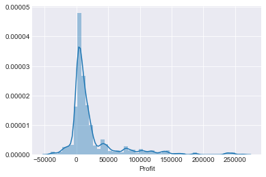
“kde=False”,我们可以删除 KDE。我们还可以按如下方式更改直方图中“bins”的数量——在本例中,它们被设置为 50:sns.displot(df['Profit'],kde=False,bins=50)
“Profit”列与“Units Sold”列。sns.jointplot(x='Profit',y='Units Sold',data=df)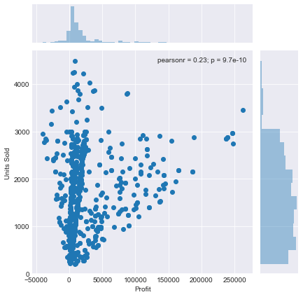
sns.jointplot(x='Profit',y='Units Sold',data=df,kind='hex')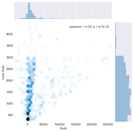
“kind”添加的另一个参数是“reg”,它代表回归。这看起来很像散点图,但这次将添加线性回归线。sns.jointplot(x='Profit',y='Units Sold',data=df,kind='reg')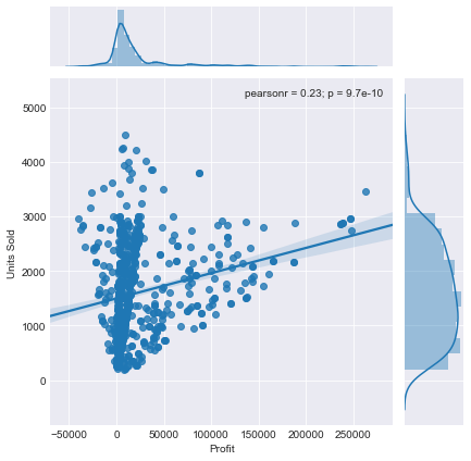
“kde”,它将绘制一个二维 KDE 图,它基本上只显示数据点最常出现的位置的密度。sns.jointplot(x='Profit',y='Units Sold',data=df,kind='kde')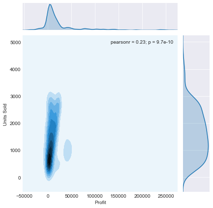
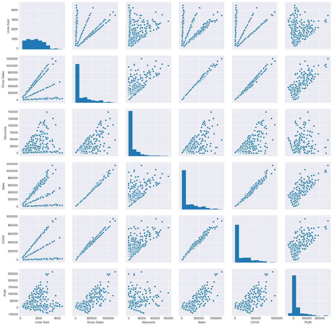
“pairplots”。这些使我们能够查看整个数据帧(对于数值数据)的成对关系,并且还支持分类数据点的“色调”参数。所以 pairplot 本质上是为 DataFrame 中数字列的每个可能组合创建一个联合图。我将快速创建一个新的 DataFrame,它删除“Month Number”和“Year”列,因为这些并不是我们连续数字数据的一部分,例如“利润”和“COGS”(销售成本)。我还将删除其他几列以缩小我们的 DataFrame,这样我们的输出图就不会过于拥挤。#删除不需要的列new_df = df.drop(['Month Number','Year','Manufacturing Price','Sale Price'],axis=1)sns.pairplot(new_df)
sns.pairplot(new_df,hue='Segment')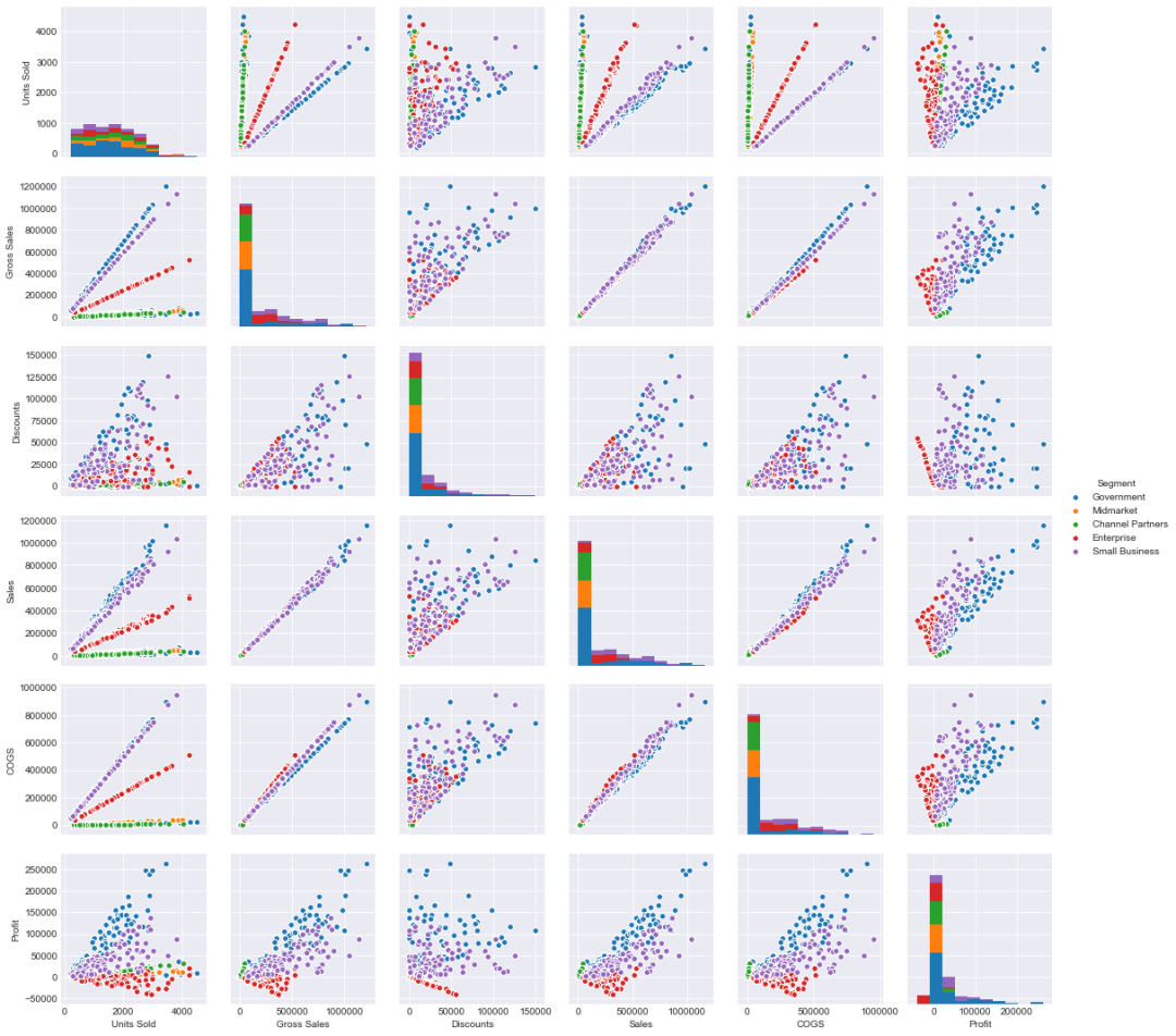
sns.pairplot(new_df,hue='Segment',palette='magma')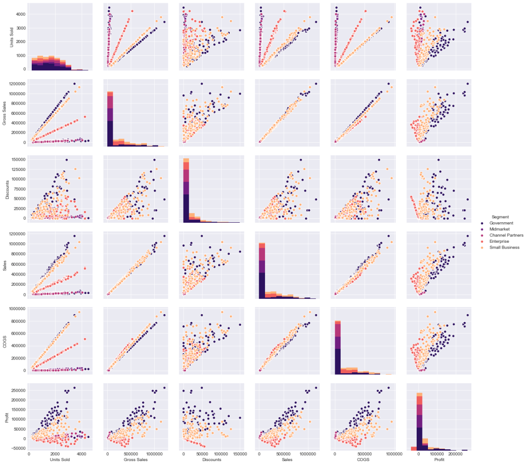
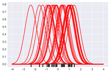
“rugplot”——这将帮助我们构建和解释我们之前创建的“kde”图是什么——无论是在我们的 distplot 中还是当我们传递“kind=kde”作为我们的参数时。sns.rugplot(df['Profit'])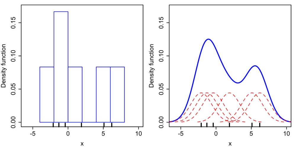
#设置一组 30 个取自正态分布的数据点x = np.random.normal(0, 1, size=30)#设置 KDE 点的带宽bandwidth = 1.06* x.std() * x.size ** (-1/ 5.)#设置 y 轴的限制support = np.linspace(-4, 4, 200)#遍历数据点并为每个点创建内核,然后绘制内核kernels = []for x_i in x:kernel = stats.norm(x_i, bandwidth).pdf(support)kernels.append(kernel)plt.plot(support, kernel, color="r")sns.rugplot(x, color=".2", linewidth=3)
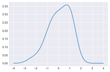
#使用复合梯形规则沿给定轴积分并创建 KDE 图from scipy.integrate import trapzdensity = np.sum(kernels, axis=0)density /= trapz(density, support)plt.plot(support, density)
“kdeplot”绘制 KDE 图。sns.kdeplot(x, shade=True)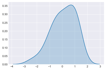
评论