
Vue新手引导插件
类似这样的效果也很常见,就是新手引导效果,自己写还是要花费些力气的,所以推荐一个插件intro.js,此插件可以轻松实现新手引导的效果。
01:安装intro.js
npm install intro.js --save
02:main.js中引入此插件
      // 首页引导插件
import intro from 'intro.js' // introjs库
import 'intro.js/introjs.css' // introjs默认css样式
// introjs还提供了多种主题,可以通过以下方式引入
import 'intro.js/themes/introjs-modern.css' // introjs主题

// 把intro.js加入到vue的prototype中,方便使用,就可以直接通过this.$intro()来调用了
Vue.prototype.$intro = intro
03:页面中使用(可直接CV看效果)
<!-- 新手引导 -->
<template>
<div>
<div class="new-tips" @click="viewIntro()">新人教程</div>
<div class="Box">
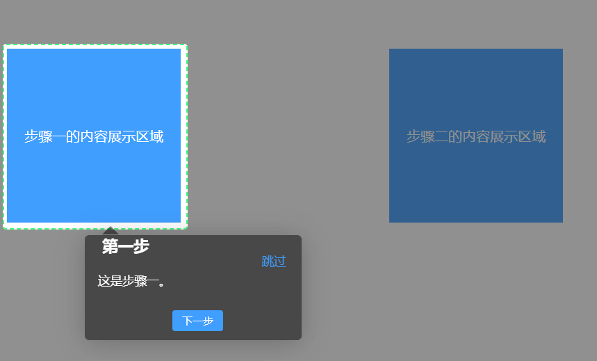
<div id="step1">
<div>步骤一的内容展示区域</div>
</div>
<div id="step2">
<div>步骤二的内容展示区域</div>
</div>
<div id="step3">
<div>步骤三的内容展示区域</div>
</div>
<div id="step4">
<div>步骤四的内容展示区域</div>
</div>
</div>
</div>
</template>
<script>
export default {
name: "guidStep",
data() {
return {
introOption: {
// 参数对象
prevLabel: "上一步",
nextLabel: "下一步",
skipLabel: "跳过",
doneLabel: "完成",
tooltipClass: "intro-tooltip" /* 引导说明文本框的样式 */,
// highlightClass: 'intro-highlight', /* 说明高亮区域的样式 */
exitOnEsc: true /* 是否使用键盘Esc退出 */,
exitOnOverlayClick: false /* 是否允许点击空白处退出 */,
keyboardNavigation: true /* 是否允许键盘来操作 */,
showBullets: false /* 是否使用点显示进度 */,
showProgress: false /* 是否显示进度条 */,
scrollToElement: true /* 是否滑动到高亮的区域 */,
overlayOpacity: 0.5, // 遮罩层的透明度 0-1之间
positionPrecedence: [
"bottom",
"top",
"right",
"left",
] /* 当位置选择自动的时候,位置排列的优先级 */,
disableInteraction: false /* 是否禁止与元素的相互关联 */,
hidePrev: true /* 是否在第一步隐藏上一步 */,
// hideNext: true, /* 是否在最后一步隐藏下一步 */
steps: [] /* steps步骤,可以写个工具类保存起来 */,
},
tipsImg2: require("../assets/logo.png"), // 新手引导的提示图片
};
},
methods: {
// 重新查看引导
viewIntro() {
this.initGuide();
},
initGuide() {
// 绑定标签元素的选择器数组
this.introOption.steps = [
{
title: "第一步",
element: "#step1",
intro: `这是步骤一。`,
},
{
title: "第二步",
element: "#step2",
intro:
`这是步骤二。<img src="` +
this.tipsImg2 +
`" alt="" style="width: 100px;margin-top: 10px;"/>`,
},
{
title: "第三步",
element: "#step3",
intro: `这是步骤三。`,
},
{
title: "重新开始",
element: "#step4",
intro: "点击此处可重新查看引导流程。",
},
];
this.$intro()
.setOptions(this.introOption)
// 点击结束按钮后执行的事件
.oncomplete(() => {
console.log("点击结束按钮后执行的事件");
})
// 点击跳过按钮后执行的事件
.onexit(() => {
console.log("点击跳过按钮后执行的事件");
})
// 确认完毕之后执行的事件
.onbeforeexit(() => {
console.log("确认完毕之后执行的事件");
})
.start();
},
},
// 在 mounted 中调用方法
mounted() {
this.$nextTick(() => {
if (
localStorage.getItem("isFirst") === null ||
localStorage.getItem("isFirst") !== "1"
) {
this.$intro().start();
localStorage.setItem("isFirst", 1);
}
});
},
};
</script>
<style>
.Box {
margin-top: 50px;
display: flex;
justify-content: space-between;
}
.Box div {
width: 200px;
height: 200px;
background: #409eff;
}
.Box div div {
line-height: 200px;
text-align: center;
color: #fff;
}
.introjs-helperLayer {
box-shadow: rgba(151, 151, 151, 0.8) 0px 0px 1px 0px,
rgba(33, 33, 33, 0.5) 0px 0px 0px 5000px !important;
border: 2px dashed #40ff79;
}
.new-tips {
color: #ff5040;
line-height: 80px;
cursor: pointer;
}
.introjs-tooltip-title {
font-size: 16px;
width: 80%;
padding-top: 10px;
}
.warper {
width: 200px;
height: 100px;
line-height: 100px;
text-align: center;
border: 1px solid saddlebrown;
}
/* 重置引导组件样式(类似element-ui个人使用) */
.intro-tooltip {
color: #ffff;
background: #2c3e50;
}
/* 引导提示框的位置 */
.introjs-bottom-left-aligned {
left: 45% !important;
}
.introjs-right,
.introjs-left {
top: 30%;
}
.intro-highlight {
background: rgba(255, 255, 255, 0.5);
}
.introjs-arrow.left {
border-right-color: #2c3e50;
}
.introjs-arrow.top {
border-bottom-color: #2c3e50;
}
.introjs-arrow.right {
border-left-color: #2c3e50;
}
.introjs-arrow.bottom {
border-top-color: #2c3e50;
}
/* 提示框头部区域 */
.introjs-tooltip-header {
padding-right: 0 !important;
padding-top: 0 !important;
}
.introjs-skipbutton {
color: #409eff !important;
font-size: 14px !important;
font-weight: normal !important;
padding: 8px 10px !important ;
}
.introjs-tooltipbuttons {
border: none !important;
}
.introjs-tooltiptext {
font-size: 14px !important;
padding: 15px !important;
}
/* 提示框按钮 */
.introjs-tooltipbuttons {
display: flex;
align-items: center;
justify-content: center;
}
.introjs-button {
width: 50px !important;
text-align: center;
padding: 4px !important;
font-size: 12px !important;
font-weight: 500 !important;
border-radius: 3px !important;
border: none !important;
}
.introjs-button:last-child {
margin-left: 10px;
}
.introjs-prevbutton {
color: #606266 !important;
background: #fff !important;
border: 1px solid #dcdfe6 !important;
}
.introjs-nextbutton {
color: #fff !important;
background-color: #409eff !important;
border-color: #409eff !important;
}
.introjs-disabled {
color: #9e9e9e !important;
border-color: #bdbdbd !important;
background-color: #f4f4f4 !important;
}
</style>
道友们,建了个群,感兴趣的话欢迎来一起交流学习,共讨bug呀。
评论