
【Python】怎么用matplotlib画出漂亮的分析图表
特征锦囊:怎么用matplotlib画出漂亮的分析图表
? Index
数据集引入 折线图 饼图 散点图 面积图 直方图 条形图
关于用matplotlib画图,先前的锦囊里有提及到,不过那些图都是比较简陋的(《特征锦囊:常用的统计图在Python里怎么画?》),难登大雅之堂,作为一名优秀的分析师,还是得学会一些让图表漂亮的技巧,这样子拿出去才更加有面子哈哈。好了,今天的锦囊就是介绍一下各种常见的图表,可以怎么来画吧。
? 数据集引入
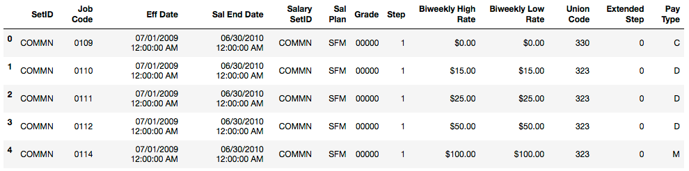
首先引入数据集,我们还用一样的数据集吧,分别是 Salary_Ranges_by_Job_Classification以及 GlobalLandTemperaturesByCity。(具体数据集可以后台回复 plot获取)
# 导入一些常用包
import pandas as pd
import numpy as np
import seaborn as sns

%matplotlib inline
import matplotlib.pyplot as plt
import matplotlib as mpl
plt.style.use('fivethirtyeight')

#解决中文显示问题,Mac
from matplotlib.font_manager import FontProperties

# 查看本机plt的有效style
print(plt.style.available)
# 根据本机available的style,选择其中一个,因为之前知道ggplot很好看,所以我选择了它
mpl.style.use(['ggplot'])

# ['_classic_test', 'bmh', 'classic', 'dark_background', 'fast', 'fivethirtyeight', 'ggplot', 'grayscale', 'seaborn-bright', 'seaborn-colorblind', 'seaborn-dark-palette', 'seaborn-dark', 'seaborn-darkgrid', 'seaborn-deep', 'seaborn-muted', 'seaborn-notebook', 'seaborn-paper', 'seaborn-pastel', 'seaborn-poster', 'seaborn-talk', 'seaborn-ticks', 'seaborn-white', 'seaborn-whitegrid', 'seaborn', 'Solarize_Light2']

# 数据集导入

# 引入第 1 个数据集 Salary_Ranges_by_Job_Classification
salary_ranges = pd.read_csv('./data/Salary_Ranges_by_Job_Classification.csv')

# 引入第 2 个数据集 GlobalLandTemperaturesByCity
climate = pd.read_csv('./data/GlobalLandTemperaturesByCity.csv')
# 移除缺失值
climate.dropna(axis=0, inplace=True)
# 只看中国
# 日期转换, 将dt 转换为日期,取年份, 注意map的用法
climate['dt'] = pd.to_datetime(climate['dt'])
climate['year'] = climate['dt'].map(lambda value: value.year)
climate_sub_china = climate.loc[climate['Country'] == 'China']
climate_sub_china['Century'] = climate_sub_china['year'].map(lambda x:int(x/100 +1))
climate.head()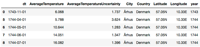
? 折线图
折线图是比较简单的图表了,也没有什么好优化的,颜色看起来顺眼就好了。下面是从网上找到了颜色表,可以从中挑选~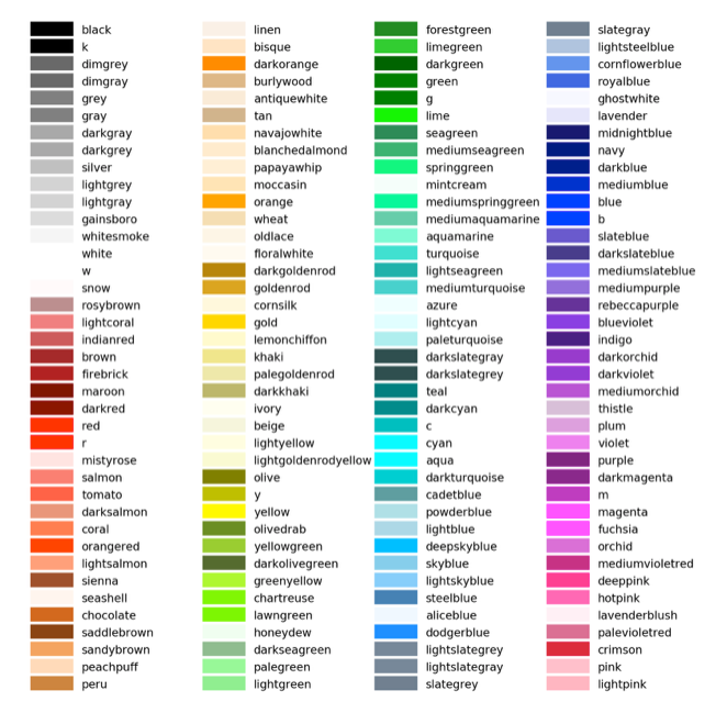
# 选择上海部分天气数据
df1 = climate.loc[(climate['Country']=='China')&(climate['City']=='Shanghai')&(climate['dt']>='2010-01-01')]\
                  .loc[:,['dt','AverageTemperature']]\
                  .set_index('dt')
df1.head()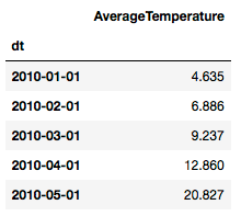
# 折线图
df1.plot(colors=['lime'])
plt.title('AverageTemperature Of ShangHai')
plt.ylabel('Number of immigrants')
plt.xlabel('Years')
plt.show()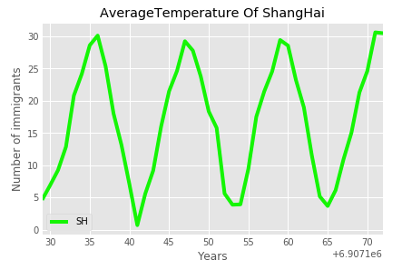
上面这是单条折线图,多条折线图也是可以画的,只需要多增加几列。
# 多条折线图
df1 = climate.loc[(climate['Country']=='China')&(climate['City']=='Shanghai')&(climate['dt']>='2010-01-01')]\
                  .loc[:,['dt','AverageTemperature']]\
                  .rename(columns={'AverageTemperature':'SH'})
df2 = climate.loc[(climate['Country']=='China')&(climate['City']=='Tianjin')&(climate['dt']>='2010-01-01')]\
                  .loc[:,['dt','AverageTemperature']]\
                  .rename(columns={'AverageTemperature':'TJ'})
df3 = climate.loc[(climate['Country']=='China')&(climate['City']=='Shenyang')&(climate['dt']>='2010-01-01')]\
                  .loc[:,['dt','AverageTemperature']]\
                  .rename(columns={'AverageTemperature':'SY'})
# 合并
df123 = df1.merge(df2, how='inner', on=['dt'])\
                .merge(df3, how='inner', on=['dt'])\
                .set_index(['dt'])
df123.head()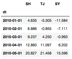
# 多条折线图
df123.plot()
plt.title('AverageTemperature Of 3 City')
plt.ylabel('Number of immigrants')
plt.xlabel('Years')
plt.show()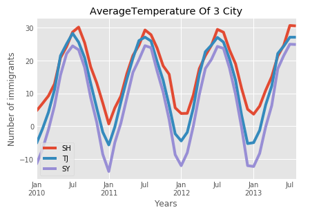
? 饼图
接下来是画饼图,我们可以优化的点多了一些,比如说从饼块的分离程度,我们先画一个“低配版”的饼图。
df1 = salary_ranges.groupby('SetID', axis=0).sum()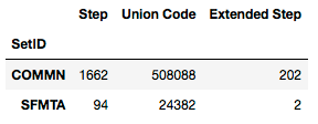
# “低配版”饼图
df1['Step'].plot(kind='pie', figsize=(7,7),
                  autopct='%1.1f%%',
                  shadow=True)
plt.axis('equal')
plt.show()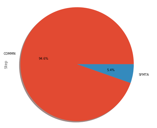
# “高配版”饼图
colors = ['lightgreen', 'lightblue'] #控制饼图颜色 ['lightgreen', 'lightblue', 'pink', 'purple', 'grey', 'gold']
explode=[0, 0.2] #控制饼图分离状态,越大越分离

df1['Step'].plot(kind='pie', figsize=(7, 7),
                  autopct = '%1.1f%%', startangle=90,
                  shadow=True, labels=None, pctdistance=1.12, colors=colors, explode = explode)
plt.axis('equal')
plt.legend(labels=df1.index, loc='upper right', fontsize=14)
plt.show()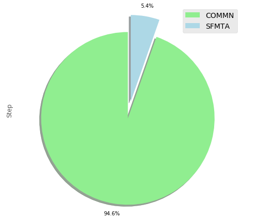
? 散点图
散点图可以优化的地方比较少了,ggplot2的配色都蛮好看的,正所谓style选的好,省很多功夫!
# 选择上海部分天气数据
df1 = climate.loc[(climate['Country']=='China')&(climate['City']=='Shanghai')&(climate['dt']>='2010-01-01')]\
                  .loc[:,['dt','AverageTemperature']]\
                  .rename(columns={'AverageTemperature':'SH'})

df2 = climate.loc[(climate['Country']=='China')&(climate['City']=='Shenyang')&(climate['dt']>='2010-01-01')]\
                  .loc[:,['dt','AverageTemperature']]\
                  .rename(columns={'AverageTemperature':'SY'})
# 合并
df12 = df1.merge(df2, how='inner', on=['dt'])
df12.head()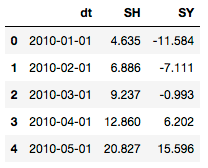
# 散点图
df12.plot(kind='scatter',  x='SH', y='SY', figsize=(10, 6), color='darkred')
plt.title('Average Temperature Between ShangHai - ShenYang')
plt.xlabel('ShangHai')
plt.ylabel('ShenYang')
plt.show()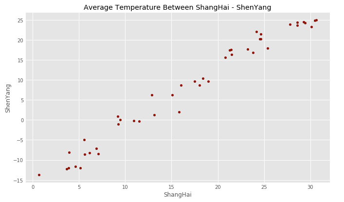
? 面积图
# 多条折线图
df1 = climate.loc[(climate['Country']=='China')&(climate['City']=='Shanghai')&(climate['dt']>='2010-01-01')]\
                  .loc[:,['dt','AverageTemperature']]\
                  .rename(columns={'AverageTemperature':'SH'})
df2 = climate.loc[(climate['Country']=='China')&(climate['City']=='Tianjin')&(climate['dt']>='2010-01-01')]\
                  .loc[:,['dt','AverageTemperature']]\
                  .rename(columns={'AverageTemperature':'TJ'})
df3 = climate.loc[(climate['Country']=='China')&(climate['City']=='Shenyang')&(climate['dt']>='2010-01-01')]\
                  .loc[:,['dt','AverageTemperature']]\
                  .rename(columns={'AverageTemperature':'SY'})
# 合并
df123 = df1.merge(df2, how='inner', on=['dt'])\
                .merge(df3, how='inner', on=['dt'])\
                .set_index(['dt'])
df123.head()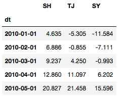
colors = ['red', 'pink', 'blue'] #控制饼图颜色 ['lightgreen', 'lightblue', 'pink', 'purple', 'grey', 'gold']
df123.plot(kind='area', stacked=False,
        figsize=(20, 10), colors=colors)
plt.title('AverageTemperature Of 3 City')
plt.ylabel('AverageTemperature')
plt.xlabel('Years')
plt.show()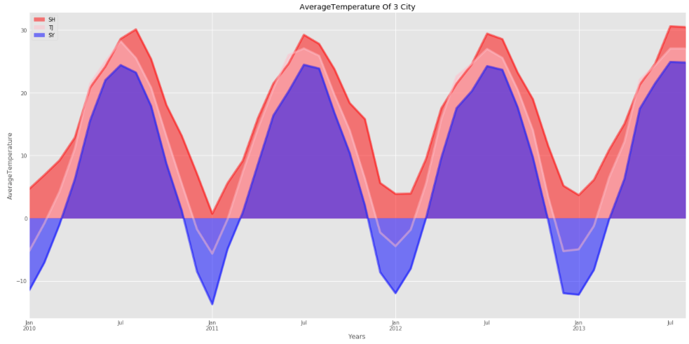
? 直方图
# 选择上海部分天气数据
df = climate.loc[(climate['Country']=='China')&(climate['City']=='Shanghai')&(climate['dt']>='2010-01-01')]\
                  .loc[:,['dt','AverageTemperature']]\
                  .set_index('dt')
df.head()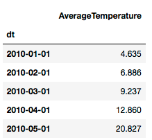
# 最简单的直方图
df['AverageTemperature'].plot(kind='hist', figsize=(8,5), colors=['grey'])
plt.title('ShangHai AverageTemperature Of 2010-2013') # add a title to the histogram
plt.ylabel('Number of month') # add y-label
plt.xlabel('AverageTemperature') # add x-label
plt.show()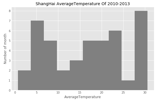
? 条形图
# 选择上海部分天气数据
df = climate.loc[(climate['Country']=='China')&(climate['City']=='Shanghai')&(climate['dt']>='2010-01-01')]\
                  .loc[:,['dt','AverageTemperature']]\
                  .set_index('dt')
df.head()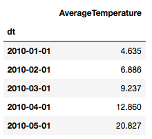
df.plot(kind='bar', figsize = (10, 6))
plt.xlabel('Month')
plt.ylabel('AverageTemperature')
plt.title('AverageTemperature of shanghai')
plt.show()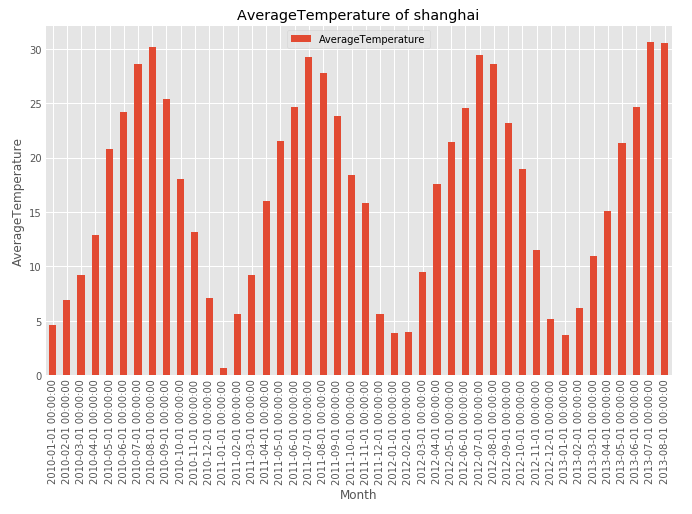
df.plot(kind='barh', figsize=(12, 16), color='steelblue')
plt.xlabel('AverageTemperature')
plt.ylabel('Month')
plt.title('AverageTemperature of shanghai')
plt.show()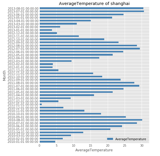
今天的内容比较长了,建议收藏起来哦,下次有空的时候可以把它弄进自己的代码库,使用起来更加方便哦~
往期精彩回顾
获取本站知识星球优惠券,复制链接直接打开:
https://t.zsxq.com/qFiUFMV
本站qq群704220115。
加入微信群请扫码:
评论