
「HTML+CSS」自定义加载动画【030】
海轰Pro
共 3239字,需浏览 7分钟
· 2021-05-05
效果展示

Demo代码
HTML
<!DOCTYPE html>
<html lang="en">
<head>
    <meta charset="UTF-8">
    <meta http-equiv="X-UA-Compatible" content="IE=edge">
    <meta name="viewport" content="width=device-width, initial-scale=1.0">
    <link rel="stylesheet" href="style.css">
    <title>Document</title>
</head>
<body>
    <section><span></span></section>
</body>
</html>
CSS
html,body{
  margin: 0;
  height: 100%;
}
body{
  display: flex;
  justify-content: center;
  align-items: center;
  background: #263238;
}
section {
    width: 650px;
    height: 300px;
    padding: 10px;
    position: relative;
    display: flex;
    align-items: center;
    justify-content: center;
    border: 2px solid red;
}
span {
  width : 96px;
  height: 96px;
  position: relative;
}
span::before,
span::after{
  position: absolute;
  content: '';
  width: 96px;
  height: 96px;
  top: 0;
  left: 0;
  background: white;
  border-radius: 50%;
  animation: animloader 2s linear infinite;
}
span::after{
  animation-delay: 1s;
}
@keyframes animloader {
  0% { transform: scale(0); opacity: 1;}
  100% { transform: scale(1); opacity: 0;}
}
原理详解
步骤1
使用span标签,设置
宽度、高度均为96px
  width: 96px;
  height: 96px;
步骤2
使用span::before、span::after伪类元素充当白色波纹
设置
绝对定位(top:0 left:0) 宽度、高度均为96px(这样就是与原span重叠了) 颜色:白色
 position: absolute;
  content: '';
  width: 96px;
  height: 96px;
  top: 0;
  left: 0;
  background: white;
效果图如下
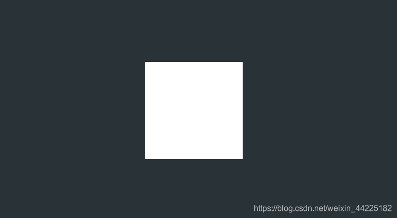
步骤3
span::before、span::after圆角化
border-radius: 50%;
效果图如下
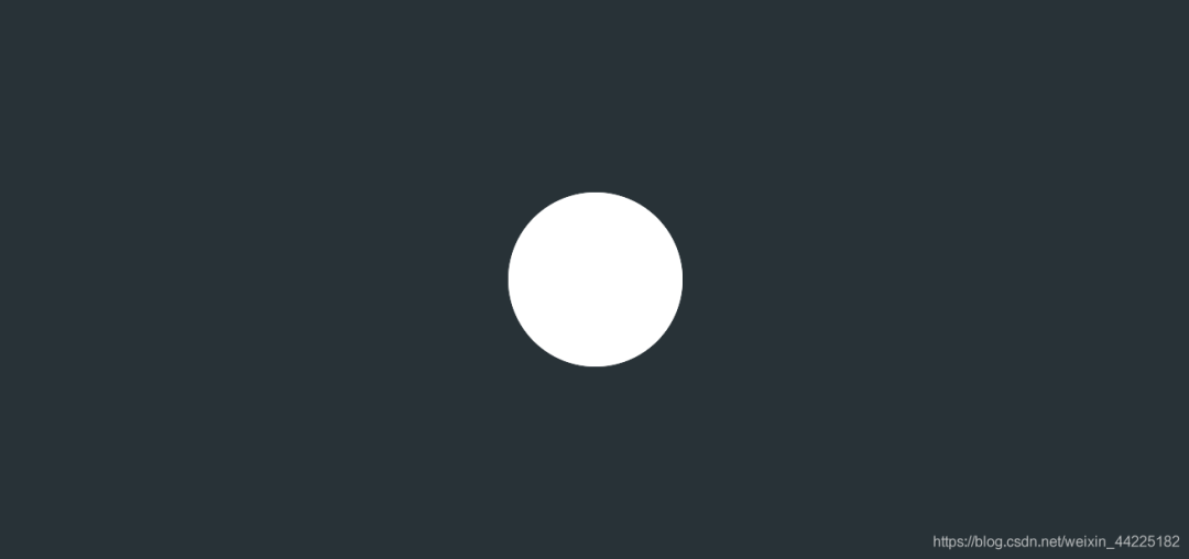
注:这里span、span::before、span::after三者都重叠在同一个位置了,其中span无颜色,其余为白色
步骤4
为span::before、span::after添加动画
初始状态:大小为0(相对于原大小),颜色为(白,透明级别1) 终止状态:大小为1(相对于原大小),颜色为(白,透明级别0)
animation: animloader 2s linear infinite;
/*动画实现*/
@keyframes animloader {
  0% {
    transform: scale(0);
    opacity: 1;
  }
  100% {
    transform: scale(1);
    opacity: 0;
  }
}
效果图如下

步骤5
为了使span::before、span::after二者之间的动画产生视觉差效果
对span::after进行延时
这样同一时刻就可以看到两个圆的变换了
animation-delay: 1s;
效果图如下
结语
学习来源:
❝https://codepen.io/bhadupranjal/pen/vYLZYqQ
文章仅作为学习笔记,记录从0到1的一个过程。
希望对您有所帮助,如有错误欢迎小伙伴指正~
我是 海轰ଘ(੭ˊᵕˋ)੭
如果您觉得写得可以的话请点个赞吧
谢谢支持❤️
评论
用 Shader 实现旗帜飘扬动画效果
我觉得对于刚入门 3D 编程的朋友来说,如果能够完成代码创建模型数据->创建材质->编写Shader动画这一系列,想必会有满满的成就感。今天就用 Cocos Creator 的 utils.MeshUtils.createMesh 接口,带大家感受一下这个流程。这个流程不仅可以用于新手学
COCOS
2
mica-mqtt 2.2.12 发布,简化 MqttClientTemplate 构造,方便自定义
一、简介mica-mqtt 基于 java aio 实现的简单、低延迟、高性能 的 mqtt 物联网开源组件。mica-mqtt 更加易于集成到已有服务和二次开发,降低自研物联网平台开发成本。二、功能支持 MQTT v3.1、v3.1.1 以及 v5.0 协议。支持 websocket mqtt 子
JAVA架构日记
0
性能优化——图片压缩、加载和格式选择
大厂技术 高级前端 Node进阶点击上方 程序员成长指北,关注公众号回复1,加入高级Node交流群前言相信大家都听说过 "258 原则(https://blog.csdn.net/weixin_42139375/article/details/8
程序员成长指北
10
一篇文章教会你使用JS+CSS实现一个简单加载进度条的效果
点击上方“前端进阶学习交流”,进行关注回复“前端”即可获赠前端相关学习资料今日鸡汤老至居人下,春归在客先。大家好,我是前端进阶者,今天给大家来做个小项目,一起来看看吧~一、前言我们经常在网页上 ,游戏界面加...
前端进阶学习交流
0
Cocos游戏开发|使用zip压缩减少web请求,加速资源加载
点击上方码不了一点+关注和★ 星标 1 引言 Cocos Creator 3.8 有提供 zip 格式的 bundle,但不支持 web 平台。今天就给大家分享一下如何使用 Zip 加速 Cocos Creator 在 Web 平台的资源加载。 前段时间使用 Cocos Cre...
COCOS
0
dom 获取不到?试试 CSS 动画监听元素渲染吧
在数据驱动视图的框架下,你最头疼的事情是什么?没错,就是获取dom。大部分业务逻辑都可以在数据层面进行处理,但有些情况就不得不去获取真实的dom,比如获取元素的宽高 dom.offsetHeight 或者调用某些dom方法等 do...
why前端
0
java 自定义生成验证码
说明 项目登录或者其他重要的操作中都要生成验证码,其重要性在此不多说。 主要是介绍自己封装的验证码生成工具类的使用。 建议安装lombok插件,不使用此插件则需要手动生成get、set方法 此工具类不需要引入第三方jar...
张小三呀
0