
不到100行Python代码教你做出精美炫酷的可视化大屏

今天小编就用Python来制作一张可视化大屏,让大家来感受一下近百年来二氧化碳排放的趋势以及给我们所居住的环境造成了什么样的影响。
介绍数据来源
本地可视化大屏中引用的数据来自于由英国牛津大学知名教授创办的网站“用数据看世界(Our World in Data”,里面收入了各个学科的数据,包括卫生、食品、收入增长和分配、能源、教育、环境等行业进行了分析与可视化展示,十分地全面,并且当中的元数据开放在Github当中

导入模块并且读取数据
我们导入需要用到的模块
import streamlit as st
import plotly.express as px
import pandas as pd
streamlit模块来制作可视化大屏,该模块是基于Python的可视化工具,最初开发出来的目的是给机器学习和数据科学团队使用的。同时我们用plotly.express模块来绘制各种图表,因此图表是具备交互性的,pandas模块来读取数据@st.cache
def get_data():
url_1 = 'https://raw.githubusercontent.com/owid/owid-datasets/master/datasets/Climate%20change%20impacts/Climate%20change%20impacts.csv'
url_2 = "https://github.com/owid/co2-data/raw/master/owid-co2-data.csv"
df_1 = pd.read_csv(url_1)
df_1_1 = df_1.query("Entity == 'World' and Year <=2021")
df_2 = pd.read_csv(url_2)
return df_1_1, df_2
可视化大屏的制作

streamlit模块当中的markdown方法来实现即可st.markdown()
然后根据上面的布局设计,我们这么来编写代码
col2, space2, col3 = st.columns((10,1,10))

with col2:
    year = st.slider('选择年份',1750,2020)
    ...

with col3:
    ...
    selected_countries = st.multiselect('选择国家',countries,default_countries)
    ...

col4, space3, col5, space4, col6 = st.columns((10,1,10,1,10))
with col4:
    st.markdown("""## 二氧化碳和全球变暖之间的关系""")

with col5:
    st.subheader(" 副标题一 ")
    ...

with col6:
    st.subheader(" 副标题二 ")
    ...
columns方法来将页面均匀的分成若干列,并且给定特定的宽度,当然每列之间还需要留一点空隙,从美观程度上来考虑,因此才有了变量space对应的是宽度1的空隙col2, space2, col3 = st.columns((10,1,10))
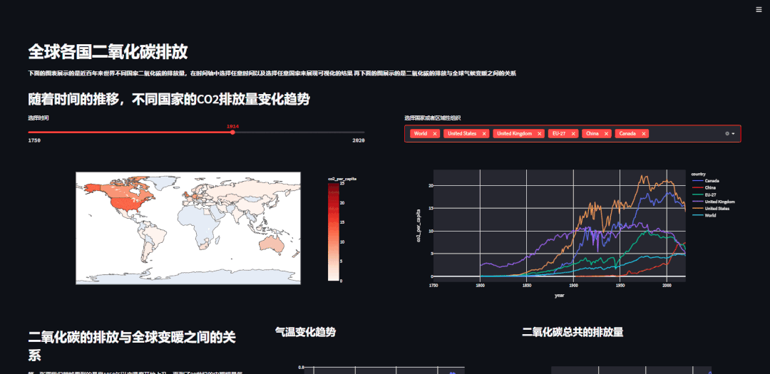
plotly.express当中的choropleth方法来绘制,另外我们添加了时间轴,通过调用streamlit模块当中的slider方法来实现with col2:
year = st.slider('选择时间', 1750, 2020)
fig = px.choropleth(df_co2[df_co2['year'] == year], locations="iso_code",
color="co2_per_capita",
hover_name="country",
range_color=(0, 25),
color_continuous_scale=px.colors.sequential.Reds)
st.plotly_chart(fig, use_container_width=True)
plotly.express模块来实现的,其中多选框则是调用了streamlit模块当中的multiselect方法,代码如下with col3:
default_countries = ['World', 'United States', 'United Kingdom', 'EU-27', 'China', 'Canada']
countries = df_co2['country'].unique()
selected_countries = st.multiselect('选择国家或者区域性组织', countries, default_countries)
df3 = df_co2.query('country in @selected_countries')
fig2 = px.line(df3, "year", "co2_per_capita", color="country")
st.plotly_chart(fig2, use_container_width=True)
最后的成品如下图所示:
点击卡片关注我,回复:代码
评论