
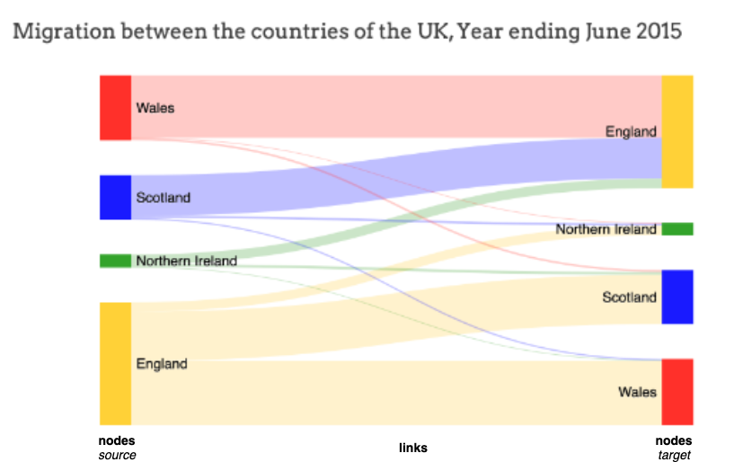
Python 绘制惊艳的桑基图

导读:本文中,我们使用 Python 的 plotly 绘制桑基图。
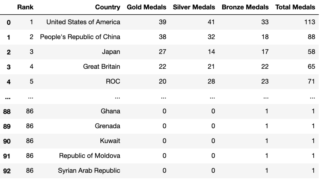
df_medals = pd.read_excel("data/Medals.xlsx")
print(df_medals.info())
df_medals.rename(columns={'Team/NOC':'Country', 'Total': 'Total Medals', 'Gold':'Gold Medals', 'Silver': 'Silver Medals', 'Bronze': 'Bronze Medals'}, inplace=True)
df_medals.drop(columns=['Unnamed: 7','Unnamed: 8','Rank by Total'], inplace=True)

df_medals
<class 'pandas.core.frame.DataFrame'>
RangeIndex: 93 entries, 0 to 92
Data columns (total 9 columns):
#   Column         Non-Null Count  Dtype
---  ------         --------------  -----
0   Rank           93 non-null     int64
1   Team/NOC       93 non-null     object
2   Gold           93 non-null     int64
3   Silver         93 non-null     int64
4   Bronze         93 non-null     int64
5   Total          93 non-null     int64
6   Rank by Total  93 non-null     int64
7   Unnamed: 7     0 non-null      float64
8   Unnamed: 8     1 non-null      float64
dtypes: float64(2), int64(6), object(1)
memory usage: 6.7+ KB
None
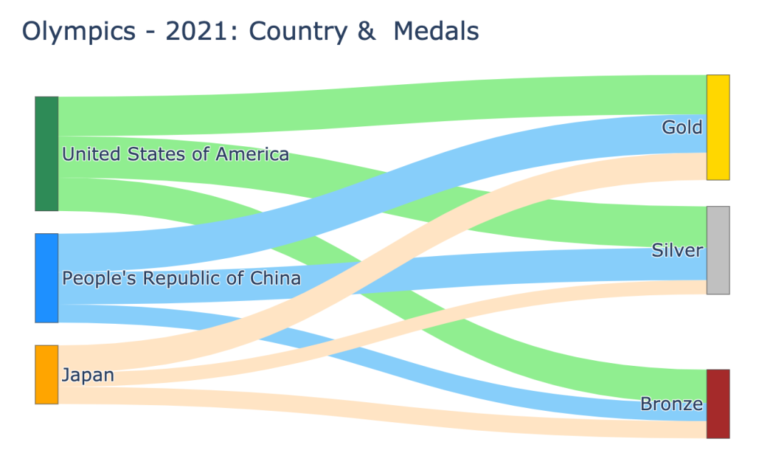
0:美国:绿色 1:中国:蓝色 2:日本:橙色
3:金牌:金色 4:银牌:银色 5:铜牌:棕色
0 (美国) 至 3,4,5 : 39, 41, 33 1 (中国) 至 3,4,5 : 38, 32, 18 2 (日本) 至 3,4,5 : 27, 14, 17
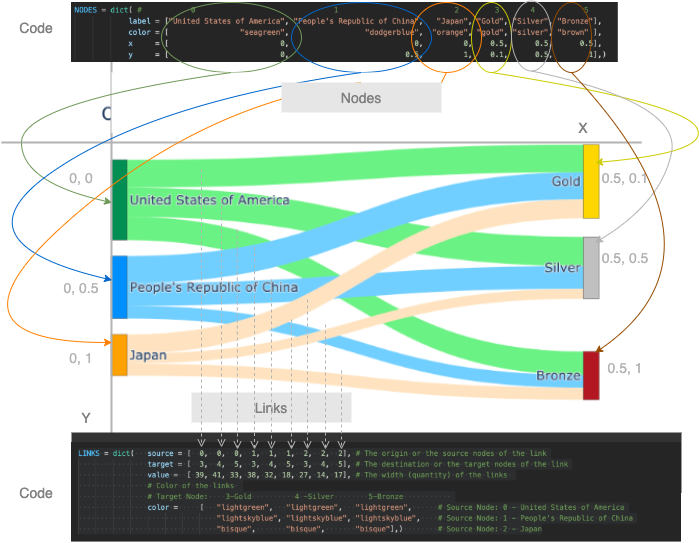
nodes (源和目标):标签和颜色作为单独的列表和 links:源节点、目标节点、值(宽度)和链接的颜色作为单独的列表
NODES = dict(
#         0                           1                             2        3       4         5
label = ["United States of America", "People's Republic of China", "Japan", "Gold", "Silver", "Bronze"],
color = ["seagreen",                 "dodgerblue",                 "orange", "gold", "silver", "brown" ],)
LINKS = dict(
  source = [  0,  0,  0,  1,  1,  1,  2,  2,  2], # 链接的起点或源节点
  target = [  3,  4,  5,  3,  4,  5,  3,  4,  5], # 链接的目的地或目标节点
  value =  [ 39, 41, 33, 38, 32, 18, 27, 14, 17], # 链接的宽度(数量)
# 链接的颜色
# 目标节点:       3-Gold          4-Silver        5-Bronze
  color = [
  "lightgreen",   "lightgreen",   "lightgreen",      # 源节点:0 - 美国 States of America
  "lightskyblue", "lightskyblue", "lightskyblue",    # 源节点:1 - 中华人民共和国China
  "bisque",       "bisque",       "bisque"],)        # 源节点:2 - 日本
data = go.Sankey(node = NODES, link = LINKS)
fig = go.Figure(data)
fig.show()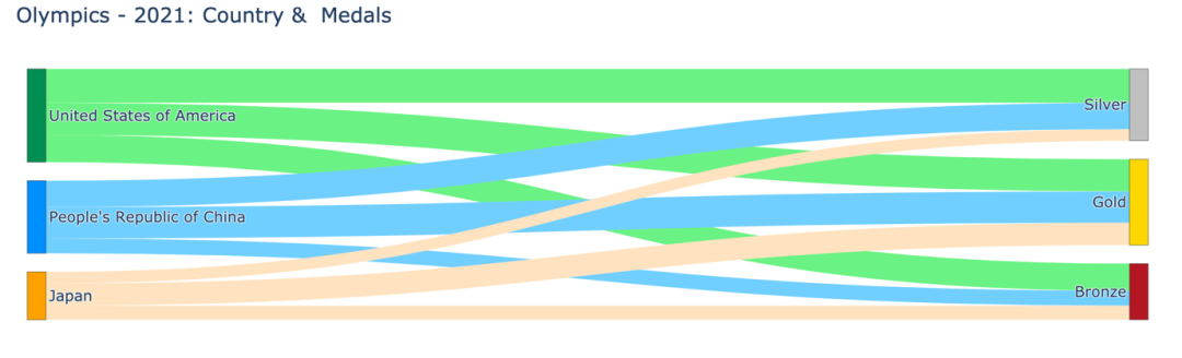
NODES = dict(
#         0                           1                             2        3       4         5
label = ["United States of America", "People's Republic of China", "Japan", "Gold", "Silver", "Bronze"],
color = ["seagreen",                 "dodgerblue",                 "orange", "gold", "silver", "brown" ],)
x = [     0,                          0,                            0,        0.5,    0.5,      0.5],
y = [     0,                          0.5,                          1,        0.1,    0.5,        1],)
data = go.Sankey(node = NODES, link = LINKS)
fig = go.Figure(data)
fig.update_layout(title="Olympics - 2021: Country &  Medals",  font_size=16)
fig.show()
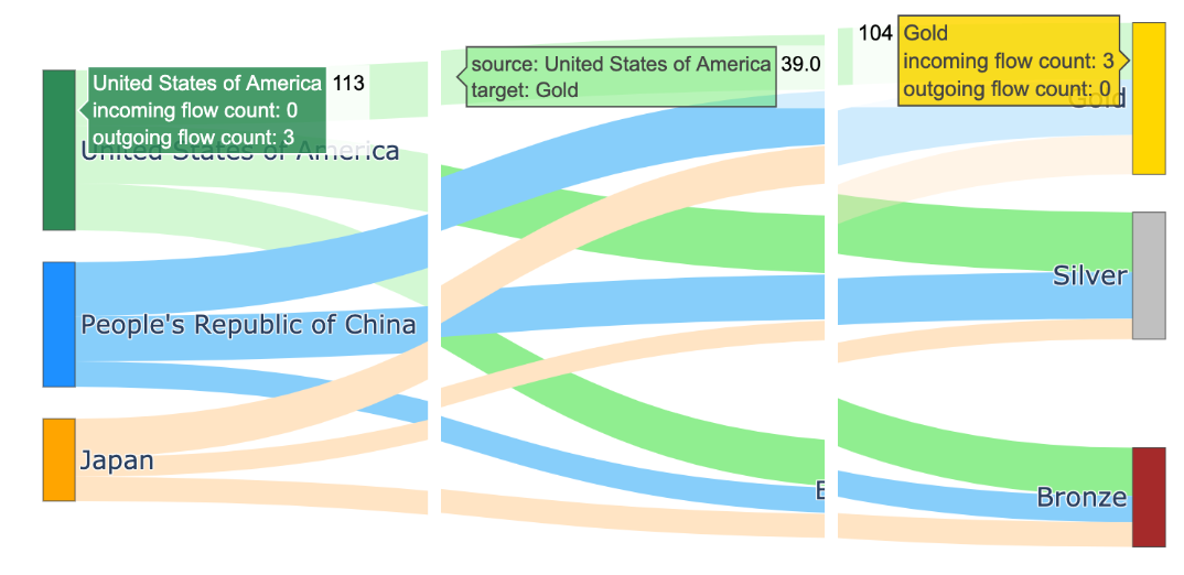
节点美国共获得11枚奖牌(=39金+41银+33铜) 节点金牌共有104枚奖牌(=美国39枚,中国38枚,日本27枚)
对于节点,由于hoverlabels 没有提供新信息,通过传递一个空hovertemplate = ""来去掉hoverlabel 对于链接,可以使标签简洁,格式为 - 对于节点和链接,让我们使用后缀"Medals"显示值。例如 113 枚奖牌而不是 113 枚。这可以通过使用具有适当valueformat和valuesuffix的update_traces函数来实现。
NODES = dict(
# 0 1 2 3 4 5
label = ["United States of America", "People's Republic of China", "Japan", "Gold", "Silver", "Bronze"],
color = [ "seagreen", "dodgerblue", "orange", "gold", "silver", "brown" ],
x = [ 0, 0, 0, 0.5, 0.5, 0.5],
y = [ 0, 0.5, 1, 0.1, 0.5, 1],
hovertemplate=" ",)
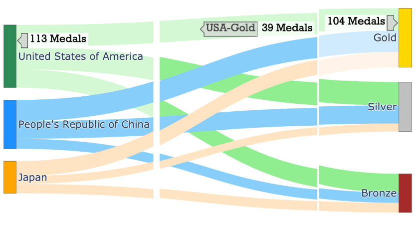
LINK_LABELS = []
for country in ["USA","China","Japan"]:
for medal in ["Gold","Silver","Bronze"]:
LINK_LABELS.append(f"{country}-{medal}")
LINKS = dict(source = [ 0, 0, 0, 1, 1, 1, 2, 2, 2],
# 链接的起点或源节点
target = [ 3, 4, 5, 3, 4, 5, 3, 4, 5],
# 链接的目的地或目标节点
value = [ 39, 41, 33, 38, 32, 18, 27, 14, 17],
# 链接的宽度(数量)
# 链接的颜色
# 目标节点:3-Gold 4 -Silver 5-Bronze
color = ["lightgreen", "lightgreen", "lightgreen", # 源节点:0 - 美国
"lightskyblue", "lightskyblue", "lightskyblue", # 源节点:1 - 中国
"bisque", "bisque", "bisque"], # 源节点:2 - 日本
label = LINK_LABELS,
hovertemplate="%{label}",)
data = go.Sankey(node = NODES, link = LINKS)
fig = go.Figure(data)
fig.update_layout(title="Olympics - 2021: Country & Medals",
font_size=16, width=1200, height=500,)
fig.update_traces(valueformat='3d',
valuesuffix='Medals',
selector=dict(type='sankey'))
fig.update_layout(hoverlabel=dict(bgcolor="lightgray",
font_size=16,
font_family="Rockwell"))
fig.show("png") #fig.show()
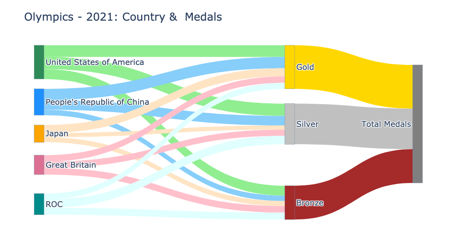
该代码可以推广到处理数据集中的所有国家。 还可以将图表扩展到另一个层次,以可视化各国的奖牌总数。
NUM_COUNTRIES = 5
X_POS, Y_POS = 0.5, 1/(NUM_COUNTRIES-1)
NODE_COLORS = ["seagreen", "dodgerblue", "orange", "palevioletred", "darkcyan"]
LINK_COLORS = ["lightgreen", "lightskyblue", "bisque", "pink", "lightcyan"]

source = []
node_x_pos, node_y_pos = [], []
node_labels, node_colors = [], NODE_COLORS[0:NUM_COUNTRIES]
link_labels, link_colors, link_values = [], [], []

# 第一组链接和节点
for i in range(NUM_COUNTRIES):
    source.extend([i]*3)
    node_x_pos.append(0.01)
    node_y_pos.append(round(i*Y_POS+0.01,2))
    country = df_medals['Country'][i]
    node_labels.append(country)
    for medal in ["Gold", "Silver", "Bronze"]:
        link_labels.append(f"{country}-{medal}")
        link_values.append(df_medals[f"{medal} Medals"][i])
    link_colors.extend([LINK_COLORS[i]]*3)

source_last = max(source)+1
target = [ source_last, source_last+1, source_last+2] * NUM_COUNTRIES
target_last = max(target)+1

node_labels.extend(["Gold", "Silver", "Bronze"])
node_colors.extend(["gold", "silver", "brown"])
node_x_pos.extend([X_POS, X_POS, X_POS])
node_y_pos.extend([0.01, 0.5, 1])

# 最后一组链接和节点
source.extend([ source_last, source_last+1, source_last+2])
target.extend([target_last]*3)
node_labels.extend(["Total Medals"])
node_colors.extend(["grey"])
node_x_pos.extend([X_POS+0.25])
node_y_pos.extend([0.5])

for medal in ["Gold","Silver","Bronze"]:
    link_labels.append(f"{medal}")
    link_values.append(df_medals[f"{medal} Medals"][:i+1].sum())
link_colors.extend(["gold", "silver", "brown"])

print("node_labels", node_labels)
print("node_x_pos", node_x_pos); print("node_y_pos", node_y_pos)

node_labels ['United States of America', "People's Republic of China",
            'Japan', 'Great Britain', 'ROC', 'Gold', 'Silver',
            'Bronze', 'Total Medals']
node_x_pos [0.01, 0.01, 0.01, 0.01, 0.01, 0.5, 0.5, 0.5, 0.75]
node_y_pos [0.01, 0.26, 0.51, 0.76, 1.01, 0.01, 0.5, 1, 0.5]
# 显示的图
NODES = dict(pad  = 20, thickness = 20,
             line = dict(color = "lightslategrey",
                         width = 0.5),
             hovertemplate=" ",
             label = node_labels,
             color = node_colors,
             x = node_x_pos,
             y = node_y_pos, )
LINKS = dict(source = source,
             target = target,
             value = link_values,
             label = link_labels,
             color = link_colors,
             hovertemplate="%{label}",)
data = go.Sankey(arrangement='snap',
                 node = NODES,
                 link = LINKS)
fig = go.Figure(data)
fig.update_traces(valueformat='3d',
                  valuesuffix=' Medals',
                  selector=dict(type='sankey'))
fig.update_layout(title="Olympics - 2021: Country &  Medals",
                  font_size=16,
                  width=1200,
                  height=500,)
fig.update_layout(hoverlabel=dict(bgcolor="grey",
                                  font_size=14,
                                  font_family="Rockwell"))
fig.show("png")

延伸阅读《利用Python进行数据分析》
干货直达👇
评论