
Android实现炫酷的上下翻动切换效果
需求描述
现在市面上主流的app的主界面,都是底下一排切换按钮,上面显示不同的界面。对于一些功能比较少的app,又想吸引人的app,咋办呢?那当然就是功能不够,效果来凑~
一般的RadioButton都是像这样,图片很文字同时显示,选中的高亮操作:

这不够风骚,我们来做一个图片和文字滚动切换,效果炫酷的RadioButton:

看到这里,虽然也没有很炫酷,但至少比单调的高亮要强那么一点吧~
功能实现
选择控件
当业务丢给你这么一个效果让你实现,我们首先要挑选合适的控件,在这里,很显然选用RadioGroup会有很大优势。因为我们只需要自定义RadioButton,点击其他按钮更换选中和非选中效果时,通过重写setChecked(boolean checked)方法,就能够辅助我们实现各自的操作和状态。
效果拆解
这里涉及到几个效果:
文字和图片的切换
默认显示图片,选中时显示文字。有个上下翻动的效果,其实这里我们只需要把图片和文字竖着排列,用图展示就是这样:
当选中的时候,把整体往上移动,将文字显示在视野中,图片被移动到上边界之外。
底部的小点切换
底部圆点只需要选中的时候画出来,未选中啥都不画就行了。遮挡层的绘制
有的朋友可能会问,什么遮挡层,这里那里有遮挡吗,答案是有的。如果只是简单的进行上下移动操作,是不需要用到这个的,但是仔细观察效果好像是斜着上下切换的,这边用了一个视觉欺骗,我把相关部分染色一下,瞬间就能看出猫腻了:

可以很清楚的看到有两条斜杠挡在了前面,由于和底色相同,在视觉上给了我们一种斜着切换的效果。
代码实现
具体的实现方案已经分析完毕,剩下的就是通过代码实现这个控件了~
首先在attr.xml中,定义一些可以自定义的属性:
<declare-styleable name="FantasticRadioButton" tools:ignore="ResourceName"><!-- 图片的引用 --><attr name="fantastic_drawable" format="reference" /><!-- 底部小点的颜色 --><attr name="bottom_dot_color" format="color" /><!-- 图片的高度 --><attr name="icon_width" format="dimension" /><!-- 图片的宽度 --><attr name="icon_height" format="dimension" /><!-- 底部小点的宽度 --><attr name="bottom_dot_width" format="dimension" /><!-- 文字内容 --><attr name="label" format="string" /><!-- 文字大小 --><attr name="label_size" format="dimension" /><!-- 文字颜色 --><attr name="label_color" format="color" /><!-- 遮罩的颜色,设置成和底色一致 --><attr name="bg_color" format="color" /></declare-styleable>
继承AppCompatRadioButton进行自定义,获取一些在xml中定义的属性:
public FantasticRadioButton(Context context, AttributeSet attrs) {super(context, attrs);initialize(context, attrs, 0);}private void initialize(Context context, AttributeSet attrs, int defStyleAttr) {TypedArray a = context.obtainStyledAttributes(attrs, R.styleable.FantasticRadioButton);mBgColor = a.getColor(R.styleable.FantasticRadioButton_bg_color, Color.WHITE);mBottomDotColor = a.getColor(R.styleable.FantasticRadioButton_bottom_dot_color, Color.parseColor("#EE82EE"));mBottomStaticRectWidth = a.getDimensionPixelOffset(R.styleable.FantasticRadioButton_bottom_dot_width, SysUtils.convertDpToPixel(4));mDrawableWidth = a.getDimensionPixelOffset(R.styleable.FantasticRadioButton_icon_width, 0);mDrawableHeight = a.getDimensionPixelOffset(R.styleable.FantasticRadioButton_icon_height, 0);mTextStr = SysUtils.getSafeString(a.getString(R.styleable.FantasticRadioButton_label));mTextColor = a.getColor(R.styleable.FantasticRadioButton_label_color, Color.GREEN);mTextSize = a.getDimensionPixelOffset(R.styleable.FantasticRadioButton_label_size, SysUtils.convertDpToPixel(16));Drawable drawable = a.getDrawable(R.styleable.FantasticRadioButton_fantastic_drawable);if (drawable != null) {mIconBitmap = drawableToBitmap(drawable);}a.recycle();mTargetDistances = mDrawableHeight * 3f;setButtonDrawable(null);mPaint.setAntiAlias(true);mPaint.setStrokeWidth(5f);mCirclePaint.setAntiAlias(true);mCirclePaint.setColor(mBottomDotColor);mCirclePaint.setStrokeWidth(5f);mCirclePaint.setStyle(Paint.Style.FILL);}
这里的mTargetDistances是指的图文需要移动的总距离,这里设置为图片高度的三倍。mCirclePaint是专门绘制底部小圆点的画笔。
设置宽高
@Overrideprotected void onSizeChanged(int w, int h, int oldw, int oldh) {super.onSizeChanged(w, h, oldw, oldh);if (w > 0 && h > 0) {mWidth = w - mInnerPaddingX * 2;mHeight = h - mInnerPaddingY * 2;// 确定画布的中心点mCenterX = w / 2;mCenterY = h / 2;}}
在onSizeChanged回调中,这时候视图的宽高已经确定,因为在这里我们给宽高和中心点的x和y进行赋值。
绘制图片和文字
private void drawIconAndText(Canvas canvas) {canvas.save();int left = mCenterX - mIconBitmap.getWidth() / 2;int top = mCenterY - mIconBitmap.getHeight() / 2;canvas.drawBitmap(mIconBitmap, left, top - mTransDistances, mPaint);// 画字float scaledSizeInPixels = TypedValue.applyDimension(TypedValue.COMPLEX_UNIT_PX,mTextSize, getResources().getDisplayMetrics());mTextPaint.setAntiAlias(true);mTextPaint.setStyle(Paint.Style.FILL);mTextPaint.setTextSize(scaledSizeInPixels);mTextPaint.setTextAlign(Paint.Align.CENTER);mTextPaint.setFakeBoldText(true);mTextPaint.setColor(mTextColor);Paint.FontMetricsInt fontMetrics = mTextPaint.getFontMetricsInt();float baseline = (mHeight + mTargetDistances - mTransDistances - fontMetrics.bottom - fontMetrics.top) / 2;canvas.drawText(mTextStr, mCenterX, baseline, mTextPaint);canvas.restore();}
就是很基础的绘制一个bitmap和text,需要注意的是,这里有一个变量:mTransDistances,这是一个很关键的变量,他代表的是当前移动的距离,我们就通过改变这个变量,来实现移动的效果!
绘制底部小点
private void drawBottomDot(Canvas canvas) {canvas.save();canvas.drawRoundRect(new RectF(mCenterX - mBottomRectWidth / 2, mHeight - mBottomRectHeight - ONE_DP, mCenterX + mBottomRectWidth / 2, mHeight - ONE_DP),mBottomRectHeight / 2, mBottomRectHeight / 2, mCirclePaint);canvas.restore();}
这里的mButtomRectWidth和mBottomHeight也是变量,通过改变这两个值,来实现缩放的效果。
绘制遮罩层
private void drawLayerPath(Canvas canvas) {canvas.save();float upTransDistance = -mLayerHeight / 2;Path path = new Path();path.moveTo(mCenterX - mWidth / 3, upTransDistance);path.lineTo(mCenterX + mWidth / 3, upTransDistance + SysUtils.convertDpToPixel(10));path.lineTo(mCenterX + mWidth / 3, upTransDistance + SysUtils.convertDpToPixel(10) + mLayerHeight);path.lineTo(mCenterX - mWidth / 3, upTransDistance + mLayerHeight);path.lineTo(mCenterX - mWidth / 3, upTransDistance);path.close();mPaint.setColor(mBgColor);mPaint.setStyle(Paint.Style.FILL);canvas.drawPath(path, mPaint);Path path2 = new Path();float startY = upTransDistance + mLayerHeight * 2;path2.moveTo(mCenterX - mWidth / 3, startY);path2.lineTo(mCenterX + mWidth / 3, startY + SysUtils.convertDpToPixel(10));path2.lineTo(mCenterX + mWidth / 3, startY + SysUtils.convertDpToPixel(10) + mLayerHeight);path2.lineTo(mCenterX - mWidth / 3, startY + mLayerHeight);path2.lineTo(mCenterX - mWidth / 3, startY);path2.close();canvas.drawPath(path2, mPaint);canvas.restore();}
这里没啥特别的,就是绘制两条斜杠在画布上。
过渡动画制作
这里采用属性动画,通过改变上面的变量,然后postInvalidate调用onDraw()来重绘界面实现过渡效果:
private ValueAnimator startBottomLineAnimation() {ValueAnimator lineAnimation = ValueAnimator.ofFloat(0f, mBottomStaticRectWidth);lineAnimation.setDuration(DURATION_TIME);lineAnimation.setInterpolator(new TimeInterpolator() {@Overridepublic float getInterpolation(float v) {return 1 - (1 - v) * (1 - v);}});lineAnimation.addUpdateListener(new ValueAnimator.AnimatorUpdateListener() {@Overridepublic void onAnimationUpdate(ValueAnimator animation) {mBottomRectWidth = (float) animation.getAnimatedValue();// 高度是宽度的五分之一mBottomRectHeight = mBottomRectWidth / 5;postInvalidate();}});return lineAnimation;}
这是底部小圆点的动画,重写插播器来控制动画的速度,先快后慢,关于动画插播器的知识,百度有很多资料~这里通过属性动画控制小圆点的高度和宽度。
private ValueAnimator getIconAndTextAnimation() {ValueAnimator transAnimation = ValueAnimator.ofFloat(0f, mTargetDistances);transAnimation.setDuration(DURATION_TIME);transAnimation.setInterpolator(new TimeInterpolator() {@Overridepublic float getInterpolation(float v) {return 1 - (1 - v);}});transAnimation.addUpdateListener(new ValueAnimator.AnimatorUpdateListener() {@Overridepublic void onAnimationUpdate(ValueAnimator animation) {mTransDistances = (float) animation.getAnimatedValue();postInvalidate();}});transAnimation.addListener(new AnimatorListenerAdapter() {@Overridepublic void onAnimationCancel(Animator animation) {mIsTransEnd = true;postInvalidate();}@Overridepublic void onAnimationEnd(Animator animation) {mIsTransEnd = true;postInvalidate();}@Overridepublic void onAnimationStart(Animator animation) {mIsTransEnd = false;postInvalidate();}@Overridepublic void onAnimationPause(Animator animation) {mIsTransEnd = true;postInvalidate();}});return transAnimation;}
这里是改变图文平移距离的属性动画控制器,并对动画状态进行监听,只有在动画执行过程中,也就是切换的时候,才绘制遮挡层。
绘制
准备工作都做完了,只差最后一步绘制了!
protected void onDraw(Canvas canvas) {super.onDraw(canvas);if (mWidth <= 0 || mHeight <= 0 || mIconBitmap == null || mIconBitmap.isRecycled()) {return;}// 先画图片和文字切换的部分if (mIconBitmap != null) {drawIconAndText(canvas);}// 画一个遮挡层,为了遮住放在图片下面的文字float layerHeight = (getHeight() - mIconBitmap.getHeight()) / 3;mPaint.setColor(mBgColor);canvas.drawRect(0, getHeight() - layerHeight, mWidth, getHeight(), mPaint);// 最后画遮挡条if (!mIsTransEnd) {drawLayerPath(canvas);}// 最后最后画底部圆圈drawBottomDot(canvas);}
绘制的时候只需要注意绘制顺序就行了,因为他是一层层往上绘制的。
最后一步
至此,一个自定义RadioButton算是完成了,最后只需要重写setChecked(boolean checked)函数,根据是否选中来执行对应的动画,就大功告成了:
@Overridepublic void setChecked(boolean checked) {boolean isChanged = checked != isChecked();super.setChecked(checked);// ValueAnimator bottomCircleAni = getCircleAnimation();ValueAnimator bottomLineAni = startBottomLineAnimation();ValueAnimator iconAni = getIconAndTextAnimation();if (isChanged) {if (checked) {// startCircleAnimator();bottomLineAni.start();iconAni.start();postInvalidate();} else {bottomLineAni.reverse();iconAni.reverse();postInvalidate();}}}
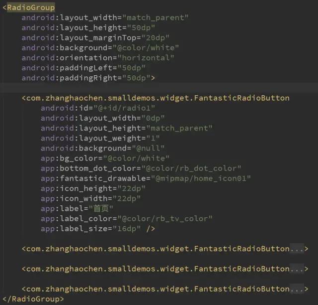
使用
使用方法很简单,直接用原生RadioGroup包裹我们自定义的RadioButton就行了,然后把RadioButton设置一下属性即可:
总结
自定义样式的RadioButton多种多样,这里也是给大家提供一种样式,当然,重要的是解决问的思路和方法,办法总比困难多,不断试错,找到正确的道路,那么距离解决问题也不会远了!
源码地址:
https://github.com/wx9265661/SmallDemos2
到这里就结束啦。