
详解CSS Flexbox,附带示例
英文 | https://medium.com/javascript-in-plain-english/css-flexbox-explained-with-examples-85efa38e4770
翻译 | web前端开发(ID:web_qdkf)
介绍
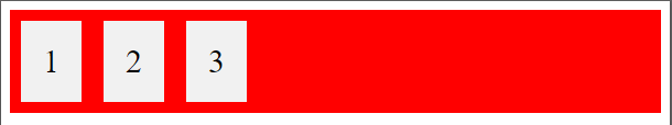
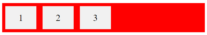
定义一个容器
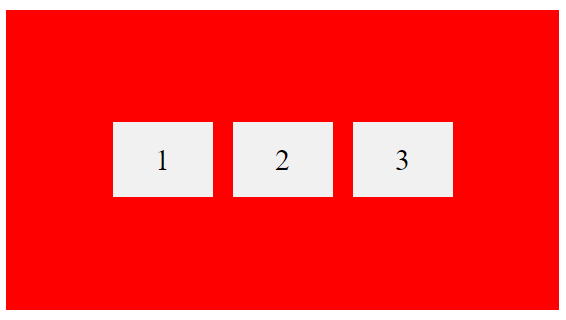
1 2 3.container {display: flex;background-color: red;}.container div{background-color: #f1f1f1;margin: 10px;padding: 20px;font-size: 30px;}
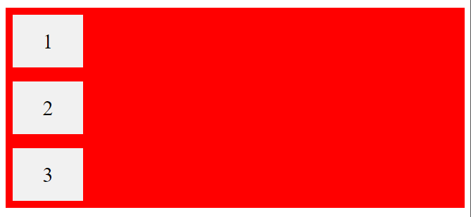
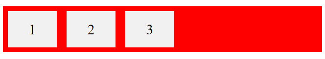
flex-direction属性
.container {display: flex;flex-direction: column;background-color: red;}.container > div {background-color: #f1f1f1;width: 100px;margin: 10px;text-align: center;line-height: 75px;font-size: 30px;}
.container {display: flex;flex-direction: row;background-color: red;}.container > div {background-color: #f1f1f1;width: 100px;margin: 10px;text-align: center;line-height: 75px;font-size: 30px;}
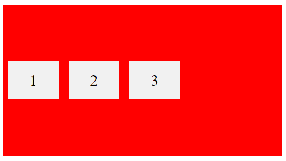
flex-wrap属性
HTml:CSS:.container {display: flex;flex-wrap: wrap;background-color: red;}.container > div {background-color: #f1f1f1;width: 100px;margin: 10px;text-align: center;line-height: 75px;font-size: 30px;}
.container {display: flex;flex-wrap: nowrap;background-color: red;}
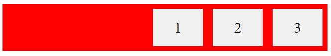
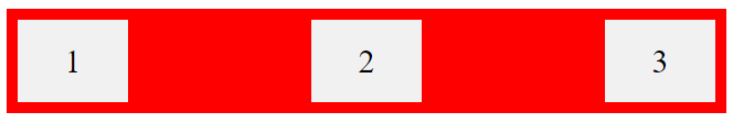
justify-content属性
.container {display: flex;justify-content: center;}

.container {display: flex;justify-content: flex-start;}
.container {display: flex;justify-content: flex-end;}
.container {display: flex;justify-content: space-between;}
align-items属性
.container {display: flex;height: 300px;align-items: center;background-color: red;}.container > div {background-color: #f1f1f1;width: 100px;margin: 10px;text-align: center;line-height: 75px;font-size: 30px;}
垂直和水平居中
.container {display: flex;height: 300px;align-items: center;justify-content: center;background-color: red;}.container > div {background-color: #f1f1f1;width: 100px;margin: 10px;text-align: center;line-height: 75px;font-size: 30px;}
子元素
你还应该了解一下以下的子元素,我想你会从中受益的,例如:
order
flex-grow
flex-shrink
flex-basis
flex
align-self
结论
Flexbox是一项很棒的CSS功能,可让你轻松设计灵活的响应式布局结构。我强烈建议你练习此功能,因为练习是提高此功能的唯一方法。
最后
欢迎加我微信(winty230),拉你进技术群,长期交流学习...
欢迎关注「前端Q」,认真学前端,做个专业的技术人...


评论