
让你拍案叫绝的 5 个Matplotlib 骚操作!

原作:Parul Pandey
Python数据科学整理,东哥起飞

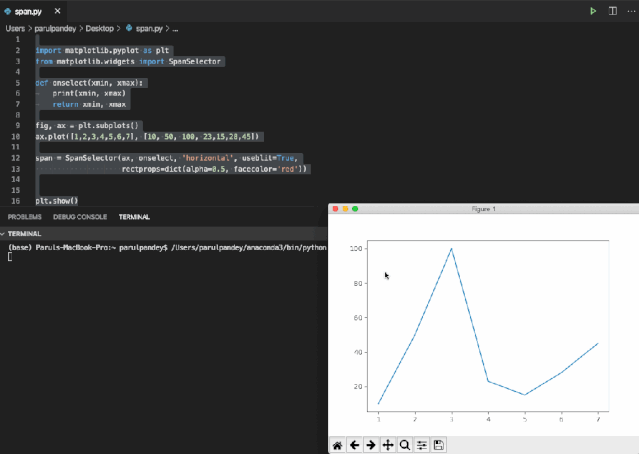
import matplotlib.pyplot as plt
from matplotlib.widgets import SpanSelector
def onselect(xmin, xmax):
    print(xmin, xmax)
    return xmin, xmax
fig, ax = plt.subplots()
ax.plot([1,2,3,4,5,6,7], [10, 50, 100, 23,15,28,45])
span = SpanSelector(ax, onselect, 'horizontal', useblit=True, rectprops=dict(alpha=0.5, facecolor='red'))
plt.show()
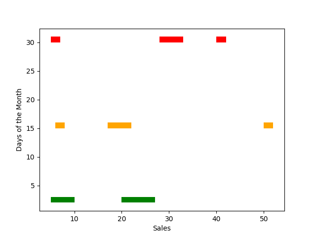
import matplotlib.pyplot as plt
#Defining the x and y ranges
xranges = [(5,5), (20,5),(20,7)]
yrange = (2,1)
#Plotting the broken bar chart
plt.broken_barh(xranges, yrange, facecolors='green')
xranges = [(6,2), (17,5),(50,2)]
yrange = (15,1)
plt.broken_barh(xranges, yrange, facecolors='orange')
xranges = [(5,2), (28,5),(40,2)]
yrange = (30,1)
plt.broken_barh(xranges, yrange, facecolors='red')
plt.xlabel('Sales')
plt.ylabel('Days of the Month')
plt.show()
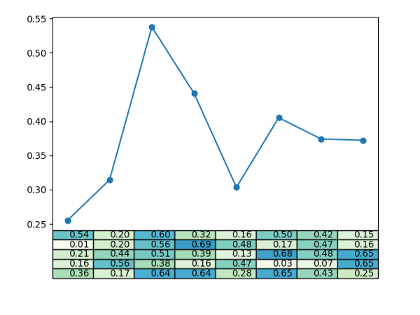
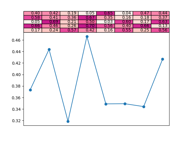
import pandas as pd
import numpy as np
import matplotlib.pyplot as plt
x = np.random.rand(5, 8)*.7
plt.plot(x.mean(axis=0), '-o', label='average per column')
plt.xticks([])
plt.table(cellText=[['%1.2f' % xxx for xxx in xx] for xx in x],cellColours=plt.cm.GnBu(x),loc='bottom')
plt.show()
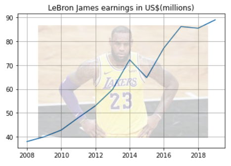
import numpy as np
import matplotlib.image as image
import matplotlib.pyplot as plt
import pandas as pd
df = pd.read_csv('income.csv')
im = image.imread('Lebron_James.jpeg') # Image
lebron_james = df[df['Name']=='LeBron James']
fig, ax = plt.subplots()
ax.grid()
ax.plot('Year','earnings ($ million)',data=lebron_james)
ax.set_title("LeBron James earnings in US$(millions)")
fig.figimage(im, 60, 40,cmap='ocean', alpha=.2)
plt.show()
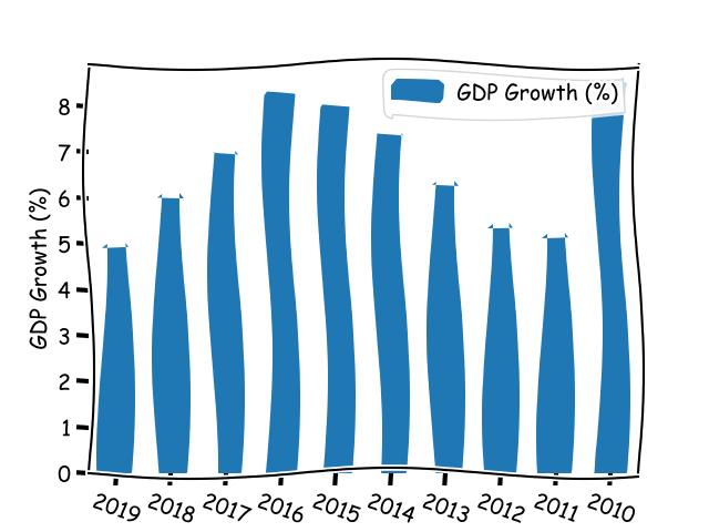
import pandas as pd
import matplotlib.pyplot as plt
df = pd.read_csv('https://raw.githubusercontent.com/parulnith/Website-articles-datasets/master/India%20GDP%20Growth%20Rate%20.csv', parse_dates=['Year'])
df['Year'] = df['Year'].apply(lambda x: pd.Timestamp(x).strftime('%Y'))
#calling xkcd() method
plt.xkcd(scale=5, length=400)
df.plot(x='Year',y='GDP Growth (%)',kind='bar')
plt.ylabel('GDP Growth (%)')
plt.xticks(rotation=-20)
plt.figure(figsize=(10,8))
plt.show()
文章参考:
https://towardsdatascience.com/advanced-plots-in-matplotlib-part-1-30dbb02b09ae
评论