
Element 系列组件之 ETextField

介绍
「ETextField」 组件是 「Flutter Element」 组件系列中的输入组件,封装了系统的 「TextField」 组件,封装了一些常用的功能,并解决了两个常见的错误,详见:
引入
在 「pubspec.yaml」 中依赖
element_ui: ^0.0.1import
import 'package:element_ui/widgets.dart';
基础用法
「ETextField」 默认显示圆角边框,
ETextField()
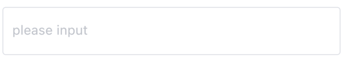
「placeholder」:设置提示文字。
ETextField(
  placeholder: 'please input',
)
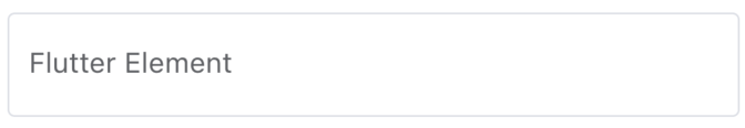
「value」:设置初始值。
ETextField(
  value: 'Flutter Element',
)
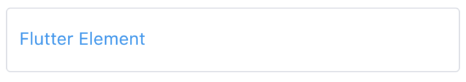
「textStyle」: 设置字体样式。
ETextField(
  value: 'Flutter Element',
  textStyle: TextStyle(color: Colors.blue),
)
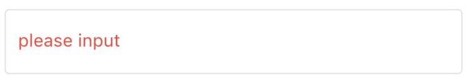
「placeholderTextStyle」:设置提示文字样式。
ETextField(
  placeholder: 'please input',
  placeholderTextStyle: TextStyle(color: Colors.red),
)
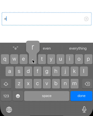
「clear」:是否显示清空按钮,默认false。
ETextField(
  placeholder: 'please input',
  clear: true,
)
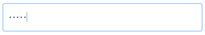
「obscureText」:密码框
ETextField(
  obscureText: true,
)
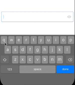
「showPassword」:是否显示密码图标,默认false。
ETextField(
  obscureText: true,
  showPassword: true,
)
「height」:设置高度,设置不同的高度,文字都会居中,如果需要多行文本,查看 「maxLines」。
ETextField(
  height: 30,
  value: 'Flutter Element',
),

ETextField(
  height: 140,
  value: 'Flutter Element',
)
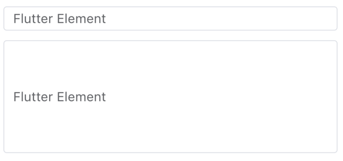
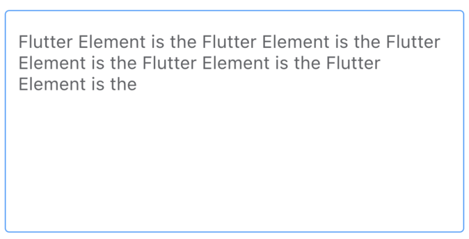
「maxLines」 :多行文本域
ETextField(
  height: 200,
  placeholder: 'please input',
  maxLines: 10,
)
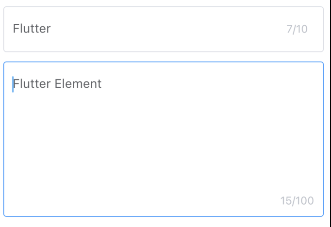
「showWordLimit」:显示字数统计
ETextField(
  showWordLimit: true,
  maxLength: 10,
),

ETextField(
  height: 200,
  maxLines: 10,
  showWordLimit: true,
  maxLength: 100,
),
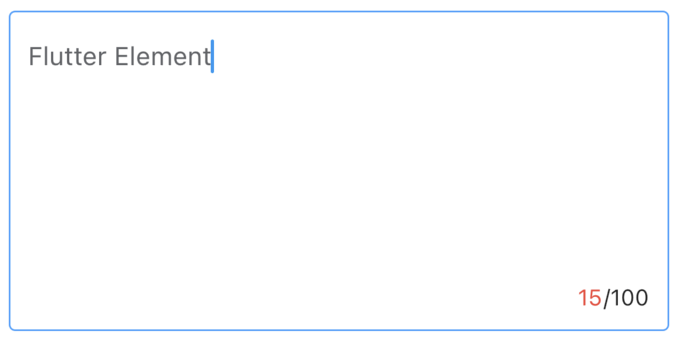
「limitBuilder」:自定义字数统计
ETextField(
  height: 200,
  maxLines: 10,
  showWordLimit: true,
  maxLength: 100,
  limitBuilder: (context, length, maxLength) {
    return Row(
      children: [
        Text(
          '$length',
          style: const TextStyle(color: Colors.red),
        ),
        Text('/$maxLength'),
      ],
    );
  },
)
「style」:类型为 「ETextFieldStyle」。
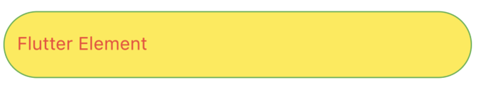
「fontColor」:字体颜色,textStyle = null 时,使用此属性。 「backgroundColor」:背景颜色。 「placeholderColor」:提示文案颜色,placeholderTextStyle = null时,使用此属性。 「borderColor」:线框颜色。 「focusBorderColor」:获取焦点时线框颜色。 「clearColor」:clear 图标颜色。 「borderRadius」:线框圆角。
ETextField(
  value: 'Flutter Element',
  placeholder: 'please input',
  style: ETextFieldStyle(
    fontColor: Colors.red,
    backgroundColor: Colors.yellow,
    placeholderColor: Colors.red.withOpacity(.5),
    borderColor: Colors.green,
    focusBorderColor: Colors.blue,
    borderRadius: BorderRadius.circular(100),
  ),
)
suffix、prefix、maxLines、keyboardType、textInputAction、textCapitalization、textAlign、textAlignVertical、onChanged、onSubmitted、inputFormatters 这些属性和原生属性一样,具体用法可参考:http://laomengit.com/guide/widgets/TextField.html

评论