
自学HarmonyOS应用开发(47)- 自定义switch组件

HarmonyOS应用开发都会用到各种各样的UI组件,开发者可以根据需求在布局文件设定UI组件各种属性。但是需求是多种多样
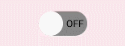
例如可以以如下方式使用switch组件:
<Switchohos:id="$+id:btn_switch"ohos:height="30vp"ohos:width="60vp"ohos:text_state_off="OFF"ohos:text_state_on="ON"/>
这段代码的显示效果如下:
有效状态时的表示只能说差强人意,相关文档中倒是提供了使用代码定制switch组件的方法,但是每次使用,每个组件都这样处理的话还是太麻烦了。本文介绍定制switch组件的方法。
定义自定义组件类
我们定义一个switch组件的派生类,通过这个类封装我们需要的定制处理:
package xwg.harmony.stopwatch;import ohos.agp.colors.RgbColor;import ohos.agp.components.AttrSet;import ohos.agp.components.ComponentState;import ohos.agp.components.Switch;import ohos.agp.components.element.ShapeElement;import ohos.agp.components.element.StateElement;import ohos.agp.utils.Color;import ohos.app.Context;public class ColorSwitch extends Switch {Color textColorOn = Color.BLACK;Color textColorOff = Color.BLACK;public ColorSwitch(Context context, AttrSet attrSet) {super(context, attrSet);Initialize(attrSet);}private void Initialize(AttrSet attrSet) {float switch_radius = 50;if (attrSet.getAttr("switch_radius").isPresent()) {switch_radius = attrSet.getAttr("switch_radius").get().getFloatValue();}// 开启状态下滑块的样式ShapeElement elementThumbOn = new ShapeElement();elementThumbOn.setShape(ShapeElement.OVAL);elementThumbOn.setRgbColor(RgbColor.fromArgbInt(0xFF1E90FF));elementThumbOn.setCornerRadius(switch_radius);// 开启状态下轨迹样式ShapeElement elementTrackOn = new ShapeElement();elementTrackOn.setShape(ShapeElement.RECTANGLE);elementTrackOn.setRgbColor(RgbColor.fromArgbInt(0xFF87CEFA));elementTrackOn.setCornerRadius(switch_radius);elementTrackOn.setStroke(1, RgbColor.fromRgbaInt(0x000000));// 关闭状态下滑块的样式ShapeElement elementThumbOff = new ShapeElement();elementThumbOff.setShape(ShapeElement.OVAL);elementThumbOff.setRgbColor(RgbColor.fromArgbInt(0xFFAFAFAF));elementThumbOff.setCornerRadius(switch_radius);// 关闭状态下轨迹样式ShapeElement elementTrackOff = new ShapeElement();elementTrackOff.setShape(ShapeElement.RECTANGLE);elementTrackOff.setRgbColor(RgbColor.fromArgbInt(0xFF808080));elementTrackOff.setCornerRadius(switch_radius);elementTrackOff.setStroke(1, RgbColor.fromRgbaInt(0x000000));setTrackElement(trackElementInit(elementTrackOn, elementTrackOff));setThumbElement(thumbElementInit(elementThumbOn, elementThumbOff));}private StateElement trackElementInit(ShapeElement on, ShapeElement off){StateElement trackElement = new StateElement();trackElement.addState(new int[]{ComponentState.COMPONENT_STATE_CHECKED}, on);trackElement.addState(new int[]{ComponentState.COMPONENT_STATE_EMPTY}, off);return trackElement;}private StateElement thumbElementInit(ShapeElement on, ShapeElement off) {StateElement thumbElement = new StateElement();thumbElement.addState(new int[]{ComponentState.COMPONENT_STATE_CHECKED}, on);thumbElement.addState(new int[]{ComponentState.COMPONENT_STATE_EMPTY}, off);return thumbElement;}}
这是ColorSwitch类的完整代码,读者直接复制粘贴之后可以在自己的开发中使用。
代码中借用了华为官方文档中的用法,对switch组件的表示颜色进行修改;定义了一个自定义switch_radius,用于指定组件两侧的圆弧大小。
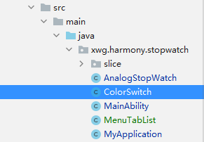
我们将这个文件放置在如下图所示的位置:
在布局中使用自定义组件
以下是在布局文件中使用ColorSwitch的示例。请注意这不是完整代码。
<DirectionalLayoutxmlns:ohos="http://schemas.huawei.com/res/ohos"xmlns:xdw="http://schemas.huawei.com/res/ohos-auto"ohos:height="match_parent"ohos:width="match_parent"ohos:orientation="vertical"ohos:alignment="top"ohos:padding="10vp"><DirectionalLayoutohos:height="50vp"ohos:width="match_parent"ohos:orientation="horizontal"ohos:alignment="top">...<xwg.harmony.stopwatch.ColorSwitchohos:id="$+id:btn_switch"ohos:height="30vp"ohos:width="80vp"ohos:layout_alignment="vertical_center"ohos:text_size="20fp"ohos:text_state_off="$string:off"ohos:text_state_on="$string:on"ohos:text_color_on="#FFFFFF"xdw:switch_radius="50"/></DirectionalLayout>...</DirectionalLayout>
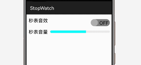
注意16行导入ColorSwitch的记法和25行使用自定义属性的方法。以下是程序执行时的效果:
参考资料
https://developer.harmonyos.com/cn/docs/documentation/doc-guides/ui-java-overview-0000000000500404
https://developer.harmonyos.com/cn/docs/documentation/doc-guides/ui-java-component-switch-0000001060806006
作者著作介绍
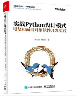
《实战Python设计模式》是作者去年3月份出版的技术书籍,该书利用Python 的标准GUI 工具包tkinter,通过可执行的示例对23 个设计模式逐个进行说明。这样一方面可以使读者了解真实的软件开发工作中每个设计模式的运用场景和想要解决的问题;另一方面通过对这些问题的解决过程进行说明,让读者明白在编写代码时如何判断使用设计模式的利弊,并合理运用设计模式。
对设计模式感兴趣而且希望随学随用的读者通过本书可以快速跨越从理解到运用的门槛;希望学习Python GUI 编程的读者可以将本书中的示例作为设计和开发的参考;使用Python 语言进行图像分析、数据处理工作的读者可以直接以本书中的示例为基础,迅速构建自己的系统架构。
觉得本文有帮助?请分享给更多人。
关注微信公众号【面向对象思考】轻松学习每一天!
面向对象开发,面向对象思考!