你知道怎么用Pandas绘制带交互的可视化图表吗?
↑↑↑关注后"星标"简说Python
人人都可以简单入门Python、爬虫、数据分析 简说Python推荐 来源:可以叫我才哥
作者:道才
之前咱们介绍过Pandas可视化图表的绘制《一文掌握Pandas可视化图表》,不过它是依托于matplotlib,因此无法进行交互。但其实,在Pandas的0.25.0版本之后,提供了一些其他绘图后端,其中就有我们今天要演示的主角基于Bokeh!
Starting in 0.25 pandas can be extended with third-party plotting backends. The main idea is letting users select a plotting backend different than the provided one based on Matplotlib.
目录:
0. 环境准备
1. 折线图
2. 柱状图(条形图)
3. 散点图
4. 点图
5. 阶梯图
6. 饼图
7. 直方图
8. 面积图
9. 地图
10. 其他

0. 环境准备
我们用到的是pandas-bokeh,它为Pandas、GeoPandas和Pyspark 的DataFrames提供了Bokeh绘图后端,类似于Pandas已经存在的可视化功能。导入库后,在DataFrames和Series上就新添加了一个绘图方法plot_bokeh()。
安装第三方库
pip install pandas-bokeh
or conda:
conda install -c patrikhlobil pandas-bokeh
如果你是使用jupyter notebook,可以这样让其直接显示
import pandas as pd
import pandas_bokeh

pandas_bokeh.output_notebook()
同样如果输出是html文件,则可以用以下方式处理
import pandas as pd
import pandas_bokeh

pandas_bokeh.output_file("Interactive Plot.html")
当然在使用的时候,记得先设置 绘制后端为pandas_bokeh
import pandas as pd

pd.set_option('plotting.backend', 'pandas_bokeh')
目前这个绘图方式支持的可视化图表有以下几类:
折线图 柱状图(条形图) 散点图 点图 阶梯图 饼图 直方图 面积图 地图
1. 折线图
交互元素含有以下几种:
可平移或缩放 单击图例可以显示或隐藏折线 悬停显示对应点数据信息
先看一个简单案例:
import numpy as np
np.random.seed(42)
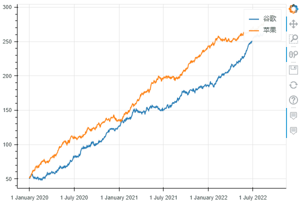
df = pd.DataFrame({"谷歌": np.random.randn(1000)+0.2,
"苹果": np.random.randn(1000)+0.17},
index=pd.date_range('1/1/2020', periods=1000))
df = df.cumsum()
df = df + 50
df.plot_bokeh(kind="line") #等价于 df.plot_bokeh.line()
在绘制过程中,我们还可以设置很多参数,用来设置可视化图表的一些功能:
kind : 图表类型,目前支持的有:“line”、“point”、“scatter”、“bar”和“histogram”;在不久的将来,更多的将被实现为水平条形图、箱形图、饼图等 x:x的值,如果未指定x参数,则索引用于绘图的 x 值;或者,也可以传递与 DataFrame 具有相同元素数量的值数组 y:y的值。 figsize : 图的宽度和高度 title : 设置标题 xlim / ylim:为 x 和 y 轴设置可见的绘图范围(也适用于日期时间 x 轴) xlabel / ylabel : 设置 x 和 y 标签 logx / logy : 在 x/y 轴上设置对数刻度 xticks / yticks : 设置轴上的刻度 color:为绘图定义颜色 colormap:可用于指定要绘制的多种颜色 hovertool:如果 True 悬停工具处于活动状态,否则如果为 False 则不绘制悬停工具 hovertool_string:如果指定,此字符串将用于悬停工具(@{column} 将替换为鼠标悬停在元素上的列的值) toolbar_location:指定工具栏位置的位置(None, “above”, “below”, “left” or “right”)),默认值:right zooming:启用/禁用缩放,默认值:True panning:启用/禁用平移,默认值:True fontsize_label/fontsize_ticks/fontsize_title/fontsize_legend:设置标签、刻度、标题或图例的字体大小(整数或“15pt”形式的字符串) rangetool启用范围工具滚动条,默认False kwargs **:bokeh.plotting.figure.line 的可选关键字参数
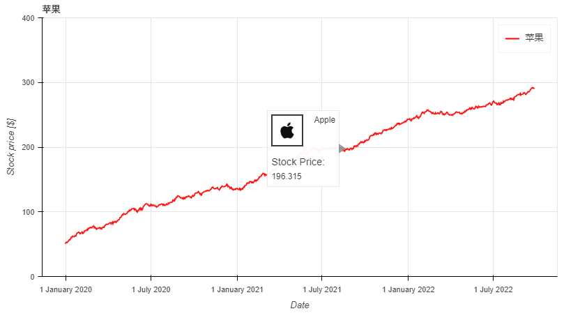
df.plot_bokeh.line(
    figsize=(800, 450), # 图的宽度和高度
    y="苹果", # y的值,这里选择的是df数据中的苹果列
    title="苹果", # 标题
    xlabel="Date", # x轴标题
    ylabel="Stock price [$]", # y轴标题
    yticks=[0, 100, 200, 300, 400], # y轴刻度值
    ylim=(0, 400), # y轴区间
    toolbar_location=None, # 工具栏(取消)
    colormap=["red", "blue"], # 颜色
    hovertool_string=r"""<img
                        src='https://dss0.bdstatic.com/-0U0bnSm1A5BphGlnYG/tam-ogel/920152b13571a9a38f7f3c98ec5a6b3f_122_122.jpg'
                        height="42" alt="@imgs" width="42"
                        style="float: left; margin: 0px 15px 15px 0px;"
                        border="2"></img> Apple

                        <h4> Stock Price: </h4> @{苹果}""",  # 悬停工具显示形式(支持css)
    panning=False, # 禁止平移
    zooming=False) # 禁止缩放
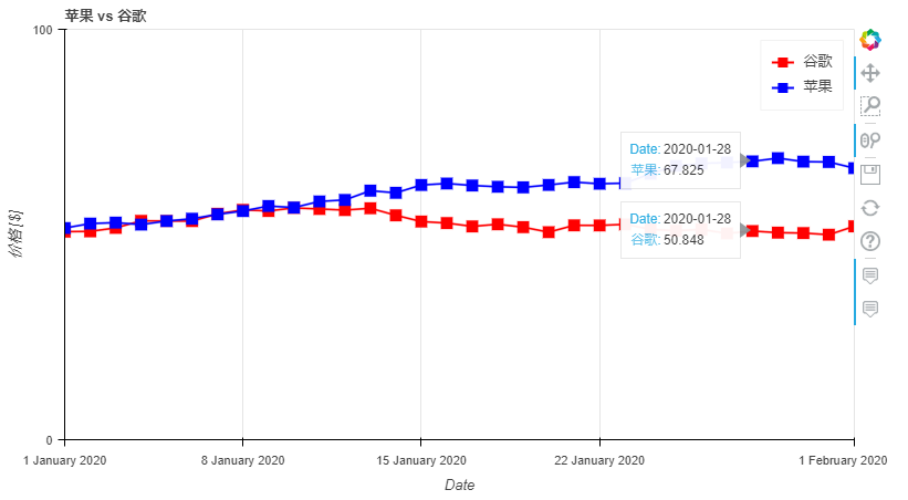
对于折线图来说,还有一些特殊的参数,它们是:
plot_data_points:添加绘制线上的数据点 plot_data_points_size:设置数据点的大小 标记:定义点类型*(默认值:circle)*,可能的值有:“circle”、“square”、“triangle”、“asterisk”、“circle_x”、“square_x”、“inverted_triangle”、“x”、“circle_cross”、“square_cross”、“diamond”、“cross” ' kwargs **:bokeh.plotting.figure.line 的可选关键字参数
df.plot_bokeh.line(
    figsize=(800, 450),
    title="苹果 vs 谷歌",
    xlabel="Date",
    ylabel="价格 [$]",
    yticks=[0, 100, 200, 300, 400],
    ylim=(0, 100),
    xlim=("2020-01-01", "2020-02-01"),
    colormap=["red", "blue"],
    plot_data_points=True, # 是否线上数据点
    plot_data_points_size=10, # 数据点的大小
    marker="square") # 数据点的类型
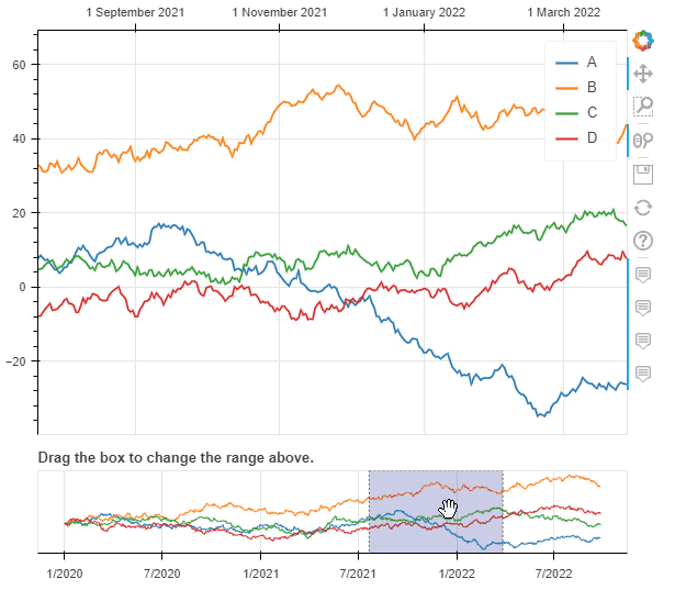
启动范围工具滚动条的折线图
ts = pd.Series(np.random.randn(1000), index=pd.date_range('1/1/2020', periods=1000))
df = pd.DataFrame(np.random.randn(1000, 4), index=ts.index, columns=list('ABCD'))
df = df.cumsum()

df.plot_bokeh(rangetool=True)
2. 柱状图(条形图)
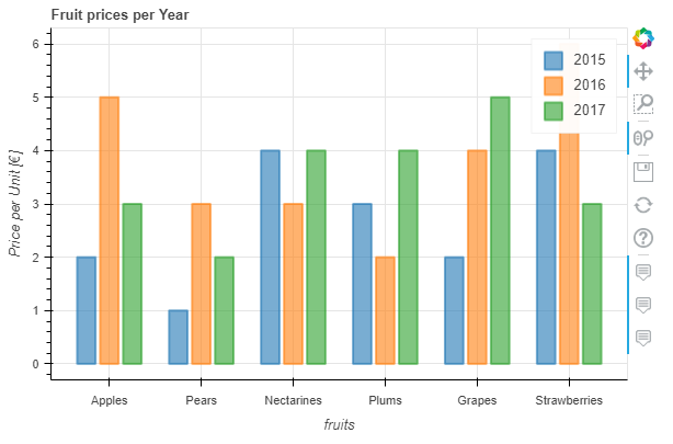
柱状图没有特殊的关键字参数,一般分为柱状图和堆叠柱状图,默认是柱状图。
data = {
    'fruits':
    ['Apples', 'Pears', 'Nectarines', 'Plums', 'Grapes', 'Strawberries'],
    '2015': [2, 1, 4, 3, 2, 4],
    '2016': [5, 3, 3, 2, 4, 6],
    '2017': [3, 2, 4, 4, 5, 3]
}
df = pd.DataFrame(data).set_index("fruits")

p_bar = df.plot_bokeh.bar(
    ylabel="Price per Unit [€]",
    title="Fruit prices per Year",
    alpha=0.6)
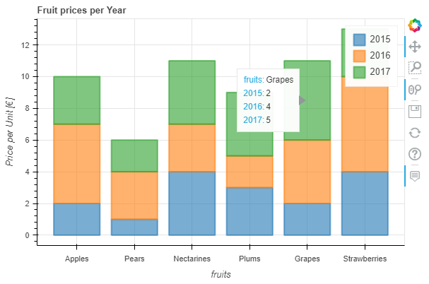
我们可以通过参数stacked来绘制堆叠柱状图:
p_stacked_bar = df.plot_bokeh.bar(
    ylabel="Price per Unit [€]",
    title="Fruit prices per Year",
    stacked=True, # 堆叠柱状图
    alpha=0.6)
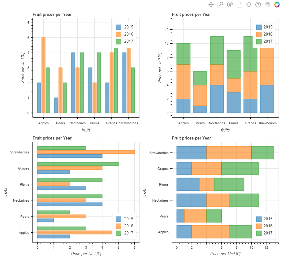
默认情况下,x轴的值就是数据索引列的值,我们也可通过指定参数x来设置x轴;另外,我们还可以通过关键字kind="barh"或访问器plot_bokeh.barh来进行条形图绘制。
#Reset index, such that "fruits" is now a column of the DataFrame:
df.reset_index(inplace=True)

#Create horizontal bar (via kind keyword):
p_hbar = df.plot_bokeh(
    kind="barh",
    x="fruits",
    xlabel="Price per Unit [€]",
    title="Fruit prices per Year",
    alpha=0.6,
    legend = "bottom_right",
    show_figure=False)

#Create stacked horizontal bar (via barh accessor):
p_stacked_hbar = df.plot_bokeh.barh(
    x="fruits",
    stacked=True,
    xlabel="Price per Unit [€]",
    title="Fruit prices per Year",
    alpha=0.6,
    legend = "bottom_right",
    show_figure=False)

#Plot all barplot examples in a grid:
pandas_bokeh.plot_grid([[p_bar, p_stacked_bar],
                        [p_hbar, p_stacked_hbar]],
                       plot_width=450)
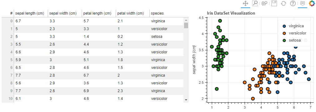
3. 散点图
散点图需要指定x和y,以下参数可选:
category:确定用于为散点着色的类别对应列字段名 kwargs **:bokeh.plotting.figure.scatter 的可选关键字参数
以下绘制表格和散点图:
# Load Iris Dataset:
df = pd.read_csv(
    r"https://raw.githubusercontent.com/PatrikHlobil/Pandas-Bokeh/master/docs/Testdata/iris/iris.csv"
)
df = df.sample(frac=1)

# Create Bokeh-Table with DataFrame:
from bokeh.models.widgets import DataTable, TableColumn
from bokeh.models import ColumnDataSource

data_table = DataTable(
    columns=[TableColumn(field=Ci, title=Ci) for Ci in df.columns],
    source=ColumnDataSource(df),
    height=300,
)

# Create Scatterplot:
p_scatter = df.plot_bokeh.scatter(
    x="petal length (cm)",
    y="sepal width (cm)",
    category="species",
    title="Iris DataSet Visualization",
    show_figure=False,
)

# Combine Table and Scatterplot via grid layout:
pandas_bokeh.plot_grid([[data_table, p_scatter]], plot_width=400, plot_height=350)
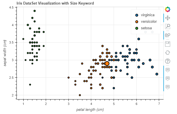
我们还可以传递一些参数比如 散点的大小之类的(用某列的值)
#Change one value to clearly see the effect of the size keyword
df.loc[13, "sepal length (cm)"] = 15

#Make scatterplot:
p_scatter = df.plot_bokeh.scatter(
    x="petal length (cm)",
    y="sepal width (cm)",
    category="species",
    title="Iris DataSet Visualization with Size Keyword",
    size="sepal length (cm)", # 散点大小
)
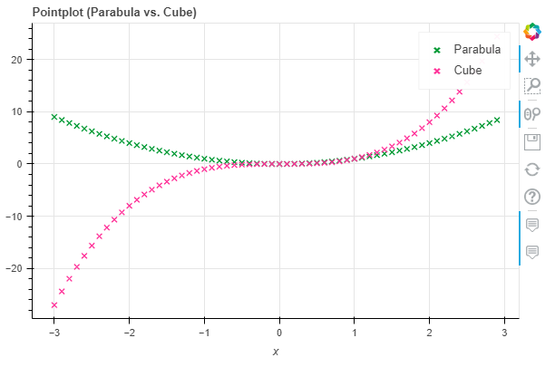
4. 点图
点图比较简单,直接调用pointplot即可
import numpy as np

x = np.arange(-3, 3, 0.1)
y2 = x**2
y3 = x**3
df = pd.DataFrame({"x": x, "Parabula": y2, "Cube": y3})
df.plot_bokeh.point(
    x="x",
    xticks=range(-3, 4),
    size=5,
    colormap=["#009933", "#ff3399"],
    title="Pointplot (Parabula vs. Cube)",
    marker="x")
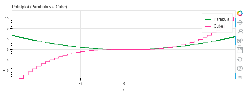
5. 阶梯图
阶梯图主要是需要设置其模式mode,目前可供选择的是before, after和center
import numpy as np

x = np.arange(-3, 3, 1)
y2 = x**2
y3 = x**3
df = pd.DataFrame({"x": x, "Parabula": y2, "Cube": y3})
df.plot_bokeh.step(
    x="x",
    xticks=range(-1, 1),
    colormap=["#009933", "#ff3399"],
    title="Pointplot (Parabula vs. Cube)",
    figsize=(800,300),
    fontsize_title=30,
    fontsize_label=25,
    fontsize_ticks=15,
    fontsize_legend=5,
    )

df.plot_bokeh.step(
    x="x",
    xticks=range(-1, 1),
    colormap=["#009933", "#ff3399"],
    title="Pointplot (Parabula vs. Cube)",
    mode="after",
    figsize=(800,300)
    )
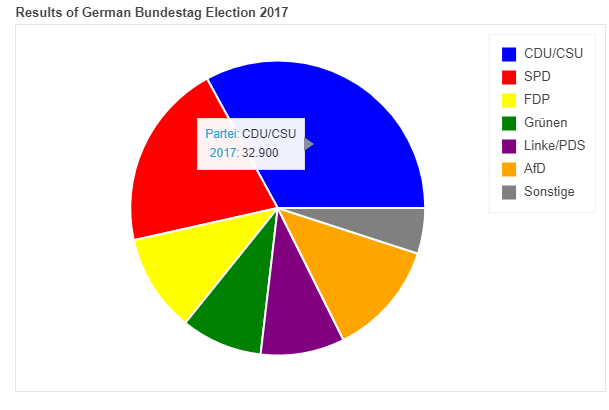
6. 饼图
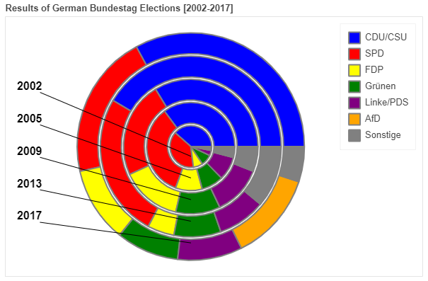
这里我们用网上的一份自 2002 年以来德国所有联邦议院选举结果的数据集为例展示
df_pie = pd.read_csv(r"https://raw.githubusercontent.com/PatrikHlobil/Pandas-Bokeh/master/docs/Testdata/Bundestagswahl/Bundestagswahl.csv")
df_pie
| Partei | 2002 | 2005 | 2009 | 2013 | 2017 | |
|---|---|---|---|---|---|---|
| 0 | CDU/CSU | 38.5 | 35.2 | 33.8 | 41.5 | 32.9 |
| 1 | SPD | 38.5 | 34.2 | 23.0 | 25.7 | 20.5 |
| 2 | FDP | 7.4 | 9.8 | 14.6 | 4.8 | 10.7 |
| 3 | Grünen | 8.6 | 8.1 | 10.7 | 8.4 | 8.9 |
| 4 | Linke/PDS | 4.0 | 8.7 | 11.9 | 8.6 | 9.2 |
| 5 | AfD | 0.0 | 0.0 | 0.0 | 0.0 | 12.6 |
| 6 | Sonstige | 3.0 | 4.0 | 6.0 | 11.0 | 5.0 |
df_pie.plot_bokeh.pie(
    x="Partei",
    y="2017",
    colormap=["blue", "red", "yellow", "green", "purple", "orange", "grey"],
    title="Results of German Bundestag Election 2017",
    )
如果我们想绘制全部的列(上图中我们绘制的是2017年的数据),则无需对y赋值,结果会嵌套显示在一个图中:
df_pie.plot_bokeh.pie(
    x="Partei",
    colormap=["blue", "red", "yellow", "green", "purple", "orange", "grey"],
    title="Results of German Bundestag Elections [2002-2017]",
    line_color="grey")
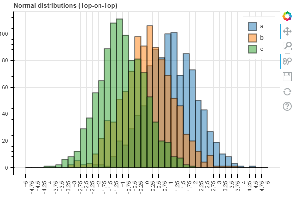
7. 直方图
在绘制直方图时,有不少参数可供选择:
bins:确定用于直方图的 bin,如果 bins 是 int,则它定义给定范围内的等宽 bin 数量(默认为 10),如果 bins 是一个序列,它定义了 bin 边缘,包括最右边的边缘,允许不均匀的 bin 宽度,如果 bins 是字符串,则它定义用于计算最佳 bin 宽度的方法,如histogram_bin_edges所定义 histogram_type:“sidebyside”、“topontop”或“stacked”,默认值:“topontop” stacked:布尔值,如果给定,则将histogram_type覆盖为*“stacked”*。默认值:*假False kwargs **:bokeh.plotting.figure.quad 的可选关键字参数
import numpy as np
df_hist = pd.DataFrame({
'a': np.random.randn(1000) + 1,
'b': np.random.randn(1000),
'c': np.random.randn(1000) - 1
},
columns=['a', 'b', 'c'])
#Top-on-Top Histogram (Default):
df_hist.plot_bokeh.hist(
bins=np.linspace(-5, 5, 41),
vertical_xlabel=True,
hovertool=False,
title="Normal distributions (Top-on-Top)",
line_color="black")
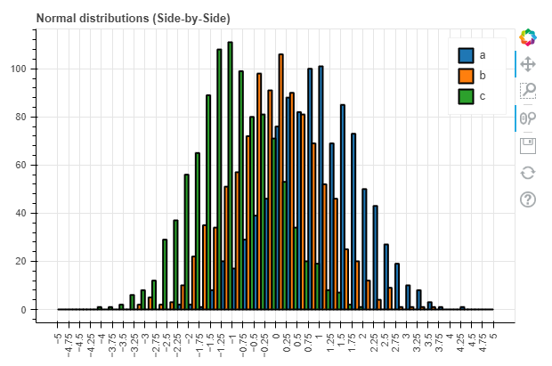
#Side-by-Side Histogram (multiple bars share bin side-by-side) also accessible via
#kind="hist":
df_hist.plot_bokeh(
kind="hist",
bins=np.linspace(-5, 5, 41),
histogram_type="sidebyside",
vertical_xlabel=True,
hovertool=False,
title="Normal distributions (Side-by-Side)",
line_color="black")
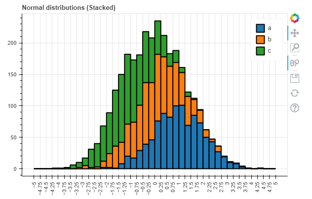
#Stacked histogram:
df_hist.plot_bokeh.hist(
bins=np.linspace(-5, 5, 41),
histogram_type="stacked",
vertical_xlabel=True,
hovertool=False,
title="Normal distributions (Stacked)",
line_color="black")
同时,对于直方图我们还有更高级的参数:
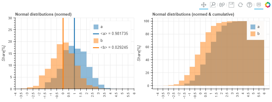
weights:DataFrame 的一列,用作 histogramm 聚合的权重(另请参见numpy.histogram) normed:如果为 True,则直方图值被归一化为 1(直方图值之和 = 1)。也可以传递一个整数,例如normed=100将导致带有百分比 y 轴的直方图(直方图值的总和 = 100),默认值:False cumulative:如果为 True,则显示累积直方图,默认值:False show_average:如果为 True,则还显示直方图的平均值,默认值:False
p_hist = df_hist.plot_bokeh.hist(
    y=["a", "b"],
    bins=np.arange(-4, 6.5, 0.5),
    normed=100,
    vertical_xlabel=True,
    ylabel="Share[%]",
    title="Normal distributions (normed)",
    show_average=True,
    xlim=(-4, 6),
    ylim=(0, 30),
    show_figure=False)

p_hist_cum = df_hist.plot_bokeh.hist(
    y=["a", "b"],
    bins=np.arange(-4, 6.5, 0.5),
    normed=100,
    cumulative=True,
    vertical_xlabel=True,
    ylabel="Share[%]",
    title="Normal distributions (normed & cumulative)",
    show_figure=False)

pandas_bokeh.plot_grid([[p_hist, p_hist_cum]], plot_width=450, plot_height=300) # 仪表盘输出方式
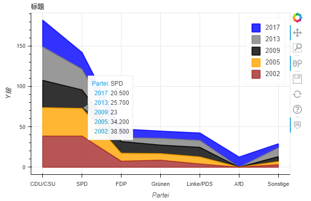
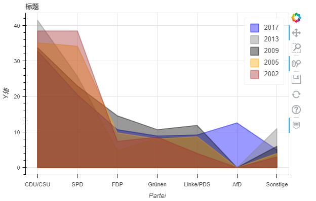
8. 面积图
面积图嘛,提供两种:堆叠或者在彼此之上绘制
stacked:如果为 True,则面积图堆叠;如果为 False,则在彼此之上绘制图。默认值:False kwargs **:bokeh.plotting.figure.patch 的可选关键字参数
# 我们用 之前饼图里的数据来绘制
df_energy = df_pie
df_energy.plot_bokeh.area(
    x="Partei",
    stacked=True,
    legend="top_right",
    colormap=["brown", "orange", "black", "grey", "blue"],
    title="标题",
    ylabel="Y轴",
    )
df_energy.plot_bokeh.area(
    x="Partei",
    stacked=False,
    legend="top_right",
    colormap=["brown", "orange", "black", "grey", "blue"],
    title="标题",
    ylabel="Y轴",
    )
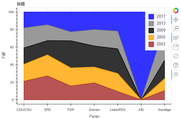
当我们使用normed关键字对图进行规范时,还可以看到这种效果:
df_energy.plot_bokeh.area(
    x="Partei",
    stacked=True,
    normed=100,  # 规范满100(可看大致占比)
    legend="top_right",
    colormap=["brown", "orange", "black", "grey", "blue"],
    title="标题",
    ylabel="Y轴",
    )
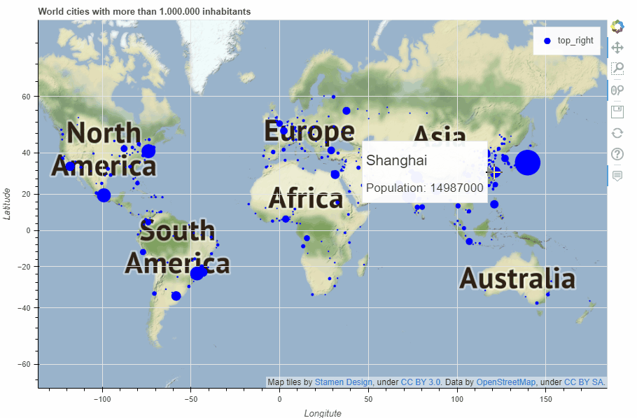
9. 地图
关于地图绘制部分内容较多,这里我们不做详细介绍,后续出个专题讲解!
plot_bokeh.map函数,参数x和y分别对应经纬度坐标,我们以全球超过100万居民所有城市为例简单展示一下:
df_mapplot = pd.read_csv(r"https://raw.githubusercontent.com/PatrikHlobil/Pandas-Bokeh/master/docs/Testdata/populated%20places/populated_places.csv")
df_mapplot.head()
| name | pop_max | latitude | longitude | |
|---|---|---|---|---|
| 0 | Mesa | 1085394 | 33.423915 | -111.736084 |
| 1 | Sharjah | 1103027 | 25.371383 | 55.406478 |
| 2 | Changwon | 1081499 | 35.219102 | 128.583562 |
| 3 | Sheffield | 1292900 | 53.366677 | -1.499997 |
| 4 | Abbottabad | 1183647 | 34.149503 | 73.199501 |
df_mapplot["size"] = df_mapplot["pop_max"] / 1000000
df_mapplot.plot_bokeh.map(
    x="longitude",
    y="latitude",
    hovertool_string="""<h2> @{name} </h2>

                        <h3> Population: @{pop_max} </h3>""",
    tile_provider="STAMEN_TERRAIN_RETINA",
    size="size",
    figsize=(900, 600),
    title="World cities with more than 1.000.000 inhabitants")
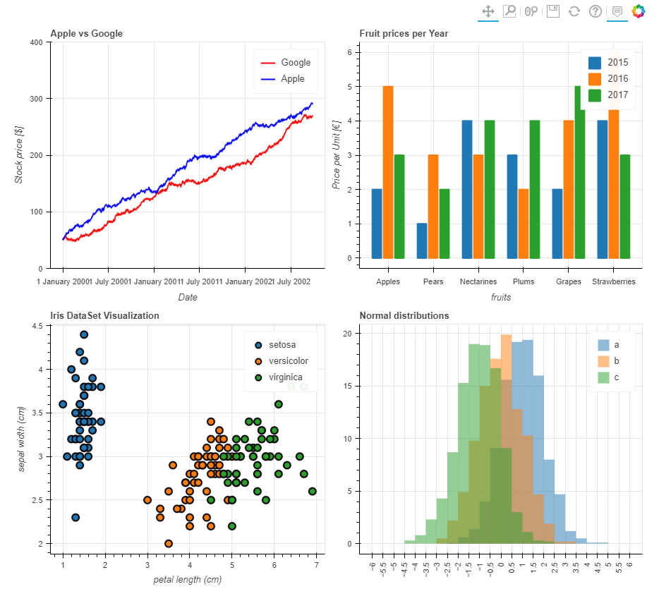
10. 其他
仪表盘输出,通过pandas_bokeh.plot_grid来设计仪表盘(大家具体看这行代码的逻辑)
import pandas as pd
import numpy as np
import pandas_bokeh
pandas_bokeh.output_notebook()

#Barplot:
data = {
    'fruits':
    ['Apples', 'Pears', 'Nectarines', 'Plums', 'Grapes', 'Strawberries'],
    '2015': [2, 1, 4, 3, 2, 4],
    '2016': [5, 3, 3, 2, 4, 6],
    '2017': [3, 2, 4, 4, 5, 3]
}
df = pd.DataFrame(data).set_index("fruits")
p_bar = df.plot_bokeh(
    kind="bar",
    ylabel="Price per Unit [€]",
    title="Fruit prices per Year",
    show_figure=False)

#Lineplot:
np.random.seed(42)
df = pd.DataFrame({
    "Google": np.random.randn(1000) + 0.2,
    "Apple": np.random.randn(1000) + 0.17
},
                  index=pd.date_range('1/1/2000', periods=1000))
df = df.cumsum()
df = df + 50
p_line = df.plot_bokeh(
    kind="line",
    title="Apple vs Google",
    xlabel="Date",
    ylabel="Stock price [$]",
    yticks=[0, 100, 200, 300, 400],
    ylim=(0, 400),
    colormap=["red", "blue"],
    show_figure=False)

#Scatterplot:
from sklearn.datasets import load_iris
iris = load_iris()
df = pd.DataFrame(iris["data"])
df.columns = iris["feature_names"]
df["species"] = iris["target"]
df["species"] = df["species"].map(dict(zip(range(3), iris["target_names"])))
p_scatter = df.plot_bokeh(
    kind="scatter",
    x="petal length (cm)",
    y="sepal width (cm)",
    category="species",
    title="Iris DataSet Visualization",
    show_figure=False)

#Histogram:
df_hist = pd.DataFrame({
    'a': np.random.randn(1000) + 1,
    'b': np.random.randn(1000),
    'c': np.random.randn(1000) - 1
},
                       columns=['a', 'b', 'c'])

p_hist = df_hist.plot_bokeh(
    kind="hist",
    bins=np.arange(-6, 6.5, 0.5),
    vertical_xlabel=True,
    normed=100,
    hovertool=False,
    title="Normal distributions",
    show_figure=False)

#Make Dashboard with Grid Layout:
pandas_bokeh.plot_grid([[p_line, p_bar],
                        [p_scatter, p_hist]], plot_width=450)
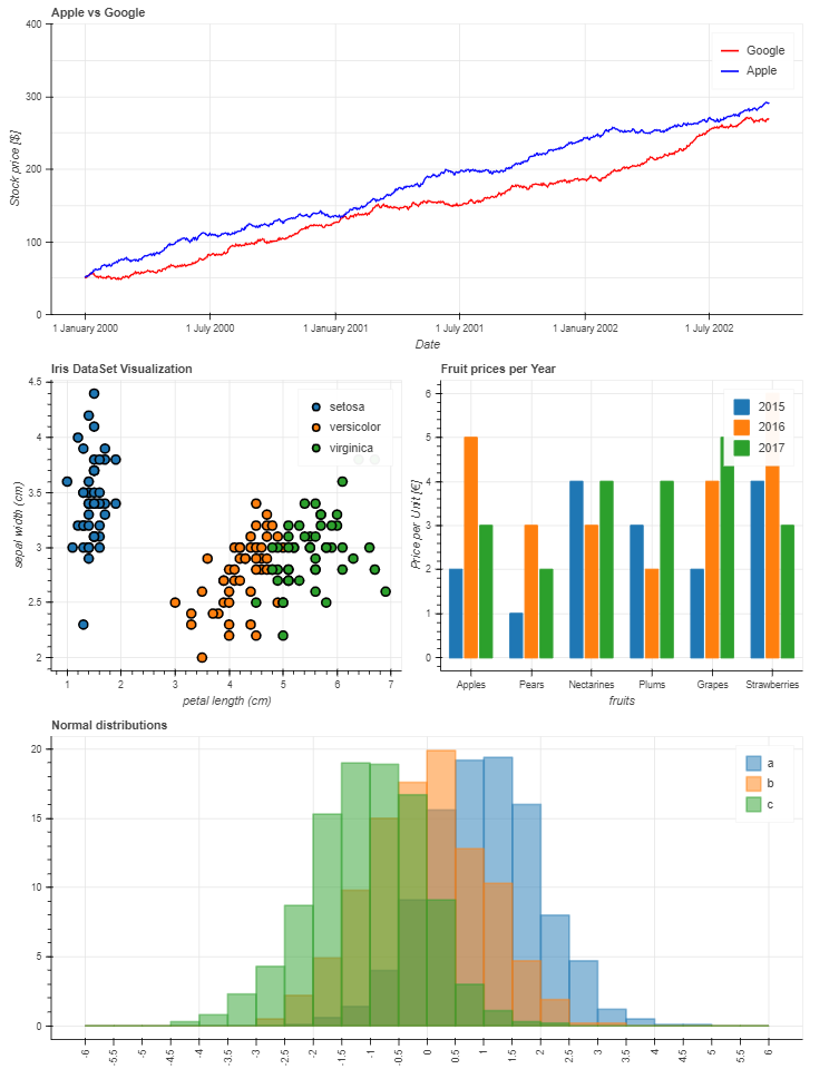
又或者这样:
p_line.plot_width = 900
p_hist.plot_width = 900

layout = pandas_bokeh.column(p_line,
                pandas_bokeh.row(p_scatter, p_bar),
                p_hist)  # 指定每行显示的内容

pandas_bokeh.show(layout)
以上就是本次全部内容,通过这部分的学习,我们发现Pandas除了结合matplotlib常规绘图外,还可以通过bokeh绘图后端快速绘制可交互的图表,用起来非常方便。
当然,如果想更深入了解或者定制化这些可视化图表,可能需要对bokeh有更多的了解,这块查阅官网资料即可!
--END--
老表赠书
图书介绍:《Python+Excel职场办公数据分析》内容主要分为两部分:第一部分为编程基础部分,共包括4章内容(第1~4章),主要讲解Python的安装方法、基本语法、Pandas模块用法、xlwings模块操作Excel数据的方法等;第二部分为实战案例部分,主要介绍批量自动处理及分析各种数据的案例(第5~8章)。
赠送规则:留言说说你的近一个月的生活/学习/工作计划,不少于20字,留言点赞top1可以获得赠书一本,另外我还会选两个走心留言赠送一本《Python+Excel职场办公数据分析》。 扫码即可加我微信
老表朋友圈经常有赠书/红包福利活动
1)近一个月内获得赠书的读者将无法再次获得赠书,想要多次获得赠书,可以查看下面的投稿规则及激励;
2)同时已经获得赠书的读者想要再次获得赠书,必须先写一篇已获得赠书的读后感(1000字+),才有机会再次获得赠书。
希望每一位读者都能获得赠书,只有有付出,就会有回报,就会有进步。
新玩法,以后每篇技术文章,点赞超过100+,我将在个人视频号直播带大家一起进行项目实战复现,快嘎嘎点赞吧!!!
直播将在我的视频号:老表Max 中开展,扫上方二维码添加我微信即可查看我的视频号。
大家的 点赞、留言、转发是对号主的最大支持。
学习更多: 整理了我开始分享学习笔记到现在超过250篇优质文章,涵盖数据分析、爬虫、机器学习等方面,别再说不知道该从哪开始,实战哪里找了 “点赞”就是对博主最大的支持