
Android | 玩转AppBarLayout,设置scrollFlags滑动属性详解
CoordinatorLayout与AppBarLayout的配合使用,在之前的文章中我们也经常使用,主要是专门用来打造各种炫酷的效果。
有童鞋看了之前的文章反馈对AppBarLayout中的scrollFlags属性的设置不是很明白,这篇文章我们具体来讲讲这个属性的用法效果。
我们先简单了解一下AppBarLayout:
AppBarLayout继承自LinearLayout,布局方向为垂直方向。所以你可以把它当成垂直布局的LinearLayout来使用。AppBarLayout是在LinearLayou上加了一些材料设计的概念,它可以让你定制当某个可滚动View的滚动手势发生变化时,其内部的子View实现何种动作。
这里说得其内部的子View实现任何动作,就是可以通过scrollFlags属性进行设置达到想要的效果。
那么app:layout_scrollFlags可以设置哪些动作呢?
下面我们通过XML布局文件代码和对应的效果图进行解析:
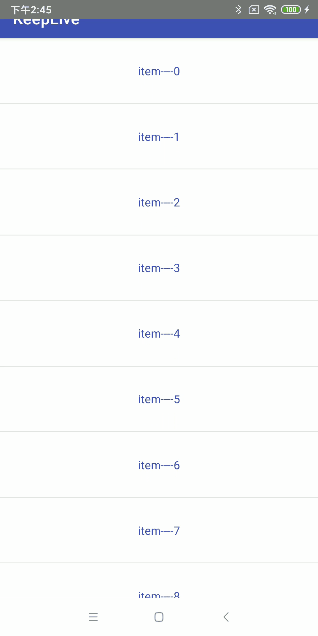
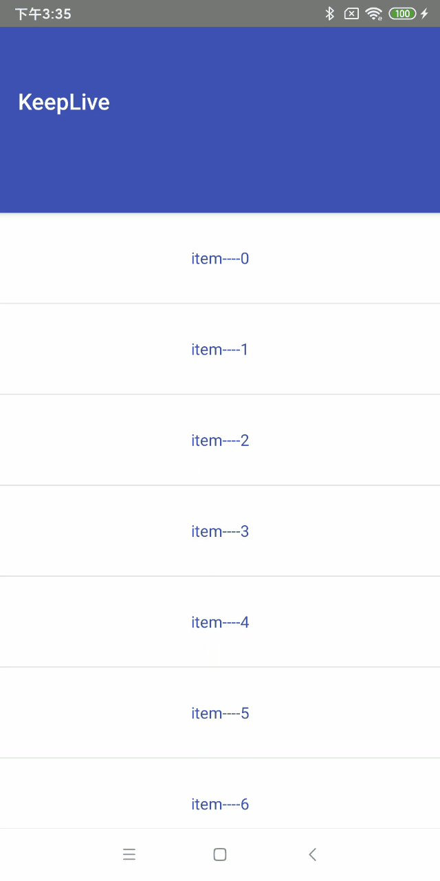
1、scroll
子View会跟随滚动事件一起发生移动而滚出或滚进屏幕。注意两点:第一点,如果使用了其他值,必定要使用这个值才能起作用;第二点:如果在这个子View前面的任何其他子View没有设置这个值,那么这个子View的设置将失去作用。
布局文件:
<android.support.design.widget.CoordinatorLayout xmlns:android="http://schemas.android.com/apk/res/android"xmlns:app="http://schemas.android.com/apk/res-auto"android:layout_width="match_parent"android:layout_height="match_parent"android:fitsSystemWindows="true"><android.support.design.widget.AppBarLayoutandroid:id="@+id/appbar"android:layout_width="match_parent"android:layout_height="wrap_content"android:theme="@style/ThemeOverlay.AppCompat.Dark.ActionBar"><android.support.v7.widget.Toolbarandroid:id="@+id/tb_toolbar"android:layout_width="match_parent"android:layout_height="50dp"android:background="@color/colorPrimary"app:layout_scrollFlags="scroll"app:title="@string/app_name" /></android.support.design.widget.AppBarLayout><android.support.v7.widget.RecyclerViewandroid:id="@+id/recyclerView"android:layout_width="match_parent"android:layout_height="wrap_content"app:layout_behavior="@string/appbar_scrolling_view_behavior" /></android.support.design.widget.CoordinatorLayout>
对应效果图:
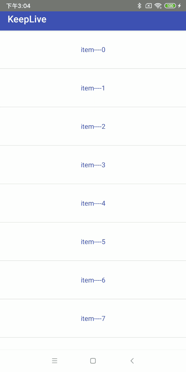
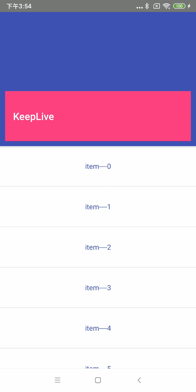
2、enterAlways
和scroll相比较,其实就是向下滚动时优先级问题,scroll首先滑动的是列表,列表的数据全部滚动完毕,才开始toolbar滑动。而scroll | enterAlways首先滑动的是toolbar ,然后再去滑动其他的view。只是优先级先后的问题。
布局文件:代码类型,只是改变属性值,这里就不赘述了
......................<android.support.v7.widget.Toolbarandroid:id="@+id/tb_toolbar"android:layout_width="match_parent"android:layout_height="50dp"android:background="@color/colorPrimary"app:layout_scrollFlags="scroll|enterAlways"app:title="@string/app_name" />......................
对应效果图:
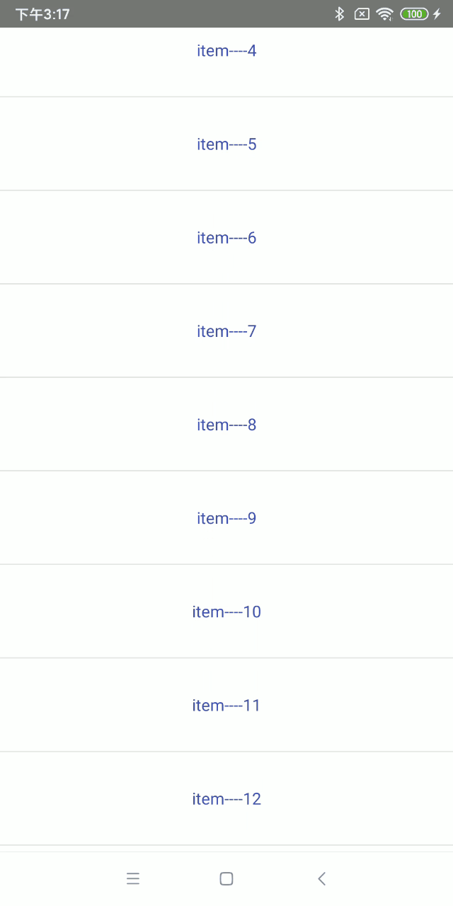
3、enterAlwaysCollapsed
enterAlwaysCollapsed是enterAlways的附加标志,这里涉及到子View的高度和最小高度,向下滚动时,子View先向下滚动最小高度值,然后Scrolling View开始滚动,到达边界时,子View再向下滚动,直至显示完全。
布局文件:代码类型,只是改变属性值,这里就不赘述了
............................<android.support.v7.widget.Toolbarandroid:id="@+id/tb_toolbar"android:layout_width="match_parent"android:layout_height="200dp"android:minHeight="50dp"android:background="@color/colorPrimary"app:layout_scrollFlags="scroll|enterAlways|enterAlwaysCollapsed"app:title="@string/app_name" />.............................
对应效果图:
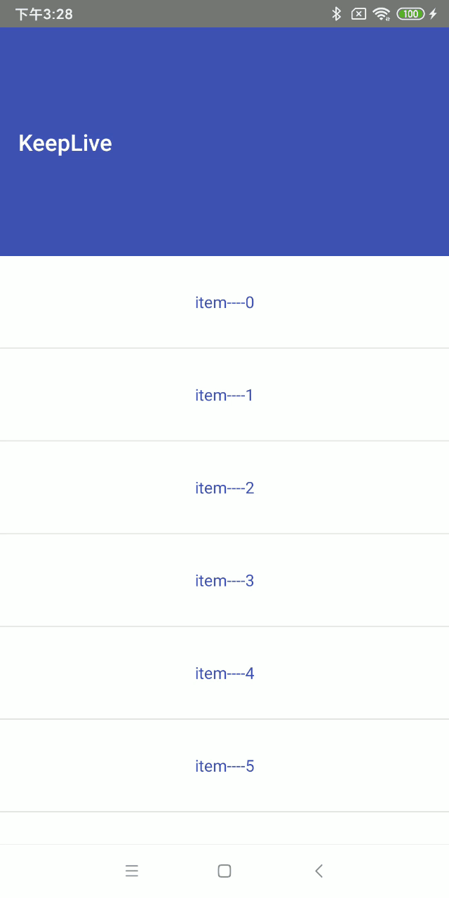
4、exitUntilCollapsed
这里也涉及到最小高度。发生向上滚动事件时,子View向上滚动直至最小高度,然后Scrolling View开始滚动。也就是,子View不会完全退出屏幕。
布局文件:代码类型,只是改变属性值,这里就不赘述了
...................................<android.support.v7.widget.Toolbarandroid:id="@+id/tb_toolbar"android:layout_width="match_parent"android:layout_height="200dp"android:minHeight="50dp"android:background="@color/colorPrimary"app:layout_scrollFlags="scroll|exitUntilCollapsed"app:title="@string/app_name" />....................................
对应效果图:
5、snap
子View滚动比例的吸附效果。也就是说子View不会存在局部显示的情况,滚动到子View的部分高度,当我们松开手指时,子View要么向上全部滚出屏幕,要么向下全部滚进屏幕。
布局文件:代码类型,只是改变属性值,这里就不赘述了
......................<android.support.v7.widget.Toolbarandroid:id="@+id/tb_toolbar"android:layout_width="match_parent"android:layout_height="200dp"android:background="@color/colorPrimary"app:layout_scrollFlags="scroll|snap"app:title="@string/app_name" />......................
对应效果图:
6、snapMargins
snapMargins是必须配合snap一起使用的额外的flag。如果设置的话,这个View将会被snap到它的顶部外边距和它的底部外边距的位置,而不是这个View自身的上下边缘。
布局文件:
<android.support.design.widget.CoordinatorLayout xmlns:android="http://schemas.android.com/apk/res/android"xmlns:app="http://schemas.android.com/apk/res-auto"android:layout_width="match_parent"android:layout_height="match_parent"android:fitsSystemWindows="true"><android.support.design.widget.AppBarLayoutandroid:id="@+id/appbar"android:layout_width="match_parent"android:layout_height="wrap_content"android:background="@color/colorPrimary"android:theme="@style/ThemeOverlay.AppCompat.Dark.ActionBar"><android.support.v7.widget.Toolbarandroid:id="@+id/tb_toolbar"android:layout_width="match_parent"android:layout_height="100dp"android:layout_marginStart="10dp"android:layout_marginTop="200dp"android:layout_marginEnd="10dp"android:layout_marginBottom="10dp"android:background="@color/colorAccent"app:layout_scrollFlags="scroll|snap|snapMargins"app:title="@string/app_name" /></android.support.design.widget.AppBarLayout><android.support.v7.widget.RecyclerViewandroid:id="@+id/recyclerView"android:layout_width="match_parent"android:layout_height="wrap_content"app:layout_behavior="@string/appbar_scrolling_view_behavior" /></android.support.design.widget.CoordinatorLayout>
对应的效果图:
可以看到Margin生效了,滑动必须超过Toolbar的高度以及上下Margin就会继续滑动,否则就恢复。
上面的内容就介绍完了,代码基本都在文章里,就不放demo了。
到这里就结束啦!