
Pyecharts绘制上下组合图、左右组合图、一轴多图,超经典!
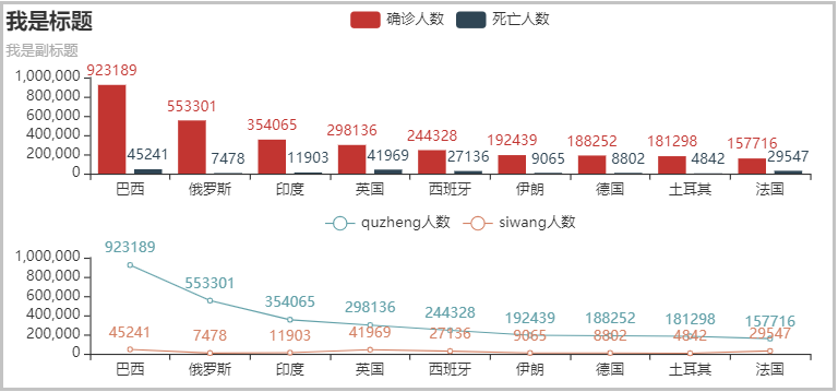
1. 上下组合
from pyecharts.charts import Bar, Line, Grid
from pyecharts import options

# 1、准备数据
country = ['巴西', '俄罗斯', '印度', '英国', '西班牙', '伊朗', '德国', '土耳其', '法国']
quezheng = [923189,553301,354065,298136,244328,192439,188252,181298,157716]
siwang = [45241,7478,11903,41969,27136,9065,8802,4842,29547]

# 2、绘制柱形图
bar = (
    Bar()
    .add_xaxis(country)
    .add_yaxis("确诊人数", quezheng)
    .add_yaxis("死亡人数", siwang)
    .set_global_opts(title_opts=options.TitleOpts(title="我是标题", subtitle="我是副标题"))
)

# 3、绘制线图
line = (
    Line()
    .add_xaxis(country)
    .add_yaxis("quzheng人数", quezheng)
    .add_yaxis("siwang人数", siwang)
    .set_global_opts(legend_opts=opts.LegendOpts(pos_bottom="45%"))
)

# 4、创建组合图
(Grid(init_opts=opts.InitOpts(width='750px', height='350px'))
 .add(bar,grid_opts=opts.GridOpts(pos_bottom="60%"))
 .add(line,grid_opts=opts.GridOpts(pos_top="60%"))
).render_notebook()
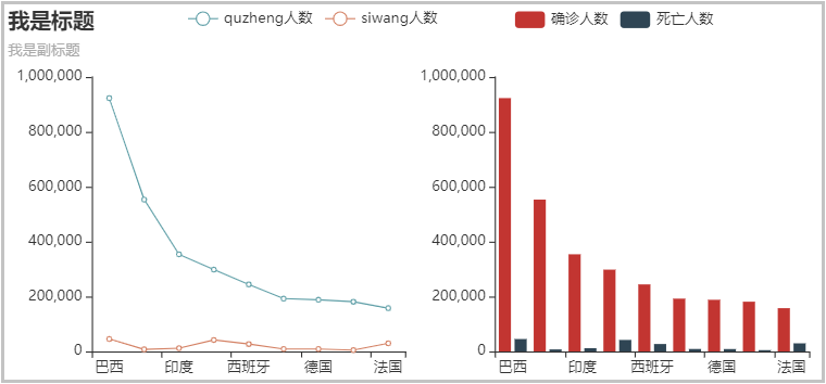
2. 左右组合
from pyecharts.charts import Bar, Line, Grid
from pyecharts import options

# 1、准备数据
country = ['巴西', '俄罗斯', '印度', '英国', '西班牙', '伊朗', '德国', '土耳其', '法国']
quezheng = [923189,553301,354065,298136,244328,192439,188252,181298,157716]
siwang = [45241,7478,11903,41969,27136,9065,8802,4842,29547]

# 2、绘制柱形图
bar = (
    Bar()
    .add_xaxis(country)
    .add_yaxis("确诊人数", quezheng, label_opts=opts.LabelOpts(is_show=False))
    .add_yaxis("死亡人数", siwang, label_opts=opts.LabelOpts(is_show=False))
    .set_global_opts(title_opts=options.TitleOpts(title="我是标题", subtitle="我是副标题"),
                     legend_opts=opts.LegendOpts(pos_right="20%"))
)

# 3、绘制线图
line = (
    Line()
    .add_xaxis(country)
    .add_yaxis("quzheng人数", quezheng, label_opts=opts.LabelOpts(is_show=False))
    .add_yaxis("siwang人数", siwang, label_opts=opts.LabelOpts(is_show=False))
    .set_global_opts(legend_opts=opts.LegendOpts(pos_left="20%"))
)

# 4、创建组合图
(Grid(init_opts=opts.InitOpts(width='750px', height='350px'))
 .add(bar,grid_opts=opts.GridOpts(pos_left="55%"))
 .add(line,grid_opts=opts.GridOpts(pos_right="55%"))
).render_notebook()
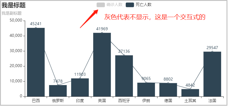
3. 一轴多图
from pyecharts.charts import Bar, Line, Grid
from pyecharts import options

# 1、准备数据
country = ['巴西', '俄罗斯', '印度', '英国', '西班牙', '伊朗', '德国', '土耳其', '法国']
quezheng = [923189,553301,354065,298136,244328,192439,188252,181298,157716]
siwang = [45241,7478,11903,41969,27136,9065,8802,4842,29547]

# 2、绘制柱形图
bar = (
    Bar(init_opts=opts.InitOpts(width='750px', height='350px'))
    .add_xaxis(country)
    .add_yaxis("确诊人数", quezheng)
    .add_yaxis("死亡人数", siwang)
    .set_global_opts(title_opts=options.TitleOpts(title="我是标题", subtitle="我是副标题"))
)

# 3、绘制线图
line = (
    Line()
    .add_xaxis(country)
    .add_yaxis("确诊人数", quezheng, label_opts=opts.LabelOpts(is_show=False))
    .add_yaxis("死亡人数", siwang, label_opts=opts.LabelOpts(is_show=False))
)

# 4、创建组合图
bar.overlap(line).render_notebook()
--End--
文章点赞超过100+
我将在个人视频号直播(老表Max)
带大家一起进行项目实战复现
扫码即可加我微信
老表朋友圈经常有赠书/红包福利活动
点击上方卡片关注公众号,回复:1024 领取最新Python学习资源
学习更多: 整理了我开始分享学习笔记到现在超过250篇优质文章,涵盖数据分析、爬虫、机器学习等方面,别再说不知道该从哪开始,实战哪里找了 “点赞”就是对博主最大的支持

评论