
position:sticky实现表头固定

单词 sticky 的中文意思是“粘性的”,position:sticky 表现也符合这个粘性的表现。基本上,可以看出是 position:relative 和 position:fixed 的结合体。当元素在屏幕内,表现为 relative,就要滚出显示器屏幕的时候,表现为 fixed。例如,可以标题吸顶。
其中导航元素设置了如下CSS:
nav {position: sticky;top: 0;}
于是,正如大家看到,随着页面的滚动,当导航距离上边缘 0 距离的时候,黏在了上边缘,表现如同 position:fixed。
我们可以实现富有层次的滚动交互,比如下面:
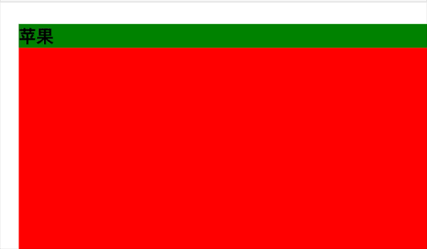
.container {width: 100%;max-height: 500px;overflow: auto;}h4 {position: sticky;top: 0;background: green;}.content {width: 100%;height: 500px;background: red;}<body><div class="container"><div><h4>苹果h4><div class="content">1div>div><div><h4>香蕉h4><div class="content">2div>div><div><h4>葡萄h4><div class="content">3div>div>div>body>
我们还可以实现表头固定,类似于下面的效果:
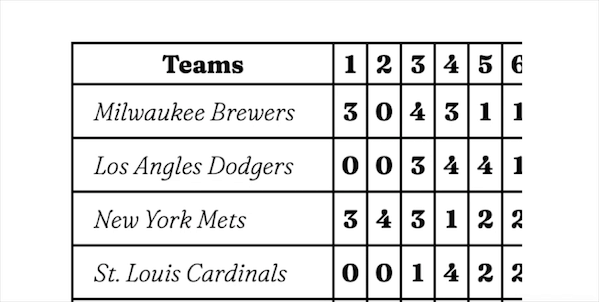
<html lang="en"><head><meta charset="UTF-8"><meta name="viewport" content="width=device-width, initial-scale=1.0"><title>Documenttitle><style>* {margin: 0;padding: 0;}html,body {width: 100%;height: 100%;}table {font-family: "Fraunces", serif;font-size: 125%;white-space: nowrap;margin: 0;border: none;border-collapse: separate;border-spacing: 0;table-layout: fixed;border: 1px solid black;}table td,table th {border: 1px solid black;padding: 0.5rem 1rem;}table thead th {padding: 3px;position: sticky;top: 0;z-index: 1;width: 25vw;background: white;}table td {background: #fff;padding: 4px 5px;text-align: center;}table tbody th {font-weight: 100;font-style: italic;text-align: left;position: relative;}table thead th:first-child {position: sticky;left: 0;z-index: 2;}table tbody th {position: sticky;left: 0;background: white;z-index: 1;}.container {/* 表格最大宽度和高度 */width: 100%;max-height: 500px;overflow: auto;}style>head><body><div class="container"><table><thead><tr><th>用户姓名th><th>用户年龄th><th>用户学校th><th>用户班级th><th>用户成绩th><th>用户个数th>tr>thead><tbody><tr><th>张三th><td>1td><td>2td><td>3td><td>4td><td>5td>tr><tr><th>张三th><td>1td><td>2td><td>3td><td>4td><td>5td>tr>tbody>table>div>body>html>
总结:
元素根据正常文档流进行定位,然后相对它的最近滚动祖先(nearest scrolling ancestor)和 containing block (最近块级祖先 nearest block-level ancestor),包括 table-related 元素,基于 top, right, bottom, 和 left 的值进行偏移。偏移值不会影响任何其他元素的位置。
该值总是创建一个新的层叠上下文(stacking context)。注意,一个 sticky 元素会“固定”在离它最近的一个拥有“滚动机制”的祖先上(当该祖先的 overflow 是 hidden, scroll, auto, 或 overlay 时),即便这个祖先不是最近的真实可滚动祖先。这有效地抑制了任何“sticky”行为。
评论