
前端CSS魔法
本文推荐一些实用且有趣的CSS片段或网站
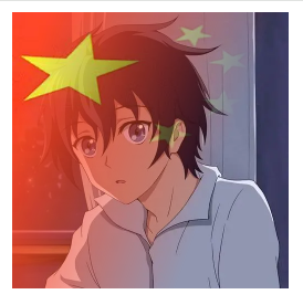
01 国旗头像
      <!DOCTYPE html>
<html>
  <head>
    <meta charset="utf-8" />
    <title></title>
    <style>
      div {
          position: relative;
          margin: auto;
          width: 200px;
          height: 200px;
          background: url('https://img0.baidu.com/it/u=3435975908,2384326966&fm=253&fmt=auto&app=138&f=JPEG?w=500&h=500') no-repeat;
          background-size: cover;
      }
      div::after {
          content: "";
          position: absolute;
          top: 0;
          left: 0;
          bottom: 0;
          right: 0;
          background: url('https://img1.baidu.com/it/u=331200533,2965705563&fm=253&fmt=auto&app=138&f=JPEG?w=500&h=333') no-repeat;
          background-size: cover;
          mask: linear-gradient(110deg, #000 10%, transparent 70%, transparent);
      }

    </style>
  </head>
  <body>
    <div></div>
  </body>
</html>
核心代码:
mask: linear-gradient(110deg, #000 10%, transparent 70%, transparent);
02 css多边形

      <!DOCTYPE html>
<html>
  <head>
    <meta charset="utf-8" />
    <title></title>
    <style>
      * {
        margin: 0;
        padding: 0;
      }

      body {
        height: 100vh;
        display: flex;
        justify-content: center;
        align-items: center;
        background-color: rgb(255, 255, 255);
      }

      .box {
        background-color: #00aa7f;
        color: azure;
        width: 200px;
        height: 225px;
        text-align: center;
        line-height: 225px;
        clip-path: polygon(50% 0%,
            100% 25%,
            100% 75%,
            50% 100%,
            0% 75%,
            0% 25%);
      }

      .box2 {
        margin-left: 10px;
        background-color: #00aa7f;
        color: azure;
        width: 200px;
        height: 225px;
        text-align: center;
        line-height: 225px;
        clip-path: polygon(50% 0%,
            25% 100%,
            100% 100%);
      }
    </style>
  </head>
  <body>
    <div class="box"></div>
    <div class="box2"></div>
  </body>
</html>
核心代码:
clip-path: polygon(50% 0%,25% 100%,100% 100%);
关于多边形-推荐一个网站,可以复制对应样式:
https://bennettfeely.com/clippy/
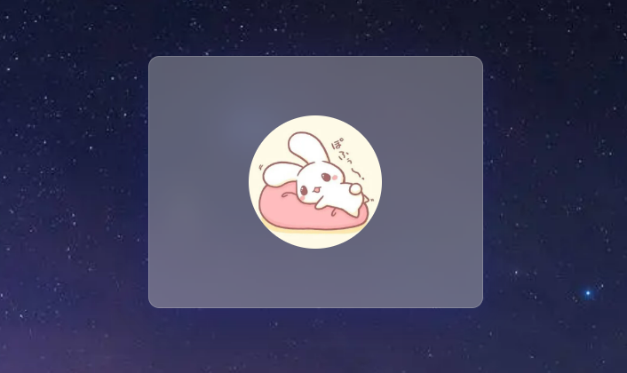
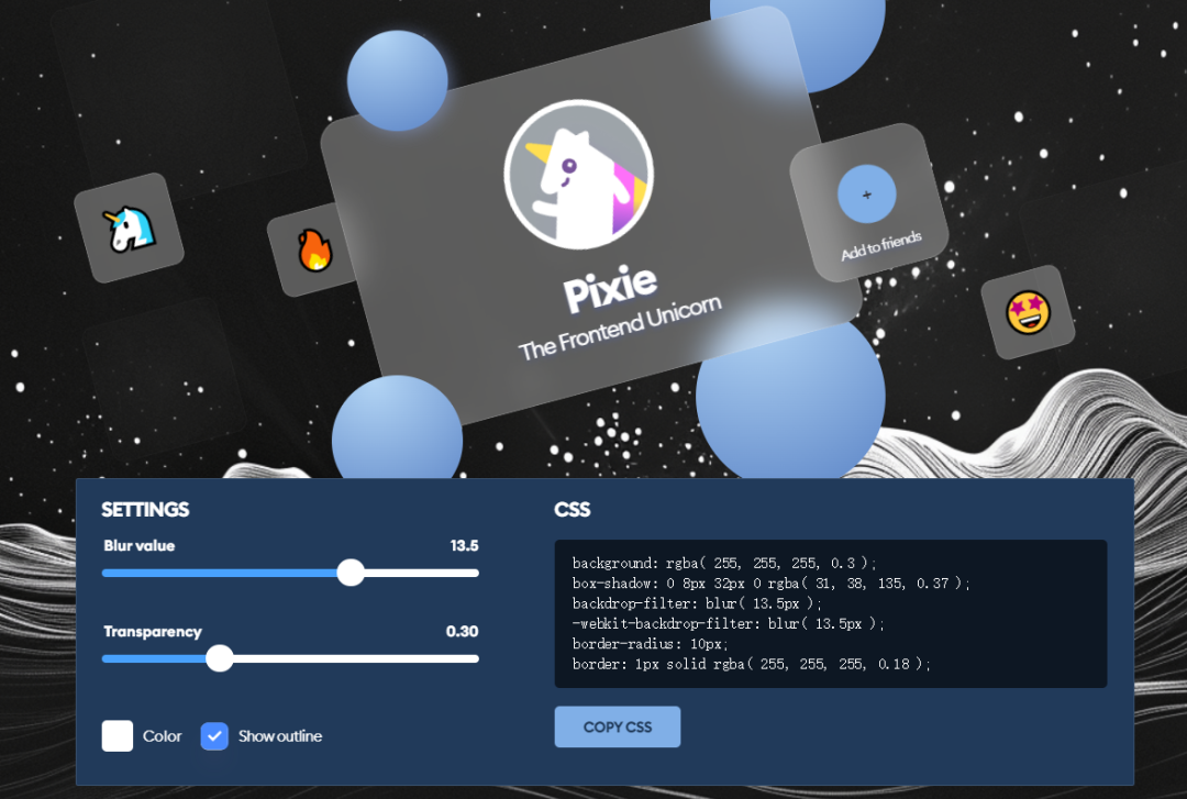
03 毛玻璃
      <!DOCTYPE html>
<html>
  <head>
    <meta charset="utf-8" />
    <title></title>
    <style>
      * {
        margin: 0;
        padding: 0;
      }

      body {
        height: 100vh;
        display: flex;
        justify-content: center;
        align-items: center;
        background: url("https://img0.baidu.com/it/u=2934556745,713129916&fm=253&fmt=auto&app=120&f=JPEG?w=1422&h=800") no-repeat;
        background-size: cover;
      }

      .box {
        width: 300px;
        height: 225px;
        display: flex;
        justify-content: center;
        align-items: center;
        background: rgba( 255, 255, 255, 0.3 );
        box-shadow: 0 8px 32px 0 rgba( 31, 38, 135, 0.37 );
        backdrop-filter: blur( 13.5px );
        -webkit-backdrop-filter: blur( 13.5px );
        border-radius: 10px;
        border: 1px solid rgba( 255, 255, 255, 0.18 );
      }

      img{
        width: 120px;
        height: 120px;
        border-radius: 50%;
      }

    </style>
  </head>
  <body>
    <div class="box">
      <img src="https://img2.baidu.com/it/u=3453764062,377256032&fm=253&fmt=auto&app=138&f=JPEG?w=500&h=500" alt="">
    </div>
  </body>
</html>
关于毛玻璃-推荐一个网站,可以复制对应样式:
https://hype4.academy/tools/glassmorphism-generator
04 生成svg/png背景
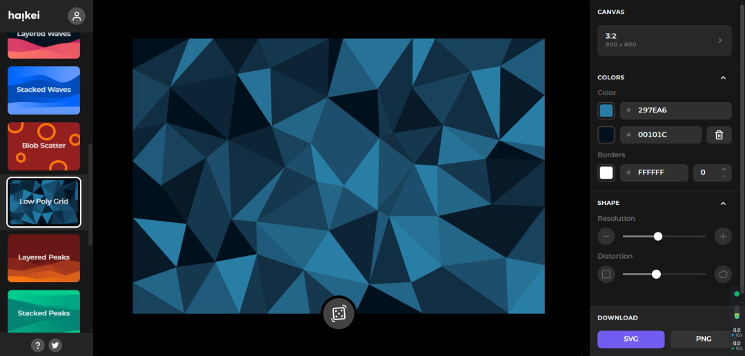
https://app.haikei.app/
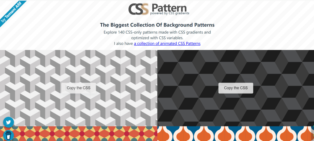
05 矢量背景生成
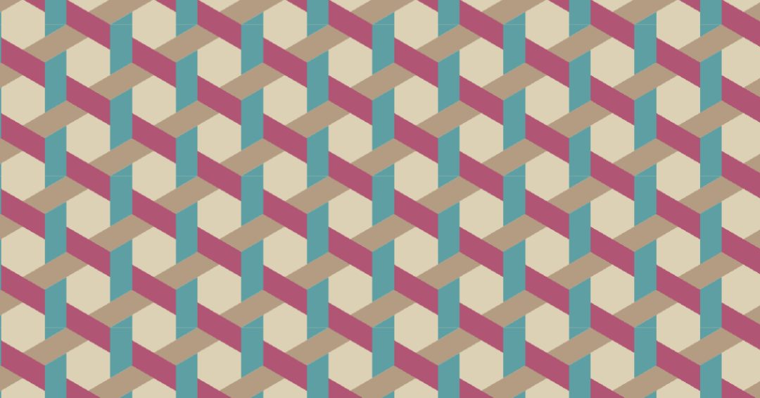
网站链接:<!DOCTYPE html>
<html>
<head>
<meta charset="utf-8" />
<title></title>
<style>
* {
margin: 0;
padding: 0;
}
html {
--s: 30px;
/* control the size */
--_c: #5E9FA3;
background:
conic-gradient(at 50% calc(100%/6), var(--_c) 60deg, #0000 0),
conic-gradient(at calc(100%/6) 50%, #0000 240deg, var(--_c) 0),
conic-gradient(from 180deg at calc(100%/6) calc(500%/6), var(--_c) 60deg, #0000 0),
conic-gradient(from 180deg at calc(500%/6), #0000 240deg, var(--_c) 0) calc(4*.866*var(--s)) 0,
repeating-linear-gradient(-150deg, #B05574 0 calc(100%/6), #0000 0 50%),
repeating-linear-gradient(-30deg, #B39C82 0 calc(100%/6), #DCD1B4 0 50%);
background-size: calc(6*.866*var(--s)) calc(3*var(--s))
}
</style>
</head>
<body>
</body>
</html>
https://css-pattern.com/
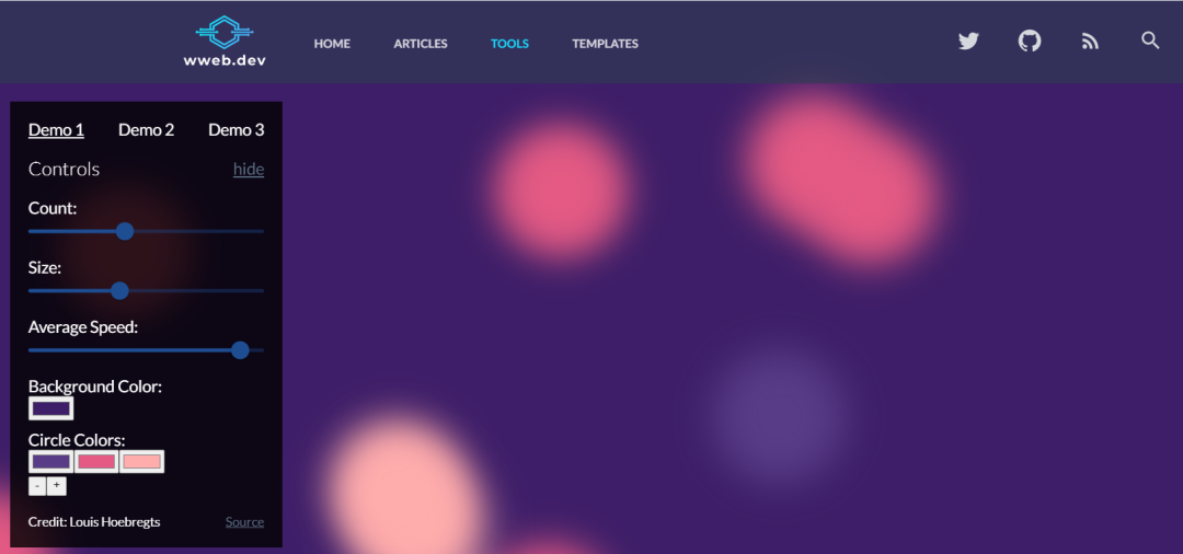
06 css动态背景生成

      <!DOCTYPE html>
<html>
  <head>
    <meta charset="utf-8" />
    <title></title>
    <style>
      * {
        margin: 0;
        padding: 0;
      }

      @keyframes move {
          100% {
              transform: translate3d(0, 0, 1px) rotate(360deg);
          }
      }

      .background {
          position: fixed;
          width: 100vw;
          height: 100vh;
          top: 0;
          left: 0;
          background: #3E1E68;
          overflow: hidden;
      }

      .background span {
          width: 20vmin;
          height: 20vmin;
          border-radius: 20vmin;
          backface-visibility: hidden;
          position: absolute;
          animation: move;
          animation-duration: 45;
          animation-timing-function: linear;
          animation-iteration-count: infinite;
      }


      .background span:nth-child(0) {
          color: #FFACAC;
          top: 90%;
          left: 47%;
          animation-duration: 8s;
          animation-delay: -17s;
          transform-origin: 2vw 17vh;
          box-shadow: -40vmin 0 5.494502440636581vmin currentColor;
      }
      .background span:nth-child(1) {
          color: #FFACAC;
          top: 31%;
          left: 5%;
          animation-duration: 40s;
          animation-delay: -14s;
          transform-origin: -5vw -14vh;
          box-shadow: -40vmin 0 5.192195104974926vmin currentColor;
      }
      .background span:nth-child(2) {
          color: #FFACAC;
          top: 18%;
          left: 62%;
          animation-duration: 20s;
          animation-delay: -5s;
          transform-origin: -18vw -12vh;
          box-shadow: 40vmin 0 5.72205756381233vmin currentColor;
      }
      .background span:nth-child(3) {
          color: #FFACAC;
          top: 71%;
          left: 45%;
          animation-duration: 30s;
          animation-delay: -2s;
          transform-origin: -4vw -20vh;
          box-shadow: -40vmin 0 5.303503038071778vmin currentColor;
      }
      .background span:nth-child(4) {
          color: #E45A84;
          top: 90%;
          left: 38%;
          animation-duration: 15s;
          animation-delay: -48s;
          transform-origin: 7vw -9vh;
          box-shadow: -40vmin 0 5.882238754040052vmin currentColor;
      }
      .background span:nth-child(5) {
          color: #583C87;
          top: 34%;
          left: 32%;
          animation-duration: 30s;
          animation-delay: -36s;
          transform-origin: -6vw -15vh;
          box-shadow: 40vmin 0 5.183333217256063vmin currentColor;
      }
      .background span:nth-child(6) {
          color: #583C87;
          top: 25%;
          left: 41%;
          animation-duration: 21s;
          animation-delay: -47s;
          transform-origin: -10vw -5vh;
          box-shadow: 40vmin 0 5.345257098222438vmin currentColor;
      }
      .background span:nth-child(7) {
          color: #E45A84;
          top: 16%;
          left: 39%;
          animation-duration: 30s;
          animation-delay: -33s;
          transform-origin: -15vw 3vh;
          box-shadow: -40vmin 0 5.693872337330205vmin currentColor;
      }
      .background span:nth-child(8) {
          color: #583C87;
          top: 42%;
          left: 55%;
          animation-duration: 46s;
          animation-delay: -50s;
          transform-origin: -6vw 25vh;
          box-shadow: 40vmin 0 5.588315610213253vmin currentColor;
      }
      .background span:nth-child(9) {
          color: #E45A84;
          top: 78%;
          left: 25%;
          animation-duration: 44s;
          animation-delay: -21s;
          transform-origin: -4vw -12vh;
          box-shadow: -40vmin 0 5.82170170819547vmin currentColor;
      }
      .background span:nth-child(10) {
          color: #E45A84;
          top: 73%;
          left: 77%;
          animation-duration: 41s;
          animation-delay: -40s;
          transform-origin: 21vw -11vh;
          box-shadow: -40vmin 0 5.838449416658446vmin currentColor;
      }
      .background span:nth-child(11) {
          color: #E45A84;
          top: 48%;
          left: 81%;
          animation-duration: 33s;
          animation-delay: -42s;
          transform-origin: 6vw 19vh;
          box-shadow: 40vmin 0 5.848850560573668vmin currentColor;
      }
      .background span:nth-child(12) {
          color: #E45A84;
          top: 77%;
          left: 7%;
          animation-duration: 25s;
          animation-delay: -1s;
          transform-origin: 15vw 24vh;
          box-shadow: -40vmin 0 5.800039290361969vmin currentColor;
      }
      .background span:nth-child(13) {
          color: #E45A84;
          top: 77%;
          left: 38%;
          animation-duration: 51s;
          animation-delay: -40s;
          transform-origin: -1vw -13vh;
          box-shadow: -40vmin 0 5.876822672246133vmin currentColor;
      }
      .background span:nth-child(14) {
          color: #583C87;
          top: 58%;
          left: 98%;
          animation-duration: 7s;
          animation-delay: -1s;
          transform-origin: -19vw -20vh;
          box-shadow: -40vmin 0 5.622075629639948vmin currentColor;
      }
      .background span:nth-child(15) {
          color: #583C87;
          top: 79%;
          left: 31%;
          animation-duration: 39s;
          animation-delay: -46s;
          transform-origin: 14vw 21vh;
          box-shadow: 40vmin 0 5.022352355698978vmin currentColor;
      }
      .background span:nth-child(16) {
          color: #E45A84;
          top: 41%;
          left: 74%;
          animation-duration: 37s;
          animation-delay: -4s;
          transform-origin: -19vw 3vh;
          box-shadow: 40vmin 0 5.049960684696969vmin currentColor;
      }
      .background span:nth-child(17) {
          color: #583C87;
          top: 56%;
          left: 34%;
          animation-duration: 26s;
          animation-delay: -35s;
          transform-origin: -16vw -7vh;
          box-shadow: -40vmin 0 5.11253385954465vmin currentColor;
      }
      .background span:nth-child(18) {
          color: #583C87;
          top: 84%;
          left: 2%;
          animation-duration: 14s;
          animation-delay: -39s;
          transform-origin: -10vw -6vh;
          box-shadow: 40vmin 0 5.903761483531039vmin currentColor;
      }
      .background span:nth-child(19) {
          color: #E45A84;
          top: 61%;
          left: 39%;
          animation-duration: 21s;
          animation-delay: -36s;
          transform-origin: 14vw 9vh;
          box-shadow: 40vmin 0 5.448311817969409vmin currentColor;
      }
      .background span:nth-child(20) {
          color: #E45A84;
          top: 33%;
          left: 5%;
          animation-duration: 8s;
          animation-delay: -7s;
          transform-origin: 4vw 2vh;
          box-shadow: 40vmin 0 5.013421190075091vmin currentColor;
      }

    </style>
  </head>
  <body>
    <div class="background">
       <span></span>
       <span></span>
       <span></span>
       <span></span>
       <span></span>
       <span></span>
       <span></span>
       <span></span>
       <span></span>
       <span></span>
       <span></span>
       <span></span>
       <span></span>
       <span></span>
       <span></span>
       <span></span>
       <span></span>
       <span></span>
       <span></span>
       <span></span>
       <span></span>
    </div>
  </body>
</html>
地址:
https://wweb.dev/resources/animated-css-background-generator
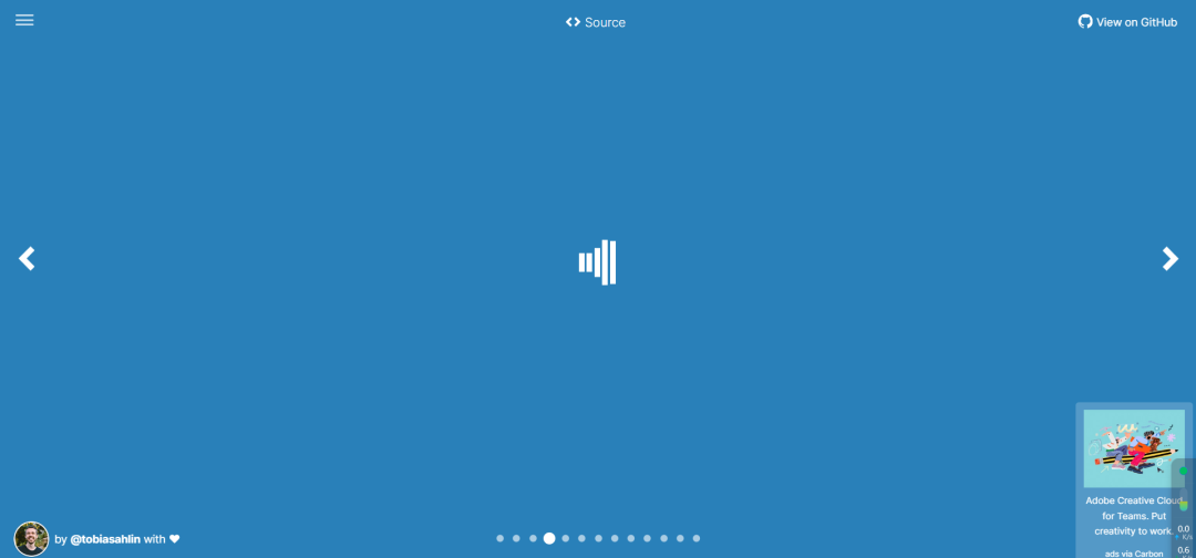
07 css动态波浪

推荐网站:<!DOCTYPE html>
<html>
<head>
<meta charset="utf-8" />
<title></title>
<style>
* {
padding: 0;
margin: 0;
}
svg {
position: absolute;
top: 0;
left: 0;
width: 100%;
height: 100%;
box-sizing: border-box;
display: block;
background-color: #0e4166;
background-image: linear-gradient(to bottom, rgba(14, 65, 102, 0.86), #0e4166);
}
</style>
</head>
<body>
<body>
<svg version="1.1" xmlns="http://www.w3.org/2000/svg"
xmlns:xlink="http://www.w3.org/1999/xlink" x="0px" y="0px" width="100%" height="100%" viewBox="0 0 1600 900" preserveAspectRatio="xMidYMax slice">
<defs>
<linearGradient id="bg">
<stop offset="0%" style="stop-color:rgba(130, 158, 249, 0.06)"></stop>
<stop offset="50%" style="stop-color:rgba(76, 190, 255, 0.6)"></stop>
<stop offset="100%" style="stop-color:rgba(115, 209, 72, 0.2)"></stop>
</linearGradient>
<path id="wave" fill="url(#bg)" d="M-363.852,502.589c0,0,236.988-41.997,505.475,0
s371.981,38.998,575.971,0s293.985-39.278,505.474,5.859s493.475,48.368,716.963-4.995v560.106H-363.852V502.589z" />
</defs>
<g>
<use xlink:href='#wave' opacity=".3">
<animateTransform
attributeName="transform"
attributeType="XML"
type="translate"
dur="10s"
calcMode="spline"
values="270 230; -334 180; 270 230"
keyTimes="0; .5; 1"
keySplines="0.42, 0, 0.58, 1.0;0.42, 0, 0.58, 1.0"
repeatCount="indefinite" />
</use>
<use xlink:href='#wave' opacity=".6">
<animateTransform
attributeName="transform"
attributeType="XML"
type="translate"
dur="8s"
calcMode="spline"
values="-270 230;243 220;-270 230"
keyTimes="0; .6; 1"
keySplines="0.42, 0, 0.58, 1.0;0.42, 0, 0.58, 1.0"
repeatCount="indefinite" />
</use>
<use xlink:href='#wave' opacty=".9">
<animateTransform
attributeName="transform"
attributeType="XML"
type="translate"
dur="6s"
calcMode="spline"
values="0 230;-140 200;0 230"
keyTimes="0; .4; 1"
keySplines="0.42, 0, 0.58, 1.0;0.42, 0, 0.58, 1.0"
repeatCount="indefinite" />
</use>
</g>
</svg>
</body>
</body>
</html>
https://animatedbackgrounds.me/
08 loading
09 和其他css语言相互转换
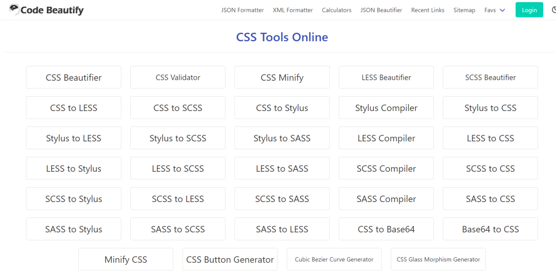
网站:
https://codebeautify.org/css-tools
如有帮助,点个在看可否
评论