
2020年你不应该错过的CSS新特性
@argyleink在第四次的伦敦(LondonCSS 2020)CSS活动中分享了一个有关于CSS特性相关的话题。看了一下这个主题的PPT,里面有些新东西还是蛮有意思的。基于该PPT,我稍微整理近24个CSS方面的新特性,感兴趣的同学可以继续往下阅读。
接下来的内容我将分为:Web动效 、Web排版 、Web性能 、 Web可访问性 、 Web美化 和 其他等六个部分。
下面聊的CSS新特性当中,有部分还处于实验阶段,如果您感兴趣的话,并不会影响你阅读。你也可以选择你感兴趣的部分阅读。(^_^)
NO.1
伦敦CSS 2020
伦敦CSS 2020(https://www.londoncss.dev/)并不是一次性的活动,到我写这篇文章为止已经是第四届(https://www.londoncss.dev/events/event4)了,每届的话题都不同。在这次活动中主要有三个话题:

@argyleink的WHAT'S NEW WITH CSS?
@Stephanie Eckles的STYLE STAGE AND MODERN CSS:Style Stage堪比现代版的CSS禅意花园(CSS Zen Garden),允许任何级别的CSS从业者重新设计基于相同HTML的样式,同时提高他们地现代CSS特性的熟悉程度
@Cassie Evans的PAINTING WITH SVG:介绍了SVG的绘制相关的特性,而且@Cassie Evans有另一篇有关于SVG的文章,非常值得我们花时间去阅读:Making lil' me - part 1
接下来,我们回到今天的主题:2020年你不应该错过的CSS新特性。
NO.2
Web动效
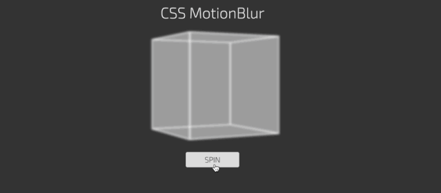
动态模糊(Motion Blur)
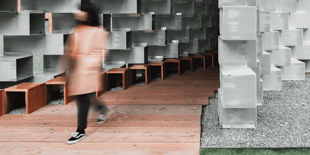
Motion Blur(动态模糊),这个概念也是我第一次接触的。查了一些资料才明白,动态模糊是一种模糊效果,它只在特动移动的时候才会让物体模糊,通常这种模糊是在物体移动的方向上应用的,这就是当你试图在拍一个移动的物体的效果。
当你拍摄一个物体(或是一个人),就像下图,这个模糊就会发生,因为这个物体(人运动)移动的速度超过了相机拍摄所需的曝光时间,所以这个物体会在最终的照片中出现多次,因为它在关键时刻移动。
在我们平时制作动效的时候,很少会考虑(添加)动态模糊效果,另外在CSS和SVG动画中也缺少这方面的效果,因此大多数Web动画看起来很生硬。也就是说,如果我们给动画在运动过程中添加一些模糊效果,会让这种动效更贴近现实生活。
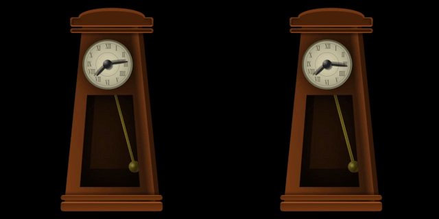
为此,@argyleink向W3C规范提出了有关于动态模糊相关的实现方案(建议)(https://github.com/w3c/csswg-drafts/issues/3837),他为开发者(CSSer)推荐了一种方法,在CSS的animation是新增了 motion-rendering 和 motion-shutter-angle 。
.animated-layer {
    /* GPU加速动画 */
    animation: rotate .5s linear infinite;

    /* 向引擎请求动态模糊
     * motion-rendering可以接受inherit | initial | auto | none | blur 值
    */
    motion-rendering: blur;

    /* 类似于相机的快门,指的是快门角度,用来控制模糊量或模糊强度
     * motion-shutter-angle可受任意角度值 inherit | initial | auto = 180deg | 0deg, ..., 720deg]
    */
    motion-shutter-angle: 180deg;
}

@keyframes rotate {
    to {
        transform: rotate(1turn);
    }
}
来看一个简单的示例(https://codepen.io/airen/pen/oNxQoLw):
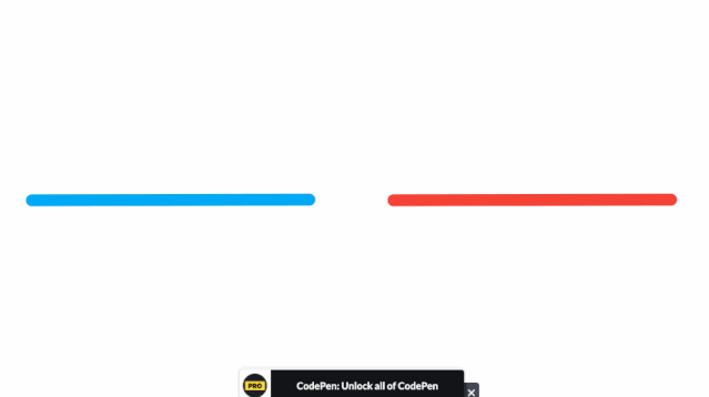
从效果上看似乎没看到动态模糊的效果。
这里还是用文档中提供的一个带有动效的图向大家展示动态模糊的效果:
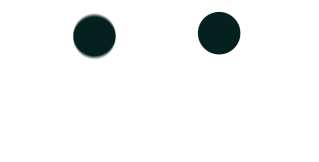
虽然说, motion-rendering 和 motion-shutter-angle 还只是一个提案,离到TR阶段还需要很长的时间,但对于某些场景(动画场景),可以使用CSS的filter来模拟,比如下面这个效果(https://codepen.io/ka4tik/pen/aFstu):
代码很简单:
.blur {
    animation: blur 250ms;
}

@keyframes blur {
    0% {
        -webkit-filter: blur(0px);
    }
    50% {
        -webkit-filter: blur(5px);
    }
    100% {
        -webkit-filter: blur(0px);
    }
}
另外,现在提供的 motion-rendering 和 motion-shutter-angle 还只是一个提议,在Github中讨论的评论中,也有建议将这两个属性换成:
filter: motion-blur(5px) motion-squash(2px)

// 或
transform-fiilter: motion-blur(180deg)

// 或
transition-filter: motion-blur(180deg)
也就是说,上面提供的CSS实现动态模糊的属性不是完全定下来的,随着后面的发展,CSS中实现动态模糊的属性,一切皆有可能。
再来看看SVG世界中,相对于CSS世界而言,SVG中要实现动态模拟效果要更容易一些,可以使用SVG中的滤镜来模拟动态模糊效果:

上图来自于@Lucas Bebber的《Motion Blur Effect with SVG(https://tympanus.net/codrops/2015/04/08/motion-blur-effect-svg/)》教程。
如果你对SVG中的滤镜相关的知识感兴趣的话,可以阅读:
SVG 1.1: Filter Effects(https://www.w3.org/TR/SVG11/filters.html)
SVG Filters 101(https://tympanus.net/codrops/2019/01/15/svg-filters-101/)
有意思的是,@Michelle Barker在Codepen写了一个Demo(https://codepen.io/michellebarker/full/povdXRW),这个Demo是用CSS的box-shadow模拟出有动态模拟的效果(https://codepen.io/michellebarker/pen/povdXRW):
如果你真的想在项目中让自己的动画效果具有动态模糊效果(让动效看上去更真一点),而又担心CSS或SVG相关特性未得到主流浏览器支持而不敢使用,那么我在这里向大家推荐一个JavaScript库: MotionBlurJS(https://www.motionblurjs.com/):
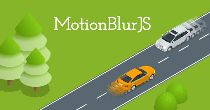
来看使用MotionBlurJS实现的动态模糊效果:
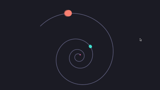
@scroll-timeline
Web开发者时常会碰到使用滚动来触发某些元素的动画效果,比如说,页面滚动条滚动到某个位置,标题固定在顶部;页面顶部展示你页面进度(滚动指示器);还是一些我们所说的视差滚动(https://www.cnblogs.com/coco1s/p/9453938.html)效果等。以往实现这些效果,大都借助JavaScript来实现,可以通过DOM事件查看滚动位置,并根据该位置更改元素的样式。如果可以的话,最好使用IntersectionObserver。有关于这方面的介绍可以阅读:
Trust is Good, Observation is Better—Intersection Observer v2(https://developers.google.com/web/updates/2019/02/intersectionobserver-v2)
How to do scroll-linked animations the right way(https://blog.logrocket.com/how-to-do-scroll-linked-animations/)
不过,现在有一个关于这方面的CSS草案,即 Scroll-linked Animations(https://drafts.csswg.org/scroll-animations-1/#scroll-driven-animations)。也就是说,在未来,我们可以直接使用CSS的@scroll-timeline(https://drafts.csswg.org/scroll-animations-1/#scroll-timeline-at-rule)属性来实现前面提到的一些动画效果。
@scroll-timeline = @scroll-timeline <timeline-name> { <declaration-list> }
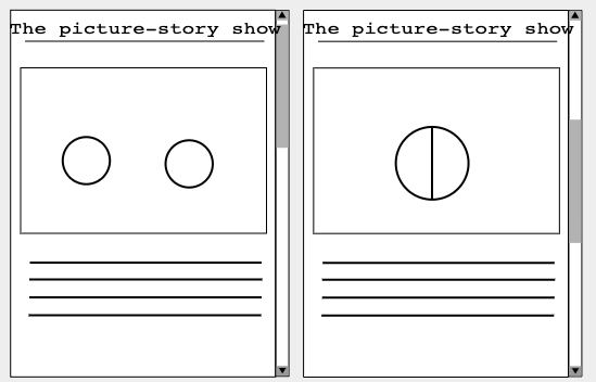
在规范中向大家提供了两个简单的示例,比如说,两个圆球的碰撞动效。这个动效由滚动位置来控制,简单地说,随着页面往下滚动,左右两个球慢慢向中间靠齐,直到他们两碰撞到一起,变成一个圆。反之,页面往上滚动时,中间的圆慢慢的会分离出左右两个圆。
CSS代码大致像下面这样:
@media (prefers-reduced-motion: no-preference) {
    div.circle {
        animation-duration: 1s;
        animation-timing-function: linear;
        animation-timeline: collision-timeline;
    }

    #left-circle {
        animation-name: left-circle;
    }

    #right-circle {
        animation-name: right-circle;
    }

    #union-circle {
        animation-name: union-circle;
        animation-fill-mode: forwards;
        animation-timeline: union-timeline;
    }

    @scroll-timeline collision-timeline {
        source: selector(#container);
        orientation: block;
        start:  200px;
        end: 300px;
    }

    @scroll-timeline union-timeline {
        source: selector(#container);
        orientation: block;
        start:  250px;
        end: 300px;
    }

    @keyframes left-circle {
        to { transform: translate(300px) }
    }

    @keyframes right-circle {
        to { transform: translate(350px) }
    }

    @keyframes union-circle {
        to { opacity: 1 }
    }
}
如果是使用JavaScript的话,可以像下面这样:
if (window.matchMedia('(prefers-reduced-motion: no-preference)').matches) {
    const scrollableElement = document.querySelector('#container');

    const collisionTimeline = new ScrollTimeline({
        source: scrollableElement,
        start: CSS.px(200),
        end: CSS.px(300)
    });

    const left = leftCircle.animate({ transform: 'translate(300px)' }, 1000);
    left.timeline = collisionTimeline;

    const right = leftCircle.animate({ transform: 'translate(350px)' }, 1000);
    right.timeline = collisionTimeline;

    const union = unionCircle.animate({ opacity: 1 }, { duration: 1000, fill: "forwards" });
    union.timeline = new ScrollTimeline({
        source: scrollableElement,
        start: CSS.px(250),
        end: CSS.px(300)
    });
}
再来看一个滚动计时器的效果(https://codepen.io/airen/pen/yJGJEJ):
上面的示例,我们是使用渐变来模拟的一个效果,但有了@scroll-timeline我们就可以像下面这样来实现:
@media (prefers-reduced-motion: no-preference) {
    @scroll-timeline progress-timeline {
        source: selector(#body);
        start: 0;
        end: 100%;
    }

    @keyframes progress {
        to { width: 100%; }
    }

    #progress {
        width: 0px;
        height: 30px;
        background: red;
        animation: 1s linear forwards progress progress-timeline;
    }
}
如果使用Web Animation API的话,可以像下面这样:
if (window.matchMedia('(prefers-reduced-motion: no-preference)').matches) {
    var animation = div.animate({ width: '100%' }, { duration: 1000, fill: "forwards" });
    animation.timeline = new ScrollTimeline(
        {
            start: 0,
            end: CSS.percent(100)
        }
    );
}
@argyleink在他分享的PPT中也提供了一个简单的示例(https://codepen.io/argyleink/pen/XWdNYaY),滚动页面的时候,你会发现两个数字之间的/符会不断的旋转:
上面的示例效果是基于Web Animation API来实现@scroll-timeline的效果,但是目前还需要其对应的Polyfill(https://github.com/flackr/scroll-timeline)。
import 'https://flackr.github.io/scroll-timeline/dist/scroll-timeline.js'

const counter = document.querySelector('main')
const slashes = document.querySelectorAll('.slash')

slashes.forEach(slash => {
    slash.animate({
        transform: <a href="https://drafts.csswg.org/scroll-animations-1/">'rotateZ(0)','rotateZ(4turn)']
    },{
        duration: 1000,
        fill: 'both',
        timeline: new ScrollTimeline({
            scrollSource: counter,
            fill: 'both',
        }),
    })
})
有关于
@scroll-timeline更详细的介绍可以查阅 [Scroll-linked Animations(https://drafts.csswg.org/scroll-animations-1/),另外,该规范目前还只是一个草案,在未来有可能还会有所变动。
NO.3
Web排版
先看布局上将会有的一些新特性:
subgrid
CSS Grid布局是Web布局模式中唯一一种二维布局,也是我自己最认可的布局模式(至少到目前为止还没有发现比Grid更强大的)。如果你从未接触过Grid布局的话,你可以把他想象成最初的table布局,因为他们俩之间有很多概念都非常的相似。
随着Web布局技术不断的更新以及浏览器不断的发展,现在使用Grid布局的越来越多,特别是今年以来,Grid和Flexbox布局的占比越来越近:
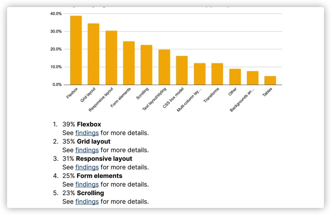
上面的数据是来自于MDN,更详细的可以阅读MDN Browser Compatibility Report 2020(https://mdn-web-dna.s3-us-west-2.amazonaws.com/MDN-Browser-Compatibility-Report-2020.pdf)
暂时把你拉回到90年代,那个时候Web的布局主要以table布局为主,在使用table布局的时候也时常会发现表格嵌套表格:
在Grid布局也是相似的,也会碰到网格嵌套网格。
<!-- HTML -->
<div class="grid">
    <div class="item">
        <div class="subitem"></div>
    </div>
</div>

/* CSS */
.grid {
    display: grid;
    grid-template-columns: repeat(9, 1fr);
    grid-template-rows: repeat(4, minmax(100px, auto));
}

.item {
    grid-column: 2 / 7;
    grid-row: 2 /  4;

    display: grid;
    grid-template-columns: repeat(3, 1fr);
    grid-template-rows: repeat(3, 80px);
}

.subitem {
    grid-column: 2 / 4;
    grid-row: 1 / 4;
}
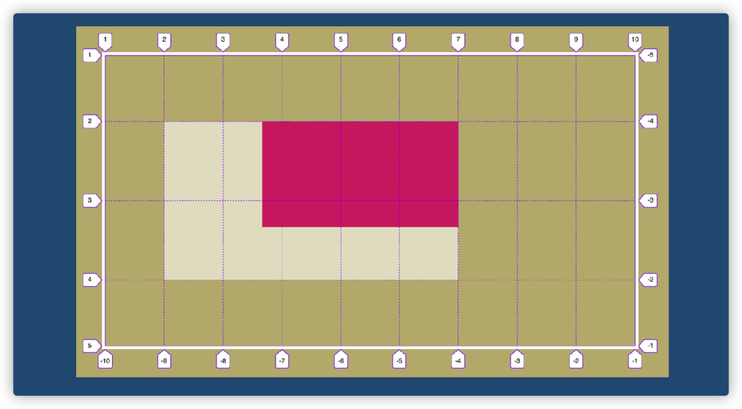
网格嵌套在网格中,各自的网格轨道是相互独立的,不过也会引起子网格中元素对齐会存在一些问题。不过在 CSS Grid Layout Module Level 2(https://drafts.csswg.org/css-grid-2) 模块中新增了 subgrid(https://drafts.csswg.org/css-grid-2/#subgrids) 属性(Firefox 71开始就支持该属性)。
有了subgrid之后,在嵌套网格的时候,我们就可以在grid-template-columns和grid-template-rows设置subgrid。这样一来,上面示例的代码我们就可以修改成:
.grid {
    display: grid;
    grid-template-columns: repeat(9, 1fr);
    grid-template-rows: repeat(4, minmax(100px, auto));
}

.item {
    grid-column: 2 / 7;
    grid-rows: 2 / 4;

    display: grid;
    grid-template-columns: subgrid;
    grid-template-rows: subgrid;
}

.subitem {
    grid-column: 3 / 6;
    grid-row: 1 / 4;
}
这样一来,子网格就会继承其父网格的网格轨道,反过来,在使用任何类型的自动调整(比如,auto、min-content、max-content等)时也会影响其维度(尺寸)。
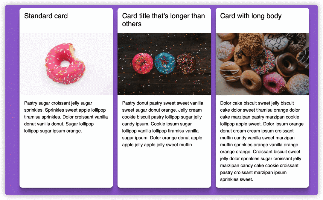
在我们平时的一些UI布局中,subgrid就可以用得上了:
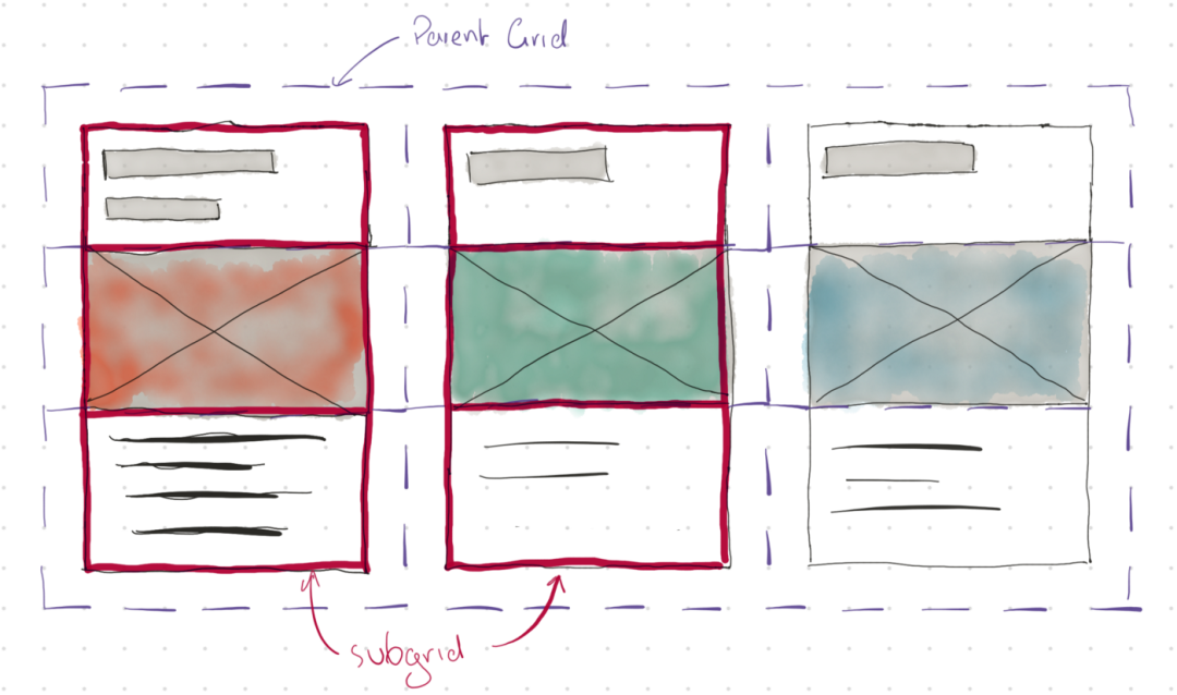
我们一起来看一个subgrid的具体实例(https://codepen.io/antonjb/pen/rNNgxWV)。注意,请使用Firefox 71+查看上面的Demo,看到的效果如下:
subgrid和grid一样,是一套复杂的体系,如果要说清楚subgrid的话,可能会要多文章文章才能讲清楚。如果你对subgrid感兴趣的话,还可以阅读下面这几篇文章:
CSS Grid Layout Module Level 2:
subgrid(https://drafts.csswg.org/css-grid-2/#subgrids)Hello
subgrid!(https://noti.st/rachelandrew/3sescR/hello-subgrid)CSS Grid Level 2: Here Comes Subgrid(https://www.smashingmagazine.com/2018/07/css-grid-2/)
MDN: Subgrid(https://developer.mozilla.org/en-US/docs/Web/CSS/CSSGridlayout/Subgrid)
Irregular-shaped Links with Subgrid(https://css-irl.info/irregular-shaped-links-with-subgrid/)
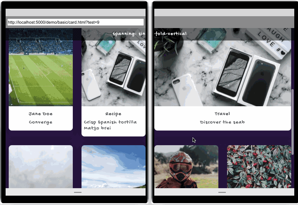
可用于双屏幕和可折叠屏幕的媒体查询条件和环境变量
随着技术不断的发展,我们所面对的终端个性化越来越强,比如现在市场上已有或将有的双屏幕和可折叠屏幕设备:
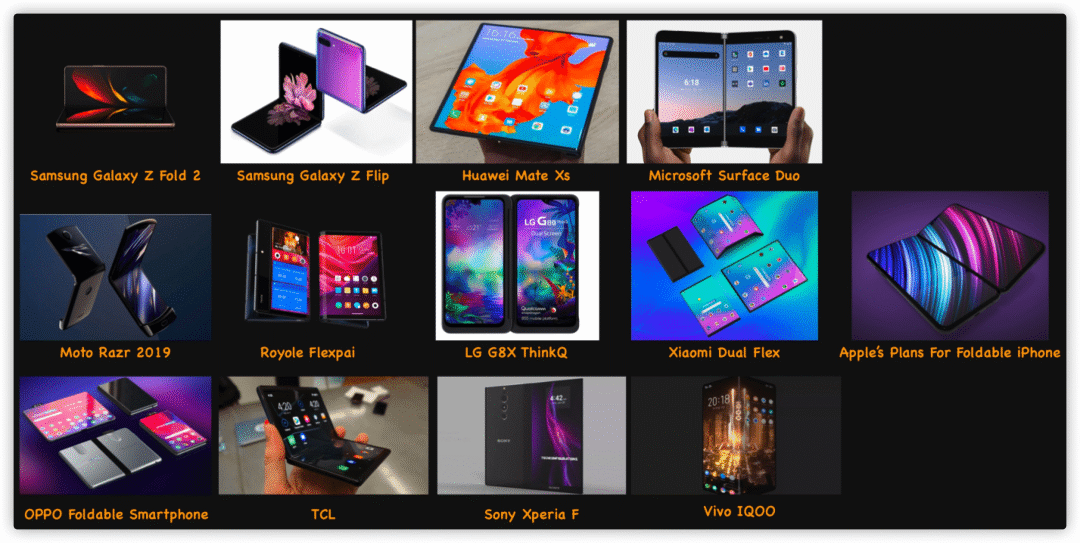
作为Web开发者,我们终究有一天需要面对这些终端的适配处理。到目前为止,CSS世界具备处理方面适配的能力,即使用screen-spanning媒体查询条件和env(fold-left)、env(fold-top)、env(fold-height)及env(fold-width)环境变量:
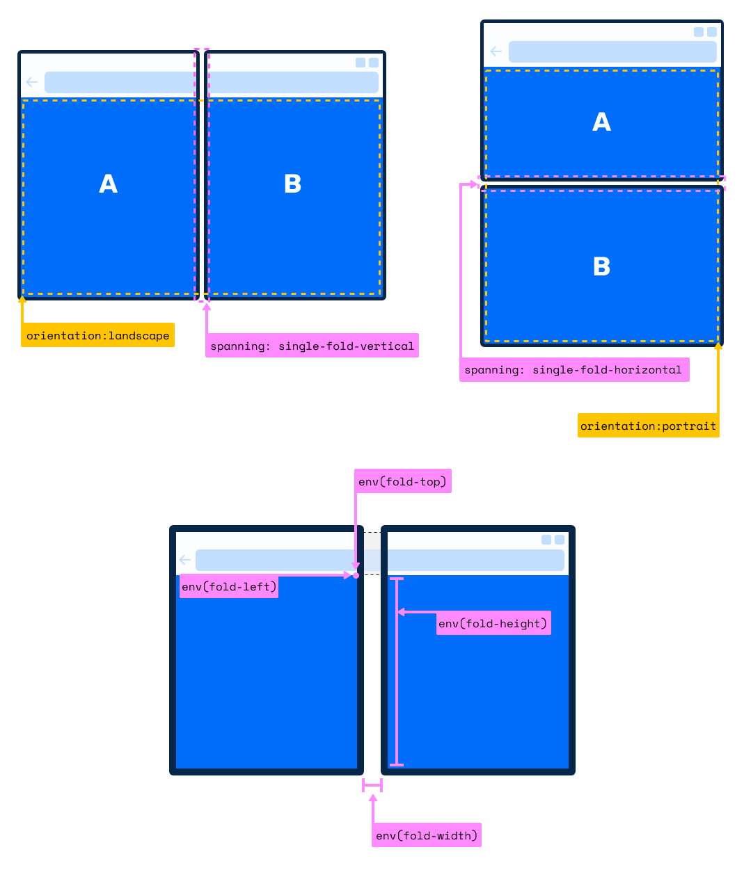
有了这些特性,我们就可以很轻易的实现像下图这样的布局效果:
如果你对这方面的知识感兴趣的话,可以阅读下面几篇文章,这几篇文章也是全网介绍双屏幕和可折叠屏幕最详细的教程:
聊聊安卓折叠屏给交互设计和开发带来的变化(https://www.atatech.org/articles/140055)
可折叠Web可能会给我们带来的变化(https://www.atatech.org/articles/177539)
可用于双屏幕和折叠屏的Web API(https://www.atatech.org/articles/181271)
瀑布流布局
瀑布流布局(Masonry Layout)也是Web布局中的典型布局之一:
虽然能使用CSS的多列布局、Flexbox布局和Grid布局等模拟出瀑布流布局效果,但更多的同学还是更喜欢使用一些JavaScript库来实现瀑布流布局,比如 Masoonry(https://masonry.desandro.com/)。
为了能让原生的CSS直接实现瀑布流布局效果,早在2017年社区中就有人提出用原生的CSS实现瀑布流布局效果(https://github.com/w3c/csswg-drafts/issues/945),不幸的是,直到现在也还只是一个实验性的属性,而且仅在Firefox Nightly浏览器中支持。
.masonry {
    display: grid;
    gap: 20px;
    grid: masonry / repeat(auto-fill, minmax(250px, 1fr));
}
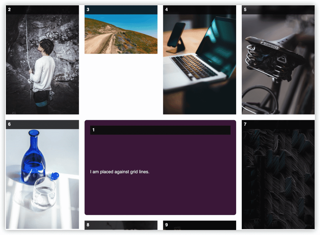
比如这个Demo(https://codepen.io/rachelandrew/pen/qBOpjPx)。
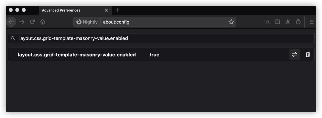
为了能在Firefox Nightly浏览器能正常的查看上面Demo的效果,你需要确保开启了相应的功能。如果没有的话,请在Firefox Nightly浏览器地址栏中输入about:config,然后搜索layout.css.grid-template-masonry-value.enabled,并将其设置为true:
然后重启浏览器,查看Demo,你看到的效果将会是像下面这样:
gap
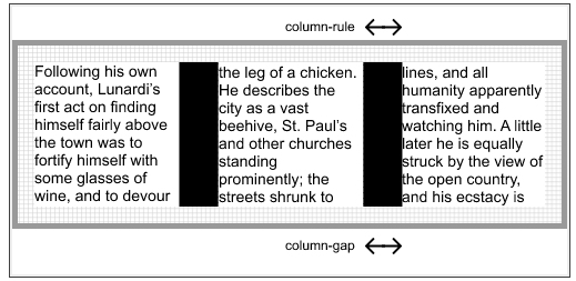
“Gap”从字面上来解释的话可以有“间隙,间隔”之意。那么在Web的布局中总是避免不了处理块与块以及行与行之间的间距。
而在CSS的世界中,用来控制元素之间的间距的间距,一般会使用盒模型中的外距,即 margin 属性,但是往往很多时候,使用margin来控制元素之间间距并不能很好的满足设计师的诉求。比如说,元素只和元素之间有间距,但和它的父容器之间没有任何的间距。针对于这样的场景,使用gap属性会比使用margin要容易控制的多。
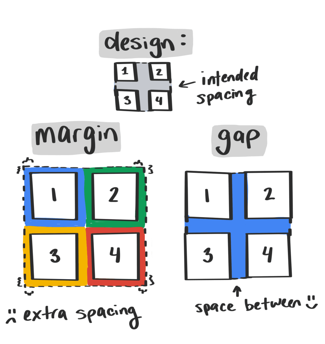
注意,上图来自于《Next-generation web styling(https://web.dev/next-gen-css-2019/)》一文。
CSS的gap属性自身最大的特点就是:gap是相对于流的,这意味着它会根据内容流的方向动态变化。比如说书写模式的改变,gap也会自动改变。
早期在CSS中,gap分很多种,在不同的容器格式中,叫法不同,比如在多列布局(Multi-column Containers)(https://www.w3.org/TR/css3-multicol/#multi-column-container)中对应的是column-gap:
body {
    column-gap: 35px;
}
但在网格容器(Grid Containers)(https://www.w3.org/TR/css-grid-1/#grid-container)又被称为grid-row-gap和grid-column-gap。
除此之外,它还可以被运用于Flexbox容器(Flexbox Containers)(https://www.w3.org/TR/css-flexbox-1/#flex-container),只不过早前,在Flexbox中没有类似flex-row-gap和flex-column-gap这样的属性。
需要注意的是,在Flexbox模块中是没有gap属性,但这并不影响我们在Flexbox布局中使用gap属性,这是因为gap统一纳入到了 CSS Box Alignment Module Level 3(https://www.w3.org/TR/css-align-3/#gaps)模块。而且gap是row-gap和column-gap的简写属性:
我们现在可以在多列布局,Flexbox布局和网格布局中像下面这样使用gap:
// 多列布局
.multi__column {
    gap: 5ch
}

// Flexbox布局
.flexbox {
    display: flex;
    gap: 20px
}

// Grid布局
.grid {
    display: grid;
    gap: 10vh 20%
}
从上面示例代码中我们可以发现,gap是row-gap和column-gap的简写属性,而且gap可以接受一个值也可以接受两个值,当gap只有一个值时,表示row-gap和column-gap的值相同;当gap有两个值时,其中第一个值是row-gap,第二个值是column-gap。
.gap {
    gap: 10px;
}

// 等同于
.gap {
    row-gap: 10px;
    column-gap: 10px
}

.gap {
    gap: 20px 30px;
}

// 等同于
.gap {
    row-gap: 20px;
    column-gap: 30px;
}
特别声明一点,虽然CSS新增了gap属性(row-gap、column-gap),但Grid中早期的grid-row-gap和grid-column-gap属性同样可用。
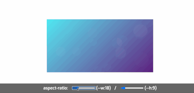
aspect-ratio
aspect-ratio 是 CSS Box Sizing Module Level 4(https://www.w3.org/TR/css-sizing-4/#aspect-ratio) 模块中的一个用来计算元素盒子宽高比的属性。在这个属性还没有之前,在CSS中都是通过其他一些方法来模拟宽高比的效果(https://www.atatech.org/articles/81457)。比如:
.aspectration {
    position: relative;/*因为容器所有子元素需要绝对定位*/
    height: 0; /*容器高度是由padding来控制,盒模型原理告诉你一切*/
    width: 100%;
}

.aspectration<a href="https://codepen.io/rachelandrew/pen/WNrRZaV">data-ratio="16:9"] {
    padding-top: 56.25%;
}

.aspectration[data-ratio="4:3"]{
    padding-top: 75%;
}
如果浏览器支持了aspect-ratio的话,可以像下面这样使用:
div {
    aspect-ratio: 1 / 1;
}
比如[@rachelandrew在Codepen提供的一个示例(https://codepen.io/rachelandrew/pen/WNrRZaV),我在该示例的基础上稍作调整了一下(https://codepen.io/airen/pen/vYGvqmZ):
:target` 和 `:target-within
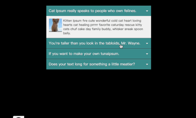
:target和:target-within都是 Selectors Level 4(https://www.w3.org/TR/selectors-4) 模块中的两个伪元素(https://www.w3.org/TR/selectors-4/#the-target-within-pseudo)。可能很多同学对:target更熟悉一些,甚至用:target伪元素的特性制作了 Tab(https://www.sitepoint.com/css3-tabs-using-target-selector/) 、Accordion(https://www.w3cplus.com/blog/160.html) 和 Modal(https://www.cssscript.com/simple-modal-box-using-css-and-target-pseudo-class/) 等UI交互效果。
比如下面这个手风琴的效果就是用:target伪元素制作(https://codepen.io/airen/pen/PxYxap)的:
这里简单的来看看:target和:target-within的作用。
在某些文档语言中,文档的URL可以通过URL的片段进一步指向文档中的特定元素。以这种方式指向的元素是文档的目标元素。其中片段标识符是URL中紧跟#的部分,例如#top或#fontnote1。你可能已经使用它们创建页面内导航,比如大家常见的“跳转链接”。有了:target伪类,我们可以突出显示与该片段对应的文档部分,而且无需JavaScript也可以做到这一点。
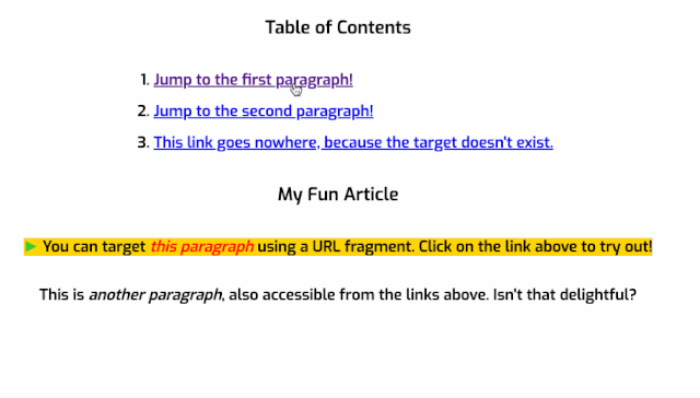
比如下面这个简单的示例(https://codepen.io/airen/pen/BaKvjGj):
<!-- HTML -->
<h3>Table of Contents</h3>
<ol>
    <li><a href="#p1">Jump to the first paragraph!</a></li>
    <li><a href="#p2">Jump to the second paragraph!</a></li>
    <li><a href="#nowhere">This link goes nowhere, because the target doesn't exist.</a></li>
</ol>

<h3>My Fun Article</h3>
<p id="p1">You can target <i>this paragraph</i> using a URL fragment. Click on the link above to try out!</p>
<p id="p2">This is <i>another paragraph</i>, also accessible from the links above. Isn't that delightful?</p>

/* CSS */

p:target {
    background-color: gold;
}

/* 在目标元素中增加一个伪元素*/
p:target::before {
    font: 70% sans-serif;
    content: "►";
    color: limegreen;
    margin-right: .25em;
}

/*在目标元素中使用italic样式*/
p:target i {
    color: red;
}
点击示例中的链接,你可以看到像下图的效果:
而:target-within伪类应用于:target伪类所应用的元素,以及在平面树(Flat Tree)的后代(包括非元素节点,比如文本节点)与匹配:target-within的条件相匹配的元素。
article:target-within {
    background-color: hsl(var(--surfaceHSL) / 10%);
}
其实在选择器Level 4模块中还新增了很多其他的伪类选择器,如果你对这方面新增的选择器感兴趣的话,可以听一听@Adam Argyle和@Ana Tudor一起办的CSS Podcast(https://thecsspodcast.libsyn.com/),其中第十四期就是专门聊CSS的伪类选择器的(https://thecsspodcast.libsyn.com/014-pseudo-elements)。
CSS逻辑属性
如果你阅读过《Web中向左向右(https://www.atatech.org/articles/159175)》一文或者有接触过CSS书写模式特性,你会发现以前我们熟悉的物理属性在不同的语言环境之下很难满足布局的需求,比如英语和阿拉伯语,日语和蒙语等,我们设置的margin-left有可能不是margin-left,width也有可能不是width。

这个时候,CSS逻辑属性就显得尤其重要。换句话说,逻辑属性的出现,我们以往熟悉的盒模型也将带来很大的变化:
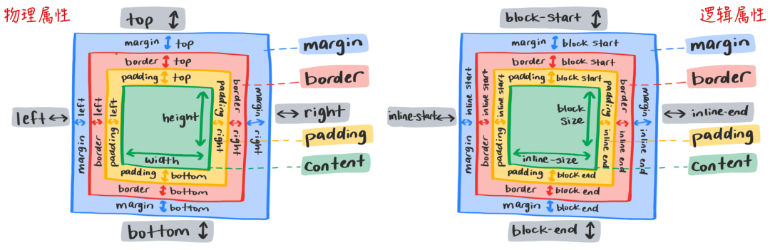
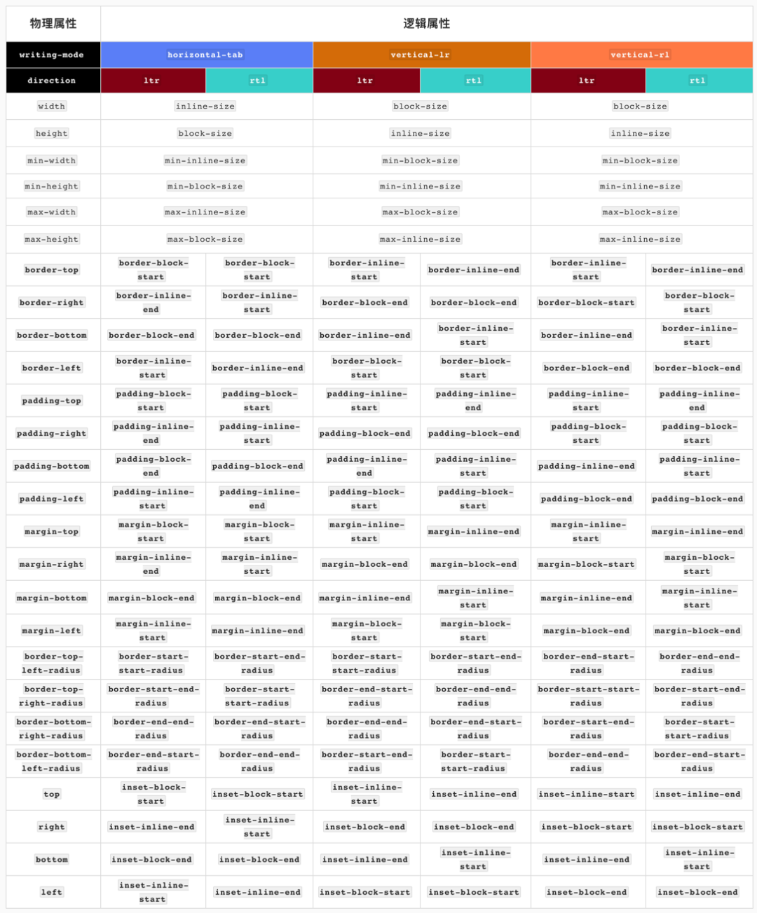
下图是我们熟悉的 物理属性 和 逻辑属性 的对应关应:
对于块轴(block axis(https://drafts.csswg.org/css-writing-modes-4/#block-axis))和内联轴(inline axis(https://drafts.csswg.org/css-writing-modes-4/#inline-axis))区别,同样用一张图来描述这两者吧:
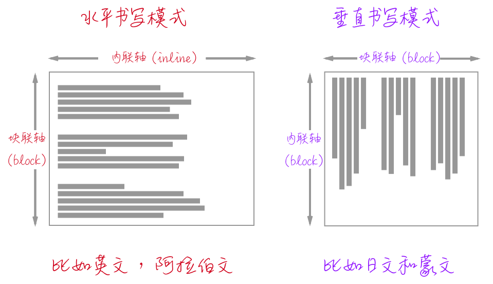
块轴和内联轴和CSS的书写模式writing-mode以及direction和HTML的dir有关系。换句话说:
块轴:主要定义网站文档(元素块)流,CSS的书写模式
writing-mode会影响块轴的方向内联轴:主要定义网站的文本流方向,也就是文本的阅读方式,CSS的
direction或HTML的dir会影响内联轴的方向
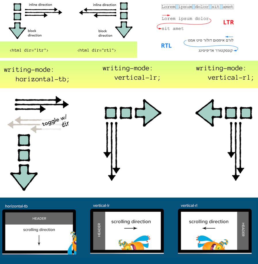
有关于
writing-mode、direction和dir对Web排版的影响相关的详细介绍可以阅读《Web中向左向右(https://www.atatech.org/articles/159175)》一文。
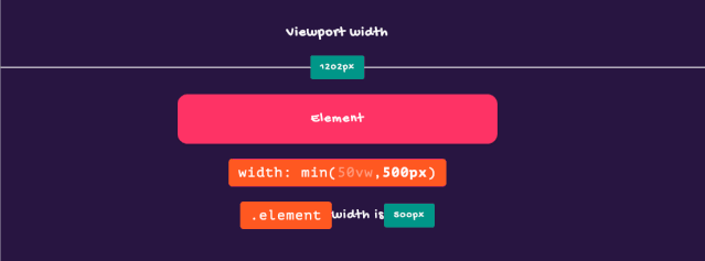
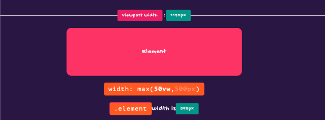
min() max() 和 clamp()
min()、max()和clamp()三个函数称为“比较函数”。早在《聊聊min(),max()和clamp()函数(https://www.w3cplus.com/css/min-max-clamp-function.html)》一文中对其做过详细的介绍。这里不做详细介绍,仅和三张图来分别展示他们的功能。
我们可以使用 min()设置最大值:
max()和min()相反,返回的是最大值。使用max()设置一个最小值:
clamp()函数和min()以及max()不同,它返回的是一个区间值。clamp()函数接受三个参数,即 clamp(MIN, VAL, MAX),其中MIN表示最小值,VAL表示首选值,MAX表示最大值。它们之间:
如果
VAL在MIN和MAX之间,则使用VAL作为函数的返回值;如果
VAL大于MAX,则使用MAX作为函数的返回值;如果
VAL小于MIN,则使用MIN作为函数的返回值
这里有一个关于clamp()的示例(https://www.atatech.org/articles/'https://codepen.io/airen/pen/pojVpJv),尝试着拖动浏览器视窗的大小,你可以看到类似下图这样的效果:

我们再来看几个和文本相关的特性:
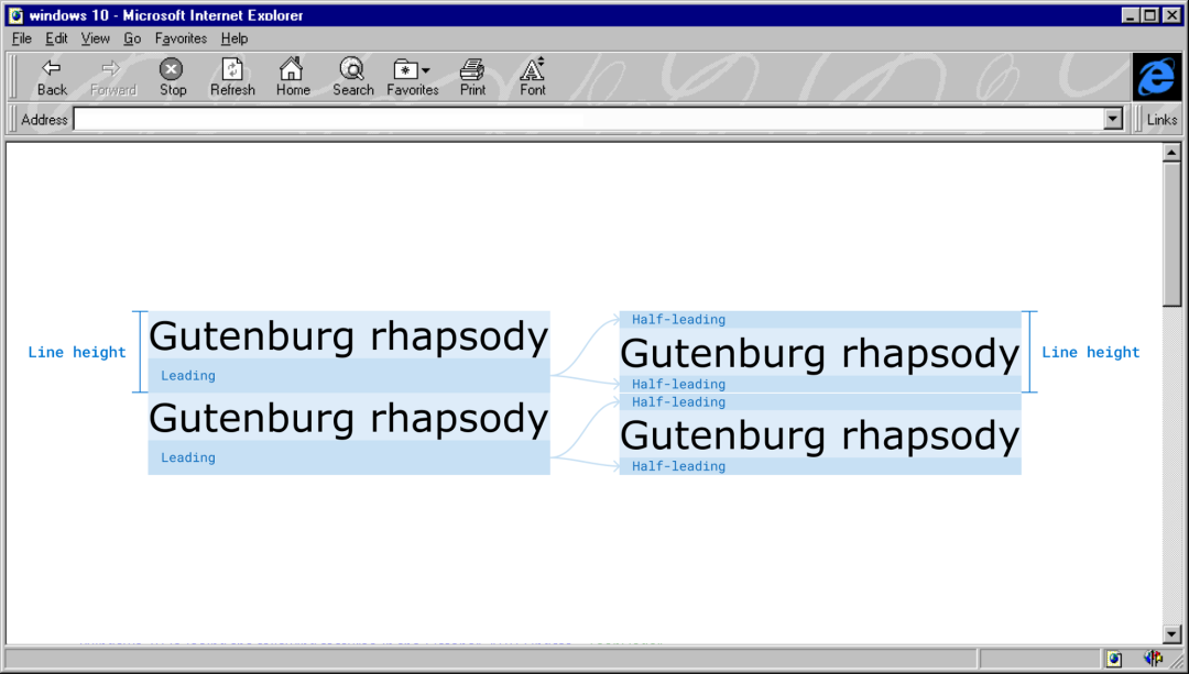
leading-trim 和 text-edge
一直以来,在Web的排版中行高(line-height)总是令Web开发者感到困惑和头痛,主要是因为line-height在CSS中是一个非常复杂的体系。他的计算总是会涉及到很多因素:
@iamvdo的《Deep dive CSS: font metrics, line-height and vertical-align(https://iamvdo.me/en/blog/css-font-metrics-line-height-and-vertical-align)》一文对这方面做过深入的阐述!
在还原UI时,文本的行高总是让我们计算元素块之间的间距带来一定的麻烦:
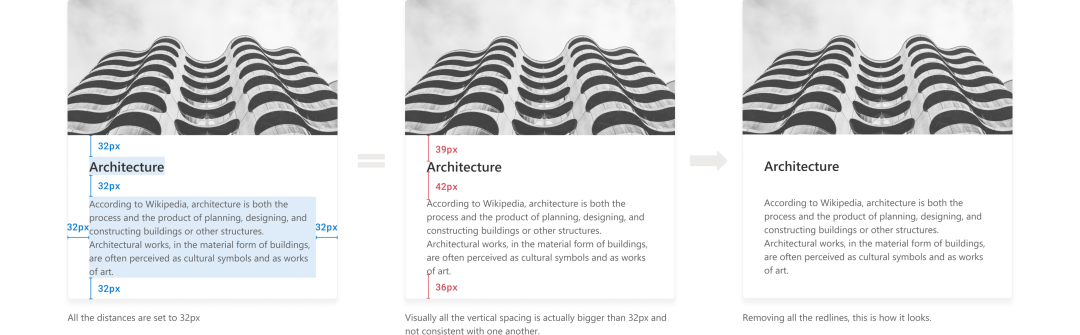
为了解决这方面的烦恼, CSS Inline Layout Module Level 3(https://www.w3.org/TR/css-inline-3)新增了一个leading-trim(https://www.w3.org/TR/css-inline-3/#leading-trim)和text-edge(https://www.w3.org/TR/css-inline-3/#text-edges)属性。可以让我们删除每一种字体中的额外间距,以便我们可以更好的计算相邻块元素之间的间距。
h1 {
    leading-trim: both;
    text-edge: cap alphabetic;
}
上面的示例首先使用text-edge来告诉浏览器想要的文本边缘是cap高度和字母基线(alphabetic baseline)。然后用leading-trim对文本两边进行修剪。
注意,
leading-trim只影响文本框,它不会切断其中的文字。
示例中的两行简单的CSS创建了一个包含文本的干净的文本框(不受line-height相关的特性影响)。这有助于实现更精确的间距,并创建更好的视觉层次结构。
CSS的text-edge和leading-trim分别可接受的值:
text-edge: leading | <a href="https://matthiasott.com/notes/the-thing-with-leading-in-css?ref=heydesigner"> text | cap | ex | ideographic | ideographic-ink ] [ text | alphabetic | ideographic | ideographic-ink ]?

leading-trim: normal | start | end | both
如果你对leading-trim特性感兴趣的话,除了阅读规范之外,还可以阅读下面几篇文章:
[The Thing With Leading in CSS(https://matthiasott.com/notes/the-thing-with-leading-in-css?ref=heydesigner)
Leading-Trim: The Future of Digital Typesetting(https://medium.com/microsoft-design/leading-trim-the-future-of-digital-typesetting-d082d84b202)
Rethinking
line-sizingandleading-trim(https://github.com/w3c/csswg-drafts/issues/5168)
::grammar-error 和 ::spelling-error
::grammar-error和::spelling-error是两个非常有意思的伪元素选择器。从字面说我们可以知道, Grammar error 指的是语法错误, Spelling error指的是拼写错误。其实这两种现象在我们平时书写文本的时候经常可见,可能会由于手误, 将某个单词或标点符号用错,甚至语法上的错误。针对于这种现象,我们总是希望有一定的提示信息来提示我们,比如颜色上的差异,添加一些下划线等等:

在 CSS Pseudo-Elements Module Level 4(https://drafts.csswg.org/css-pseudo) 的高亮伪元素(https://drafts.csswg.org/css-pseudo/#highlight-pseudos)中我们可以看到这两个伪元素的身影:
::grammar-error:浏览器为语法错误的文本段添加样式::spelling-error:浏览器为拼写错误的文本段添加样式
在CSS中并不是所有属性都能运用于这两个伪元素,到目前为止,只有color、background-color、cursor、text-emphasis-color、text-shadow、outline、text-decoration、fill-color、stroke-color 和stroke-width可以用于这两个伪元素。
:root::spelling-error {
    text-decoration-line: spelling-error;
}

:root::grammar-error  {
    text-decoration-line: grammar-error;
}

<a href="https://drafts.csswg.org/css-values-4">spellcheck]::spelling-error {
    text-decoration: wavy underline var(--neon-red);
}

[grammarcheck]::grammar-error {
    text-decoration: wavy underline var(--neon-blue);
}
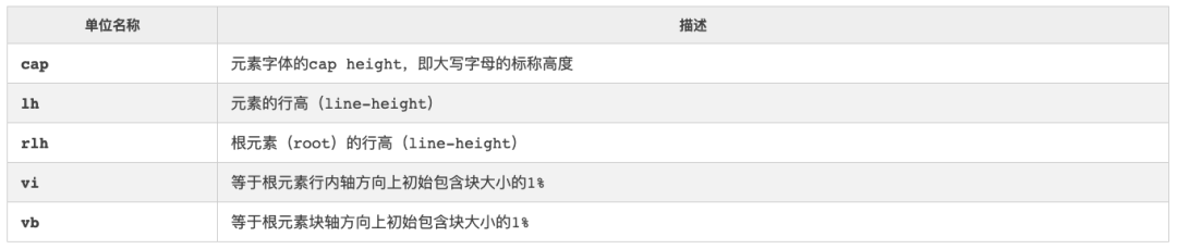
新增相对单位:cap、lh、rlh、vi和 vb
[CSS中单位和值(https://drafts.csswg.org/css-values-4) 中单位有:
但在 相对单位(https://drafts.csswg.org/css-values-4/#relative-lengths) 中并没有提到cap、lh、rlh、vi和vb这几个相对单位。
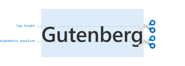
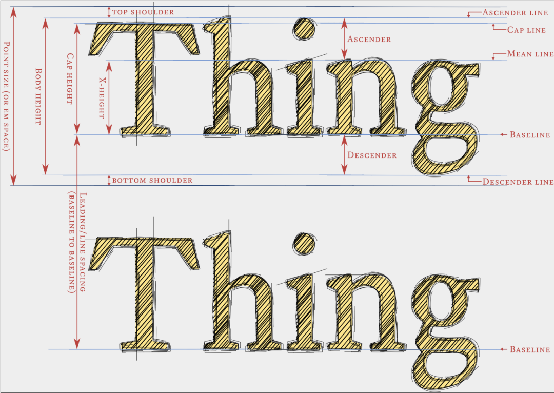
从上表的描述来看,其中cap、lh、rlh的计算都和元素的字体以及行高等有关系。我用下图来描述一个字体的Cap Height,Line Height等:
NO.4
Web性能
contain 和 content-visibility
这两个属性是属于 CSS容器模块 的,其最大的特点应该是可以帮助Web开发者提高Web页面的性能:
当容器的内容发生变化时,浏览器考虑到其他元素可能也会发生变化,于是就会去检查页面中所有的元素。一直以来浏览器都是这么做的,大家都习以为常了。但从另一方面来说,开发者很清楚当前修改的元素是否独立、是否影响其他元素。因此如果开发者能把这个信息通过CSS告诉浏览器,那么浏览器就不需要再去考虑其他元素了,这就是非常完美的事情。而CSS容器模块中的contain属性就为我们提供了这种能力。
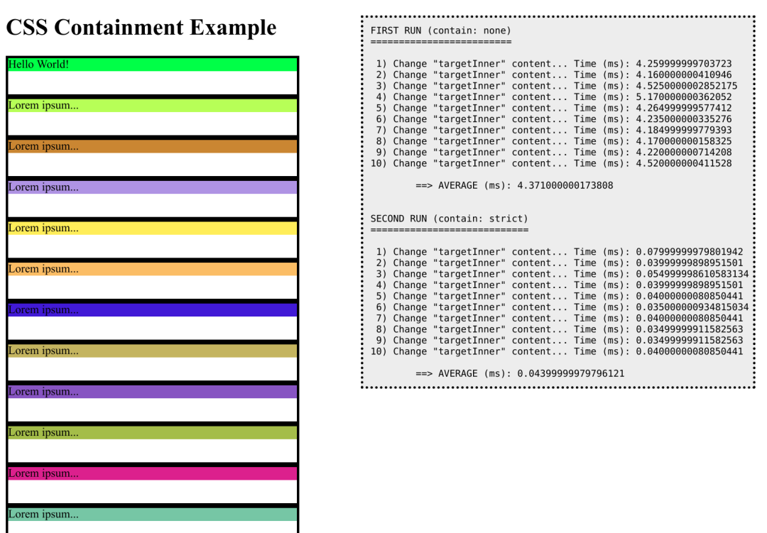
们来看@Manuel Rego Casasnovas在《An introduction to CSS Containment(https://blogs.igalia.com/mrego/2019/01/11/an-introduction-to-css-containment/?ref=heydesigner)》文章中提供的一个示例(https://blogs.igalia.com/mrego/files/2019/01/css-contain-example.html):
假设一个页面有很多个元素,在这个示例中,我们有10000个这样的元素:
<div class="item">
    <div>Lorem ipsum...</div>
</div>
使用JavaScript的textContent这个API来动态更改div.item > div的内容:
const NUM_ITEMS = 10000;
const NUM_REPETITIONS = 10;
function log(text) {
    let log = document.getElementById("log");
    log.textContent += text;
}

function changeTargetContent() {
    log("Change \"targetInner\" content...");

    // Force layout.
    document.body.offsetLeft;
    let start = window.performance.now();
    let targetInner = document.getElementById("targetInner");
    targetInner.textContent = targetInner.textContent == "Hello World!" ? "BYE" : "Hello World!";

    // Force layout.
    document.body.offsetLeft;
    let end = window.performance.now();
    let time = window.performance.now() - start; log(" Time (ms): " + time + "\n");

    return time;
}

function setup() {
    for (let i = 0; i < NUM_ITEMS; i++) {
        let item = document.createElement("div");
        item.classList.add("item");
        let inner = document.createElement("div");
        inner.style.backgroundColor = "#" + Math.random().toString(16).slice(-6);
        inner.textContent = "Lorem ipsum...";
        item.appendChild(inner);
        wrapper.appendChild(item);
    }
}
如果不使用contain,即使更改是在单个元素上,浏览器在布局上的渲染也会花费大量的时间,因为它会遍历整个DOM树(在本例中,DOM树很大,因为它有10000个DOM元素):
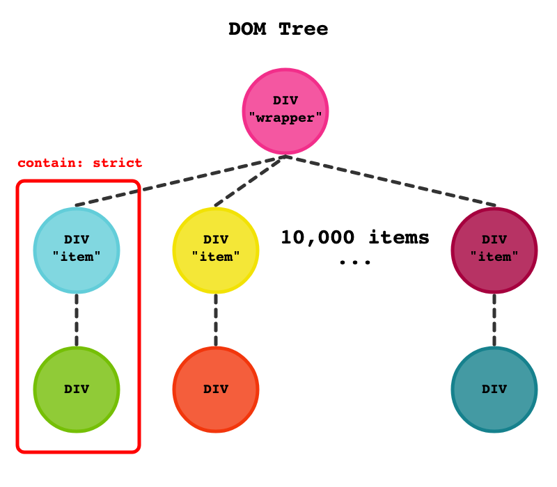
在本例中,div的大小是固定的,我们在内部div中更改的内容不会溢出它。因此,我们可以将contain: strict应用到项目上,这样当项目内部发生变化时,浏览器就不需要访问其他节点,它可以停止检查该元素上的内容,并避免到外部去。
CSS容器模块中的content-visibility属性会显著影响第一次下载和第一次渲染的速度。此外,你可以立即与新渲染的内容交互,而无需等待内容的其余部分加载。该属性强制用户代理跳过不在屏幕上的标记和绘制元素。实际上,它的工作方式类似于延迟加载,只是不加载资源,而是渲染资源。
简单地说,CSS的content-visibility属性 可跳过不在屏幕上的内容渲染,包括布局(Layout)和渲染(Paint),直到真正需要布局渲染的时候为止。所以利用它可以使用初始用户加载速度更快,还能与屏幕上的内容进行更快的交互。
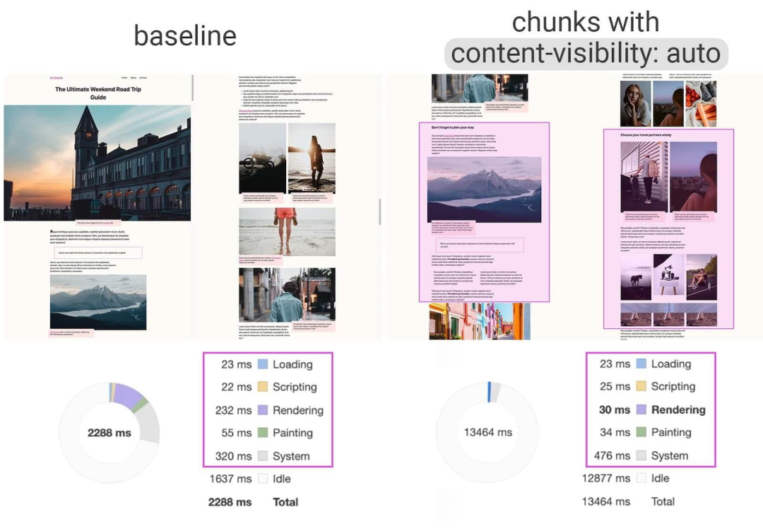
上图来自于@Una Kravets和@Vladimir Levin的《content-visibility: the new CSS property that boosts your rendering performance(https://web.dev/content-visibility/)》一文。从图中我们可以获知,使用content-visibility: auto属性可使分块的内容区域的初始加载性能提高7倍。
有关于这方面的介绍,还可以阅读:
CSS Containment in Chrome 52(https://developers.google.com/web/updates/2016/06/css-containment)
Helping Browsers Optimize With The CSS Contain Property(https://www.smashingmagazine.com/2019/12/browsers-containment-css-contain-property/)
An introduction to CSS Containment(https://blogs.igalia.com/mrego/2019/01/11/an-introduction-to-css-containment)
Let’s Take a Deep Dive Into the CSS Contain Property(https://css-tricks.com/lets-take-a-deep-dive-into-the-css-contain-property/)
CSS Containment(https://developer.mozilla.org/zh-CN/docs/Web/CSS/CSS_Containment)
content-visibility: the new CSS property that boosts your rendering performance(https://web.dev/content-visibility/)
Short note on content-visibility: hidden(https://html5accessibility.com/stuff/2020/08/25/short-note-on-content-visibility-hidden/)
Using content-visibility: hidden(https://www.w3.org/TR/css-contain-2/#using-cv-hidden)
Using content-visibility: auto(https://www.w3.org/TR/css-contain-2/#using-cv-auto)
数据服务
数据服务指的是 Data Saver。啥意思呢?不做解释,直接用一段代码来描述:
@media (prefers-reduced-data: reduce) {
    header {
        background-image: url(/grunge.avif);
    }
}
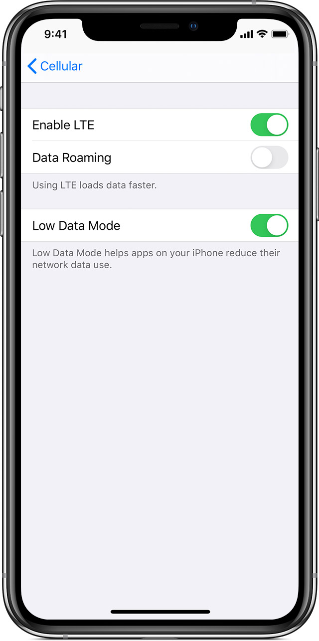
我想大家对于@media (prefers-reduced-data: reduce)应该不会陌生吧。是的,它就是我们所说的CSS媒体查询。只不过稍有不同的是,这个媒体查询是根据用户在设备上的设置喜好来做条件判断。比如上面示例代码,当用户在设备上开启了“Low Data Mode”(低数据模式),会加载grunge.avif图像,可以帮助iPhone上的应用程序减少网络数据的使用:
到目前为止,CSS媒体查询提供了多个媒体特性,可以以用户在设备上的喜好设置做为判断,比如iOS13+开始,iPhone提供的DarkMode模式(prefers-color-scheme)(https://www.atatech.org/articles/153525):
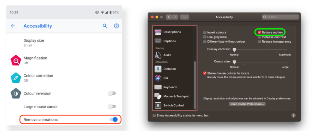
比如,使用prefers-reduced-motion媒体查询用于检测用户的系统是否被开启了动画减弱功能:
上面提到的这些媒体查询条件都是在 CSS Media Queries Level 5(https://www.w3.org/TR/mediaqueries-5/) 模块中新增的。
除了上面提到的之外,还有一些我们平时很少见的媒体查询条件,比如:
@media (hover: hoveer) {}

@media (hover: none) and (pointer: coarse) {}

@media (hover: none) and (pointer: fine) {}

@media print and (min-resolution: 300dpi) {}

@media (scan: interlace) {}

@media (update) {}

@media(environment-blending: additive){}

@media (color) {}
变量字体
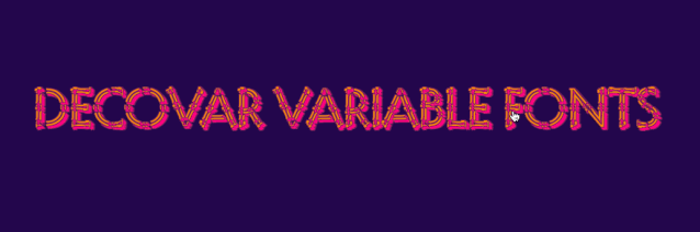
变量字体是一个非常有意思的CSS特性,它也常被称为“可变字体”,先给大家展示一个Demo(https://codepen.io/airen/pen/yLNpQQW):
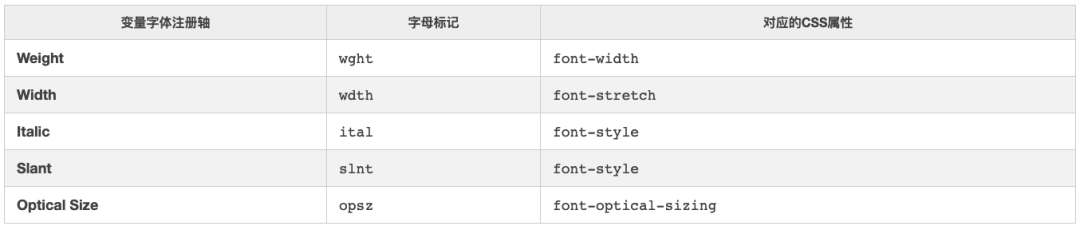
变量字体的目标是让网站性能更好,同时给用户提供了更多选择和扩展。变量字体是类似矢量图形,允许为各种字体轴定义不同的值。变量字体设计中一般有五个注册轴,包括字体、字宽、斜体和光学尺寸。每个注册轴都有一个对应的四个字母的标记,可以映射到现有的CSS属性:
除了注册轴之外,字体设计器还可以包含自定义轴。自定义轴让可变字体变得更具创造性,因为不限制自定义轴的范围、定义或数量。与注册轴类似,自定义轴具有相应的四个字母标记。但是,自定义轴的字母标记必须是大写的。例如,你定义了一个注册轴是grade,其对应的字母标记是 GRAD。
比如上面示例效果对应的代码:
.text {
    font-weight: 800;
    font-style: italic;
    font-variation-settings: "SSTR" 183, "INLN" 648, "TSHR" 460, "TRSB" 312, "TWRM" 638, "SINL" 557, "TOIL" 333, "TINL" 526, "WORM" 523;
    transition: font-variation-settings .28s ease;
}

.text:hover {
    font-weight: 400;
    font-style: normal;
    font-variation-settings: "SSTR" 283, "INLN" 248, "TSHR" 160, "TRSB" 112, "TWRM" 338, "SINL" 257, "TOIL" 133, "TINL" 426, "WORM" 223;
}
在Firefox浏览器中,我们还可以通过开发者工具中“字体”选项提供的相关可变字体注册轴的值调整:
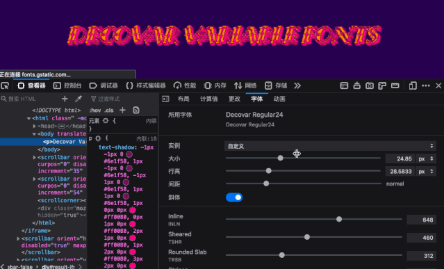
调整完之后,可以获得新代码:
p {
    font-size: 60px;
    line-height: 37px;
    letter-spacing: 0.113em;
    font-variation-settings: "SSTR" 450, "INLN" 741, "TSHR" 292, "TRSB" 497, "TWRM" 173, "SINL" 557, "TOIL" 728, "TINL" 526, "WORM" 523, "TFLR" 362, "TRND" 516, "SWRM" 536, "TSLB" 509;
    font-weight: 491;
}
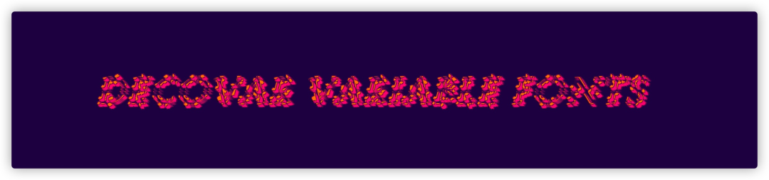
对应效果如下:
NO.5
Web可访问性
:focus-visible 和 :focus-within
一直以来我很容易把:focus-within和:focus-visible混淆。其实:focus-within和:focus-visible都是CSS选择器 Level 4中用户操作类伪类选择器(https://www.w3.org/TR/selectors-4/#useraction-pseudos)。早前在《初探CSS 选择器Level 4(https://www.w3cplus.com/css/css-selectors-level-4.html)》中聊过:focus-within,但没有聊过:focus-visible。
另外,在《CSS :focus-within(https://www.w3cplus.com/css/focus-within.html)》教程中就提到过, :focus-within能非常方便处理获取焦点状态。当元素本身或其后代元素获得焦点时,:focus-within伪类的元素就会有效 。:focus-within伪类选择器的行为本质上是一种父选择器行为,子元素的状态会影响父元素的样式。由于这种“父选择器”行为需要借助用户的行为触发,属于“后渲染”,不会与现有的渲染机制相互冲突。
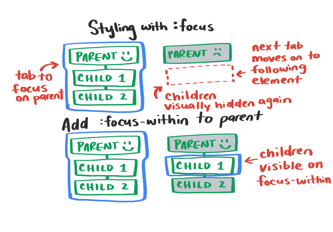
如果上面的介绍让你感到困惑的话,可以看下面这个Demo(https://codepen.io/ericwbailey/pen/KQOpRM)。你会发现,当的后代元素得到焦点时,会有一个放大的效果:
实现上图的效果代码非常的简单:
form:focus-within {
    box-shadow: 0px 0.2em 2.5em #c4c4c4;
    transform: scale(1.025);
}
对于:focus-visible伪类来说,当元素匹配:focus伪类并且客户端(UA)的启发式引擎决定焦点应当可见时就会生效。这个选择器可以有效地根据用户的输入方式(鼠标 vs 键盘)展示不同形式的焦点。
简单点说,按键盘tab键和鼠标点击得到的焦点效果不同。比如:
/* 链接得到焦点时的样式 */
a:focus {

}

/*
* 1\. 如果链接有焦点,但是浏览器通常不会显示默认的焦点样式,会覆盖上面的焦点样式
* 2\. 不是按键盘`tab`键让链接得到的焦点,比如说鼠标点击链接
*/
a:focus:not(:focus-visible) {

}

/* 按键盘tab键让链接得到焦点的样式 */
a:focus-visible {

}
来看一个具体的案例(https://codepen.io/airen/pen/GRZPPVR)。这个示例中分别用鼠标点击链链和按键盘tab键让链接得到焦点,它的样式是不一样的:

如果你对Web可访问性(A11Y)方面感兴趣的话,还可以阅读:
【双11盖楼互动技术大揭秘】创建可访问性网站并不是想得那么难(https://www.atatech.org/articles/154459)
如何构建有温度的互动项目(https://www.atatech.org/articles/163878)
如何快速修复Web可访问性存在的问题(https://www.atatech.org/articles/164846)
NO.6
Web美化
Color Level 4 和 Level 5
CSS Color Level 4(https://www.w3.org/TR/css-color-4) 和 Level 5(https://www.w3.org/TR/css-color-5) 两个模块主要是为我们推出了一些颜色使用的新属性,比如:
a(从绿色到红色的分量)和b(从蓝色到黄色的分量)三个数字表示。而Lch分别表示了颜色的亮度、饱和度和色调gray()函数表示法简化了对这组常见颜色的指定,因此只需要一个数值参数,用来指定颜色的灰度color-mix():该函数接受两个color-contrast():该函数首先使用一种颜色(通常是背景色),然后使用两种或两种以上颜色的列表,它从该列表中选择亮度对比度最高的颜色到单一颜色color-adjust():该函数接受一个
对于Web开发者来说,最大的感受是语法规则有较大的变化:
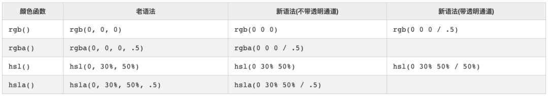
来看两个示例:
// Color Level 4
.colour {
    --fn-notation: hsl(2rad 50% 50% / 80%);
    --neon-pink: color(display-p3 1 0 1);
    --gray: lch(50% 0 0);
    --fallback: color(lab 25 25 25, display-p3 1 0 1, #ccc);
}

// Color Level 5
.colour {
    --pink: color-mix(red, white);
    --halfpink: color(var(--pink) / 50%);
    --halfred: rgb(from #f00 / 50%);
    --darkred: hsl(from red h s calc(l * .25));
}
这里再特意提一下display-p3颜色,我们可以配合CSS的媒体查询@media (dynamic-range: high)一起使用:
@media (dynamic-range: high) {
    .neon-red {
        --neon-glow: color(display-p3 1 0 0);
    }

    .neon-pink {
        --neon-glow: color(display-p3 1 0 1);
    }

    .neon-purple {
        --neon-glow: color(display-p3 0 0 1);
    }

    .neon-blue {
        --neon-glow: color(display-p3 0 1 1);
    }

    .neon-green {
        --neon-glow: color(display-p3 0 1 0);
    }

    .neon-yellow {
        --neon-glow: color(display-p3 1 1 0);
    }

    .neon-white {
        --neon-glow: color(display-p3 1 1 1);
    }
}
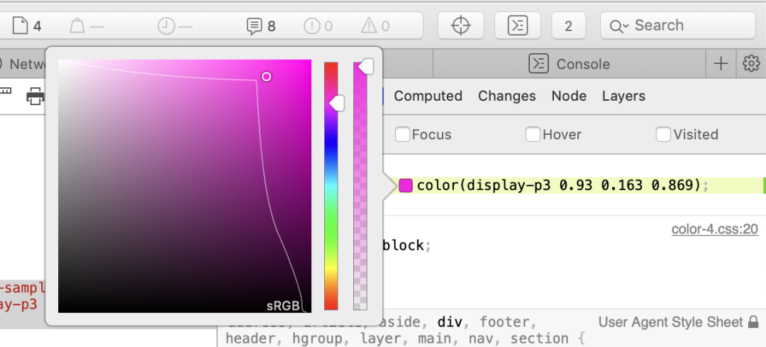
注意,Display-P3颜色空间颜色要比sRGB颜色空间中的颜色更鲜艳:

也可以说,Display-P3是sRGB的一个超集,大约要大35%:

Safari 97预览版本可以查看到display-p3的效果:
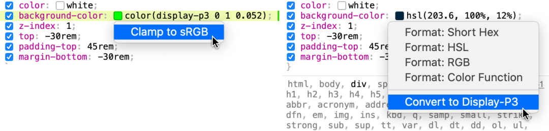
同样的,在color()函数中使用display-p3指定颜色空间时,也可以和sRGB颜色空间相互转换,如下图所示:
下面是@Adam Argyle 在Codepen提供的一个有关于display-p3的示例(https://codepen.io/argyleink/pen/MWymQGj):
::marker
::marker也是CSS的伪元素,现在被纳入到CSS Lists Module Level 3规范中。在该规范中涵盖了列表和计算数器相关的属性,比如我们熟悉的list-style-type、list-style-position、list-style、list-item、counter-increment、counter-reset、counter()和counters()等属性。
在CSS中display设置list-item值之后就会生成一个Markers标记以及控制标记位置和样式的几个属性,而且还定义了计数器(计数器是一种特殊的数值对象),而且该计数器通常用于生成标记(Markers)的默认内容。
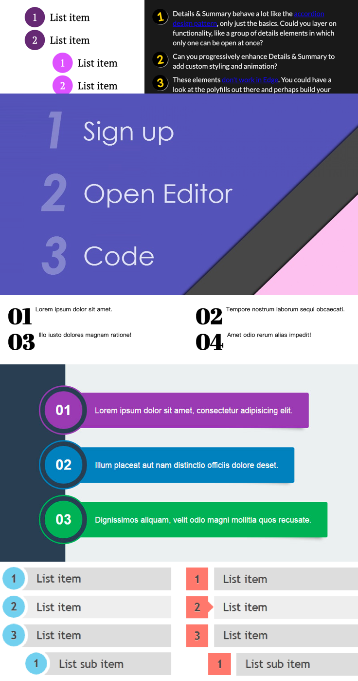
一时之间,估计大家对于Markers标记并不熟悉,但对于一个列表所涉及到的相关属性应该较为熟悉,对于一个CSS List,它可以涵盖了下图所涉及到的相关属性:

事实上,CSS的::marker和伪元素::before(或::after)类似,也可以通过content和attr()一起来控制Marker标记的效果。需要记住,生成个性化Marker标记内容需要做到几下几点:
非列表项
li元素需要显式的设置display:list-item(内联列表项需要使用display: inline list-item)需要显式设置
list-style-type为none使用content添加内容(也可以通过attr()配合data-*来添加内容)
比如下面这个小示例:
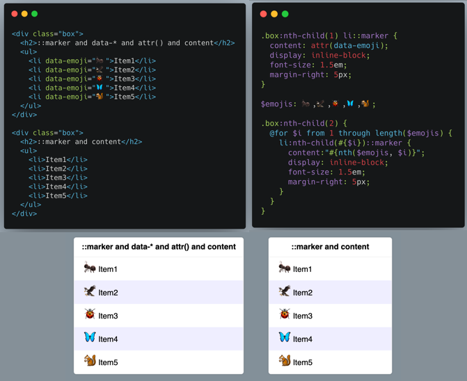
另外,::marker还没有得到浏览器支持之前,一般都是使用CSS的计数器来实现一些带有个性化的有顺序列表,比如下面这样的效果:
是不是很有意思,有关于::marker伪元素更详细的介绍,还可以阅读:《 Custom bullets with CSS ::marker(https://web.dev/css-marker-pseudo-element/)》一文。
text-emphasis
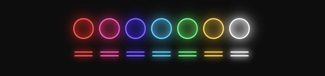
先上张图:
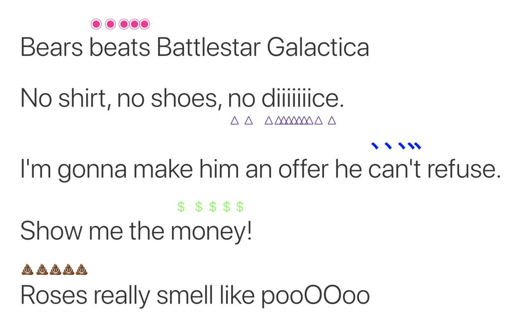
上图的效果就是使用CSS的text-emphasis实现的。在以往我们要给文本添加一些装饰效果,除了加粗(font-weight)、倾斜(font-style)、阴影(text-shadow),文本上面或下面添加线条(text-decoration)等之外也没有别的了(当然,还可以使用其他的CSS实现一些特殊效果)。但要实现上图的效果还是有一定难度的。不过text-emphasis的出现,这一切变得要简单地多。
text-emphasis是属于 CSS Text Decoration Module 规范中的一个特性,在 Level 3(https://www.w3.org/TR/css-text-decor-3/#emphasis-marks)中和text-emphasis有关的属性还有text-emphasis-style和text-emphasis-color,而且text-emphasis是这两个属性的简写属性。另外还有一个用来指定标记符位置的属性text-emphasis-position:
.emphasis {
    text-emphasis: triangle rebeccapurple;
    text-emphasis-position: under;
}
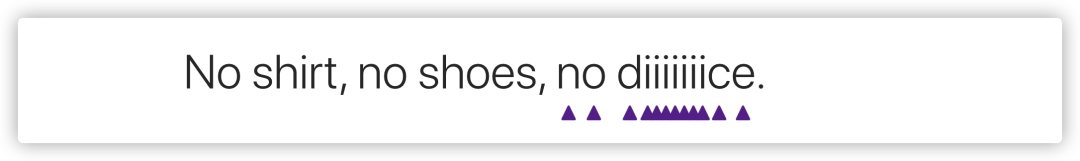
在 Level 4的规范中还新增了text-emphasis-skip属性(https://www.w3.org/TR/css-text-decor-4/#text-emphasis-skip)。
具体的效果如下(https://codepen.io/airen/pen/yLOZpzO):

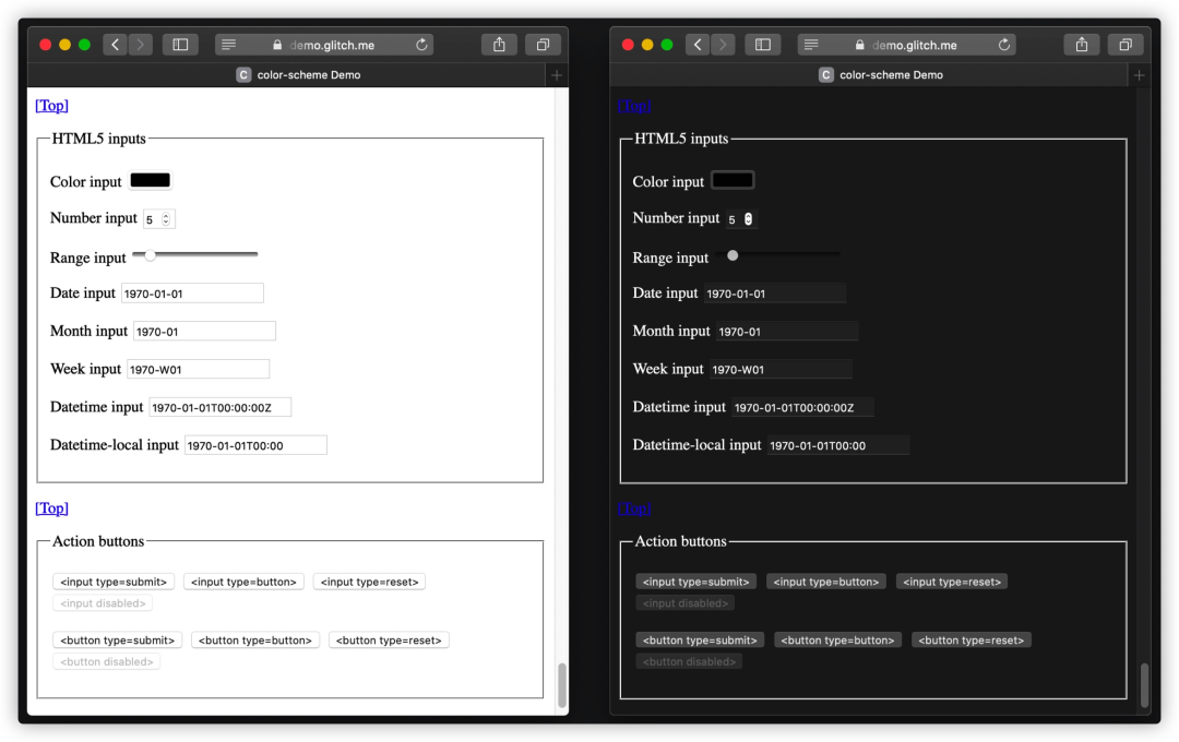
color-scheme
color-scheme属性来自于 CSS Color Adjustment Module Level 1(https://drafts.csswg.org/css-color-adjust/#color-scheme-prop)。如果你在自己的项目中实现过iOS的DarkMode的效果(https://www.atatech.org/articles/153525),你肯定使用过CSS的媒体查询prefers-color-scheme。
:root {
    --color: #fff;
    --color-bg: #000;
}

@media (prefers-color-scheme: dark) {
    --color: #000;
    --color-bg: #fff;
}

body {
    color: var(--color);
    background-color: var(--color-bg)
}
虽然说,这可以让用户根据自己喜好来选择自己喜欢的皮肤,但这并不能覆盖所有的。这个时候可以使用color-scheme属性来做一定的补充。该属性允许用户通过用户代理控制自动调整色彩模式,比如暗色模式,对比度调整或特定所需的配色方案。这些值与用户的首选项进行协商,从而产生影响用户界面(UI)内容的所选颜色方案,例如表单控制和滚动条的默认颜色,以及CSS系统颜色的使用值。
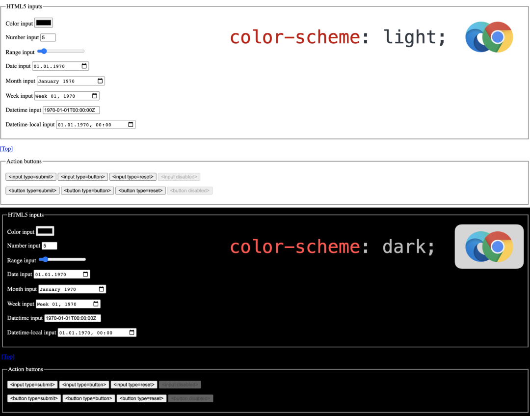
color-scheme有两种用法,先来看第一种:
:root {
    color-scheme: dark light;
}
在:root元素上,使用color-scheme颜色方案进行渲染,会影响画布的表面颜色(即全局背景颜色),color属性的初始值和系统颜色的使用值,还应该影响视窗滚动条颜色。
另外一种使用方式是在标签上:
<meta name="color-scheme" content="dark light" />
要遵守color-scheme CSS属性,需要先下载CSS(如果它是通过引用的)并进行解析。为了帮助用户代理立即用所需的颜色方案渲染页面背景,还可以在元素中提供一个颜色方案值。
由于meta标记和CSS属性(如果应用到:root)最终都会导致相同的行为,所以我更建议通过meta标记指定颜色方案,这样浏览器可以更快地采用首选方案。
最后给大家提供@tomayac(https://twitter.com/tomayac)提供的一个关于color-scheme的Demo(https://color-scheme-demo.glitch.me/),下图是dark和light下相应的效果:
这里仅仅是简单的说了一下color-scheme属性,如果想深入的了解还是需要阅读一些相关的教程:
CSS Color Adjustment Module Level 1:
color-scheme(https://drafts.csswg.org/css-color-adjust/#color-scheme-prop)Improved dark mode default styling with the
color-schemeCSS property and the correspondingmetatag(https://web.dev/color-scheme/)Don’t Forget the
color-schemeProperty(https://blog.jim-nielsen.com/2020/color-scheme-property/)
NO.7
其他
& > 和 @nest
很多同学应该使用过像Sass、LESS之类的CSS处理器,这些处理器中有一个特大的特性就是选择器的嵌套,比如Sass中:
.parent {
    & > .child {
        color: red;
    }
}

.child {
    .parent & {
        color: blue;
    }
}
编译之后的CSS:
.parent > .child {
    color: red;
}

.parent .child {
    color: blue;
}
以往只能在CSS处理器中使用这样的特性,但将来在CSS中也可以使用这方面的特性,因为现在CSS中新增了一个嵌套模块,即 CSS Nesting Module(https://drafts.csswg.org/css-nesting-1)。有点类似于CSS自定义属性(变量)特性一样,最早也是出现在CSS处理器中,现在原生CSS也支持了这方面的特性。
也就是说,在不久的将来(如果在你的工程构建中配置了postcss-preset-env(https://preset-env.cssdb.org/),现在就可以使用):
article, section {
    &  p {
        color: blue;
    }
}
相当于:
:is(article, section) p {
    color: blue;
}
也就是:
article p,
section p {
    color: blue
}
还可以是& >结合起来使用:
article, section {
    & > p {
        color: blue;
    }
}
相当于:
article > p,
section > p{
    color: blue;
}
再来看另外几种有效的嵌套方式:
.foo {
    color: blue;
    & > .bar {
        color: red;
    }
}
/* 等同于 */
.foo {
    color: blue;
}
.foo > .bar {
    color: red;
}

.foo {
    color: blue;
    &.bar {
        color: red;
    }
}
/* 等同于 */
.foo {
    color: blue;
}
.foo.bar {
    color: red;
}

.foo, .bar {
    color: blue;
    & + .baz, &.qux {
        color: red;
    }
}
/* 等同于 */
.foo, .bar {
    color: blue;
}
:is(.foo, .bar) + .baz,
:is(.foo, .bar).qux {
    color: red;
}
但是下面这几种写法将是 无效的:
/* 无效,因为没有嵌套选择器 */
.foo {
    color: red;
    .bar {
        color: blue;
    }
}

/* 无效,因为&不在第一个复合选择器中 */
.foo {
    color: red;
    .bar & {
        color:blue;
    }
}

/* 无效,因为列表中的第二个选择器不包含嵌套选择器 */
.foo {
    color: red;
    &.bar, .baz {
        color: blue;
    }
}
还可以结合 @nest 使用。下面这几种嵌套方式都是有效的:
.foo {
    color: red;
    @nest & > .bar {
        color: blue;
    }
}
/* 等同于 */
.foo {
    color: red;
}
.foo > .bar {
    color: blue;
}

.foo {
    color: red;
    @nest .parent & {
        color: blue;
    }
}
/* 等同于 */
.foo {
    color: red;
}
.parent .foo {
    color: blue;
}

.foo {
    color: red;
    @nest :not(&) {
        color: blue;
    }
}
/* 等同于 */
.foo {
    color: red;
}
:not(.foo) {
    color: blue;
}
但像下面这样嵌套则是无效的:
/* 无效,因为没有嵌套选择器 */
.foo {
    color: red;
    @nest .bar {
        color: blue;
    }
}

/* 无效,因为不是列表中的所有选择器都包含嵌套选择器 */
.foo {
    color: red;
    @nest & .bar, .baz {
        color: blue;
    }
}
注意,如果使用@nest时记得要和&结合在一起使用才有效。
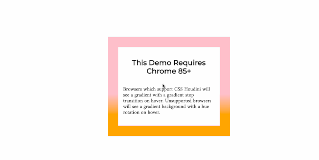
@property
在CSS Houdini中,最令人兴奋的是给CSS自定义属性和值的API。这个API通过赋予CSS自定义属性(通常也称为CSS变量)语义意义(由语法定义)甚至回退值来增强CSS自定义属性。
简单地说,可以使用CSS Houdini的CSS自定义属性和值的CSS.registerProperty()来注册一个自定义属性:
CSS.registerProperty({
name: '--colorPrimary',
syntax: '' ,
initialValue: 'magenta',
inherits: false
});
这样一来就可以使用已注册好的--colorPrimary自定义属性:
.card {
    background-color: var(--colorPrimary); /* magenta */
}

.highlight-card {
    --colorPrimary: yellow;
    background-color: var(--colorPrimary); /* yellow */
}

.another-card {
    --colorPrimary: 23;
    background-color: var(--colorPrimary); /* magenta */
}
现在或者将来,我们可以直接使用CSS的@property来注册一个自定义属性:
@property --gradient-start {
syntax: "" ;
initial-value: white;
inherits: false;
}
在CSS中就可以直接像下面这样使用:
.el {
    --gradient-start: white;
    background: linear-gradient(var(--gradient-start), black);
    transition: --gradient-start 1s;
}

.el:hover {
    --gradient-start: red;
}
比如下面这个示例(https://codepen.io/airen/pen/poyqBGe)(请使用Chrome 85+查看):
在CSS的世界中,还有另外一套规范是和CSS自定义属性有关的,那就是 CSS Custom Properties for Cascading Variables Module Level 1(https://www.w3.org/TR/css-variables-1/)。使用--在选择器块中声明自定义属性,然后使用var()函数引用已声明的自定义属性,将其当作CSS属性的值:
:root {
    --color: #f09
}

body {
    color: var(--color)
}
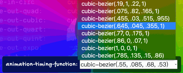
到目前为止,CSS自定义属性(也有同学称为CSS变量)已经得到了主流浏览器的使用,而且在一些大型Web应用中可以看到其身影。另外CSS自定义属性被运用的场景也很多,比如说@Adam Argyle就用CSS自定义属性模拟了一套缓动函数(https://codepen.io/argyleink/full/BajvPLz),我们可以用于CSS Animation中:
:root {
    --ease-in-quad: cubic-bezier(0.55, 0.085, 0.68, 0.53);
    --ease-in-cubic: cubic-bezier(0.55, 0.055, 0.675, 0.19);
    --ease-in-quart: cubic-bezier(0.895, 0.03, 0.685, 0.22);
    --ease-in-quint: cubic-bezier(0.755, 0.05, 0.855, 0.06);
    --ease-in-expo: cubic-bezier(0.95, 0.05, 0.795, 0.035);
    --ease-in-circ: cubic-bezier(0.6, 0.04, 0.98, 0.335);
    --ease-out-quad: cubic-bezier(0.25, 0.46, 0.45, 0.94);
    --ease-out-cubic: cubic-bezier(0.215, 0.61, 0.355, 1);
    --ease-out-quart: cubic-bezier(0.165, 0.84, 0.44, 1);
    --ease-out-quint: cubic-bezier(0.23, 1, 0.32, 1);
    --ease-out-expo: cubic-bezier(0.19, 1, 0.22, 1);
    --ease-out-circ: cubic-bezier(0.075, 0.82, 0.165, 1);
    --ease-in-out-quad: cubic-bezier(0.455, 0.03, 0.515, 0.955);
    --ease-in-out-cubic: cubic-bezier(0.645, 0.045, 0.355, 1);
    --ease-in-out-quart: cubic-bezier(0.77, 0, 0.175, 1);
    --ease-in-out-quint: cubic-bezier(0.86, 0, 0.07, 1);
    --ease-in-out-expo: cubic-bezier(1, 0, 0, 1);
    --ease-in-out-circ: cubic-bezier(0.785, 0.135, 0.15, 0.86);

    --easing: var(--ease-in-quad);
}

.animation__target {
    animation: ani 5s var(--easing) alternate infinite;
}

// JavaScript
const handlerElement = document.getElementById("easing");

handlerElement.addEventListener("change", function (e) {
        document.documentElement.style.setProperty("--easing", e.target.value);
});
点击这里查看效果(https://codepen.io/airen/pen/ExPryme):
::cue`和`::cue(selector)
::cue和::cue(selector)对我而言是一个全新的东西,这两个伪元素是 WebVTT: The Web Video Text Tracks Format(https://w3c.github.io/webvtt/#the-cue-pseudo-element) 模块中的。
::cue和::cue(selector)两个伪元素最大的差别是后者带参数的伪元素。具体的作用:
::cue伪元素(不带参数)匹配元素构造的任何WebVTT节点对象列表,但与背景符号对应的属性必须应用于WebVTT线索背景框,而不是WebVTT节点对象列表::cue(selector)是带有参数的伪元素,必须有一个由CSS选择器组成的参数。它匹配元素构造的WebVTT内部节点对象,该元素也匹配给定的CSS选择器
在CSS中只有部分属性可以运用于::cue和::cue(selector)两个伪元素,比如color、opacity、visibility、text-decoration、text-shadow、background、outline、font、line-height、white-space、text-combine-upright和ruby-position等。
::cue {
    color: white;
    background-color: hsl(0 0% 0% / 90%);
}
说实话,没有完全阅读 WebVTT: The Web Video Text Tracks Format(https://w3c.github.io/webvtt) 模块所有内容,对其并不完全了解。这里只是做一个抛砖引玉的作用,如果你的工作内容和WebVTT相关,那应该对你会有一定的作用;如果你对这方面感兴趣的话,可以深挖这方面的知识。
NO.8
小结
这篇文章是阅读@argyleink在2020第四届伦敦CSS分享会上分享的PPT有感而出的(https://london-css-2020.netlify.app/)。在文章中整理了@argyleink在PPT中提到的一些CSS新特性,另外自己从自己的角度额外增加了一些新的特性,差不多有近24个。当然,上面罗列的一些特性对于有些同学而言不是新特性(对我而言有些也不是新特性),但还是非常值得拿出来介绍,因为这些特性已经或将来不久就可以运用到自己的项目中。
由于要聊的特性个数较多,而且很多特性要聊清楚,聊透彻的话,都需要多篇篇幅才能聊完,因此文章中只做了一个蜻蜓点水,抛砖引玉的作用,如果大家对相应的特性感兴趣的话,可以针对性的去了解。另外,您肯定还有接触过一些新特性,并且没有在文章中提到,如果是的话,欢迎你在评论中与我们一起共享。
最后向大家推荐几篇和这个话题相关的文章:
What's new with CSS?(https://london-css-2020.netlify.app/)
CSS News July 2020(https://www.smashingmagazine.com/2020/07/css-news-july-2020/)
What's New in Web 2020(https://speakerdeck.com/limhenry/whats-new-in-web-2020)
The Web in 2020: Extensibility and Interoperability(https://css-tricks.com/the-web-in-2020-extensibility-and-interoperability/)
Next-generation web styling(https://web.dev/next-gen-css-2019/)
关注公众号【程序员哆啦A梦】,每日获取好文推荐 添加微信,入群交流
扫码关注公众号,订阅更多精彩内容。
