
R语言学习 - 热图简化
共 416字,需浏览 1分钟
· 2020-09-19
前面推出过热图绘制和热图美化,现在来一个函数绘制热图的简化方式。文后更有不用写代码的在线工具可用。
热图绘制 - pheatmap
绘制热图除了使用ggplot2,还可以有其它的包或函数,比如pheatmap::pheatmap(pheatmap包中的pheatmap函数)、gplots::heatmap.2等。
相比于ggplot2作heatmap, pheatmap会更为简单一些,一个函数设置不同的参数,可以完成行列聚类、行列注释、Z-score计算、颜色自定义等。那我们来看看效果怎样。
data_ori <- "Grp_1;Grp_2;Grp_3;Grp_4;Grp_5
a;6.6;20.9;100.1;600.0;5.2
b;20.8;99.8;700.0;3.7;19.2
c;100.0;800.0;6.2;21.4;98.6
d;900;3.3;20.3;101.1;10000"

data <- read.table(text=data_ori, header=T, row.names=1, sep=";", quote="")
Grp_1 Grp_2 Grp_3 Grp_4 Grp_5
a 6.6 20.9 100.1 600.0 5.2
b 20.8 99.8 700.0 3.7 19.2
c 100.0 800.0 6.2 21.4 98.6
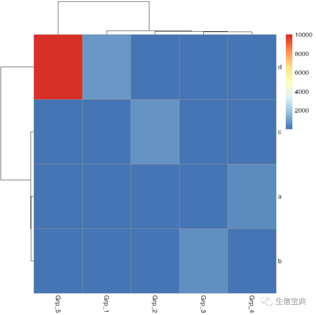
d 900.0 3.3 20.3 101.1 10000.0pheatmap::pheatmap(data, filename="pheatmap_1.pdf")虽然有点丑,但一步就出来了。
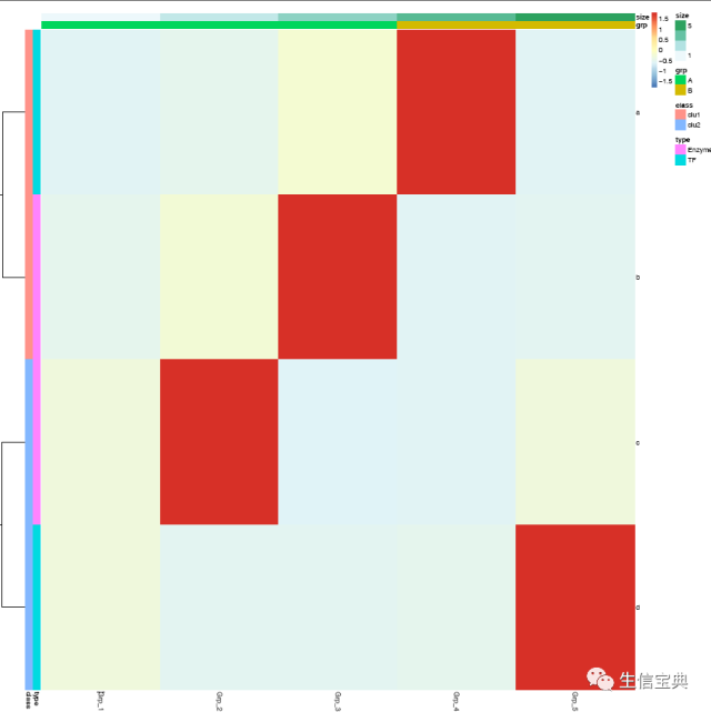
 在
在heatmap美化篇提到的数据前期处理方式,都可以用于pheatmap的画图。此外Z-score计算在pheatmap中只要一个参数就可以实现。
pheatmap::pheatmap(data, scale="row", filename="pheatmap_1.pdf")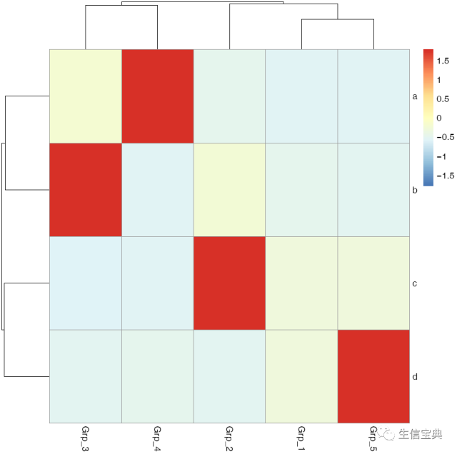
有时可能不需要行或列的聚类,原始展示就可以了。
pheatmap::pheatmap(data, scale="row", cluster_rows=FALSE, cluster_cols=FALSE, filename="pheatmap_1.pdf")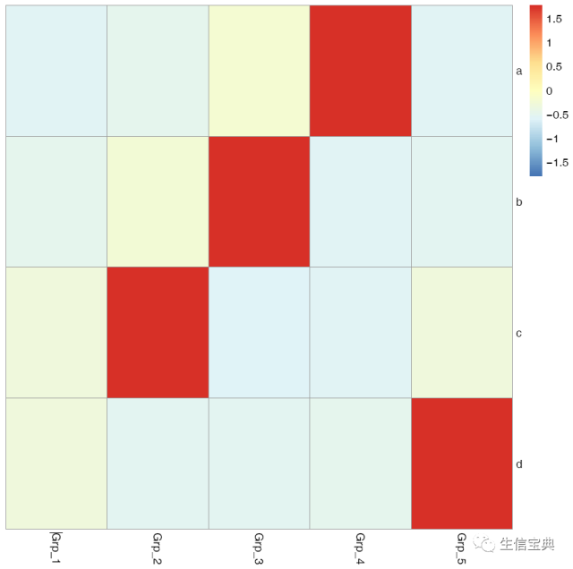
给矩阵 (data)中行和列不同的分组注释。假如有两个文件,第一个文件为行注释,其第一列与矩阵中的第一列内容相同 (顺序没有关系),其它列为第一列的不同的标记,如下面示例中(假设行为基因,列为样品)的2,3列对应基因的不同类型 (TF or enzyme)和不同分组。第二个文件为列注释,其第一列与矩阵中第一行内容相同,其它列则为样品的注释。
row_anno = data.frame(type=c("TF","Enzyme","Enzyme","TF"), class=c("clu1","clu1","clu2","clu2"), row.names=rownames(data))
row_anno
type class
a TF clu1
b Enzyme clu1
c Enzyme clu2
d TF clu2col_anno = data.frame(grp=c("A","A","A","B","B"), size=1:5, row.names=colnames(data))
col_anno grp size
Grp_1 A 1
Grp_2 A 2
Grp_3 A 3
Grp_4 B 4
Grp_5 B 5pheatmap::pheatmap(data, scale="row",
cluster_rows=FALSE,
annotation_col=col_anno,
annotation_row=row_anno,
filename="pheatmap_1.pdf")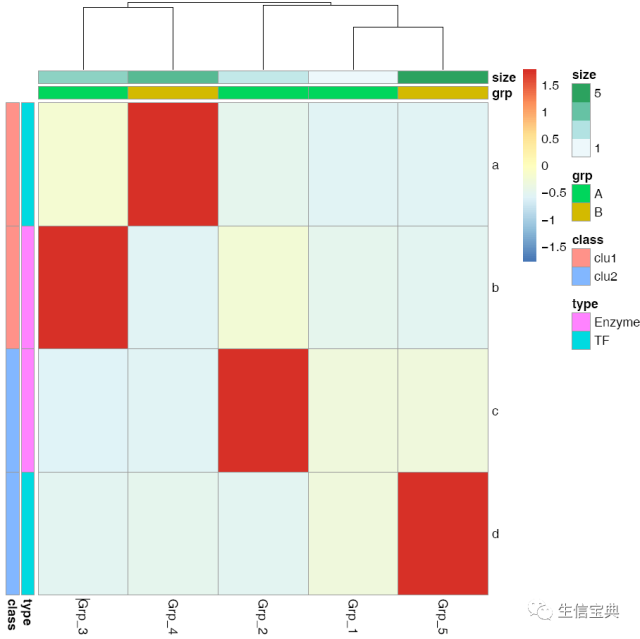
自定义下颜色吧。
#  values larger than 1 will give more color for high end.
# Values between 0-1 will give more color for low end.
pheatmap::pheatmap(data, scale="row",
cluster_rows=FALSE,
annotation_col=col_anno,
annotation_row=row_anno,
color=colorRampPalette(c('green','yellow','red'), bias=1)(50),
filename="pheatmap_1.pdf")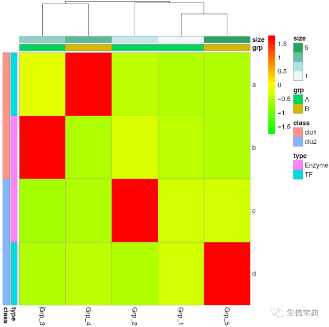
heatmap.2的使用就不介绍了,跟pheatmap有些类似,而且也有不少教程。
不改脚本的热图绘制
绘图时通常会碰到两个头疼的问题:
需要画很多的图,唯一的不同就是输出文件,其它都不需要修改。如果用R脚本,需要反复替换文件名,繁琐又容易出错。
每次绘图都需要不断的调整参数,时间久了不用,就忘记参数放哪了;或者调整次数过多,有了很多版本,最后不知道用哪个了。
为了简化绘图、维持脚本的一致,我用bash对R做了一个封装,然后就可以通过修改命令好参数绘制不同的图了。
先看一看怎么使用
首先把测试数据存储到文件中方便调用。数据矩阵存储在heatmap_data.xls文件中;行注释存储在heatmap_row_anno.xls文件中;列注释存储在heatmap_col_anno.xls文件中。
# tab键分割,每列不加引号
write.table(data, file="heatmap_data.xls", sep="\t", row.names=T, col.names=T,quote=F)
# 如果看着第一行少了ID列不爽,可以填补下
system("sed -i '1 s/^/ID\t/' heatmap_data.xls")

write.table(row_anno, file="heatmap_row_anno.xls", sep="\t", row.names=T, col.names=T,quote=F)
write.table(col_anno, file="heatmap_col_anno.xls", sep="\t", row.names=T, col.names=T,quote=F)然后用程序sp_pheatmap.sh绘图。
# -f: 指定输入的矩阵文件
# -d:指定是否计算Z-score, (否), (按行算),
# -P: 行注释文件
# -Q: 列注释文件
ct@ehbio:~/$ sp_pheatmap.sh -f heatmap_data.xls -d row -P heatmap_row_anno.xls -Q heatmap_col_anno.xls一个回车就得到了下面的图
字有点小,是因为图太大了,把图的宽和高缩小下试试。
# -f: 指定输入的矩阵文件
# -d:指定是否计算Z-score, (否), (按行算),
# -P: 行注释文件
# -Q: 列注释文件
# -u: 设置宽度,单位是inch
# -v: 设置高度,单位是inch
ct@ehbio:~/$ sp_pheatmap.sh -f heatmap_data.xls -d row -P heatmap_row_anno.xls -Q heatmap_col_anno.xls -u 8 -v 12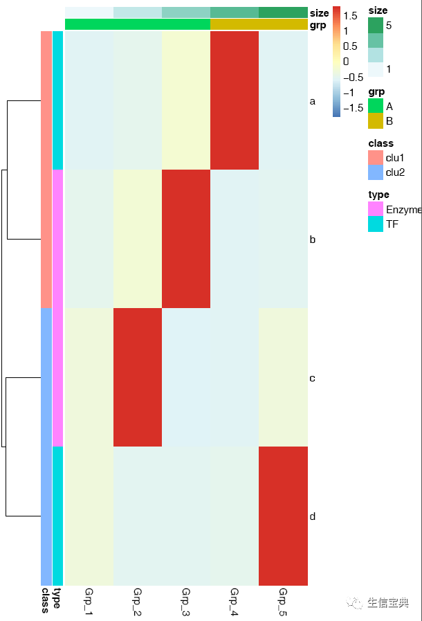
横轴的标记水平放置
# -A: 0, X轴标签选择0度
# -C: 自定义颜色,注意引号的使用,最外层引号与内层引号不同,引号之间无交叉
# -T: 指定给定的颜色的类型;如果给的是vector (如下面的例子), 则-T需要指定为vector; 否则结果会很怪异,只有俩颜色。
# -t: 指定图形的题目,注意引号的使用;参数中包含空格或特殊字符等都要用引号引起来作为一个整体。
ct@ehbio:~/$ sp_pheatmap.sh -f heatmap_data.xls -d row -P heatmap_row_anno.xls -Q heatmap_col_anno.xls -u 8 -v 12 -A 0 -C 'c("white", "blue")' -T vector -t "Heatmap of gene expression profile"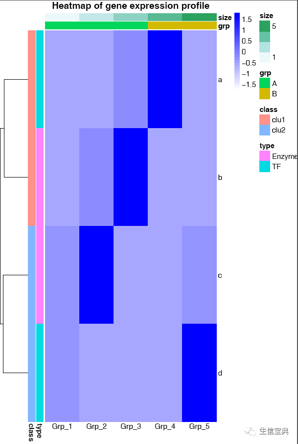
sp_pheatmap.sh的参数还有一些,可以完成前面讲述过的所有热图的绘制,具体如下:
***CREATED BY Chen Tong (chentong_biology@163.com)***

----Matrix file--------------
Name    T0_1    T0_2    T0_3    T4_1    T4_2
TR19267|c0_g1|CYP703A2    1.431    0.77    1.309    1.247    0.485
TR19612|c1_g3|CYP707A1    0.72    0.161    0.301    2.457    2.794
TR60337|c4_g9|CYP707A1    0.056    0.09    0.038    7.643    15.379
TR19612|c0_g1|CYP707A3    2.011    0.689    1.29    0    0
TR35761|c0_g1|CYP707A4    1.946    1.575    1.892    1.019    0.999
TR58054|c0_g2|CYP707A4    12.338    10.016    9.387    0.782    0.563
TR14082|c7_g4|CYP707A4    10.505    8.709    7.212    4.395    6.103
TR60509|c0_g1|CYP707A7    3.527    3.348    2.128    3.257    2.338
TR26914|c0_g1|CYP710A1    1.899    1.54    0.998    0.255    0.427
----Matrix file--------------

----Row annorarion file --------------
------1. At least two columns--------------
------2. The first column should be the same as the first column in
         matrix (order does not matter)--------------
Name    Clan    Family
TR19267|c0_g1|CYP703A2    CYP71    CYP703
TR19612|c1_g3|CYP707A1    CYP85    CYP707
TR60337|c4_g9|CYP707A1    CYP85    CYP707
TR19612|c0_g1|CYP707A3    CYP85    CYP707
TR35761|c0_g1|CYP707A4    CYP85    CYP707
TR58054|c0_g2|CYP707A4    CYP85    CYP707
TR14082|c7_g4|CYP707A4    CYP85    CYP707
TR60509|c0_g1|CYP707A7    CYP85    CYP707
TR26914|c0_g1|CYP710A1    CYP710    CYP710
----Row annorarion file --------------

----Column annorarion file --------------
------1. At least two columns--------------
------2. The first column should be the same as the first row in
---------matrix (order does not matter)--------------
Name    Sample
T0_1    T0
T0_2    T0
T0_3    T0
T4_1    T4
T4_2    T4
----Column annorarion file --------------

Usage:

sp_pheatmap.sh options

Function:

This script is used to do heatmap using package pheatmap.

The parameters for logical variable are either TRUE or FALSE.

OPTIONS:
    -f    Data file (with header line, the first column is the
         rowname, tab seperated. Colnames must be unique unless you
        know what you are doing.)[NECESSARY]
    -t    Title of picture[Default empty title]
        ["Heatmap of gene expression profile"]
    -a    Display xtics. [Default TRUE]
    -A    Rotation angle for x-axis value (anti clockwise)
        [Default 90]
    -b    Display ytics. [Default TRUE]
    -H    Hieratical cluster for columns.
        Default FALSE, accept TRUE
    -R    Hieratical cluster for rows.
        Default TRUE, accept FALSE
    -c    Clustering method, Default "complete".
        Accept "ward.D", "ward.D2","single", "average" (=UPGMA),
        "mcquitty" (=WPGMA), "median" (=WPGMC) or "centroid" (=UPGMC)
    -C    Color vector.
        Default pheatmap_default.
        Aceept a vector containing multiple colors such as
        <'c("white", "blue")'> will be transferred
        to "white", "blue"), bias=1)(30)>
        or an R function
        7, name="RdYlBu")))(100)>
        generating a list of colors.

    -T    Color type, a vetcor which will be transferred as described in <-C> [vector] or
           a raw vector [direct vector] or    a function [function (default)].
    -B    A positive number. Default 1. Values larger than 1 will give more color
           for high end. Values between 0-1 will give more color for low end.
    -D    Clustering distance method for rows.
        Default 'correlation', accept 'euclidean',
        "manhattan", "maximum", "canberra", "binary", "minkowski".
    -I    Clustering distance method for cols.
        Default 'correlation', accept 'euclidean',
        "manhattan", "maximum", "canberra", "binary", "minkowski".
    -L    First get log-value, then do other analysis.
        Accept an R function log2 or log10.
        [Default FALSE]
    -d    Scale the data or not for clustering and visualization.
        [Default 'none' means no scale, accept 'row', 'column' to
        scale by row or column.]
    -m    The maximum value you want to keep, any number larger willl
        be taken as this given maximum value.
        [Default Inf, Optional]
    -s    The smallest value you want to keep, any number smaller will
        be taken as this given minimum value.
        [Default -Inf, Optional]
    -k    Aggregate the rows using kmeans clustering.
        This is advisable if number of rows is so big that R cannot
        handle their hierarchical clustering anymore, roughly more than 1000.
        Instead of showing all the rows separately one can cluster the
        rows in advance and show only the cluster centers. The number
        of clusters can be tuned here.
        [Default 'NA' which means no
        cluster, other positive interger is accepted for executing
        kmeans cluster, also the parameter represents the number of
        expected clusters.]
    -P    A file to specify row-annotation with format described above.
        [Default NA]
    -Q    A file to specify col-annotation with format described above.
        [Default NA]
    -u    The width of output picture.[Default 20]
    -v    The height of output picture.[Default 20]
    -E    The type of output figures.[Default pdf, accept
        eps/ps, tex (pictex), png, jpeg, tiff, bmp, svg and wmf)]
    -r    The resolution of output picture.[Default 300 ppi]
    -F    Font size [Default 14]
    -p    Preprocess data matrix to avoid 'STDERR 0 in cor(t(mat))'.
        Lowercase .
        [Default TRUE]
    -e    Execute script (Default) or just output the script.
        [Default TRUE]
    -i    Install the required packages. Normmaly should be TRUE if this is
        your first time run s-plot.[Default FALSE]
sp_pheatmap.sh是我写作的绘图工具s-plot的一个功能,s-plot可以绘制的图的类型还有一些,列举如下;在后面的教程中,会一一提起。
Usage:

s-plot options

Function:

This software is designed to simply the process of plotting and help
researchers focus more on data rather than technology.

Currently, the following types of plot are supported.

#### Bars
s-plot barPlot
s-plot horizontalBar
s-plot multiBar
s-plot colorBar

#### Lines
s-plot lines

#### Dots
s-plot pca
s-plot scatterplot
s-plot scatterplot3d
s-plot scatterplot2
s-plot scatterplotColor
s-plot scatterplotContour
s-plot scatterplotLotsData
s-plot scatterplotMatrix
s-plot scatterplotDoubleVariable
s-plot contourPlot
s-plot density2d

#### Distribution
s-plot areaplot
s-plot boxplot
s-plot densityPlot
s-plot densityHistPlot
s-plot histogram

#### Cluster
s-plot hcluster_gg (latest)
s-plot hcluster
s-plot hclust (depleted)

#### Heatmap
s-plot heatmapS
s-plot heatmapM
s-plot heatmap.2
s-plot pheatmap
s-plot pretteyHeatmap # obseleted
s-plot prettyHeatmap

#### Others
s-plot volcano
s-plot vennDiagram
s-plot upsetView为了推广,也为了激起大家的热情,如果想要sp_pheatmap.sh脚本的,还需要劳烦大家动动手,转发此文章到朋友圈,并后台回复 s-plot 索取。
易生信系列培训课程,扫码获取免费资料

更多阅读
后台回复“生信宝典福利第一波”获取教程合集
高颜值免费在线绘图
R统计和作图
随机森林randomForest 分类Classification 回归Regression
听说分享到朋友圈的朋友会在公众号周年庆时中奖 (大家还记得去年的大放送吧,不记得查查历史 )
)
学习宏基因组关照此公众号。