
实例:纯CSS3实现饼状图

来源 | http://www.fly63.com/article/detial/712
.pie {width: 100px;height: 100px;border-radius: 50%;background: yellowgreen;background-image: linear-gradient(to right, transparent 50%, #655 0);}.pie::before {content: '';display: block;margin-left: 50%;height: 100%;border-radius: 0 100% 100% 0/50%;background-color: inherit;transform-origin: left;transform: rotate(.2turn);}
实现效果如图所示: 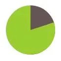
改变rotate的角度就可以实现不同大小的饼状图效果,但是亲手试验的读者会发现,旋转50%以上并不能呈现出理想的效果,而是会呈现出如下效果: 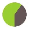
.pie {width: 100px;height: 100px;border-radius: 50%;background: yellowgreen;background-image: linear-gradient(to right, transparent 50%, #655 0);}.pie::before {content: '';display: block;margin-left: 50%;height: 100%;border-radius: 0 100% 100% 0/50%;background-color: inherit;transform-origin: left;animation: spin 3s linear infinite,bg 6s step-end infinite;}@keyframes spin{to{transform: rotate(.5turn);}}@keyframes bg{50%{background: #655;}}
读者最好亲手试验,尝试修改其中的属性,理解其中的意思,只有理解了才能做出更有趣的东西。如果读者对svg感兴趣的话,可以尝试使用svg来实现饼状图,svg实现的效果要更加丰富多彩些。
本文完〜

评论