
对比Excel,一文掌握Pandas表格条件格式(可视化)
回复“书籍”即可获赠Python从入门到进阶共10本电子书
大家好,我是才哥。
本来这周不是加班周,但是毕竟项目赶进度,还是需要加班着,咱们更文又变得慢了起来。
最近有粉丝询问Pandas表格可视化的一些问题,刚好前段时间也看过,那么就结合之前处理Excel时的条件格式对着来看吧。
所以,今天咱们隆重介绍一下Excel条件格式与Pandas的表格可视化,走起!
目录:
1. 概述
2. 突出显示单元格
2.1. 高亮缺失值
2.2. 高亮最大值
2.3. 高亮最小值
2.4. 高亮区间值
2.5. 高亮分位数
3. 色阶(背景及文本渐变色)
3.1. 背景渐变色
3.2. 文本渐变色
4. 数据条
5. 数据格式化
6. 自定义格式函数
7. 其他
1. 概述
咱们先简单介绍一下什么是表格条件格式可视化,以常用的Excel为例说明。
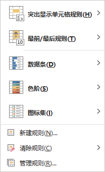
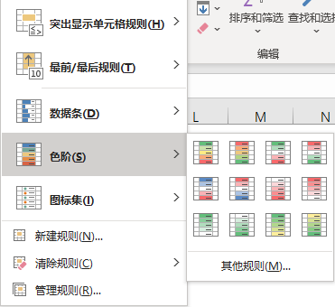
在Excel菜单栏里,默认(选择)开始菜单,在中间部位有个条件格式控件,里面就是关于表格条件格式的方方面面。主要包含突出显示单元格规则、最前/最后规则、数据条、色阶、图标集以及规则管理等。
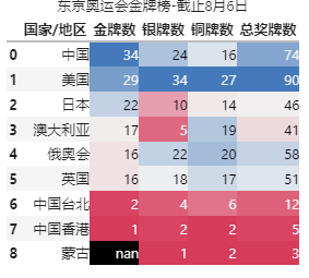
基于以上,我们其实可以通过函数方式进行多种条件的综合,让Excel表格可视化丰富多彩,比如以下截图展示的就是色阶效果!
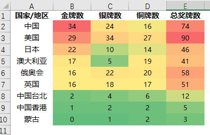
在上图中,我们对每列单独进行条件格式-色阶设置,绿色->红色 代表数值从小到大,可以很直观的快速感受数值表现。
所谓 表格条件格式可视化,就是对表格的数据按照一定的条件进行可视化的展示(这里的可视化更多是指单元格背景色、字体颜色以及文本格式显示等)。
那么,Pandas作为表格化的数据处理工具,我们可以如何实现 表格条件格式可视化呢?!
大杀器:df.style
2. 突出显示单元格
在Excel条件格式中,突出显示单元格规则提供的是大于、小于、等于以及重复值等内置样式,不过在Pandas中这些需要通过函数方法来实现,我们放在后续介绍。这里介绍Pandas突出显示缺失值、最大值、最小值、区间值的函数方法以及Excel实现这些操作的自定义操作。
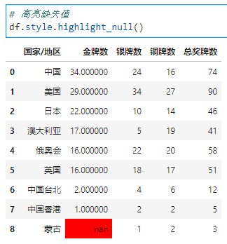
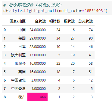
2.1. 高亮缺失值
df.style.highlight_null()
Signature:
df.style.highlight_null(
    null_color: 'str' = 'red',
    subset: 'Subset | None' = None,
    props: 'str | None' = None,
) -> 'Styler'
Docstring:
Highlight missing values with a style.
null_color用于指定高亮的背景色,默认是红色
subset用于指定操作的列或行
props用于突出显示CSS属性(后面案例中会涉及到)
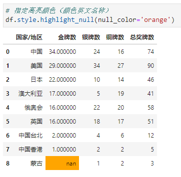
比如,我们可以指定高亮的背景色为橙色(颜色可以是英文名称)
比如,我们可以指定高亮的背景色为紫红色(颜色可以是16进制)
2.2. 高亮最大值
df.style.highlight_max()
Signature:
df.style.highlight_max(
    subset: 'Subset | None' = None,
    color: 'str' = 'yellow',
    axis: 'Axis | None' = 0,
    props: 'str | None' = None,
) -> 'Styler'
Docstring:
Highlight the maximum with a style.
subset用于指定操作的列或行
color用于指定颜色,默认是黄色
axis用于指定行最大、列最大或全部,默认是列方向最大
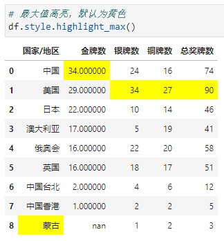
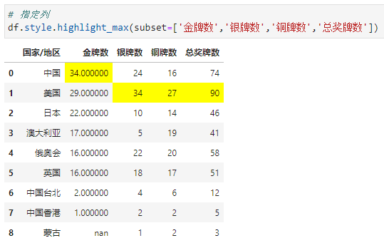
这里我们发现对于中文也有列最大高亮,至于为啥是蒙古其实我也不清楚,为了避免出现这种情况,有两种方法:①将这一列设置为索引(这里不做演示),②采用subset指定
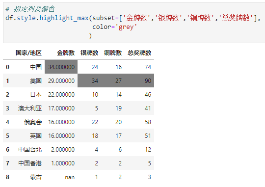
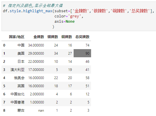
指定颜色为灰色
显示全部最大值
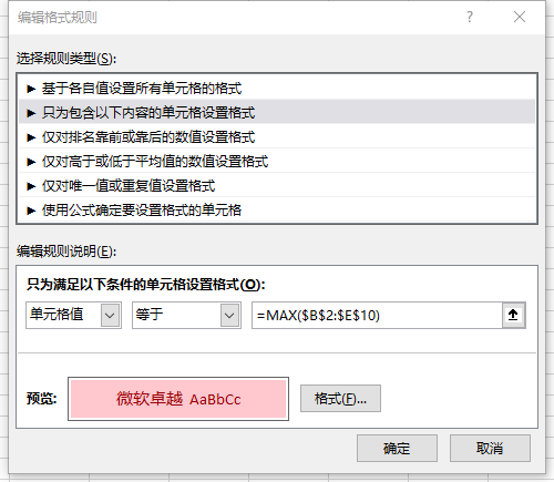
那么,Excel如何显示最大值呢?这里我们以显示全部最大值为例展开介绍,逻辑如下:
通过函数MAX获取数据区域的最大值 然后编辑格式满足单元格值等于这个最大值即可
操作为:选中数据区域,进行条件格式设置->编辑格式规则
具体规则如下图:
我们就可以得到想要的效果:
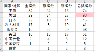
同样的道理,我们可以根据需求高亮列或行的最大值、最小值等
2.3. 高亮最小值
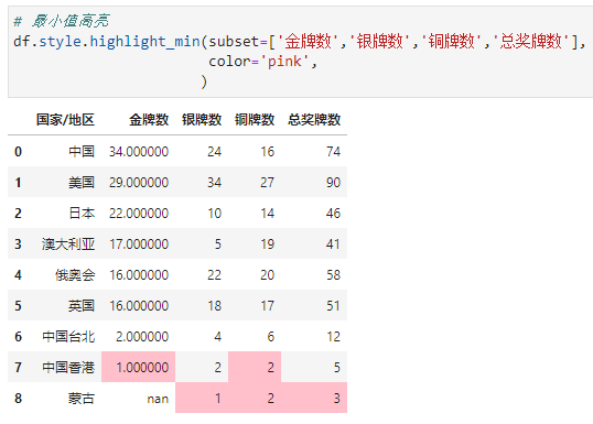
df.style.highlight_min()
参数基本同高亮最大值,这里不再赘述,看案例
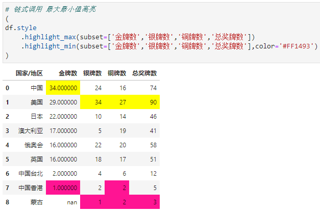
链式调用 最大最小值高亮
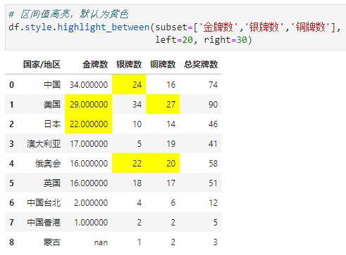
2.4. 高亮区间值
df.style.highlight_between
Signature:
df.style.highlight_between(
    subset: 'Subset | None' = None,
    color: 'str' = 'yellow',
    axis: 'Axis | None' = 0,
    left: 'Scalar | Sequence | None' = None,
    right: 'Scalar | Sequence | None' = None,
    inclusive: 'str' = 'both',
    props: 'str | None' = None,
) -> 'Styler'
Docstring:
Highlight a defined range with a style.
subset用于指定操作的列或行
color用于指定颜色,默认是黄色
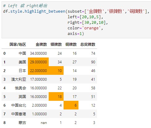
axis用于指定行、列或全部,如果left或right作为序列给出,则应用于这些序列的边界
left用于指定区间最小值
right用于指定区间最大值
inclusive用于确定是否左右闭包,可选'both', 'neither', 'left', 'right'
props用于突出显示CSS属性
高亮数量在[20, 30]的单元格
props用于突出显示CSS属性,案例中我们将待高亮的部分显示为字体颜色-白色,背景色-紫色
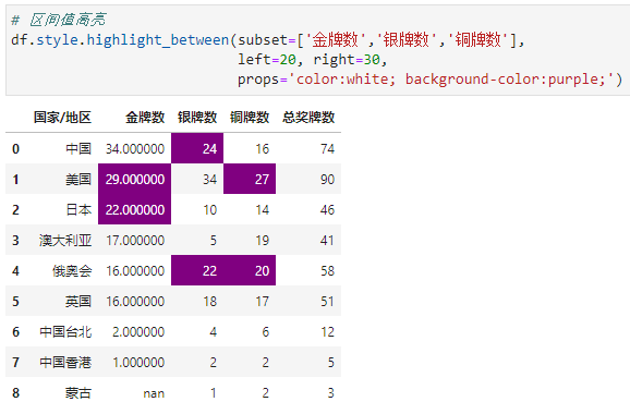
金牌数区间[20, 30]、银牌数区间[10, 20]、铜牌数区间[5, 10]
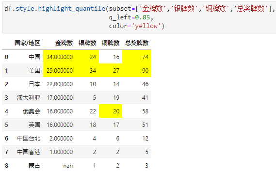
2.5. 高亮分位数
df.style.highlight_quantile()
Signature:
df.style.highlight_quantile(
    subset: 'Subset | None' = None,
    color: 'str' = 'yellow',
    axis: 'Axis | None' = 0,
    q_left: 'float' = 0.0,
    q_right: 'float' = 1.0,
    interpolation: 'str' = 'linear',
    inclusive: 'str' = 'both',
    props: 'str | None' = None,
) -> 'Styler'
Docstring:
Highlight values defined by a quantile with a style.
subset用于指定操作的列或行
color用于指定颜色,默认是黄色
axis用于指定行、列或全部
q_left用于指定分位数左边界,默认是0
q_right用于指定分位数右边界,默认是1
inclusive用于确定是否左右闭包,可选'both', 'neither', 'left', 'right'
props用于突出显示CSS属性
比如,高亮各列奖牌数前15%的值
3. 色阶(背景及文本渐变色)
色阶部分包含背景渐变色和文本渐变色
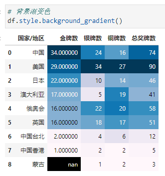
3.1. 背景渐变色
在Excel中,直接通过条件格式->色阶 操作即可选择想要的背景渐变色效果
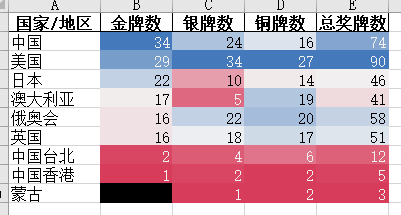
而在Pandas中,我们可以通过df.style.background_gradient()进行背景渐变色的设置。
Signature:
df.style.background_gradient(
    cmap='PuBu',
    low: 'float' = 0,
    high: 'float' = 0,
    axis: 'Axis | None' = 0,
    subset: 'Subset | None' = None,
    text_color_threshold: 'float' = 0.408,
    vmin: 'float | None' = None,
    vmax: 'float | None' = None,
    gmap: 'Sequence | None' = None,
) -> 'Styler'
Docstring:
Color the background in a gradient style.
cmap用于指定matplotlib色条
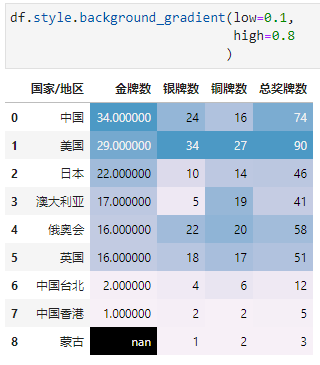
low和high用于指定最小最大值颜色边界,区间[0, 1]
axis用于指定行、列或全部,默认是列方向
subset用于指定操作的列或行
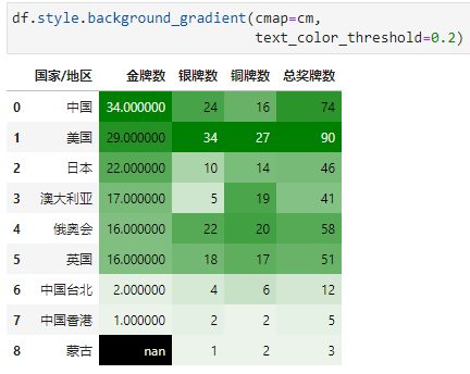
text_color_threshold用于指定文本颜色亮度,区间[0, 1]
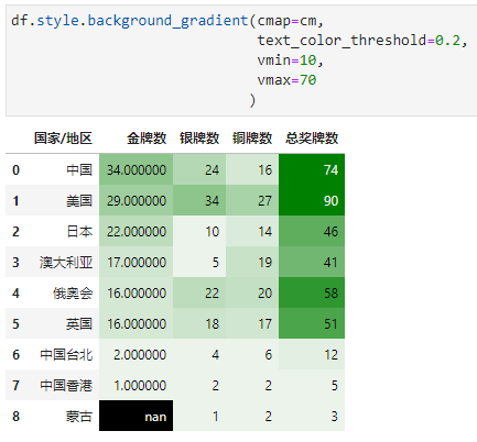
vmin和vmax用于指定与cmap最小最大值对应的单元格最小最大值
low和high用于指定最小最大值颜色边界,区间[0, 1]
cmap用于指定matplotlib色条,采用seaborn美化样式
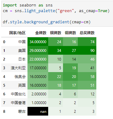
text_color_threshold用于指定文本颜色亮度,区间[0, 1]
vmin和vmax用于指定与cmap最小最大值对应的单元格最小最大值(10以下同色,70以上同色)
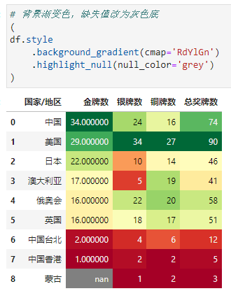
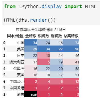
我们可以看到以上对于缺失值来说,其背景色是黑色,我们可以通过链式方法和高亮缺失值对缺失值背景色进行修改
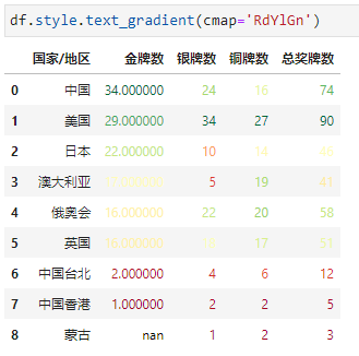
3.2. 文本渐变色
文本渐变色顾名思义就是对单元格的文本进行颜色渐变,可以通过df.style.text_gradient()来操作,其参数和背景渐变色基本一致。
4. 数据条
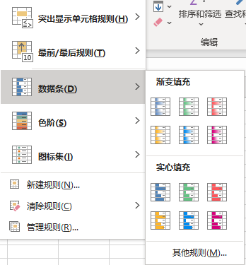
在Excel中,直接通过条件格式->数据条 操作即可选择想要的数据条效果
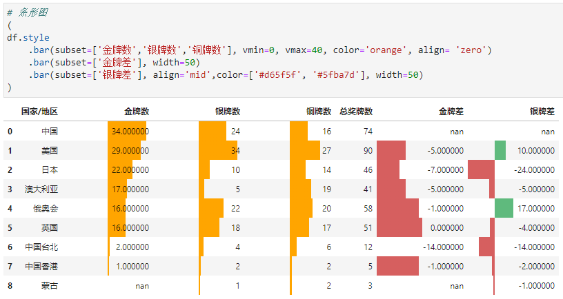
而在Pandas中,我们可以通过 df.style.bar()来进行数据条绘制
Signature:
df.style.bar(
    subset: 'Subset | None' = None,
    axis: 'Axis | None' = 0,
    color='#d65f5f',
    width: 'float' = 100,
    align: 'str' = 'left',
    vmin: 'float | None' = None,
    vmax: 'float | None' = None,
) -> 'Styler'
Docstring:
Draw bar chart in the cell backgrounds.
subset用于指定操作的列或行
axis用于指定行、列或全部,默认是列方向
color用于指定数据条颜色
width用于指定数据条长度,默认是100,区间[0, 100]
vmin和vmax用于指定与数据条最小最大值对应的单元格最小最大值
align数据条与单元格对齐方式,默认是left左对齐,还有zero居中和mid位于(max-min)/2
比如,奖牌数(不算总的)最低0最高40+颜色为橙色+居中展示,金牌差数据条长度为50(也就是单元格一半的长度)、银牌差mid对齐+数据条为单元格一半长度+正负显示不同颜色
5. 数据格式化
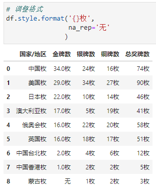
调整数据格式用到df.style.format()
Signature:
df.style.format(
    formatter: 'ExtFormatter | None' = None,
    subset: 'Subset | None' = None,
    na_rep: 'str | None' = None,
    precision: 'int | None' = None,
    decimal: 'str' = '.',
    thousands: 'str | None' = None,
    escape: 'str | None' = None,
) -> 'StylerRenderer'
Docstring:
Format the text display value of cells.
formatter显示格式
subset用于指定操作的列或行
na_rep用于指定缺失值的格式
precision用于指定浮点位数
decimal用于用作浮点数、复数和整数的十进制分隔符的字符,默认是.
thousands用作浮点数、复数和整数的千位分隔符的字符
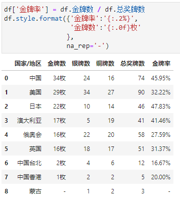
escape用于特殊格式输出(如html、latex等,这里不做展开,可参考官网)比如,我们给数据加上单位
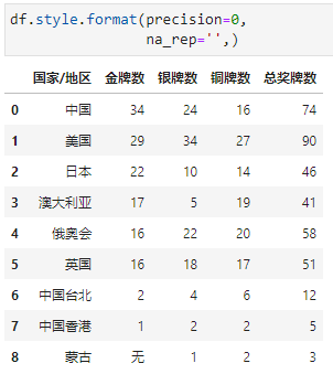
枚,缺失值显示为无
设置小数点位数为0
指定列进行格式化
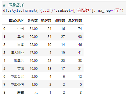
分别对指定列进行单独格式化
6. 自定义格式函数
通过传递样式函数来自定义格式:
applymap()(elementwise):接受一个函数,它接受一个值并返回一个带有 CSS 属性值对的字符串。
apply()(column-/ row- /table-wise): 接受一个函数,它接受一个 Series 或 DataFrame 并返回一个具有相同形状的 Series、DataFrame 或 numpy 数组,其中每个元素都是一个带有 CSS 属性的字符串-值对。此方法根据axis关键字参数一次传递一个或整个表的 DataFrame 的每一列或行。对于按列使用axis=0、按行使用axis=1,以及一次性使用整个表axis=None。
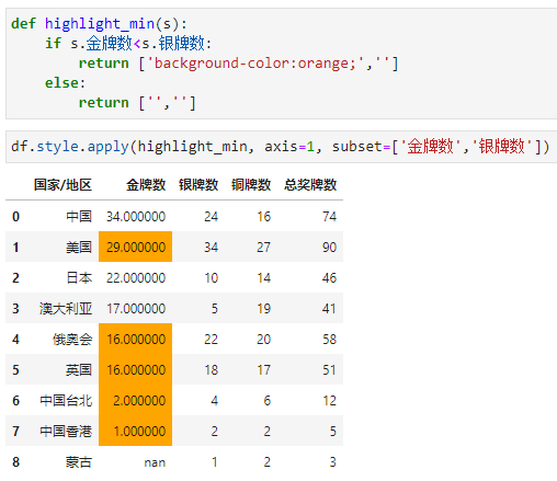
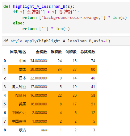
比如,我们定义一个函数,如果金牌数<银牌数,则高亮金牌数这一列对应的值
比如,我们还可以定义函数,如果金牌数<银牌数,则这一行数据都高亮
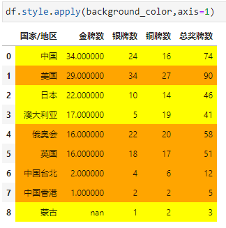
又或者,我们可以根据不同的比值对每行进行不同的高亮
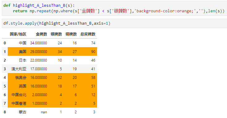
关于以上函数的写法,我们还可以调用numpy的where和repeat方法进行优化,如:
7. 其他
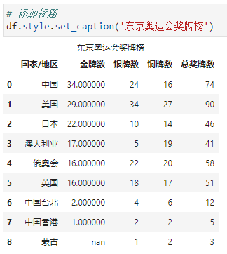
还有一些小操作,比如添加标题、隐藏索引、隐藏指定列等等
添加标题
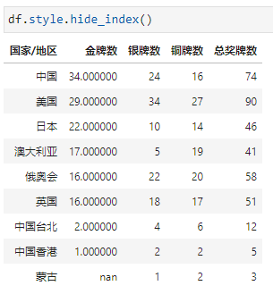
隐藏索引
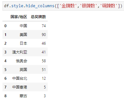
隐藏指定列
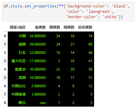
设置属性
如果一些单元格属性和单元格值无关,我们可以通过df.style.set_properties()来进行定制化操作,比如:背景色-黑色,字体颜色-草绿色,边框颜色-白色。(css样式)
选中放大
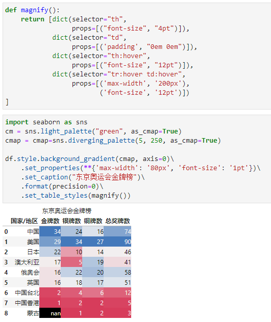
鼠标选择单元格会有放大效果
导出Excel
就直接to_excel就行了,dfs = df.style.xxx,然后dfs.to_excel()
导出html
以上就是本次全部内容,大家感兴趣的话可以自己演示一遍熟悉熟悉,又或者想想日常工作中的一些条件格式需求,然后通过Pandas演示出来效果看看。
小伙伴们,快快用实践一下吧!如果在学习过程中,有遇到任何问题,欢迎加我好友,我拉你进Python学习交流群共同探讨学习。
------------------- End -------------------
往期精彩文章推荐:

欢迎大家点赞,留言,转发,转载,感谢大家的相伴与支持
想加入Python学习群请在后台回复【入群】
万水千山总是情,点个【在看】行不行
/今日留言主题/
随便说一两句吧~~