
网页动画的12原则,帮你做出漂亮的动画效果

译文 | https://cssanimation.rocks/cn/principles/
作者 | @donovanh
原文 | https://cssanimation.rocks/principles/
作为前端的设计师和工程师,我们用 css 去做样式、定位并创建出好看的网站。我们经常用 css 去添加页面的运动过渡效果甚至动画,但我们经常做的东西不会超过这些。
动效是一个有助于访客和消费者理解我们设计的强有力工具。这里有些原则能最大限度地应用在我们的工作中。
迪士尼经过基础工作练习的长时间累积,在 1981 年出版的 The Illusion of Life: Disney Animation 一书中发表了动画的十二个原则 (12 Principles of Animation) 。这些原则描述了动画能怎样用于让观众相信自己沉浸在现实世界中。
1、挤压和拉伸 (Squash and stretch)

<article><div></div><div></div></article>.shape {animation: one 4s infinite ease-out;}.surface {background: #000;height: 10em;width: 1em;position: absolute;top: calc(50% - 4em);left: calc(50% + 10em);}one {15% {opacity: 0;}25% {transform: none;: cubic-bezier(1,-1.92,.95,.89);width: 4em;height: 4em;top: calc(50% - 2em);left: calc(50% - 2em);opacity: 1;}45% {transform: translateX(8em);height: 6em;width: 2em;top: calc(50% - 3em);: linear;opacity: 1;}100% {transform: translateX(8em) translateY(5em);height: 6em;width: 2em;top: calc(50% - 3em);opacity: 0;}}body {margin: 0;background: #e9b59f;: HelveticaNeue, Arial, Sans-serif;color: #fff;}{width: 100%;height: 100vh;position: relative;}{background: #2d97db;border: 1em solid #fff;width: 4em;height: 4em;position: absolute;top: calc(50% - 2em);left: calc(50% - 2em);}
2、预备动作 (Anticipation)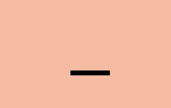
<article><div></div><div></div></article>.shape {animation: two 5s infinite ease-out;: 50% 7em;}.surface {background: #000;width: 8em;height: 1em;position: absolute;top: calc(50% + 4em);left: calc(50% - 3em);}two {15% {opacity: 0;transform: none;}25% {opacity: 1;transform: none;: cubic-bezier(.5,.05,.91,.47);}38% {transform: translateX(-2em);}45% {transform: translateX(-4em);}52% {transform: translateX(-4em) rotateZ(-20deg);}75% {transform: translateX(-4em) rotateZ(-10deg);}{transform: translateX(-4em) rotateZ(-24deg);opacity: 1;}100% {transform: translateX(-6em) translateY(4em) rotateZ(-90deg);opacity: 0;}}{width: 100%;height: 100vh;position: relative;}{background: #2d97db;border: 1em solid #fff;width: 4em;height: 4em;position: absolute;top: calc(50% - 2em);left: calc(50% - 2em);}
3、演出布局 (Staging)
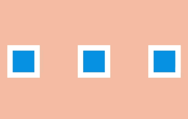
<article><div></div><div></div><div></div></article>.shape.a {transform: translateX(-12em);}.shape.c {transform: translateX(12em);}.shape.b {animation: three 5s infinite ease-out;: 0 6em;}.shape.a, .three .shape.c {animation: threeb 5s infinite linear;}three {10% {transform: none;: cubic-bezier(.57,-0.5,.43,1.53);}30% {transform: rotateZ(-40deg);}{transform: rotateZ(-38deg);}{transform: rotateZ(-42deg);}{transform: rotateZ(-38deg);}{transform: rotateZ(-40deg);}{transform: rotateZ(-38deg);}{transform: rotateZ(-42deg);}{transform: rotateZ(-38deg);: cubic-bezier(.57,-0.5,.43,1.53);}100% {transform: none;}}threeb {20% {filter: none;}50% {filter: blur(5px);}100% {filter: none;}}{width: 100%;height: 100vh;position: relative;}{background: #2d97db;border: 1em solid #fff;width: 4em;height: 4em;position: absolute;top: calc(50% - 2em);left: calc(50% - 2em);}
4、连续运动和姿态对应 (Straight-Ahead Action and Pose-to-Pose)

<article><div></div><div></div></article>.shape.a {left: calc(50% - 8em);animation: four 6s infinite cubic-bezier(.57,-0.5,.43,1.53);}.shape.b {left: calc(50% + 8em);animation: four 6s infinite steps(1);}four {10% {transform: none;}30% {transform: rotateZ(-45deg) scale(1.25);}{transform: rotateZ(-45deg) translate(2em, -2em) scale(1.8);}75% {transform: rotateZ(-45deg) scale(1.1);}100% {transform: none;}}{width: 100%;height: 100vh;position: relative;}{background: #2d97db;border: 1em solid #fff;width: 4em;height: 4em;position: absolute;top: calc(50% - 2em);left: calc(50% - 2em);}
5、跟随和重叠动作 (Follow Through and Overlapping Action)

<div><div></div></div></article>.shape {animation: five 4s infinite cubic-bezier(.64,-0.36,.1,1);position: relative;left: auto;top: auto;}.shape-container {animation: five-container 4s infinite cubic-bezier(.64,-0.36,.1,2);position: absolute;left: calc(50% - 4em);top: calc(50% - 4em);}five {15% {opacity: 0;transform: translateX(-12em);}25% {transform: translateX(-12em);opacity: 1;}90% {transform: translateX(12em);opacity: 1;}{transform: translateX(12em);opacity: 0;}}five-container {35% {transform: none;}60% {transform: skewX(20deg);}100% {transform: none;}}{width: 100%;height: 100vh;position: relative;}{background: #2d97db;border: 1em solid #fff;width: 4em;height: 4em;position: absolute;top: calc(50% - 2em);left: calc(50% - 2em);}
6、缓入缓出 (Slow In and Slow Out)

<article><div></div></article>.shape {animation: six 3s infinite cubic-bezier(0.5,0,0.5,1);}six {5% {transform: translate(-12em);}55% {transform: translate(12em);}100% {transform: translate(-12em);}}{width: 100%;height: 100vh;position: relative;}{background: #2d97db;border: 1em solid #fff;width: 4em;height: 4em;position: absolute;top: calc(50% - 2em);left: calc(50% - 2em);}
7、弧线运动 (Arc)

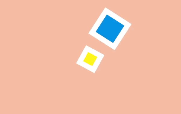
<article><div></div><div></div></article>.shape.a {animation: sevenb 3s infinite linear;top: calc(50% - 2em);left: calc(50% - 9em);: 10em 50%;}.shape.b {animation: sevenb 6s infinite linear reverse;: yellow;width: 2em;height: 2em;left: calc(50% - 1em);top: calc(50% - 1em);}sevenb {{transform: rotateZ(360deg);}}{width: 100%;height: 100vh;position: relative;}{background: #2d97db;border: 1em solid #fff;width: 4em;height: 4em;position: absolute;top: calc(50% - 2em);left: calc(50% - 2em);}
8、次要动作 (Secondary Action)
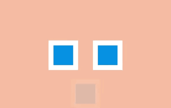
<article><div></div><div></div><div></div></article>.shape.a {transform: translateX(-6em);animation: eight-shape-a 4s cubic-bezier(.57,-0.5,.43,1.53) infinite;}.shape.b {top: calc(50% + 6em);opacity: 0;animation: eight-shape-b 4s linear infinite;}.shape.c {transform: translateX(6em);animation: eight-shape-c 4s cubic-bezier(.57,-0.5,.43,1.53) infinite;}eight-shape-a {50% {transform: translateX(-5.5em);}100% {transform: translateX(-10em);}}eight-shape-b {{transform: none;}30% {transform: translateY(-1.5em);opacity: 1;: cubic-bezier(.57,-0.5,.43,1.53);}{transform: translateY(-1.25em);opacity: 1;}{transform: translateY(-1.75em);opacity: 1;}38% {transform: translateY(-1.25em);opacity: 1;}60% {transform: translateY(-1.5em);opacity: 1;}100% {transform: translateY(-8em);opacity: 1;}}eight-shape-c {50% {transform: translateX(5.5em);}100% {transform: translateX(10em);}}{width: 100%;height: 100vh;position: relative;}{background: #2d97db;border: 1em solid #fff;width: 4em;height: 4em;position: absolute;top: calc(50% - 2em);left: calc(50% - 2em);}
9、时间节奏 (Timing)
<div></div><div></div></article>.shape.a {animation: nine 4s infinite cubic-bezier(.93,0,.67,1.21);left: calc(50% - 12em);: 100% 6em;}.shape.b {animation: nine 2s infinite cubic-bezier(1,-0.97,.23,1.84);left: calc(50% + 2em);: 100% 100%;}nine {10% {transform: translateX(0);}60% {transform: rotateZ(90deg);}100% {transform: translateX(0);}}{width: 100%;height: 100vh;position: relative;}{background: #2d97db;border: 1em solid #fff;width: 4em;height: 4em;position: absolute;top: calc(50% - 2em);left: calc(50% - 2em);}
10、夸张手法 (Exaggeration)

<article><div></div></article>.shape {animation: ten 4s infinite linear;: 50% 8em;top: calc(50% - 6em);}ten {10% {transform: none;: cubic-bezier(.87,-1.05,.66,1.31);}{transform: rotateZ(-45deg) scale(2);: cubic-bezier(.16,.54,0,1.38);}100% {transform: rotateZ(360deg) scale(1);}}{width: 100%;height: 100vh;position: relative;}{background: #2d97db;border: 1em solid #fff;width: 4em;height: 4em;position: absolute;top: calc(50% - 2em);left: calc(50% - 2em);}
11、扎实的描绘 (Solid drawing)

<article><div><div><span></span><span></span><span></span><span></span><span></span><span></span></div></div></article>.shape {background: none;border: none;perspective: 400px;: center;}.shape .container {animation: eleven 4s infinite cubic-bezier(.6,-0.44,.37,1.44);: preserve-3d;}.shape span {display: block;position: absolute;opacity: 1;width: 4em;height: 4em;border: 1em solid #fff;background: #2d97db;}.shape span.front {transform: translateZ(3em);}.shape span.back {transform: translateZ(-3em);}.shape span.left {transform: rotateY(-90deg) translateZ(-3em);}.shape span.right {transform: rotateY(-90deg) translateZ(3em);}.shape span.top {transform: rotateX(-90deg) translateZ(-3em);}.shape span.bottom {transform: rotateX(-90deg) translateZ(3em);}eleven {{opacity: 0;}40% {transform: none;opacity: 1;}75% {transform: rotateX(-20deg) rotateY(-45deg) translateY(4em);: cubic-bezier(1,-0.05,.43,-0.16);opacity: 1;}{transform: translateZ(-180em) translateX(20em);opacity: 0;}}{width: 100%;height: 100vh;position: relative;}{background: #2d97db;border: 1em solid #fff;width: 4em;height: 4em;position: absolute;top: calc(50% - 2em);left: calc(50% - 2em);}
12、吸引力 (Appeal)

<article><div><div><span></span><span></span><span></span><span></span></div></div></article>.shape {background: none;border: none;perspective: 400px;: center;}.shape .container {animation: show-container 8s infinite cubic-bezier(.6,-0.44,.37,1.44);: preserve-3d;width: 4em;height: 4em;border: 1em solid #fff;background: #2d97db;position: relative;}.item {: #1f7bb6;position: absolute;}.item.one {animation: show-text 8s 0.1s infinite ease-out;height: 6%;width: 30%;top: 15%;left: 25%;}.item.two {animation: show-text 8s 0.2s infinite ease-out;height: 6%;width: 20%;top: 30%;left: 25%;}.item.three {animation: show-text 8s 0.3s infinite ease-out;height: 6%;width: 50%;top: 45%;left: 25%;}.item.four {animation: show-button 8s infinite cubic-bezier(.64,-0.36,.1,1.43);height: 20%;width: 40%;top: 65%;left: 30%;}show-container {{opacity: 0;transform: rotateX(-90deg);}{opacity: 1;transform: none;width: 4em;height: 4em;}90% {width: 12em;height: 12em;transform: translate(-4em, -4em);opacity: 1;}{opacity: 0;transform: rotateX(-90deg);width: 4em;height: 4em;}}show-text {15% {transform: translateY(1em);opacity: 0;}85% {opacity: 1;transform: none;}100% {opacity: 0;transform: translateY(-1em);: cubic-bezier(.64,-0.36,.1,1.43);}}show-button {25% {transform: scale(0);opacity: 0;}80% {transform: none;opacity: 1;}100% {opacity: 0;transform: scale(0);}}{width: 100%;height: 100vh;position: relative;}{background: #2d97db;border: 1em solid #fff;width: 4em;height: 4em;position: absolute;top: calc(50% - 2em);left: calc(50% - 2em);}
学习更多技能
请点击下方公众号

评论