
这篇Cell里面的GSEA展示很不错!

这篇文章中有一张图很有趣,如下:
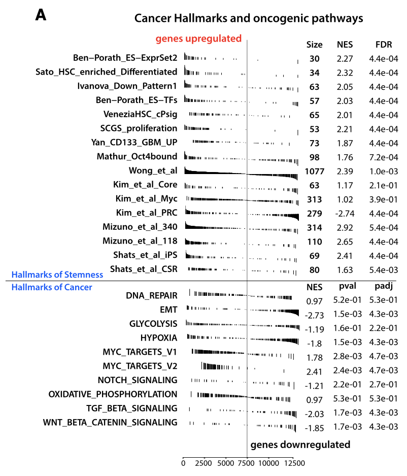
作者使用Hallmarks通路进行GSEA富集分析,共发现26条通路显著与两种表型相关,与stemness表型相关的有16条通路,与cancer表型相关的有10条通路。
本次演练中,我们选择MSIDB数据库中的50条Hallmarks通路进行示例,通路信息下载链接:http://www.gsea-msigdb.org/gsea/downloads.jsp
下面我们用我们自己的数据来做一下这张图:
rm(list = ls())library(edgeR)library(DESeq2)library(fgsea)library(clusterProfiler)library(enrichplot)library(ggplot2)
load('data.rda') ## 加载我们的数据 包括临床数据clin和表达数据exprhead(expr)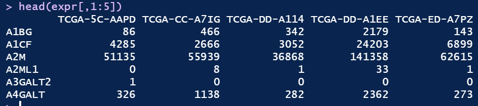
表达矩阵为 raw read count data
head(clin)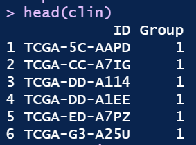
第一列为expr每一列对应的ID,第二列为分组信息。
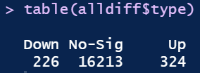
table(clin$Group)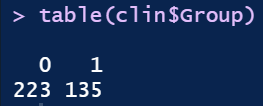
0和1分别有223个和135个
##构建分组信息group <- factor(rep(c('1','0'),times=c(135,223)))colData <- data.frame(row.names=rownames(clin),group)
##保留在50%以上的样本中count>=1的基因keep <- rowSums(expr>=1) >= ncol(expr)*0.5table(keep)cc <- expr[keep,]
##差异分析dds <- DESeqDataSetFromMatrix(round(cc), colData, design= ~group)dds <- DESeq(dds)res<- results(dds,contrast=c("group","1","0"),independentFiltering=FALSE)
##差异分析结果alldiff <- as.data.frame(res)%>%na.omit()alldiff$type <- ifelse(alldiff$padj>0.05,'No-Sig',ifelse(alldiff$log2FoldChange>1,'Up',ifelse(alldiff$log2FoldChange< -1,'Down','No-Sig')))table(alldiff$type)
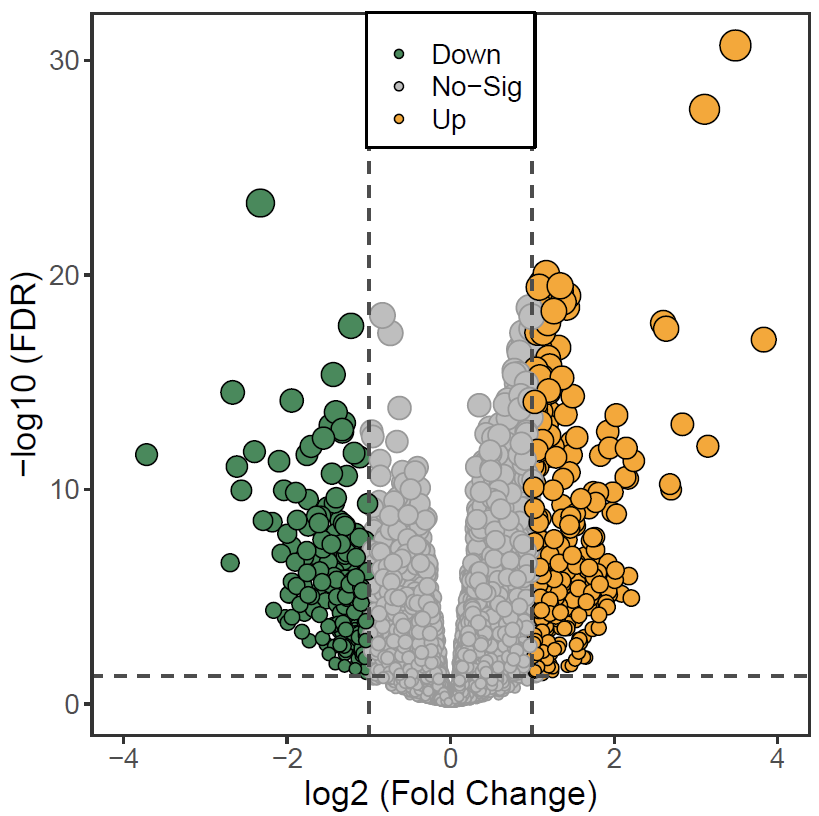
## 顺手画个火山图ggplot(alldiff,aes(log2FoldChange,-log10(padj),fill=type))+geom_point(shape=21,aes(size=-log10(padj),color=color))+scale_fill_manual(values=c('seagreen','gray','orange'))+scale_color_manual(values=c('gray60','black'))+geom_vline(xintercept=c(-1,1),lty=2,col="gray30",lwd=0.6) +geom_hline(yintercept = -log10(0.05),lty=2,col="gray30",lwd=0.6)+theme_bw(base_rect_size = 1)+theme(axis.title = element_text(size = 15),axis.text = element_text(size = 12),legend.title = element_blank(),legend.text = element_text(size = 12),panel.grid = element_blank(),plot.title = element_text(family = 'regular',hjust = 0.5),legend.position = c(0.5, 1),legend.justification = c(0.5, 1),legend.key.height = unit(0.5,'cm'),legend.background = element_rect(fill = NULL, colour = "black",size = 0.5))+xlim(-4,4)+guides(size=F,color=F)+ylab('-log10 (FDR)')+xlab('log2 (Fold Change)')
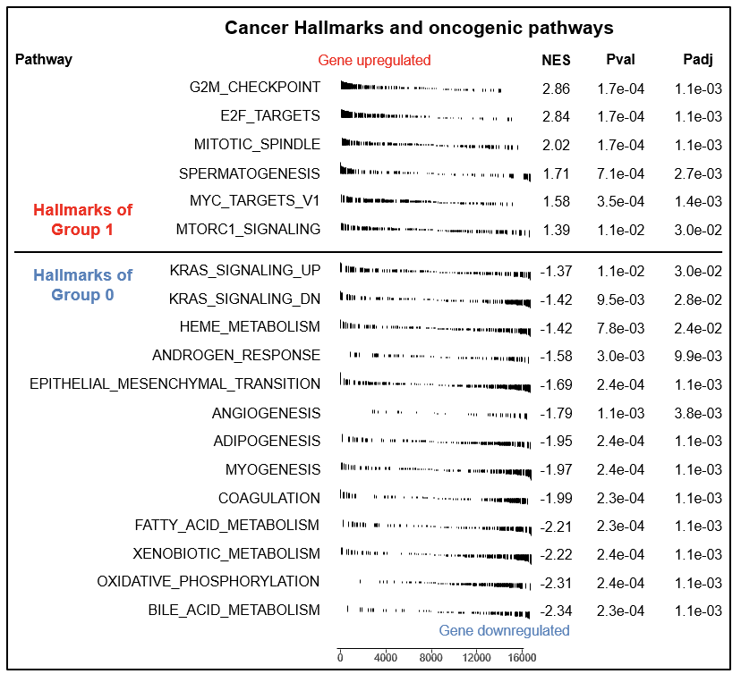
接下来开始重头戏,开始画GSEA table
## 根据logfc降序排列基因alldiff <- alldiff[order(alldiff$log2FoldChange,decreasing = T),]
## fgsea中输入的关键基因信息id <- alldiff$log2FoldChangenames(id) <- rownames(alldiff)
## fgsea中输入的关键通路信息gmtfile <- "./h.all.v7.4.symbols.gmt"hallmark <- read.gmt(gmtfile)hallmark$term <- gsub('HALLMARK_','',hallmark$term)hallmark.list <- hallmark %>% split(.$term) %>% lapply( "[[", 2)
## Perform the fgsea analysisfgseaRes <- fgsea(pathways = hallmark.list,stats = id,minSize=1,maxSize=10000,nperm=10000)sig <- fgseaRes[fgseaRes$padj<0.05,]sig <- sig[order(sig$NES,decreasing = T),]
## 最后一步 开始绘图plotGseaTable(hallmark.list[sig$pathway],id, fgseaRes,gseaParam = 0.5)
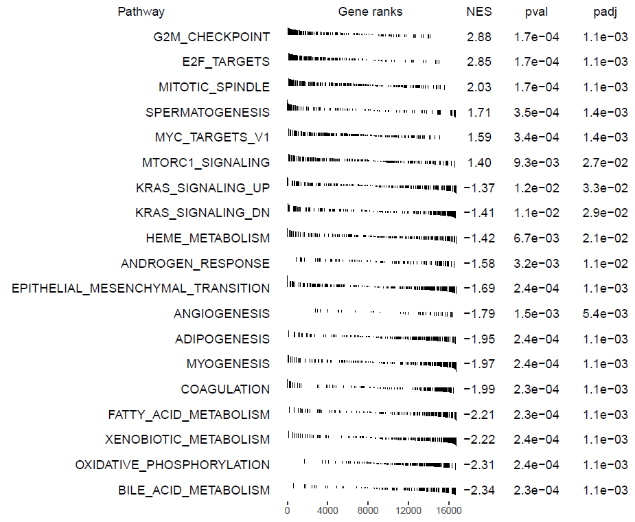
这样子基本上画完了,但是貌似不是很好看,可以保存为PPT格式再处理一下
library(export)graph2ppt(file = 'GSEA-table.pptx',height = 7,width = 8.5)
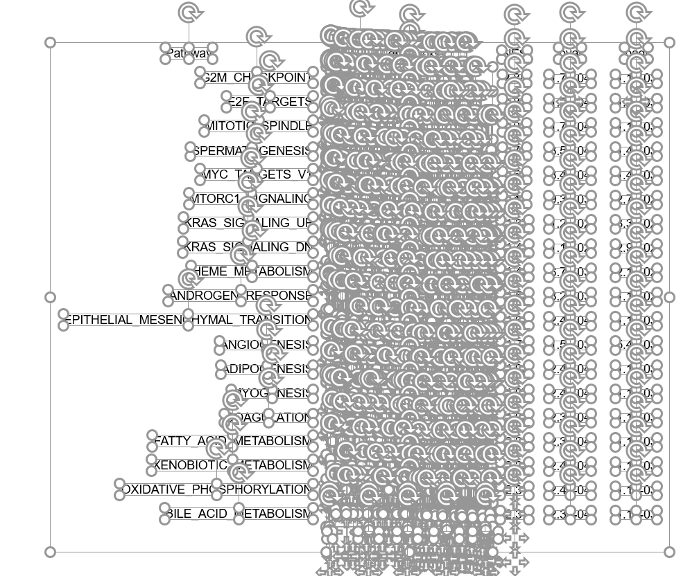
其中每个元素都可以调整哦
调整完之后如下所示:
加编者微信入群 "生信交流群-医学僧"
加微信时请备注 "学校-专业-姓名"
往期精品(点击图片直达文字对应教程)
|
|
|
|
|
|
|
|
|
|
|
|
|
|
|
|
|
|
|
|
|
|
|
|
|
|
|


后台回复“生信宝典福利第一波”或点击阅读原文获取教程合集

评论