
ConstraintLayout2.0进阶之路-欢迎新同学
ConstraintLayout2.0针对布局来说,主要新增了两类东西,一个是新增了VirtualLayouts,用于将一组View进行关联管理,并赋予定义的能力,另一个是放开了ConstraintHelper的限制。
国际惯例,官网镇楼。
https://github.com/androidx/constraintlayout/wiki/What's-New-in-2.1
https://developer.android.com/training/constraint-layout
VirtualLayouts
ConstraintLayout1.1首次引入了Barriers和Guidelines这样的ConstraintHelper,它们是创建了一个不可见的View,让他管理了多个View的id引用,从而实现多View的整体布局,例如对齐等逻辑。而在ConstraintLayout2.0中,ConstraintLayout增加了类似Flow这样的VirtualLayouts,它允许将某些行为同时作用到所有被引用的widget上,这实际上是对这类使用场景的一种约束范式,同时统一了实现方式。
在Constraint Layout中,VirtualLayouts作为virtual view group的角色参与约束和布局中,但是它们并不会作为视图添加到视图层级结构中,而是仅仅引用其它视图来辅助它们在布局系统中完成各自的布局功能。
Flow
Flow可以说是Chains的强化版,它是一种新的VirtualLayouts,可以用来构建流式排版效果,当出现空间不足的情况时,它能够自动换行,或者是自动延展到屏幕的另一区域。当你需要对多个View进行流式布局,或者不确定其布局空间的实际尺寸时,就可以使用Flow来实现。借助官网上的一张图,可以很方便的了解Flow的使用。
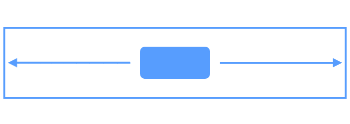 图片
图片Flow包含很多可以设置的属性,下面通过一些例子来进行讲解。
wrapMode
这个属性用于控制元素的排列方式,通过下面这个动图,可以了解其布局的基本规则。
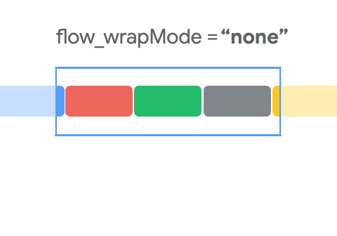 图片
图片Flow可以通过constraint_referenced_ids来获取要引用的所有视图,然后根据这些视图创建一个虚拟的virtual view group,再对这些视图进行流式布局,示例代码如下所示。
android:layout_height="wrap_content"
app:constraint_referenced_ids="bt1,bt2,bt3"
app:flow_wrapMode="aligned"
app:layout_constraintEnd_toEndOf="parent"
app:layout_constraintStart_toStartOf="parent"
app:layout_constraintTop_toTopOf="parent" />
- NONE : 默认模式。Views不会被包裹到另一行或列。如果它们在屏幕之外,则不能被看到。
- CHAIN : CHAIN与Chains非常相似,可以认为是Chains的强化版本。CHAIN是根据orientation逐行或逐列进行排列的,默认的展示风格是SPREAD。
- ALIGNED : ALIGNED模式与CHAIN类似,但链式是在将不同行和列的视图对齐后考虑的,默认的样式是SPREAD。
Gap
Gap展示了Flow中每个元素直接的间隔,这个间隔包含horizontalGap和verticalGap两种,你可以在原有Chain Style的基础上进行额外设置,示例代码如下所示。
android:layout_height="wrap_content"
app:constraint_referenced_ids="bt1,bt2,bt3"
app:flow_horizontalGap="50dp"
app:flow_verticalGap="50dp"
app:flow_wrapMode="aligned"
app:layout_constraintEnd_toEndOf="parent"
app:layout_constraintStart_toStartOf="parent"
app:layout_constraintTop_toTopOf="parent" />
Style
当wrapMode设置为ALIGNED或CHAIN时,根据Flow的orientation,可以设置相应的flow_verticalStyle和flow_horizontalStyle,此时,这个Style与Chains中的Style枚举一样,可以设置spread、spread_inside和packed,效果也和Chains的效果一样。
- flow_firstHorizontalStyle:约束第一条水平链,当有多条链(多行)时,只约束第一条链(第一行),其他链(其他行)不约束
- flow_lastHorizontalStyle:约束最后一条水平链,当有多条链(多行)时,只约束最后一条链(最后一行),其他链(其他行)不约束
- flow_horizontalStyle:约束所有水平链
- flow_firstVerticalStyle:同水平约束
- flow_lastVerticalStyle:同水平约束
- flow_verticalStyle:约束所有垂直链
Bias
当Style设置为Packed时,可以通过Bias来设置位移的权重,这个效果与Chains的效果也是一样的。
Alignment
这里的Alignment指的是Flow方向的法向方向的对齐方式,如果指定Flow的方向,是不会生效的,例如Flow的orientation是vertical,那么设置flow_horizontalAlign才会生效。
maxElementsWrap
表示当前方向上最大的元素数量,这个属性在固定行或固定列数量的时候,是非常有用的。
在Component Tree界面,可以直接多选要创建Flow的Views,拖进去自动生成constraint_referenced_ids。
演示
Flow是一个非常强大的布局工具,但是属性也很多,所以初学者很难掌握,所以我写了一个Demo,用于演示Flow的使用。
 image
image代码很简单,详细的可以查看 https://github.com/xuyisheng/ConstraintLayout2Demo
ConstraintHelper
ConstraintHelper是ConstraintLayout中的一个非常重要的部分,你可以认为ConstraintHelper是一个用于记录标记Views的Helper,它并没有创建新的布局,而是引用了指定的Views,并针对这个整体实现一些效果。
Layer
Layer作为一种新的辅助工具,可以认为是Group的强化版,它可以让你在多个视图上创建一个虚拟的图层。但是,与Flow不同的是,它并不会对视图进行布局操作,它的使用场景是对多个视图同时进行变换。
例如,你需要对多个视图整体进行旋转、平移或缩放操作,再或者说是设置一组View的背景,那么就可以使用Layer。
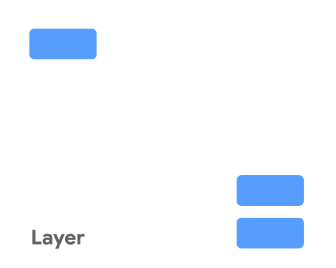 图片
图片Layer在布局期间会调整大小,其大小会根据其引用的所有视图进行调整,你可以将Layer理解为一组View的边界矩形范围,通过Layer,可以很方便的拿到referenced_ids指定的View的边界范围,示例代码如下所示。
android:layout_height="wrap_content"
app:constraint_referenced_ids="bt1,bt2,bt3"
app:flow_wrapMode="aligned"
app:layout_constraintEnd_toEndOf="parent"
app:layout_constraintStart_toStartOf="parent"
app:layout_constraintTop_toTopOf="parent" />
借助Layer,可以很方便的给一组View设置背景色的功能,这个场景在ConstraintLayout1中,只能通过新增一个View并建立与要设置背景色的一组View的约束的方式来实现,而现在,使用Layer就很方便了。
android:layout_height="wrap_content"
android:background="#80BEBEBE"
app:constraint_referenced_ids="chipOne,chipTwo,chipThree,chipFour,chipFive,chipSix,chipSeven,chipEight"
app:layout_constraintTop_toTopOf="parent" />
在Component Tree界面,可以直接多选要创建Layer的Views,拖进去自动生成constraint_referenced_ids。
自定义ConstraintHelper
ConstraintHelper的三个使用场景。
- 辅助布局:创建一个新的布局方式,避免创建新的ViewGroup从而加深层级
- 修改布局:在布局完成后,修改布局效果
- 重新渲染:在View绘制完成后,对View进行修改、重新渲染效果
常用回调:
- init:初始化调用
- updatePreLayout:布局前更新
- updatePostLayout:布局后更新
- updatePostMeasure:测量后更新
- updatePostConstraints:更新约束
- onDraw:进行绘制
自定义ConstraintHelper最基本的方式就是通过继承ConstraintHelper来实现,并通过重写上面的一些回调,来实现布局的修改,下面通过一个简单的例子来演示下如何创建自定义ConstraintHelper,代码如下所示。
class CircularRevealHelper @JvmOverloads constructor(
    context: Context, attrs: AttributeSet? = null, defStyleAttr: Int = 0
) : ConstraintHelper(context, attrs, defStyleAttr) {

    override fun updatePostLayout(container: ConstraintLayout?) {
        super.updatePostLayout(container)
        getViews(container).forEach { view ->
            ViewAnimationUtils.createCircularReveal(
                view, view.width / 2,
                view.height / 2, 0f,
                hypot((view.height / 2.0), (view.width / 2.0)).toFloat()
            ).apply {
                duration = 1000
                start()
            }
        }
    }
}
updatePostLayout会在onLayout之后调用,在这里做动画就可以。这里除了使用createCircularReveal来创建动画,一般的属性动画也是一样的。
在xml布局中,只需要指定ConstraintHelper和referenced_ids即可。
android:layout_height="wrap_content"
app:constraint_referenced_ids="chipOne,chipTwo,chipThree,chipFour,chipFive,chipSix,chipSeven,chipEight"
app:layout_constraintTop_toTopOf="parent" />
ConstraintHelper还有一个好处就是可以对渲染效果进行封装,例如上面的CircularReveal效果,创建好ConstraintHelper之后,以后如果还有View需要使用CircularReveal的效果,那直接创建一个ConstraintHelper就可以了,实现了很好的复用功能。
除了继承ConstraintHelper来实现自定义的ConstraintHelper,也可以通过继承现有的一些系统ConstraintHelper,例如Layer,这样的好处是,可以拿到一些额外的参数,方便计算,例如Layer中提供的布局边界,这样实现一个发散靠拢的效果,就很简单了,示例代码如下所示。
class FlyingHelper @JvmOverloads constructor(
    context: Context, attrs: AttributeSet? = null, defStyleAttr: Int = 0
) : Layer(context, attrs, defStyleAttr) {

    override fun updatePostLayout(container: ConstraintLayout) {
        super.updatePostLayout(container)
        val centerPoint = PointF(((left + right) / 2).toFloat(), ((top + bottom) / 2).toFloat())
        ValueAnimator.ofFloat(0f, 1f).setDuration(1000).apply {
            addUpdateListener { animation ->
                val animatedFraction = animation.animatedFraction
                updateTranslation(centerPoint, animatedFraction, container)
            }
            start()
        }
    }

    private fun updateTranslation(centerPoint: PointF, animatedFraction: Float, container: ConstraintLayout) {
        val views = getViews(container)
        for (view in views) {
            val viewCenterX = (view.left + view.right) / 2
            val viewCenterY = (view.top + view.bottom) / 2
            val startTranslationX = if (viewCenterX < centerPoint.x) -2000f else 2000f
            val startTranslationY = if (viewCenterY < centerPoint.y) -2000f else 2000f
            view.translationX = (1 - animatedFraction) * startTranslationX
            view.translationY = (1 - animatedFraction) * startTranslationY
        }
    }
}
ImageFilterButton、ImageFilterView
ImageFilterButton继承自AppCompatImageButton,而ImageFilterView继承自AppCompatImageView,他们都可以实现对图片的一些简单处理,例如圆角、亮度、色相、饱和度等。
圆角
例如通过roundPercent和round来实现圆角。
android:layout_width="80dp"
android:layout_height="60dp"
android:background="#2962FF"
app:roundPercent="1" />
图像叠加效果
使用crossfade属性来实现altSrc和src的叠加效果。altSrc提供的资源,会和src提供的资源通过crossfade属性形成交叉淡化效果。默认情况下,crossfade = 0,altSrc所引用的资源为不可见,它的取值范围在0-1,借助这个属性可以实现两个Image过渡的效果动画。
图片处理
除了上面提到的这些,ImageFilterButton、ImageFilterView还支持很多简单的图像处理特性,下面的表中详细介绍了。
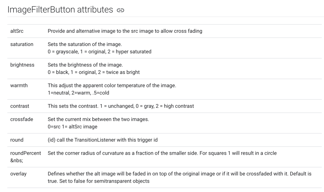 image
image总的来说,ImageFilterButton、ImageFilterView可以帮助开发者实现一些简单的图像处理效果,不过使用场景还是比较有限。
ConstraintLayoutStates
ConstraintLayoutStates是ConstraintLayout2.0新增的用于切换状态布局的一个功能,它可以根据状态切换不同的布局文件。
首先,需要在layout下创建不同状态的layout xml文件,布局文件的root id相同即可。
然后在xml文件夹下创建管理文件,代码如下所示。
"1.0" encoding="utf-8"?>
"http://schemas.android.com/apk/res/android"
xmlns:app="http://schemas.android.com/apk/res-auto">
app:constraints="@layout/states_1" />
app:constraints="@layout/states_2" />
在使用的时候,使用loadLayoutDescription来加载管理文件即可。
override fun onCreate(savedInstanceState: Bundle?) {
    super.onCreate(savedInstanceState)
    setContentView(R.layout.states_1)
    val constraintLayout = findViewById(R.id.constraint_state)
    constraintLayout.loadLayoutDescription(R.xml.constraint_layout_states)
    constraintLayout.setOnClickListener {
        constraintLayout.setState(R.id.state2, 0, 0)
    }
}
这样就可以通过setState来实现状态布局的切换了。
ConstraintProperties
ConstraintProperties是一个用于在代码中创建约束的工具类。在2.0版本之前,我们需要这样修改属性,代码如下所示。
ConstraintSet().apply {
    clone(constraintLayout)
    setTranslationX(R.id.xxx, 32f)
    setMargin(R.id.xxx, ConstraintSet.START, 42)
    applyTo(constraintLayout)
}
而2.0提供了ConstraintProperties可以使用流式API修改属性,代码如下所示。
ConstraintProperties(findViewById(R.id.xxx))
    .translationZ(8f)
    .margin(ConstraintSet.START, 8)
    .apply()
在代码中使用ConstraintLayout更加方便了。
向大家推荐下我的网站 https://xuyisheng.top/ 点击原文一键直达
专注 Android-Kotlin-Flutter 欢迎大家访问