《精通react/vue组件设计》之实现一个健壮的警告提示(Alert)组件

    
前言
本文是笔者写组件设计的第七篇文章, 今天带大家实现一个自带主题且可关闭的Alert组件, 该组件在诸如Antd或者elementUI等第三方组件库中都会出现,主要用来提供系统的用户反馈.
之所以会写组件设计相关的文章,是因为作为一名前端优秀的前端工程师,面对各种繁琐而重复的工作,我们不应该按部就班的去"辛勤劳动",而是要根据已有前端的开发经验,总结出一套自己的高效开发的方法.
前端组件一般会划分为如下几种类型:
- 通用型组件: 比如Button, Icon等.
 - 布局型组件: 比如Grid, Layout布局等.
 - 导航型组件: 比如面包屑Breadcrumb, 下拉菜单Dropdown, 菜单Menu等.
 - 数据录入型组件: 比如form表单, Switch开关, Upload文件上传等.
 - 数据展示型组件: 比如Avator头像, Table表格, List列表等.
 - 反馈型组件: 比如Progress进度条, Drawer抽屉, Modal对话框等.
 - 其他业务类型
 
正文
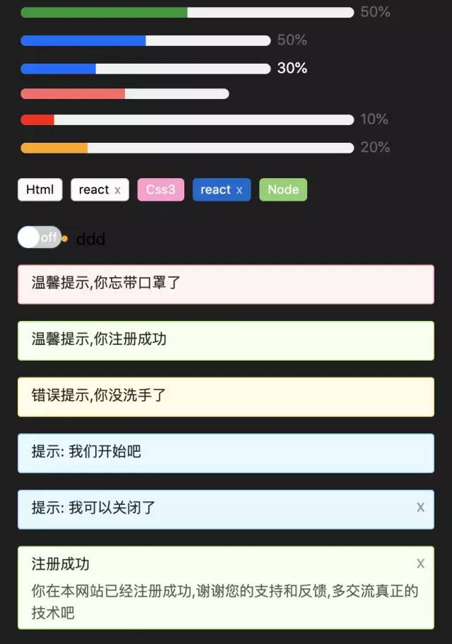
在开始组件设计之前希望大家对css3和js有一定的基础,并了解基本的react/vue语法.我们先看看实现后的组件效果:
    
1. 组件设计思路
按照之前笔者总结的组件设计原则,我们第一步是要确认需求. 一个警告提示(Alert)组件会有如下需求点:
- 能控制Alert组件的样式
 - 能控制Alert组件的关闭按钮是否显示
 - 用户可以自己输入提示内容
 - 能控制关闭按钮的文本,或者自定义关闭按钮
 - 支持显示提示内容的辅助文本
 - 内置提供不同类型的警告提示样式,比如成功, 错误, 警告等
 - 关闭提示时能提供自定义事件
 

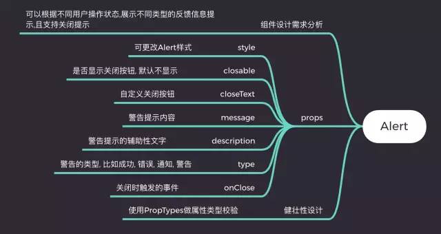
对于react选手来说,如果没用typescript,建议大家都用PropTypes, 它是react内置的类型检测工具,我们可以直接在项目中导入. vue有自带的属性检测方式,这里就不一一介绍了.
通过以上需求分析, 我们发现实现一个Alert非常简单, 它属于反馈型组件,所以不会涉及到太多功能.接下来我们就来看看具体实现.
2. 基于react实现一个Alert组件
2.1. Alert组件框架设计
首先我们先根据需求将组件框架写好,这样后面写业务逻辑会更清晰:
    
        
          import classnames from 'classnames'
        
        
          import styles from './index.less'


          /**
        
        
           * 警告提示组件
        
        
           * @param {style} object 更改Alert样式
        
        
           * @param {closable} bool 是否显示关闭按钮, 默认不显示
        
        
           * @param {closeText} string|reactNode 自定义关闭按钮
        
        
           * @param {message} string 警告提示内容
        
        
           * @param {description} string 警告提示的辅助性文字
        
        
           * @param {type} string 警告的类型
        
        
           * @param {onClose} func 关闭时触发的事件
        
        
           */
        
        
          function Alert(props) {
        
        
            const {
        
        
              style,
        
        
              closable,
        
        
              closeText,
        
        
              message,
        
        
              description,
        
        
              type,
        
        
              onClose
        
        
            } = props


            return <div className={styles.xAlertWrap}>
        
        
                    <div className={styles.alertMes}>{ message }</div>
        
        
                    <div className={styles.alertDesc}>{ description }</div>
        
        
                    <span className={styles.closeBtn}>{ closeText ? closeText : 'x' }</span>
        
        
                   </div>
        
        
          }


          export default Alert


  有了这个框架,我们就来往里面实现内容吧.
2.2 实现style,closeText,message, description,type
这几个功能在框架搭建好之后已经部分实现了,是因为他们都比较简单,不会牵扯到其他复杂逻辑.只需要对外暴露属性并使用属性即可. 具体实现如下:
    
        
          function Alert(props) {
        
        
            const {
        
        
              style,
        
        
              closable,
        
        
              closeText,
        
        
              message,
        
        
              description,
        
        
              type,
        
        
              onClose
        
        
            } = props


            return <div 
        
        
                className={classnames(styles.xAlertWrap, styles[type] || styles.warning)}
        
        
                style={{
        
        
                  ...style
        
        
                }}
        
        
              >
        
        
                <div className={styles.alertMes}>{ message }</div>
        
        
                <div className={styles.alertDesc}>{ description }</div>
        
        
                <span className={styles.closeBtn}>{ closeText ? closeText : 'x' }</span>
        
        
              </div>
        
        
          }


  以上代码可以发现笔者采用了classnames这个第三方工具, 他可以组合我们的class以实现更灵活的配置. 对于type的实现,我的思路是提前预制好几种类型样式, 通过用户手动配置来匹配到对应的样式:
    
        
          .xAlertWrap {
        
        
            box-sizing: border-box;
        
        
            position: relative;
        
        
            padding: 5px 12px;
        
        
            margin-bottom: 16px;
        
        
            border-radius: 3px;
        
        
            &.success {
        
        
              background-color: #f6ffed;
        
        
              border: 1px solid #b7eb8f;
        
        
            }
        
        
            &.info {
        
        
              background-color: #e6f7ff;
        
        
              border: 1px solid #91d5ff;
        
        
            }
        
        
            &.error {
        
        
              background-color: #fffbe6;
        
        
              border: 1px solid #ffe58f;
        
        
            }
        
        
            &.warning {
        
        
              background-color: #fff1f0;
        
        
              border: 1px solid #ffa39e;
        
        
            }
        
        
          }


  2.3 实现closable和onClose
closable主要是用来让用户能手动关闭Alert,onClose是对外暴露的关闭时的方法, 因为没必要也不需要向外暴露属性来让Alert关闭, 所以最好的方式是在组件内部实现, 我们会通过useState这个钩子来处理,代码如下:
    
        
          function Alert(props) {
        
        
            const {
        
        
              style,
        
        
              closable,
        
        
              closeText,
        
        
              message,
        
        
              description,
        
        
              type,
        
        
              onClose
        
        
            } = props
        
        
            let [visible, setVisible] = useState(true)


            const handleColse = () => {
        
        
              setVisible(false)
        
        
              onClose && onClose()
        
        
            }
        
        
            return visible ? 
        
        
              <div 
        
        
                className={classnames(styles.xAlertWrap, styles[type] || styles.warning)}
        
        
                style={{
        
        
                  opacity: visible ? '1' : '0',
        
        
                  ...style
        
        
                }}
        
        
              >
        
        
                <div className={styles.alertMes}>{ message }</div>
        
        
                <div className={styles.alertDesc}>{ description }</div>
        
        
                {
        
        
                  !!closable && <span className={styles.closeBtn} onClick={handleColse}>{ closeText ? closeText : 'x' }</span>
        
        
                }
        
        
              </div> : null
        
        
          }


  通过控制visible来控制Alert的出现和消失, 并且当点击关闭按钮时能调用外部暴露的onClose方法.
  
  2.4 健壮性支持, 我们采用react提供的propTypes工具:
    
        
          import PropTypes from 'prop-types'
        
        
          // ...
        
        
          Alert.propTypes = {
        
        
            style: PropTypes.object,
        
        
            closable: PropTypes.bool,
        
        
            closeText: PropTypes.oneOfType([
        
        
              PropTypes.string,
        
        
              PropTypes.element
        
        
            ]),
        
        
            message: PropTypes.string,
        
        
            description: PropTypes.string,
        
        
            type: PropTypes.string,
        
        
            onClose: PropTypes.func
        
        
          }


  关于prop-types的使用官网上有很详细的案例,这里说一点就是oneOfType的用法, 它用来支持一个组件可能是多种类型中的一个. 组件完整css代码如下:
    
        
           {
        
        
            : border-box;
        
        
            position: relative;
        
        
            padding: 5px 12px;
        
        
            : 16px;
        
        
            : 3px;
        
        
             {
        
        
              : #f6ffed;
        
        
              border: 1px solid #b7eb8f;
        
        
            }
        
        
             {
        
        
              : #e6f7ff;
        
        
              border: 1px solid #91d5ff;
        
        
            }
        
        
             {
        
        
              : #fffbe6;
        
        
              border: 1px solid #ffe58f;
        
        
            }
        
        
             {
        
        
              : #fff1f0;
        
        
              border: 1px solid #ffa39e;
        
        
            }


             {
        
        
              :5px;
        
        
              color: rgba(0, 0, 0, 0.85);
        
        
              : 14px;
        
        
              : 1.5em;
        
        
            }
        
        
             {
        
        
              color: rgba(0, 0, 0, 0.65);
        
        
              : 14px;
        
        
              : 1.5em;
        
        
              : break-all;
        
        
            }
        
        
             {
        
        
              position: absolute;
        
        
              right: 8px;
        
        
              top: 5px;
        
        
              color: rgba(0, 0, 0, 0.4);
        
        
              cursor: pointer;
        
        
            }


            }


  通过以上步骤, 一个健壮的的Alert组件就完成了,关于代码中的css module和classnames的使用大家可以自己去官网学习,非常简单.如果不懂的可以在趣谈前端技术群里提问,笔者看到后会第一时间解答.
2.5 使用Alert组件
我们可以通过如下方式使用它:
    
        
          <Alert message="温馨提示,你忘带口罩了" />
        
        
          <Alert message="温馨提示,你注册成功" type="success" />
        
        
          <Alert message="错误提示,你没洗手了" type="error" />
        
        
          <Alert message="提示: 我们开始吧" type="info" />
        
        
          <Alert message="提示: 我可以关闭了" type="info" closable onClose={() => { alert(111) }} /><Alert message="注册成功" description="你在本网站已经注册成功,谢谢您的支持和反馈,多交流真正的技术吧" closable type="success" />


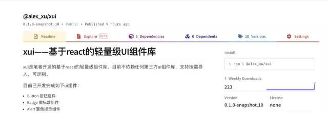
  笔者已经将实现过的组件发布到npm上了,大家如果感兴趣可以直接用npm安装后使用,方式如下:
    
        
          npm i /xui


            // 导入xui


          import {
        
        
            Button,
        
        
            Skeleton,
        
        
            Empty,
        
        
            Progress,
        
        
            Tag,
        
        
            Switch,
        
        
            Drawer,
        
        
            Badge,
        
        
            Alert
        
        
          } from '@alex_xu/xui'


  该组件库支持按需导入,我们只需要在项目里配置babel-plugin-import即可,具体配置如下:
    
        
          // .babelrc
        
        
          "plugins": [
        
        
            ["import", { "libraryName": "@alex_xu/xui", "style": true }]
        
        
          ]


  npm库截图如下:


最后
我在之前的文章中已实现:
- modal(模态窗),
 - badge(徽标),
 - table(表格),
 - tooltip(工具提示条),
 - Skeleton(骨架屏),
 - Message(全局提示),
 - form(form表单),
 - switch(开关),
 - 日期/日历,
 - 二维码识别器组件
 
等组件, 欢迎学习参考.
如果想获取组件设计系列完整源码, 或者想学习更多H5游戏, webpack,node,gulp,css3,javascript,nodeJS,canvas数据可视化等前端知识和实战,欢迎在公号《趣谈前端》加入我们的技术群一起学习讨论,共同探索前端的边界。
    
如果对于react/vue组件设计原理不熟悉的,可以参考我的之前写的组件设计系列文章:
