
不同样式tooltip对话框小三角的css实现

开发过程中已经遇到过好多次需要手动实现 tooltip 样式了,这里就总结下,以便未来更好的复制粘贴。
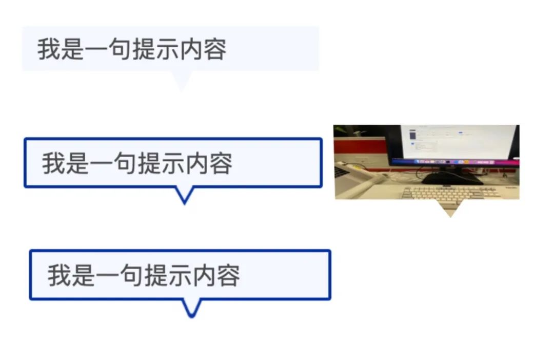
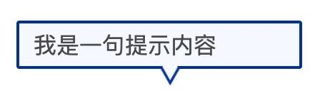
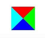
如上图,常见的 tooltip 总共有 3 种类型,纯背景色无边框、有边框、包含背景图,其中的小三角可能是纯色、尖尖有弧度。
下边介绍四种常用的方法来实现 tooltip。
贴图
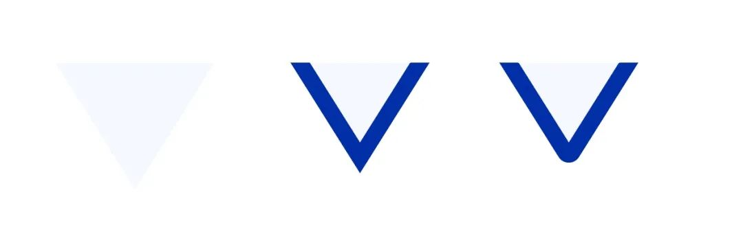
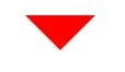
简单方便快捷,一个三角形的图定下位即可。在女朋友的帮助下,用 AI 成功画了三种三角形。
下边我们只需要把三角形贴到矩形下边即可。
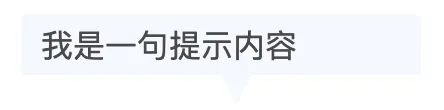
纯背景色三角形
.wxml
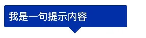
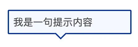
<view class="tooltip">
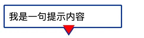
<view class="tooltip-text">我是一句提示内容</view>
<image class="tooltip-triangle" src="https://windliangblog.oss-cn-beijing.aliyuncs.com/tooltip-01.png" />
</view>
.wxss
.tooltip {
width: 400rpx;
margin: 100rpx;
position: relative;
}
.tooltip-text {
height: 60rpx;
line-height: 60rpx;
background: #F5F8FF;
color: #494949;
border-radius: 5rpx;
padding: 0 20rpx;
}
.tooltip-triangle {
position: absolute;
width: 30rpx;
height: 30rpx;
top: 60rpx;
left: 200rpx;
}
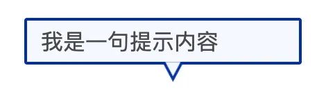
带边框的三角形和三角形圆角
.wxml
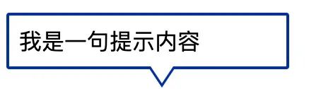
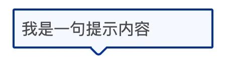
<view class="tooltip">
<view class="tooltip-text">我是一句提示内容</view>
<image class="tooltip-triangle" src="https://windliangblog.oss-cn-beijing.aliyuncs.com/tooltip-02.png" />
</view>
.wxss
.tooltip {
width: 400rpx;
margin: 100rpx;
position: relative;
}
.tooltip-text {
height: 60rpx;
line-height: 60rpx;
background: #f5f8ff;
color: #494949;
border-radius: 5rpx;
padding: 0 20rpx;
border: 2px solid #002fa7;
}
.tooltip-triangle {
position: absolute;
width: 30rpx;
height: 30rpx;
top: 62rpx;
left: 200rpx;
}
发现原有的
border没有盖住,然后从重新做了一张上边延伸背景色的图。
圆角的三角同理,换下
image的src即可。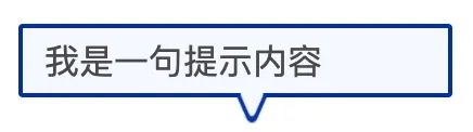
利用 border
不知道是谁第一个想到的这种方案,是真的很神奇。我们经常写 border ,可有没有想过它的四个角的连接处是什么样的?
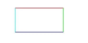
让我们将连接处放大:

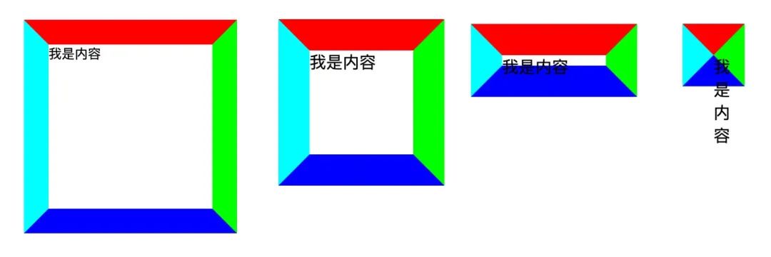
会发现每条边其实是一个梯形,然后互相接起来。那么如果 border 中内容的宽高都是 0 会怎么样呢?
.border {
  border-width: 4px;
  border-color: #F00 #0F0 #00F #0FF;
  border-style: solid;
  width: 0px;
  height: 0px;
}
三角形出现了!我们只需要将左边下边右边的 border 颜色设置为透明就是我们要的三角形了,border-color: #F00 transparent transparent transparent;
此外,虽然底部 boder 设置为透明了,但是还占据高度,我们可以将它的 width 设为 0:border-bottom-width: 0。
然后我们只需要将之前使用的图片替换掉即可。
.wxml
<view class="tooltip">
        <view class="tooltip-text">我是一句提示内容</view>
        <view class="tooltip-triangle"></view>
</view>

.wxss
.tooltip {
    max-width: 400rpx;
    margin-left: 20rpx;
    position: relative;
}
.tooltip-text {
    padding: 15rpx;
    background: #002FA7;
    color: #fff;
    border-radius: 5rpx;
}

.tooltip-triangle {
    position: absolute;
    top: 62rpx;
    left: 200rpx;
    border-width: 30rpx;
    border-color: #002FA7 transparent transparent transparent;
    border-style: solid;
    width: 0px;
    height: 0px;
}
效果如下:
三角形形状的话,我们可以通过 border-width 属性去调整高低胖瘦。
带边框三角
上边的矩形和三角形都没有边框,如果是有边框的,下边这种该怎么实现呢?
其实很简单,我们只需要在原有三角形的位置写一个一样的三角形,然后颜色设置为对话框的背景色,向上偏移一定位置即可。
把覆盖的三角形颜色设置为红色,这样看起来就很明显了,如下图:
代码如下:
.wxml
<view class="tooltip">
        <view class="tooltip-text">我是一句提示内容</view>
        <view class="tooltip-triangle-top"></view>
        <view class="tooltip-triangle"></view>
</view>

.wxss
.tooltip {
    max-width: 400rpx;
    margin-left: 20rpx;
    position: relative;
}

.tooltip-text {
    padding: 15rpx;
    background: #fff;
    border-radius: 5rpx;
    border: 5rpx solid #002FA7;
}

.tooltip-triangle-top {
    position: absolute;
    top: 71rpx;
    left: 200rpx;
    border-width: 30rpx;
    border-left-width: 20rpx;
    border-right-width: 20rpx;
    border-color: #FFF transparent transparent transparent;
    border-style: solid;
    width: 0px;
    height: 0px;
    z-index: 10;
}

.tooltip-triangle {
    position: absolute;
    top: 76rpx;
    left: 200rpx;
    border-width: 30rpx;
    border-left-width: 20rpx;
    border-right-width: 20rpx;
    border-color: #002FA7 transparent transparent transparent;
    border-style: solid;
    width: 0px;
    height: 0px;
}
矩形旋转
只需要两个同样位置的矩形,然后旋转上边的矩形即可。旋转过来的三角形的长边就是原来矩形的长,三角形边长比是1 比 1 比根号 2。所以原有矩形的长宽比应该为根号 2 比 1。即,width = 1.41 * height 。
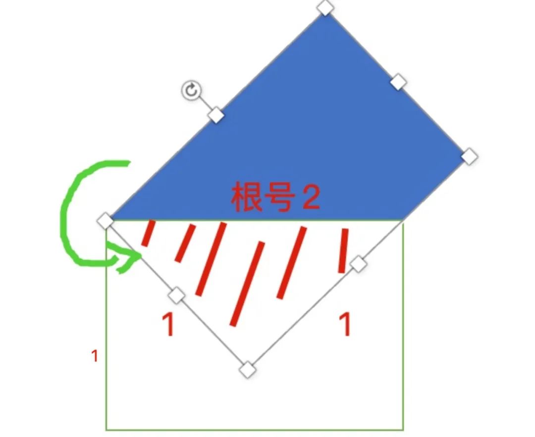
代码的话,我们用伪元素矩形旋转,另一个矩形设置 overflow:hidden 即可。
.wxml
<view class="tooltip">
        <view class="tooltip-text">我是一句提示内容</view>
        <view class="tooltip-triangle"></view>
</view>

.wxss
.tooltip {
    max-width: 400rpx;
    position: relative;
}

.tooltip-text {
    padding: 15rpx;
    background: #002FA7;
    border-radius: 5rpx;
    color: #FFF;
}


.tooltip-triangle {
    position: relative;
    left: 150rpx;
    width: calc(30rpx * 1.41);
    height: 30rpx;
    overflow: hidden;
}


.tooltip-triangle::before {
    content: '';
    width: 100%;
    height: 100%;
    background: #002FA7;
    display: block;
    transform: rotate(-45deg);
    transform-origin: left top;
}
由于我们三角形是由矩形生成的,所以带边框的 tooltip 相对 border 的方法就容易多了。
我们只需要给伪元素设置边框即可。
.wxss
.tooltip {
    max-width: 400rpx;
    position: relative;
}

.tooltip-text {
    padding: 15rpx;
    background: #f5f8ff;
    color: #494949;
    border-radius: 5rpx;
    border: 4rpx solid #002fa7;
}


.tooltip-triangle {
    position: relative;
    left: 150rpx;
    width: calc(30rpx * 1.41);
    height: 30rpx;
    overflow: hidden;
}


.tooltip-triangle::before {
    content: '';
    border: 4rpx solid #002fa7;
    background: #f5f8ff;
    width: 100%;
    height: 100%;
    display: block;
    transform: rotate(-45deg);
    transform-origin: left top;
    box-sizing: border-box;
    border-radius: 8rpx;
}
此时出现了一个问题,上边矩形的 border 露了出来。
这里用一个 trick 的方法,我们在原有矩形上边加一个 border 盖住上边矩形的边框。
.wxss 添加下边的属性
.tooltip-triangle {
    border-top: 4rpx solid #f5f8ff;
    bottom: 8rpx;
}
此外,带弧角的三角形,我们也只需要在伪元素矩形上设置圆角即可。
.wxss 添加下边的属性
.tooltip-triangle::before
    border-radius: 8rpx;
}
clip-path
下边这种 tooltip 类型,小三角延伸了背景图片(背景图片 url 可能不是固定的),上边几种方法都是无能为力的。
此时就需要 clip-path 属性了,我们可以在 clippy 快速生成我们需要的多边形路径。
https://bennettfeely.com/clippy/
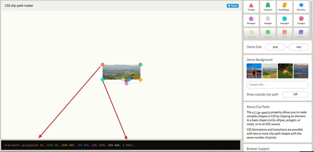
polygon 就是画多边形,然后给定各个点的坐标即可,代码中各个颜色和图片中的各个点是对应的。
然后我们把上边的代码复制过来即可。
.wxml
<view class="tooltip">
        <image src="https://windliangblog.oss-cn-beijing.aliyuncs.com/meituan4.jpg" class="tooltip-text"></image>
</view>

.wxss
.tooltip {
    max-width: 400rpx;
    position: relative;
}

.tooltip-text {
    width: 400rpx;
    height: 200rpx;
    overflow: hidden;
    clip-path: polygon(0% 0%, 100% 0%, 100% 80%, 70% 80%, 63% 100%, 55% 80%, 1% 80%);
}
使用 clip-path 的话 border 和圆角就比较难搞了,因为最下边的边其实是被截掉了。
在 Web 页面中可以使用 SVG 来实现想要的效果,可以 参考这里 的一个回答。
https://stackoverflow.com/questions/31854185/how-to-add-border-in-my-clip-path-polygon-css-style
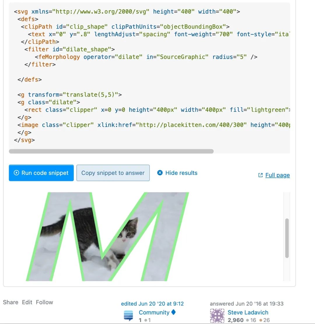
但在小程序中我没想到好方法,欢迎大家和我交流。
总
上边主要介绍了贴图、border、矩形旋转、clip-path四种方法。日常开发中,border 方案基本满足需要了,偷懒的话也可以直接找设计要图。大家还用过其他方法吗?
往期干货: 26个经典微信小程序+35套微信小程序源码+微信小程序合集源码下载(免费) 干货~~~2021最新前端学习视频~~速度领取
 前端书籍-前端290本高清pdf电子书打包下载
点赞和在看就是最大的支持❤️