
自学鸿蒙应用开发(33)- 在布局中使用自定义UI组件
在布局中使用自定义组件
开发一个自定义UI组件,当然会希望在布局中像原生组件那样使用它。就像下面这样:
<DirectionalLayoutxmlns:ohos="http://schemas.huawei.com/res/ohos"ohos:height="match_parent"ohos:width="match_parent"ohos:orientation="vertical"><Textohos:id="$+id:text_helloworld"ohos:height="match_content"ohos:width="match_content"ohos:background_element="$graphic:background_ability_main"ohos:layout_alignment="horizontal_center"ohos:text="$string:HelloWorld"ohos:text_size="50"/><com.components.cusomized.ArcProgressBarContainerohos:id="$+id:mrprogressId"ohos:height="500vp"ohos:width="match_parent"ohos:background_element="#FFEEE20D"><com.components.cusomized.ArcProgressBarohos:id="$+id:red_bar"ohos:height="match_parent"ohos:width="match_parent"ohos:progress_element="#FF0000"ohos:start_angle="45"ohos:max_angle="270"ohos:progress="20"ohos:min = "0"ohos:max = "100"/><com.components.cusomized.ArcProgressBarohos:id="$+id:green_bar"ohos:height="match_parent"ohos:width="match_parent"ohos:progress_element="#00FF00"ohos:start_angle="45"ohos:max_angle="270"ohos:progress="100"ohos:min = "0"ohos:max = "100"/><com.components.cusomized.ArcProgressBarohos:id="$+id:blue_bar"ohos:height="match_parent"ohos:width="match_parent"ohos:progress_element="#00FFFF"ohos:start_angle="45"ohos:max_angle="270"ohos:progress="50"ohos:min = "0"ohos:max = "100"/></com.components.cusomized.ArcProgressBarContainer><DirectionalLayoutohos:height="match_content"ohos:width="match_parent"ohos:orientation="horizontal"><Buttonohos:id="$+id:increase"ohos:width="0"ohos:weight="1"ohos:height="match_content"ohos:text_size="27fp"ohos:text="+1"ohos:text_color="#FFFFFF"ohos:background_element="#00007F"/><Buttonohos:id="$+id:decrease"ohos:width="0"ohos:weight="1"ohos:height="match_content"ohos:text_size="27fp"ohos:text="-1"ohos:text_color="#FFFFFF"ohos:background_element="#00007F"ohos:left_margin="15vp"ohos:bottom_margin="15vp"ohos:right_padding="8vp"ohos:left_padding="8vp"/></DirectionalLayout></DirectionalLayout>
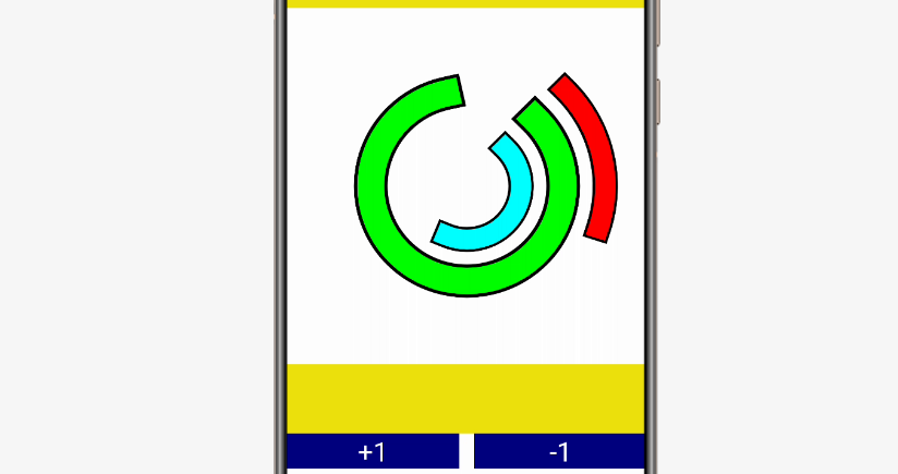
上述代码中16~54行定义了一个包含3个ArcProgressBar的ArcProgressBarContainer。ArcProgressBar的属性借用的鸿蒙原生RoundProgressBar的属性。以下是这个布局的效果。
自定义组件容器
组建容器类ArcProgressBarContainer负责协调每个ArcProgressBar的描画动作。
public class ArcProgressBarContainer extends ComponentContainer implements Component.DrawTask {// HiLogLabelprivate static final HiLogLabel Label = new HiLogLabel(HiLog.LOG_APP, 0x00101, "RoundProgressBarContainer");private int active_bar = 1;public ArcProgressBarContainer(Context context) {super(context);addDrawTask(this);}public ArcProgressBarContainer(Context context, AttrSet attrSet) {super(context, attrSet);HiLog.warn(Label, attrSet.toString());addDrawTask(this);}public ArcProgressBarContainer(Context context, AttrSet attrSet, String styleName) {super(context, attrSet, styleName);addDrawTask(this);}public void onDraw(Component component, Canvas canvas) {Paint paint = new Paint();paint.setColor(Color.WHITE);canvas.drawRect(getBoundRect(), paint);paint.setStyle(Paint.Style.STROKE_STYLE);paint.setStrokeCap(Paint.StrokeCap.SQUARE_CAP);for(int i = 0; i < getChildCount(); i++){Component child = getComponentAt(i);((ArcProgressBar) child).onDraw(canvas, paint, getProgressRect(i), barWidth(), i == active_bar);}paint.setColor(Color.LTGRAY);}private RectFloat getBoundRect(){float width = getWidth();float height = getHeight();float size = Math.min(width, height);float x_padding = (width - size) / 2;float y_padding = (height - size) / 2;return new RectFloat(x_padding, y_padding, width - x_padding, height - y_padding);}private float barWidth(){RectFloat bound = getBoundRect();if(getChildCount() > 0) {return bound.getWidth() / 2 * 0.7f / getChildCount();}else{return 0;}}private RectFloat getProgressRect(int round_index){RectFloat arcRect = getBoundRect();arcRect.shrink(barWidth(), barWidth());arcRect.shrink(barWidth() * round_index, barWidth() * round_index);return arcRect;}}
这段代码的实现和上一篇文章中的RoundProgressBar基本相同,区别在于:
将基类由Component替换为ComponentContainer
使用ComponentContainer的子要素管理机制管理ArcProgressBar。
自定义进度条类ArcProgressBar
ArcProgressBar负责实现单曲圆弧进度条的显示。代码如下:
public class ArcProgressBar extends Component{// HiLogLabelprivate Color edgeColor;private Color barColor;private float minValue;private float maxValue;private float startAngle;private float maxAngle;private float progressValue;public ArcProgressBar(Context context) {super(context);}public ArcProgressBar(Context context, AttrSet attrSet) {super(context, attrSet);Initialize(attrSet);}public ArcProgressBar(Context context, AttrSet attrSet, String styleName) {super(context, attrSet, styleName);Initialize(attrSet);}public ArcProgressBar(Context context, AttrSet attrSet, int resId) {super(context, attrSet, resId);Initialize(attrSet);}public void setValue(float value){progressValue = value;invalidate();}public float getValue(){ return progressValue; }void onDraw(Canvas canvas, Paint paint, RectFloat rect, float width, boolean active){float minAngle = startAngle - 90;float sweepAngle = (progressValue - minValue)/(maxValue - minValue) * (maxAngle - minAngle);if(active){width *= 0.8f;}else{width *= 0.6f;}paint.setColor(edgeColor);paint.setStrokeWidth(width);canvas.drawArc(rect, new Arc(minAngle, sweepAngle, false), paint);paint.setColor(barColor);paint.setStrokeWidth(width * 0.8f);canvas.drawArc(rect, new Arc(minAngle, sweepAngle, false), paint);}private void Initialize(AttrSet attrSet){edgeColor = Color.BLACK;if(attrSet.getAttr("progress_element").isPresent()){barColor = attrSet.getAttr("progress_element").get().getColorValue();}else {barColor = Color.GRAY;}if(attrSet.getAttr("start_angle").isPresent()){startAngle = attrSet.getAttr("start_angle").get().getFloatValue();}else {startAngle = 0;}if(attrSet.getAttr("max_angle").isPresent()){maxAngle = attrSet.getAttr("max_angle").get().getFloatValue();}else {maxAngle = 0;}if(attrSet.getAttr("min").isPresent()){minValue = attrSet.getAttr("min").get().getFloatValue();}else {minValue = 0;}if(attrSet.getAttr("max").isPresent()){maxValue = attrSet.getAttr("max").get().getFloatValue();}else {maxValue = 0;}if(attrSet.getAttr("progress").isPresent()){progressValue = attrSet.getAttr("progress").get().getFloatValue();}else {progressValue = 0;}}}
最大的变化在于
ArcProgressBar继承了Component
增加了一个Initialize方法用于获取布局文件中指定的属性值。
在代码中使用ArcProgressBar
可以像系统原生UI组件一样使用自定义组件:
public class MainAbilitySlice extends AbilitySlice {public void onStart(Intent intent) {super.onStart(intent);super.setUIContent(ResourceTable.Layout_ability_main);ArcProgressBar bar = (ArcProgressBar) findComponentById(ResourceTable.Id_green_bar);Button increase = (Button)findComponentById(ResourceTable.Id_increase);increase.setClickedListener(new Component.ClickedListener(){public void onClick(Component component) {bar.setValue(bar.getValue() + 1);}});Button decrease = (Button)findComponentById(ResourceTable.Id_decrease);decrease.setClickedListener(new Component.ClickedListener(){public void onClick(Component component) {bar.setValue(bar.getValue() - 1);}});}public void onActive() {super.onActive();}public void onForeground(Intent intent) {super.onForeground(intent);}}
下面这段代码的动作效果视频:
参考代码
完整代码可以从以下链接下载:
https://github.com/xueweiguo/Harmony/tree/master/CustomizeComponent
作者著作介绍
《实战Python设计模式》是作者去年3月份出版的技术书籍,该书利用Python 的标准GUI 工具包tkinter,通过可执行的示例对23 个设计模式逐个进行说明。这样一方面可以使读者了解真实的软件开发工作中每个设计模式的运用场景和想要解决的问题;另一方面通过对这些问题的解决过程进行说明,让读者明白在编写代码时如何判断使用设计模式的利弊,并合理运用设计模式。

对设计模式感兴趣而且希望随学随用的读者通过本书可以快速跨越从理解到运用的门槛;希望学习Python GUI 编程的读者可以将本书中的示例作为设计和开发的参考;使用Python 语言进行图像分析、数据处理工作的读者可以直接以本书中的示例为基础,迅速构建自己的系统架构。
觉得本文有帮助?请分享给更多人。
关注微信公众号【面向对象思考】轻松学习每一天!
面向对象开发,面向对象思考!