5 种快速易用的 Python Matplotlib 数据可视化方法
在下方公众号后台回复:面试手册,可获取杰哥汇总的 3 份面试 PDF 手册。
数据可视化是数据科学家工作的重要部分。在项目的早期阶段,我们通常需要进行探索性数据分析来获得对数据的洞察。通过数据可视化可以让该过程变得更加清晰易懂,尤其是在处理大规模、高维度数据集时。在本文中,我们介绍了最基本的 5 种数据可视化图表,在展示了它们的优劣点后,我们还提供了绘制对应图表的 Matplotlib 代码。
Matplotlib 是一个很流行的 Python 库,可以帮助你快速方便地构建数据可视化图表。然而,每次启动一个新项目时都需要重新设置数据、参数、图形和绘图方式是非常枯燥无聊的。本文将介绍 5 种数据可视化方法,并用 Python 和 Matplotlib 写一些快速易用的可视化函数。下图展示了选择正确可视化方法的导向图。
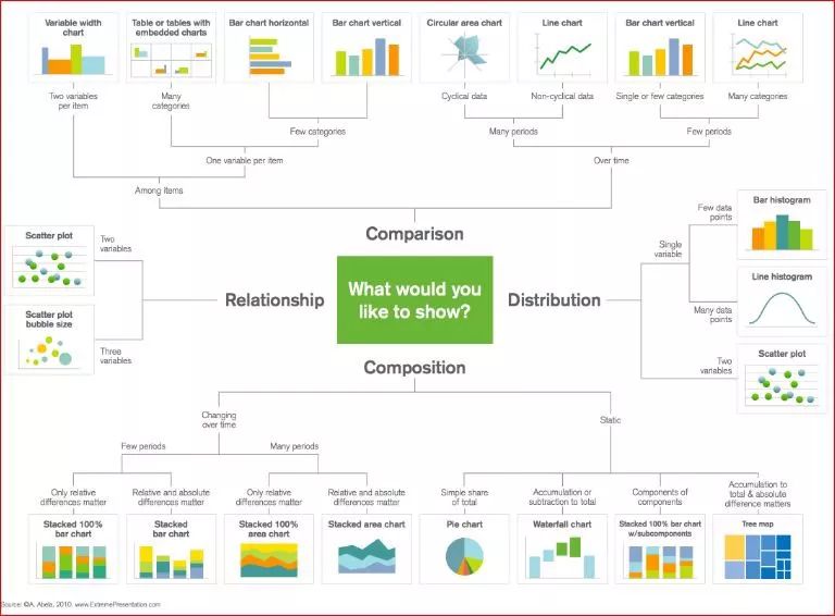
选择正确可视化方法的导向图。
散点图
由于可以直接看到原始数据的分布,散点图对于展示两个变量之间的关系非常有用。你还可以通过用颜色将数据分组来观察不同组数据之间的关系,如下图所示。你还可以添加另一个参数,如数据点的半径来编码第三个变量,从而可视化三个变量之间的关系,如下方第二个图所示。
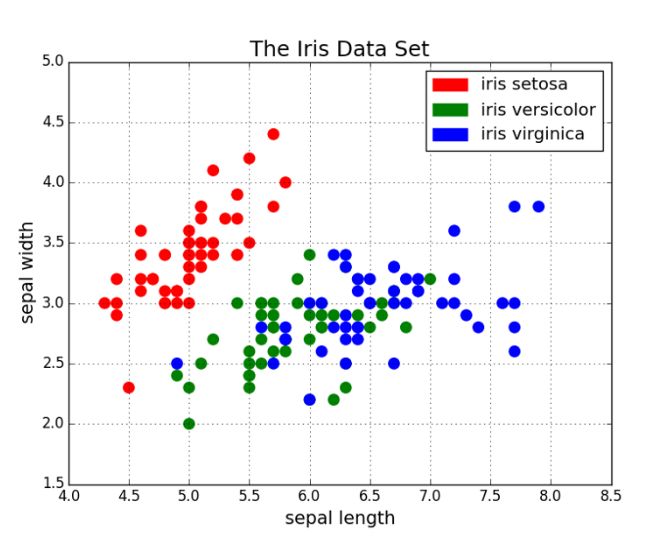
用颜色分组的散点图。
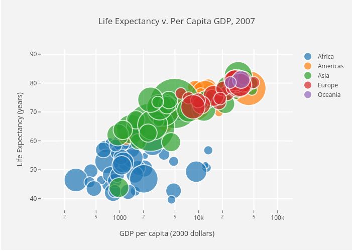
用颜色分组的散点图,点半径作为第三个变量表示国家规模。
接下来是代码部分。我们首先将 Matplotlib 的 pyplot 导入为 plt,并调用函数 plt.subplots() 来创建新的图。我们将 x 轴和 y 轴的数据传递给该函数,然后将其传递给 ax.scatter() 来画出散点图。我们还可以设置点半径、点颜色和 alpha 透明度,甚至将 y 轴设置为对数尺寸,最后为图指定标题和坐标轴标签。
import matplotlib.pyplot as plt
import numpy as np

def scatterplot(x_data, y_data, x_label="", y_label="", title="", color = "r", yscale_log=False):

    # Create the plot object
    _, ax = plt.subplots()

    # Plot the data, set the size (s), color and transparency (alpha)
    # of the points
    ax.scatter(x_data, y_data, s = 10, color = color, alpha = 0.75)

    if yscale_log == True:
        ax.set_yscale('log')

    # Label the axes and provide a title
    ax.set_title(title)
    ax.set_xlabel(x_label)
    ax.set_ylabel(y_label)
线图
当一个变量随另一个变量的变化而变化的幅度很大时,即它们有很高的协方差时,线图非常好用。如下图所示,我们可以看到,所有专业课程的相对百分数随年代的变化的幅度都很大。用散点图来画这些数据将变得非常杂乱无章,而难以看清其本质。线图非常适合这种情况,因为它可以快速地总结出两个变量的协方差。在这里,我们也可以用颜色将数据分组。
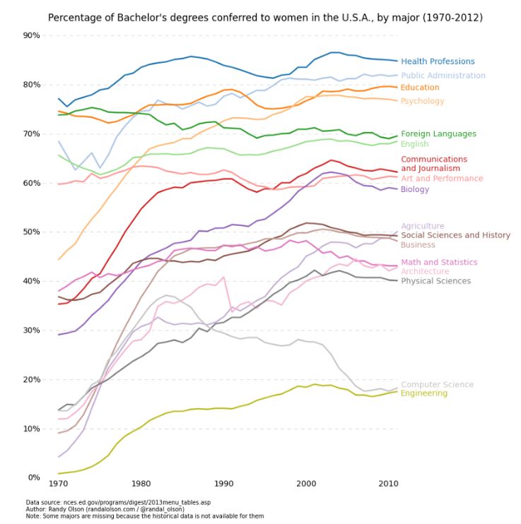
线图示例。
以下是线图的实现代码,和散点图的代码结构很相似,只在变量设置上有少许变化。
def lineplot(x_data, y_data, x_label="", y_label="", title=""):
    # Create the plot object
    _, ax = plt.subplots()

    # Plot the best fit line, set the linewidth (lw), color and
    # transparency (alpha) of the line
    ax.plot(x_data, y_data, lw = 2, color = '#539caf', alpha = 1)

    # Label the axes and provide a title
    ax.set_title(title)
    ax.set_xlabel(x_label)
    ax.set_ylabel(y_label)
直方图
直方图对于观察或真正了解数据点的分布十分有用。以下为我们绘制的频率与 IQ 的直方图,我们可以直观地了解分布的集中度(方差)与中位数,也可以了解到该分布的形状近似服从于高斯分布。使用这种柱形(而不是散点图等)可以清楚地可视化每一个箱体(X 轴的一个等距区间)间频率的变化。使用箱体(离散化)确实能帮助我们观察到「更完整的图像」,因为使用所有数据点而不采用离散化会观察不到近似的数据分布,可能在可视化中存在许多噪声,使其只能近似地而不能描述真正的数据分布。
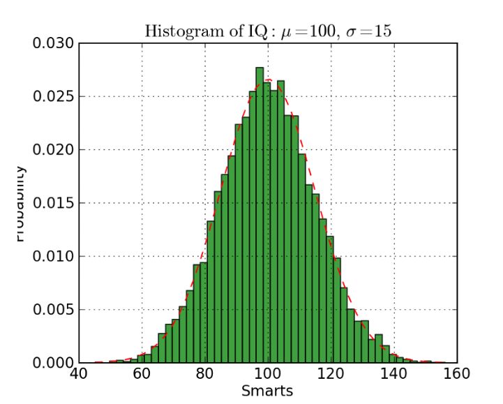
直方图案例
下面展示了 Matplotlib 中绘制直方图的代码。这里有两个步骤需要注意,首先,n_bins 参数控制直方图的箱体数量或离散化程度。更多的箱体或柱体能给我们提供更多的信息,但同样也会引入噪声并使我们观察到的全局分布图像变得不太规则。而更少的箱体将给我们更多的全局信息,我们可以在缺少细节信息的情况下观察到整体分布的形状。其次,cumulative 参数是一个布尔值,它允许我们选择直方图是不是累积的,即选择概率密度函数(PDF)或累积密度函数(CDF)。
def histogram(data, n_bins, cumulative=False, x_label = "", y_label = "", title = ""):
    _, ax = plt.subplots()
    ax.hist(data, n_bins = n_bins, cumulative = cumulative, color = '#539caf')
    ax.set_ylabel(y_label)
    ax.set_xlabel(x_label)
    ax.set_title(title)
如果我们希望比较数据中两个变量的分布,有人可能会认为我们需要制作两个独立的直方图,并将它们拼接在一起而进行比较。但实际上 Matplotlib 有更好的方法,我们可以用不同的透明度叠加多个直方图。如下图所示,均匀分布设置透明度为 0.5,因此我们就能将其叠加在高斯分布上,这允许用户在同一图表上绘制并比较两个分布。
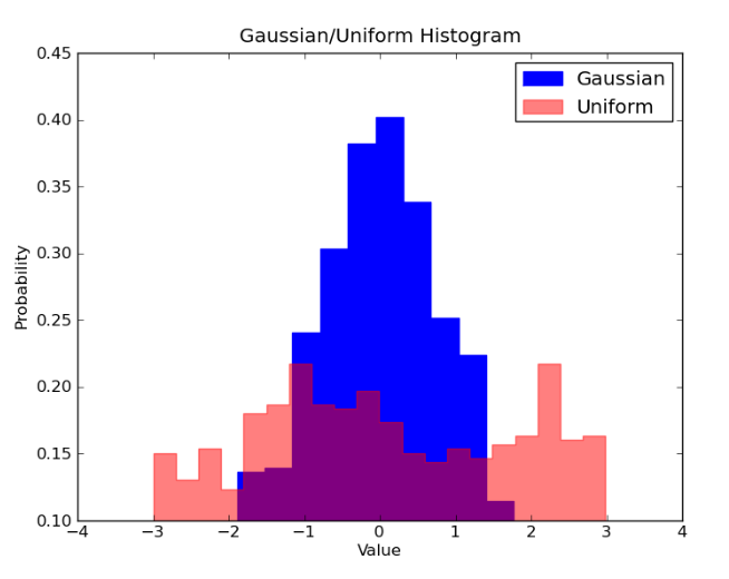
叠加直方图
在叠加直方图的代码中,我们需要注意几个问题。首先,我们设定的水平区间要同时满足两个变量的分布。根据水平区间的范围和箱体数,我们可以计算每个箱体的宽度。其次,我们在一个图表上绘制两个直方图,需要保证一个直方图存在更大的透明度。
# Overlay 2 histograms to compare them
def overlaid_histogram(data1, data2, n_bins = 0, data1_name="", data1_color="#539caf", data2_name="", data2_color="#7663b0", x_label="", y_label="", title=""):
    # Set the bounds for the bins so that the two distributions are fairly compared
    max_nbins = 10
    data_range = [min(min(data1), min(data2)), max(max(data1), max(data2))]
    binwidth = (data_range[1] - data_range[0]) / max_nbins


    if n_bins == 0
        bins = np.arange(data_range[0], data_range[1] + binwidth, binwidth)
    else:
        bins = n_bins

    # Create the plot
    _, ax = plt.subplots()
    ax.hist(data1, bins = bins, color = data1_color, alpha = 1, label = data1_name)
    ax.hist(data2, bins = bins, color = data2_color, alpha = 0.75, label = data2_name)
    ax.set_ylabel(y_label)
    ax.set_xlabel(x_label)
    ax.set_title(title)
    ax.legend(loc = 'best')
条形图
当对类别数很少(<10)的分类数据进行可视化时,条形图是最有效的。当类别数太多时,条形图将变得很杂乱,难以理解。你可以基于条形的数量观察不同类别之间的区别,不同的类别可以轻易地分离以及用颜色分组。我们将介绍三种类型的条形图:常规、分组和堆叠条形图。
常规条形图如图 1 所示。在 barplot() 函数中,x_data 表示 x 轴上的不同类别,y_data 表示 y 轴上的条形高度。误差条形是额外添加在每个条形中心上的线,可用于表示标准差。
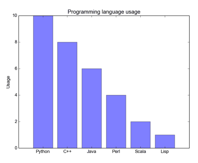
常规条形图
分组条形图允许我们比较多个类别变量。如下图所示,我们第一个变量会随不同的分组(G1、G2 等)而变化,我们在每一组上比较不同的性别。正如代码所示,y_data_list 变量现在实际上是一组列表,其中每个子列表代表了一个不同的组。然后我们循环地遍历每一个组,并在 X 轴上绘制柱体和对应的值,每一个分组的不同类别将使用不同的颜色表示。
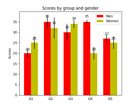
分组条形图
堆叠条形图非常适合于可视化不同变量的分类构成。在下面的堆叠条形图中,我们比较了工作日的服务器负载。通过使用不同颜色的方块堆叠在同一条形图上,我们可以轻松查看并了解哪台服务器每天的工作效率最高,和同一服务器在不同天数的负载大小。绘制该图的代码与分组条形图有相同的风格,我们循环地遍历每一组,但我们这次在旧的柱体之上而不是旁边绘制新的柱体。
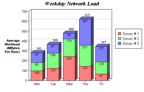
堆叠条形图
def barplot(x_data, y_data, error_data, x_label="", y_label="", title=""):
    _, ax = plt.subplots()
    # Draw bars, position them in the center of the tick mark on the x-axis
    ax.bar(x_data, y_data, color = '#539caf', align = 'center')
    # Draw error bars to show standard deviation, set ls to 'none'
    # to remove line between points
    ax.errorbar(x_data, y_data, yerr = error_data, color = '#297083', ls = 'none', lw = 2, capthick = 2)
    ax.set_ylabel(y_label)
    ax.set_xlabel(x_label)
    ax.set_title(title)


def stackedbarplot(x_data, y_data_list, colors, y_data_names="", x_label="", y_label="", title=""):
    _, ax = plt.subplots()
    # Draw bars, one category at a time
    for i in range(0, len(y_data_list)):
        if i == 0:
            ax.bar(x_data, y_data_list[i], color = colors[i], align = 'center', label = y_data_names[i])
        else:
            # For each category after the first, the bottom of the
            # bar will be the top of the last category
            ax.bar(x_data, y_data_list[i], color = colors[i], bottom = y_data_list[i - 1], align = 'center', label = y_data_names[i])
    ax.set_ylabel(y_label)
    ax.set_xlabel(x_label)
    ax.set_title(title)
    ax.legend(loc = 'upper right')


def groupedbarplot(x_data, y_data_list, colors, y_data_names="", x_label="", y_label="", title=""):
    _, ax = plt.subplots()
    # Total width for all bars at one x location
    total_width = 0.8
    # Width of each individual bar
    ind_width = total_width / len(y_data_list)
    # This centers each cluster of bars about the x tick mark
    alteration = np.arange(-(total_width/2), total_width/2, ind_width)


    # Draw bars, one category at a time
    for i in range(0, len(y_data_list)):
        # Move the bar to the right on the x-axis so it doesn't
        # overlap with previously drawn ones
        ax.bar(x_data + alteration[i], y_data_list[i], color = colors[i], label = y_data_names[i], width = ind_width)
    ax.set_ylabel(y_label)
    ax.set_xlabel(x_label)
    ax.set_title(title)
    ax.legend(loc = 'upper right')
箱线图
上述的直方图对于可视化变量分布非常有用,但当我们需要更多信息时,怎么办?我们可能需要清晰地可视化标准差,也可能出现中位数和平均值差值很大的情况(有很多异常值),因此需要更细致的信息。还可能出现数据分布非常不均匀的情况等等。
箱线图可以给我们以上需要的所有信息。实线箱的底部表示第一个四分位数,顶部表示第三个四分位数,箱内的线表示第二个四分位数(中位数)。虚线表示数据的分布范围。
由于箱线图是对单个变量的可视化,其设置很简单。x_data 是变量的列表。Matplotlib 函数 boxplot() 为 y_data 的每一列或 y_data 序列中的每个向量绘制一个箱线图,因此 x_data 中的每个值对应 y_data 中的一列/一个向量。
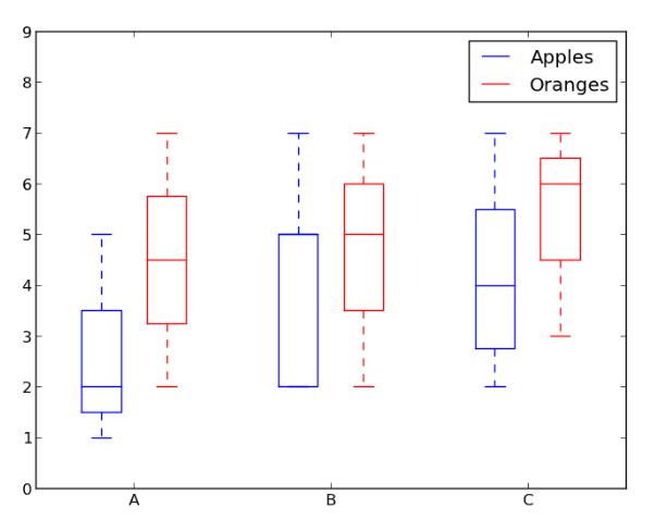
箱线图示例。
def boxplot(x_data, y_data, base_color="#539caf", median_color="#297083", x_label="", y_label="", title=""):
    _, ax = plt.subplots()

    # Draw boxplots, specifying desired style
    ax.boxplot(y_data
               # patch_artist must be True to control box fill
               , patch_artist = True
               # Properties of median line
               , medianprops = {'color': median_color}
               # Properties of box
               , boxprops = {'color': base_color, 'facecolor': base_color}
               # Properties of whiskers
               , whiskerprops = {'color': base_color}
               # Properties of whisker caps
               , capprops = {'color': base_color})

    # By default, the tick label starts at 1 and increments by 1 for
    # each box drawn. This sets the labels to the ones we want
    ax.set_xticklabels(x_data)
    ax.set_ylabel(y_label)
    ax.set_xlabel(x_label)
    ax.set_title(title)
结论
本文介绍了 5 种方便易用的 Matplotlib 数据可视化方法。将可视化过程抽象为函数可以令代码变得易读和易用。
原文地址:https://towardsdatascience.com/5-quick-and-easy-data-visualizations-in-python-with-code-a2284bae952f
推荐阅读
我用Python的Matplotlib库绘制25个超好看图表
25 个常用 Matplotlib 图的 Python 代码,爱了爱了
看了这个总结,其实 Matplotlib 可视化,也没那么难!