
SCI绘图-饼图又能耍什么花样呢?
饼图的概念
As usual,在介绍一种新的图表之前,先介绍图的组成、元素和功能等,即使是像Pie Chart这种常见的基础图表(真的不是在水🐥)。
饼图是一种常见的数据可视化图表,用于展示数据的相对比例。它通常呈圆形,被分成若干个扇形区域,每个扇形区域的大小表示相应数据的比例或百分比。饼图适用于展示数据的分布情况,尤其是用于比较各部分与整体的关系。
使用ggplot2绘制饼图
接下来,手把手教你如何调教ggplot生成优美的SCI图!比起封装好的方法,有时候原生的方法会更加有趣。
首先,模拟出绘图的数据
library(ggplot2)
data <- data.frame(
category = c("Technology", "Healthcare",
"Finance", "Education",
"Entertainment", "Travel"),
value = c(20, 15, 7, 10, 18, 3)
)
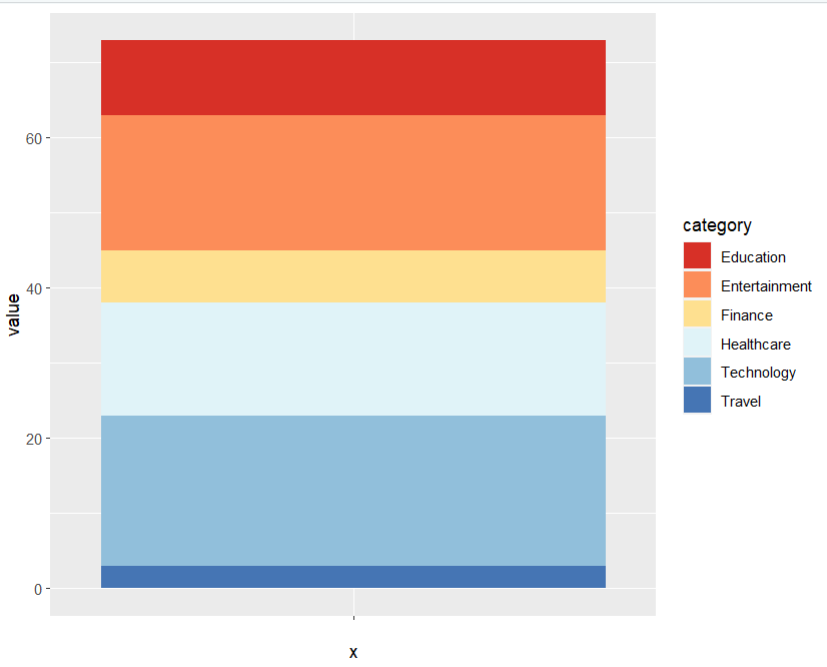
ggplot2中饼图实现是通过先绘制堆积的条形图,然后将坐标转为极坐标系来 实现的
        p <- ggplot(data, aes(x = "", y = value, fill = category)) +


          geom_bar(stat = "identity", width = 1) +


          scale_fill_brewer(palette = "RdYlBu")


          p
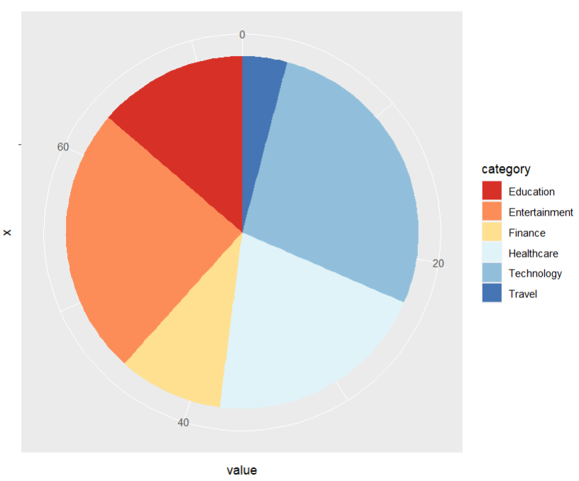
          # 转为极坐标系


        p + coord_polar("y", start = 0)
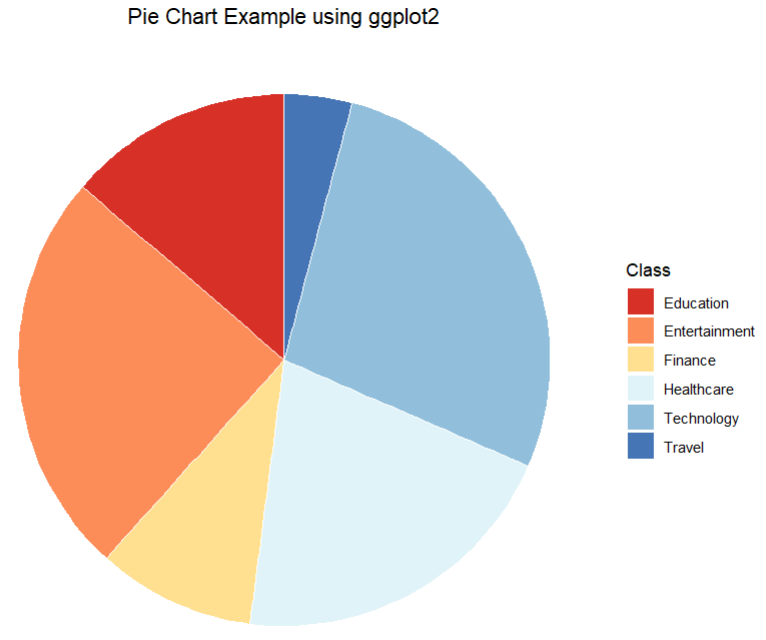
ggplot(data, aes(x = "", y = value, fill = category)) +
geom_bar(stat = "identity", width = 1, color='white') +
scale_fill_brewer(palette = "RdYlBu") +
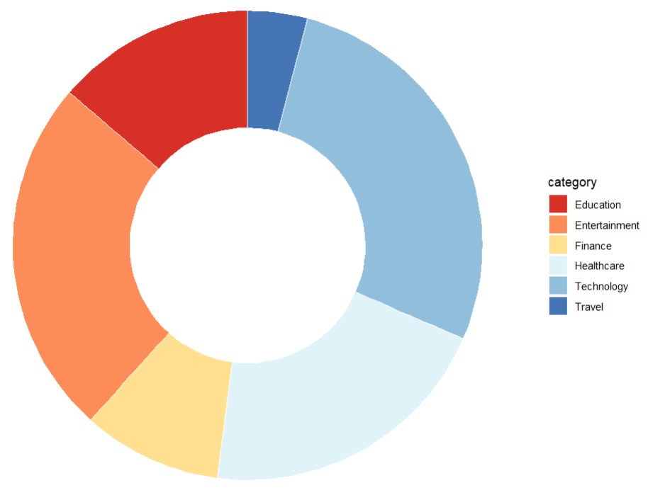
coord_polar("y", start = 0) +
theme_void() +
theme(legend.position = "right",
plot.title = element_text(hjust = 0.5)) +
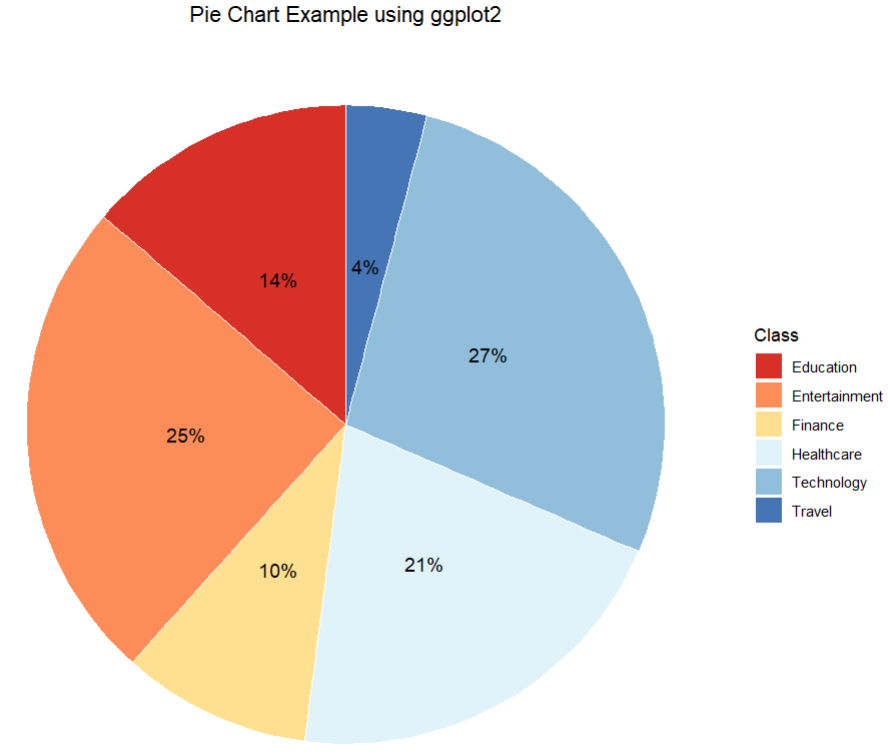
labs(title = "Pie Chart Example using ggplot2",
fill = "Class")
在饼图内部添加百分比标签
          # 计算标签的坐标


        data <- data %>%


          arrange(desc(category)) %>%


          mutate(prop = value / sum(data$value) *100) %>%


          mutate(ypos = cumsum(prop)- 0.5*prop)


          # bar chart


        ggplot(data, aes(x = '', y = prop, fill = category)) +


          geom_bar(stat = "identity", color='white', width = 1) +


          scale_fill_brewer(palette = "RdYlBu") +


          coord_polar("y", start = 0) +


          theme_void() +


          theme(legend.position = "right",


                plot.title = element_text(hjust = 0.5)) +


          geom_text(aes(y=ypos, label = paste0(round(prop), "%")),


                    color = "black",


                    size = 4) +


          labs(title = "Pie Chart Example using ggplot2",


          fill = "Class")
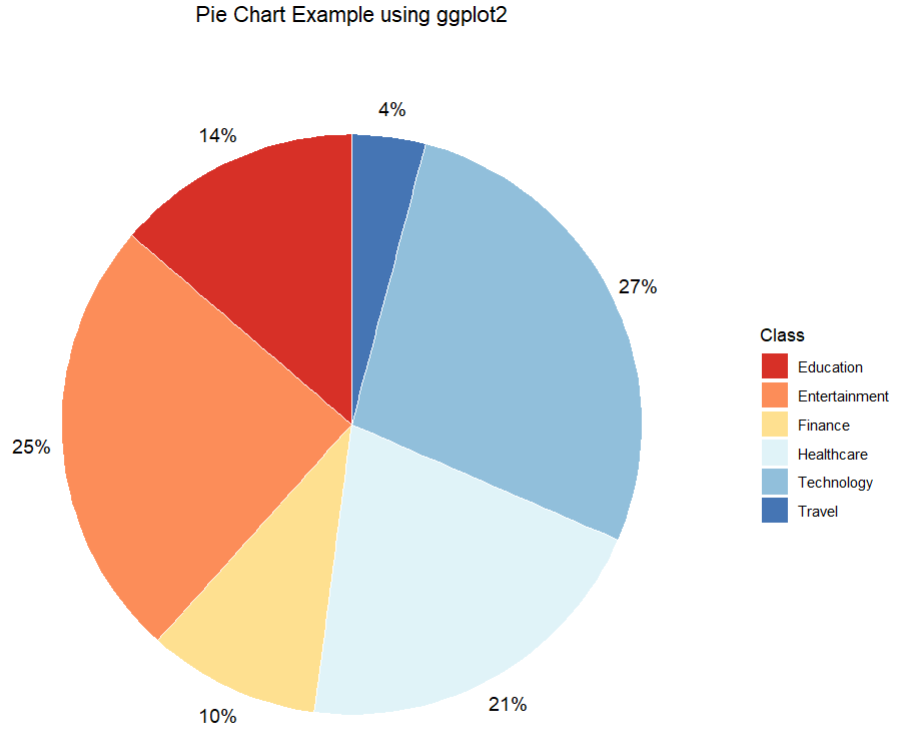
调整标签位置
        ggplot(data, aes(x = '', y = prop, fill = category)) +


          geom_bar(stat = "identity", color='white', width = 1) +


          scale_fill_brewer(palette = "RdYlBu") +


          coord_polar("y", start = 0) +


          theme_void() +


          theme(legend.position = "right",


                plot.title = element_text(hjust = 0.5)) +


          geom_text(aes(x=1.6, y=ypos, label = paste0(round(prop), "%")),


                    color = "black",


                    size = 4) +


          labs(title = "Pie Chart Example using ggplot2",


           fill = "Class")
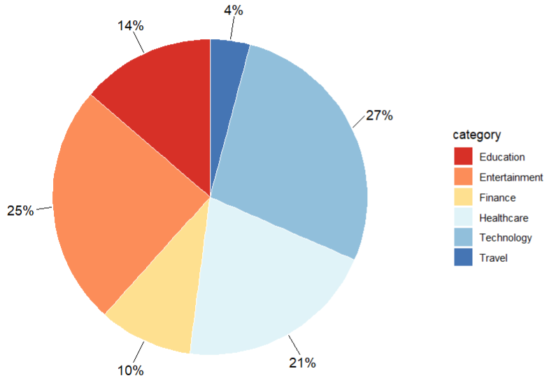
美化标签,添加连线
        ggplot(data, aes(x = '', y = prop, fill = category)) +


          geom_bar(stat = "identity", color='white', width = 1) +


          scale_fill_brewer(palette = "RdYlBu") +


          coord_polar("y", start = 0) +


          theme_void() +


          theme(legend.position = "right",


                plot.title = element_text(hjust = 0.5)) +


          geom_text_repel(aes(x=1.5, y=ypos,


                    label = paste0(round(prop), "%")),


                    color = "black",


                    size = 4,


                    nudge_x = 0.15) +


          labs(title = "Pie Chart Example using ggplot2",


               fill = "Class")
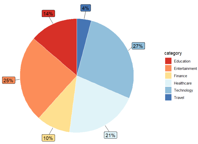
        ggplot(data, aes(x = '', y = prop, fill = category)) +


          geom_bar(stat = "identity", color='white', width = 1) +


          scale_fill_brewer(palette = "RdYlBu") +


          coord_polar("y", start = 0) +


          theme_void() +


          theme(legend.position = "right") +


          geom_text(aes(x=-0.5, y=ypos, label=''))
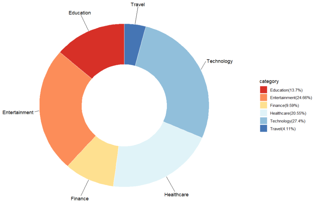
        data <- data %>%


          mutate(label = paste0(category,"(",round(prop,2),"%",")"))


        ggplot(data, aes(x = '', y = prop, fill = category)) +


          geom_bar(stat = "identity", color='white', width = 1) +


          scale_fill_brewer(palette = "RdYlBu",


            labels=sort(data$label))+


          coord_polar("y", start = 0) +


          theme_void() +


          theme(legend.position = "right") +


          geom_text(aes(x=-0.5, y=ypos, label='')) +


          geom_text_repel(aes(x=1.5, y=ypos, label=category),


                          nudge_x=0.5)
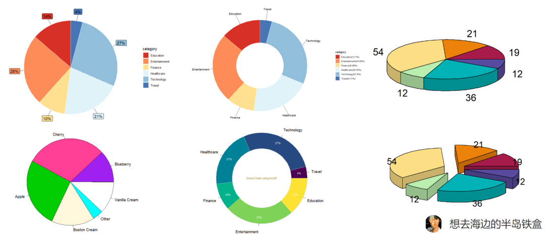
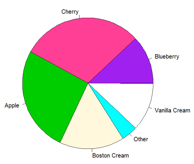
R自带的pie方法
        # 模拟数据


        pie.sales <- c(0.12, 0.3, 0.26, 0.16, 0.04, 0.12)


        names(pie.sales) <- c("Blueberry", "Cherry",


                              "Apple", "Boston Cream", "Other", "Vanilla Cream")


        # 绘图方法


        pie(pie.sales, col = c("purple", "violetred1", "green3",


                               "cornsilk", "cyan", "white"))
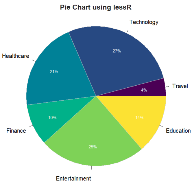
PieChart using lessR
使用R包lessR来绘制饼图和圆环图
library(lessR)
PieChart(category, value,
data=data,
fill="viridis",
hole=0,
main="Pie Chart using lessR")
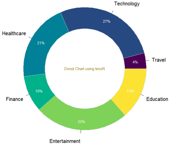
调整hole参数使其变成圆环图
        PieChart(category, value, data=data,


                 fill="viridis",hole=0.65,


                 add="Donut Chart using lessR", x1=0, y1=0,


                 main="")
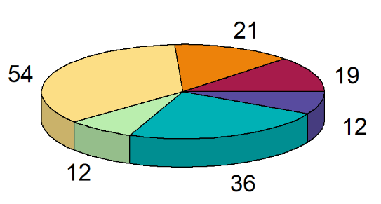
3D饼图
3D的感觉蛮丑的,个人不太推荐!图表的目的是把数据信息清晰地传递给读者,感觉3D饼图有点画蛇添足了!当然,或许你喜欢呢!
    # install.packages("plotrix")
library(plotrix)

data <- c(19, 21, 54, 12, 36, 12)

pie3D(data,
      col = hcl.colors(length(data), "Spectral"),
      labels = data)
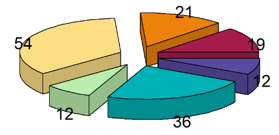
饼图,我裂开了
    # install.packages("plotrix")
library(plotrix)

data <- c(19, 21, 54, 12, 36, 12)

pie3D(data,
      col = hcl.colors(length(data), "Spectral"),
      labels = data,
      explode = 0.2)
Question
最后,我有个朋友想问大家下面这种图叫什么?知道的大神请留言! 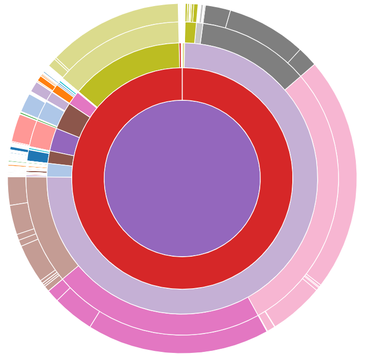

点赞👍关注
本期就介绍到这里啦!持续更新ING~

整理不易,期待您的点赞、分享、转发...

往期精彩推荐
SCI绘图-网络图可视化最详细教程! SCI绘图-网络(Graph)图可视化工具合集 龙年微信红包封面!限量2000份! 科研论文还不知道如何配色2? 科研论文还不知道如何配色1? SCI绘图-ggplot绘制超好看的火山图 HTTPX,一个超强的爬虫库! GSEA分析实战及结果可视化教程! 一文读懂GSEA分析原理 SCI绘图-箱线图的绘制原理与方法
更多合集推荐
🔥#SCI绘图 💥 #生物信息 ✨ #科研绘图素材资源 📚 #数学 🌈 #测序原理
我知道你
在看
哦

评论