
看完这篇文章,我才知道 Python 制作动态图表的正确方式
Python实战社群
Java实战社群
长按识别下方二维码,按需求添加
扫码关注添加客服
进Python社群▲
扫码关注添加客服
进Java社群▲
作者丨周萝卜
来源丨萝卜大杂烩
关于动态图表,相信大家都或多或少的接触过一些,如果是代码水平比较不错的,可以选择 Matplotlib,当然也可以使用 pyecharts 的相关功能,不过这些工具都专注于图表的制作,也就是对于图表的数据,你是需要自行转换的。而今天介绍的这个可视化图库,完美的结合了 Pandas 数据格式,又辅以 Matplotlib 的强大功能,使得我们制作动图变得容易的多了。
图库简介
这款给力的可视化图库,就是 pandas_alive,虽然当前在 GitHub 上的 star 数量不是很高,但是相信凭借其强大的功能,崭露头角也是迟早的事情
项目地址:
https://github.com/JackMcKew/pandas_alive
项目安装:
与一般的 Python 库一样,直接使用 pip 安装即可,这里有一点需要注意,就是由于是通过 Matplotlib 来制作动图,所以需要手动安装下 Matplotlib 的依赖工具 imagemagick,这是一个图片处理工具,感兴趣的同学可以自行查看下
项目功能:
这款可视化图库,可以支持的图表类型是非常多的,包括动态条形图、动态曲线图、气泡图、饼状图以及地图等等,这些图表差不多可以满足我们日常的使用了
制图简介
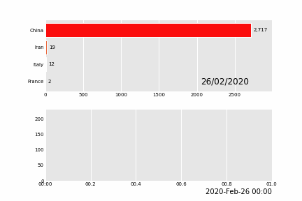
这里我们就来简单看一下该如何制作动态图表吧,首先是动态条形图,基本4行代码搞定,有两行还是 import
import pandas_alive
import pandas as pd

covid_df = pd.read_csv('covid19.csv', index_col=0, parse_dates=[0])

covid_df.diff().fillna(0).plot_animated(filename='line_chart.gif',kind='line',period_label={'x':0.25,'y':0.9})

怎么样,是不是超级方便呢
下面我们就来看看其他图表的制作方法吧!
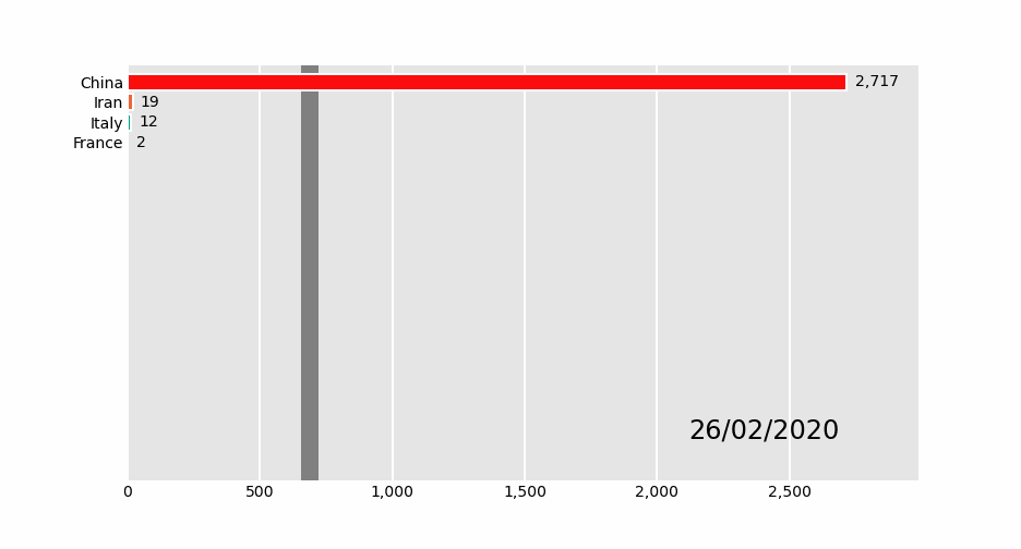
01 动态条形图
import pandas_alive
import pandas as pd

covid_df = pd.read_csv('covid19.csv', index_col=0, parse_dates=[0])

covid_df.plot_animated(filename='examples/perpendicular-example.gif',perpendicular_bar_func='mean')
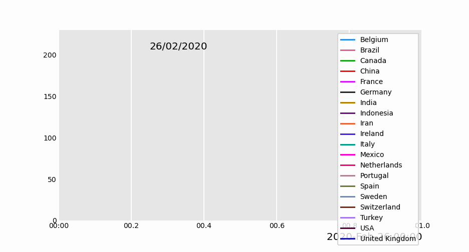
02 动态柱状图
import pandas_alive

import pandas as pd

covid_df = pd.read_csv('covid19.csv', index_col=0, parse_dates=[0])

covid_df.plot_animated(filename='examples/example-barv-chart.gif',orientation='v')

03 动态曲线图
import pandas_alive

import pandas as pd

covid_df = pd.read_csv('covid19.csv', index_col=0, parse_dates=[0])

covid_df.diff().fillna(0).plot_animated(filename='examples/example-line-chart.gif',kind='line',period_label={'x':0.25,'y':0.9})
04 动态面积图
import pandas_alive

import pandas as pd

covid_df = pd.read_csv('covid19.csv', index_col=0, parse_dates=[0])

covid_df.sum(axis=1).fillna(0).plot_animated(filename='examples/example-bar-chart.gif',kind='bar',
        period_label={'x':0.1,'y':0.9},
        enable_progress_bar=True, steps_per_period=2, interpolate_period=True, period_length=200
)
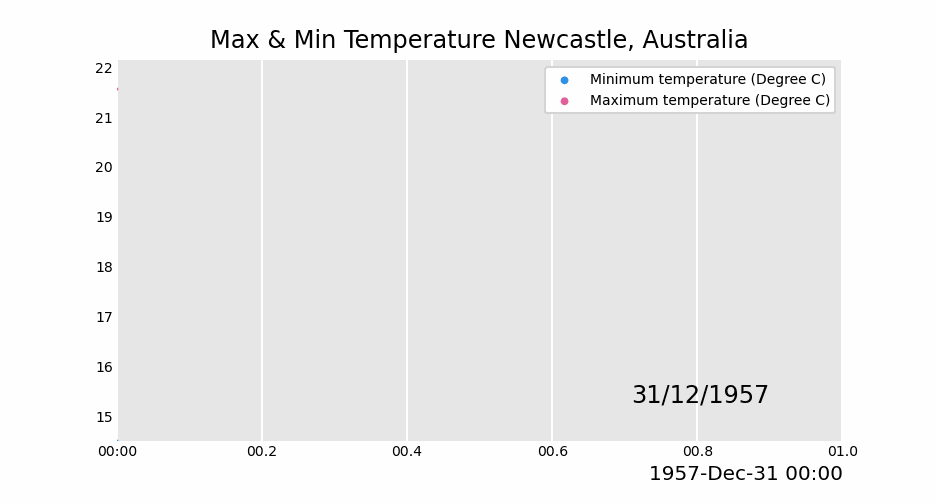
05 动态散点图
import pandas as pd
import pandas_alive

max_temp_df = pd.read_csv(
    "data/Newcastle_Australia_Max_Temps.csv",
    parse_dates={"Timestamp": ["Year", "Month", "Day"]},
)
min_temp_df = pd.read_csv(
    "data/Newcastle_Australia_Min_Temps.csv",
    parse_dates={"Timestamp": ["Year", "Month", "Day"]},
)

merged_temp_df = pd.merge_asof(max_temp_df, min_temp_df, on="Timestamp")

merged_temp_df.index = pd.to_datetime(merged_temp_df["Timestamp"].dt.strftime('%Y/%m/%d'))

keep_columns = ["Minimum temperature (Degree C)", "Maximum temperature (Degree C)"]

merged_temp_df[keep_columns].resample("Y").mean().plot_animated(filename='examples/example-scatter-chart.gif',kind="scatter",title='Max & Min Temperature Newcastle, Australia')
06 动态饼图
import pandas_alive

import pandas as pd

covid_df = pd.read_csv('covid19.csv', index_col=0, parse_dates=[0])

covid_df.plot_animated(filename='examples/example-pie-chart.gif',kind="pie",rotatelabels=True,period_label={'x':0,'y':0})

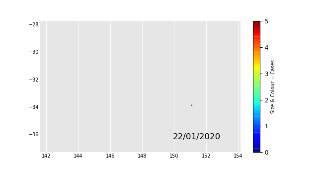
07 动态气泡图
import pandas_alive

multi_index_df = pd.read_csv("data/multi.csv", header=[0, 1], index_col=0)

multi_index_df.index = pd.to_datetime(multi_index_df.index,dayfirst=True)

map_chart = multi_index_df.plot_animated(
    kind="bubble",
    filename="examples/example-bubble-chart.gif",
    x_data_label="Longitude",
    y_data_label="Latitude",
    size_data_label="Cases",
    color_data_label="Cases",
    vmax=5, steps_per_period=3, interpolate_period=True, period_length=500,
    dpi=100
)
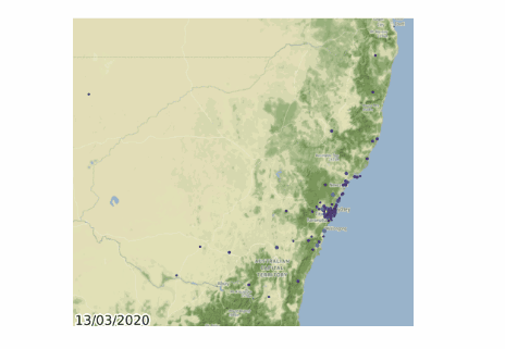
08 动态地理图表
import geopandas
import pandas_alive
import contextily

gdf = geopandas.read_file('data/nsw-covid19-cases-by-postcode.gpkg')
gdf.index = gdf.postcode
gdf = gdf.drop('postcode',axis=1)

map_chart = gdf.plot_animated(filename='examples/example-geo-point-chart.gif',basemap_format={'source':contextily.providers.Stamen.Terrain})
09 行政区域动图
import geopandas
import pandas_alive
import contextily

gdf = geopandas.read_file('data/italy-covid-region.gpkg')
gdf.index = gdf.region
gdf = gdf.drop('region',axis=1)

map_chart = gdf.plot_animated(filename='examples/example-geo-polygon-chart.gif',basemap_format={'source':contextily.providers.Stamen.Terrain})

10 多动图组合
import pandas_alive

import pandas as pd

covid_df = pd.read_csv('covid19.csv', index_col=0, parse_dates=[0])

animated_line_chart = covid_df.diff().fillna(0).plot_animated(kind='line',period_label=False,add_legend=False)

animated_bar_chart = covid_df.plot_animated(n_visible=10)

pandas_alive.animate_multiple_plots('examples/example-bar-and-line-chart.gif',[animated_bar_chart,animated_line_chart],
    enable_progress_bar=True)
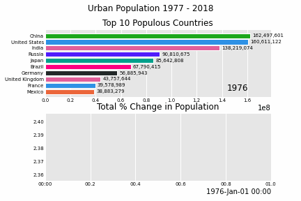
11 城市人口变化
import pandas_alive

urban_df = pandas_alive.load_dataset("urban_pop")

animated_line_chart = (
    urban_df.sum(axis=1)
    .pct_change()
    .fillna(method='bfill')
    .mul(100)
    .plot_animated(kind="line", title="Total % Change in Population",period_label=False,add_legend=False)
)

animated_bar_chart = urban_df.plot_animated(n_visible=10,title='Top 10 Populous Countries',period_fmt="%Y")

pandas_alive.animate_multiple_plots('examples/example-bar-and-line-urban-chart.gif',[animated_bar_chart,animated_line_chart],
    title='Urban Population 1977 - 2018', adjust_subplot_top=0.85, enable_progress_bar=True)
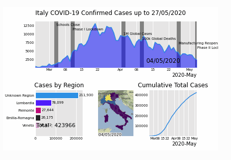
12 意大利疫情
import geopandas
import pandas as pd
import pandas_alive
import contextily
import matplotlib.pyplot as plt


region_gdf = geopandas.read_file('data\geo-data\italy-with-regions')
region_gdf.NOME_REG = region_gdf.NOME_REG.str.lower().str.title()
region_gdf = region_gdf.replace('Trentino-Alto Adige/Sudtirol','Trentino-Alto Adige')
region_gdf = region_gdf.replace("Valle D'Aosta/Vallée D'Aoste\r\nValle D'Aosta/Vallée D'Aoste","Valle d'Aosta")

italy_df = pd.read_csv('data\Regional Data - Sheet1.csv',index_col=0,header=1,parse_dates=[0])

italy_df = italy_df[italy_df['Region'] != 'NA']

cases_df = italy_df.iloc[:,:3]
cases_df['Date'] = cases_df.index
pivoted = cases_df.pivot(values='New positives',index='Date',columns='Region')
pivoted.columns = pivoted.columns.astype(str)
pivoted = pivoted.rename(columns={'nan':'Unknown Region'})

cases_gdf = pivoted.T
cases_gdf['geometry'] = cases_gdf.index.map(region_gdf.set_index('NOME_REG')['geometry'].to_dict())

cases_gdf = cases_gdf[cases_gdf['geometry'].notna()]

cases_gdf = geopandas.GeoDataFrame(cases_gdf, crs=region_gdf.crs, geometry=cases_gdf.geometry)

gdf = cases_gdf

map_chart = gdf.plot_animated(basemap_format={'source':contextily.providers.Stamen.Terrain},cmap='viridis')

cases_df = pivoted

from datetime import datetime

bar_chart = cases_df.sum(axis=1).plot_animated(
    kind='line',
    label_events={
        'Schools Close':datetime.strptime("4/03/2020", "%d/%m/%Y"),
        'Phase I Lockdown':datetime.strptime("11/03/2020", "%d/%m/%Y"),
        '1M Global Cases':datetime.strptime("02/04/2020", "%d/%m/%Y"),
        '100k Global Deaths':datetime.strptime("10/04/2020", "%d/%m/%Y"),
        'Manufacturing Reopens':datetime.strptime("26/04/2020", "%d/%m/%Y"),
        'Phase II Lockdown':datetime.strptime("4/05/2020", "%d/%m/%Y"),

    },
    fill_under_line_color="blue",
    add_legend=False
)

map_chart.ax.set_title('Cases by Location')

line_chart = (
    cases_df.sum(axis=1)
    .cumsum()
    .fillna(0)
    .plot_animated(kind="line", period_label=False, title="Cumulative Total Cases",add_legend=False)
)


def current_total(values):
    total = values.sum()
    s = f'Total : {int(total)}'
    return {'x': .85, 'y': .1, 's': s, 'ha': 'right', 'size': 11}

race_chart = cases_df.cumsum().plot_animated(
    n_visible=5, title="Cases by Region", period_label=False,period_summary_func=current_total
)

import time

timestr = time.strftime("%d/%m/%Y")

plots = [bar_chart, race_chart, map_chart, line_chart]

# Otherwise titles overlap and adjust_subplot does nothing
from matplotlib import rcParams
from matplotlib.animation import FuncAnimation

rcParams.update({"figure.autolayout": False})
# make sure figures are `Figure()` instances
figs = plt.Figure()
gs = figs.add_gridspec(2, 3, hspace=0.5)
f3_ax1 = figs.add_subplot(gs[0, :])
f3_ax1.set_title(bar_chart.title)
bar_chart.ax = f3_ax1

f3_ax2 = figs.add_subplot(gs[1, 0])
f3_ax2.set_title(race_chart.title)
race_chart.ax = f3_ax2

f3_ax3 = figs.add_subplot(gs[1, 1])
f3_ax3.set_title(map_chart.title)
map_chart.ax = f3_ax3

f3_ax4 = figs.add_subplot(gs[1, 2])
f3_ax4.set_title(line_chart.title)
line_chart.ax = f3_ax4

axes = [f3_ax1, f3_ax2, f3_ax3, f3_ax4]
timestr = cases_df.index.max().strftime("%d/%m/%Y")
figs.suptitle(f"Italy COVID-19 Confirmed Cases up to {timestr}")

pandas_alive.animate_multiple_plots(
    'examples/italy-covid.gif',
    plots,
    figs,
    enable_progress_bar=True
)


近期精彩内容推荐:


评论