
自定义itemCheckView
和你一起终身学习,这里是程序员Android
经典好文推荐,通过阅读本文,您将收获以下知识点:
一、自定义View类实现
二、自定义View标签
三、自定义View 布局
四、自定义View 选择器
五、自定义View 素材
六、Activity 引用 自定义view 控件
七、Activity使用自定义View
itemCheckView 主要用于自定义选中item,常用于Settings 模块中,实现效果如下:

自定义itemCheckView
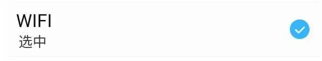
选中.jpg
一、自定义View类实现
public class ItemCheckView extends RelativeLayout {
    // 每一个xml中的结点,都需要转换成java中的对象才可以去运行
    // 转换成一个对象,调用其构造方法,在调用构造方法的时候,去做xml--->view操作

    private static final String TAG = "ItemCheckView";
    private TextView tv_title;
    private TextView tv_des;
    private CheckBox cb_box;
    private static final String NAMESPACE = "http://schemas.android.com/apk/res/com.programandroid";
    private String mDesTitle;
    private String mDesOff;
    private String mDesOn;

    public ItemCheckView(Context context, AttributeSet attrs, int defStyle) {
        super(context, attrs, defStyle);
        initAttrs(attrs);
        initUI(context);
    }

    public ItemCheckView(Context context, AttributeSet attrs) {
        super(context, attrs);
        initAttrs(attrs);
        initUI(context);
    }

    public ItemCheckView(Context context) {
        super(context);
        initUI(context);
    }

    // 单独抽取出来的 xml--->view
    private void initUI(Context context) {
        View.inflate(context, R.layout.item_check_view, this);

        tv_title = (TextView) findViewById(R.id.tv_title);
        tv_des = (TextView) findViewById(R.id.tv_des);

        cb_box = (CheckBox) findViewById(R.id.cb_box);

        tv_title.setText(mDesTitle);
    }

    // checkbox是否选中的状态,就决定了当前条目是否开启版本更新检测
    // checbbox选中状态,和版本更新状态绑定

    /**
     * 当前条目的选中状态,是否开启更新的选中状态
     */
    public boolean isCheck() {
        // 是否要去更新,由checkbox选中状态决定 true选中 false未选中
        return cb_box.isChecked();
    }

    /**
     * @param isCheck
     *            传递一个选中未选中的状态变量(true 选中 false未选中)
     */
    public void setCheck(boolean isCheck) {
        cb_box.setChecked(isCheck);
        if (isCheck) {
            tv_des.setText(mDesOn);
        } else {
            tv_des.setText(mDesOff);
        }
    }

    /**
     * @param attrs
     *            包含了属性名称和属性值的set集合
     */
    private void initAttrs(AttributeSet attrs) {
        // 打印属性总个数
        /*
         * Log.i(tag, "attrs.getAttributeCount() = "+attrs.getAttributeCount());
         * for(int i=0;i         * "属性名称 = "+attrs.getAttributeName(i)); Log.i(tag,
         * "属性值 = "+attrs.getAttributeValue(i)); }
         */

        mDesTitle = attrs.getAttributeValue(NAMESPACE, "desTitle");
        mDesOff = attrs.getAttributeValue(NAMESPACE, "desOff");
        mDesOn = attrs.getAttributeValue(NAMESPACE, "desOn");

        Log.i(TAG, mDesTitle);
        Log.i(TAG, mDesOff);
        Log.i(TAG, mDesOn);
    }
二、自定义View标签
1.注意 :自定义 Android 命名空间
同Android 命名空间(xmlns:android="http://schemas.android.com/apk/res/android" )方法一样,想使用自定义view的属性,必须声明自定义view的命名空间(xmlns:programandroid="http://schemas.android.com/apk/res/com.programandroid")
2. 注意:自定义View 属性
自定义View 属性如下:
  programandroid:desOff="  不选中"
  programandroid:desOn="  选中"
  programandroid:desTitle=" WIFI "
属性声明在res/values/attrs.xml中定义
<resources>
    <declare-styleable name="ItemCheckView">
        <attr name="desTitle" format="string"/>
        <attr name="desOff" format="string"/>
        <attr name="desOn" format="string"/>
    declare-styleable>
resources>
三、自定义View 布局
<RelativeLayout xmlns:android="http://schemas.android.com/apk/res/android"
    android:layout_width="match_parent"
    android:layout_height="wrap_content"
    android:layout_margin="5dp" >

    <TextView
        android:id="@+id/tv_title"
        android:layout_width="wrap_content"
        android:layout_height="wrap_content"
        android:text="sss"
        android:textColor="@android:color/primary_text_light"
        android:textSize="18sp" />

    <TextView
        android:id="@+id/tv_des"
        android:layout_width="wrap_content"
        android:layout_height="wrap_content"
        android:layout_below="@id/tv_title"
        android:text="sss"
        android:textColor="@android:color/secondary_text_light"
        android:textSize="14sp" />

    <CheckBox
        android:id="@+id/cb_box"
        style="@style/CustomCheckboxTheme"
        android:layout_width="wrap_content"
        android:layout_height="wrap_content"
        android:layout_alignParentRight="true"
        android:layout_centerVertical="true"
        android:clickable="false"
        android:focusable="false"
        android:focusableInTouchMode="false" />

RelativeLayout>
四、自定义View 选择器
1. CheckBox 自定义样式
<selector xmlns:android="http://schemas.android.com/apk/res/android">

    <item android:drawable="@drawable/btn_checkbox_press" android:state_checked="true"/>
    <item android:drawable="@drawable/btn_checkbox_normal" android:state_checked="false"/>
    <item android:drawable="@drawable/btn_checkbox_normal"/>

selector>
2.自定义 item选择器
<selector xmlns:android="http://schemas.android.com/apk/res/android">


    <item android:drawable="@drawable/list_item_bg_light_pressed" android:state_pressed="true"/>

    <item android:drawable="@drawable/list_item_bg_light_pressed" android:state_focused="true"/>

    <item android:drawable="@drawable/list_item_bg_light_normal"/>

selector>
五、自定义View 素材

btn_checkbox_normal.png

btn_checkbox_press.png
六、自定义view 在Activity中布局引用
    <com.programandroid.CustomView.ItemCheckView
        xmlns:programandroid="http://schemas.android.com/apk/res/com.programandroid"
        android:id="@+id/custom_item_check_view"
        android:layout_width="wrap_content"
        android:layout_height="wrap_content"
        android:background="@drawable/listview_item_selector"
        programandroid:desOff="  不选中"
        programandroid:desOn="  选中"
        programandroid:desTitle=" WIFI " />
七、 Activity使用自定义View
    /**
     * 自定义InitItemCheckView Activity 调用
     */
    private void InitItemCheckView() {
        // TODO Auto-generated method stub
        final ItemCheckView mItemCheckView = (ItemCheckView) findViewById(R.id.custom_item_check_view);
        mItemCheckView.setCheck(false);

        mItemCheckView.setOnClickListener(new OnClickListener() {

            @Override
            public void onClick(View v) {
                // TODO Auto-generated method stub

                // 1,获取当前条的原有状态
                boolean check = mItemCheckView.isCheck();
                // 2,对第一步获取的状态取反
                mItemCheckView.setCheck(!check);
                if (!check) {

                } else {

                }

            }
        });
    }
至此,本篇已结束。转载网络的文章,小编觉得很优秀,欢迎点击阅读原文,支持原创作者,如有侵权,恳请联系小编删除。同时感谢您的阅读,期待您的关注。
点个在看,方便您使用时快速查找!
评论