
酷!一个仿漫画手绘风格的 Python 图表库
【导读】:关于数据可视化工具,如果你有点厌烦了常见风格(比如:Matplotlib 、Seaborn 和 pyecharts),那可以试试换一种风格。
本文前哨君给大家介绍一个风格完全不一样的开源库:cutecharts,其 UI 效仿 XKCD 漫画手绘风格,在部分场景(比如:个人作品展示)的效果或许会更好。
补充:XKCD 是一个 IT 漫画网站,在国外非常有名气。
这是一张 XKCD 漫画作品的汉化版

为什么会有 cutecharts?
据 cutecharts 的开发者介绍,他个人非常喜欢一个 JS 图表库 chart.xkcd,但它支持的图表类型不多,比 pyecharts 少很多。
Javascript 在数据交互和视觉效果上更有优势,而 Python 是一种深受数据科学界的喜爱的语言。因此,他想结合这两种技术的力量,于是就开发了 cutecharts.py。
此外,cutecharts 更多的是一个库,用来学习如何将 JS 世界与 Python/notebook 相结合。cutecharts 的项目结构与 pyecharts 相同,它支持 pyechart s的所有核心功能,同时更轻量级,总体上也更简洁。
GitHub 地址:
https://github.com/chenjiandongx/cutecharts
简单使用
一行命令先安装好该库:
pip install cutecharts
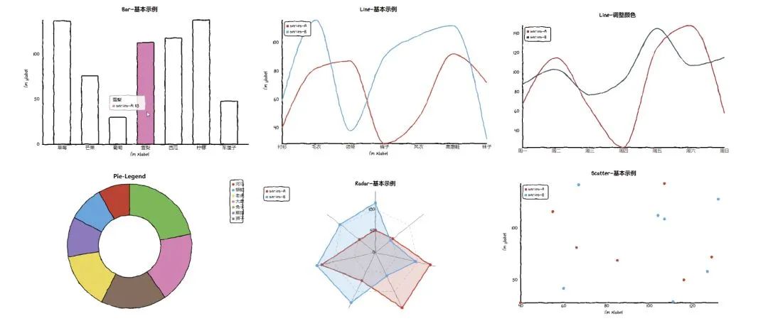
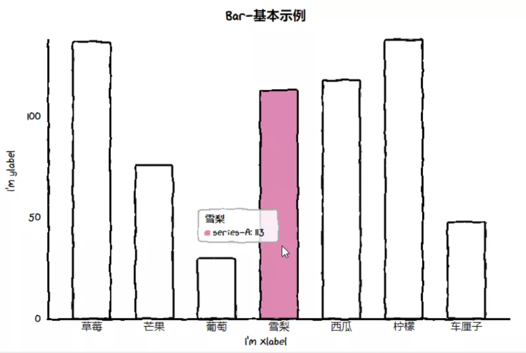
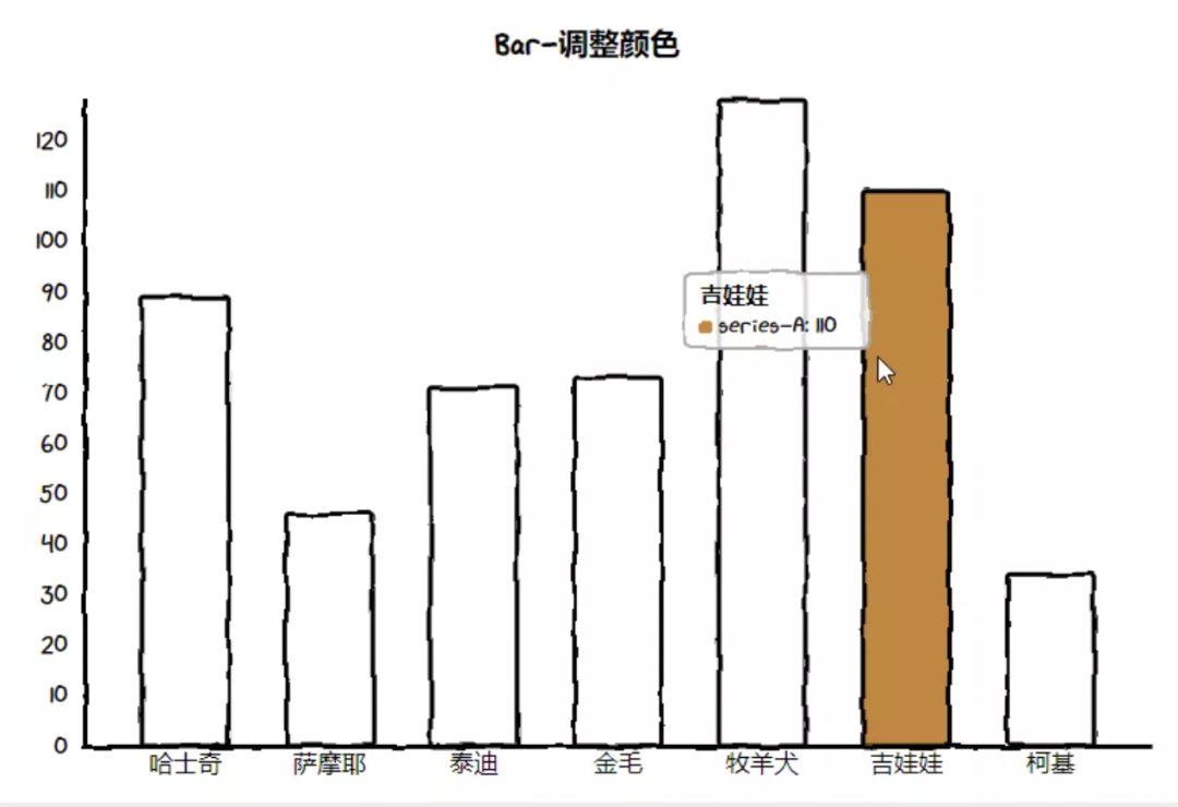
下面就是 cutecharts 项目主页提供的一些示例:
Commons
不同图表有着部分相同的方法。
__init__
Params                                          Desc
------                                          ----
title: Optional[str] = None                     图表标题
width: str = "800px"                            图表宽度
height: str = "600px"                           图表高度
assets_host: Optional[str] = None               引用资源 Host
render
Params                                          Desc
------                                          ----
dest: str = "render.html"                       渲染的文件路径
template_name: str = "basic_local.html"         渲染使用的模板,一般不需要修改
render_notebook
Params                                          Desc
------                                          ----
template_type: str = "basic"                    渲染使用的模板类型,一般不需要修改
load_javascript
加载 JS 依赖,在 JupyterLab 渲染时使用。
Bar(柱状图)
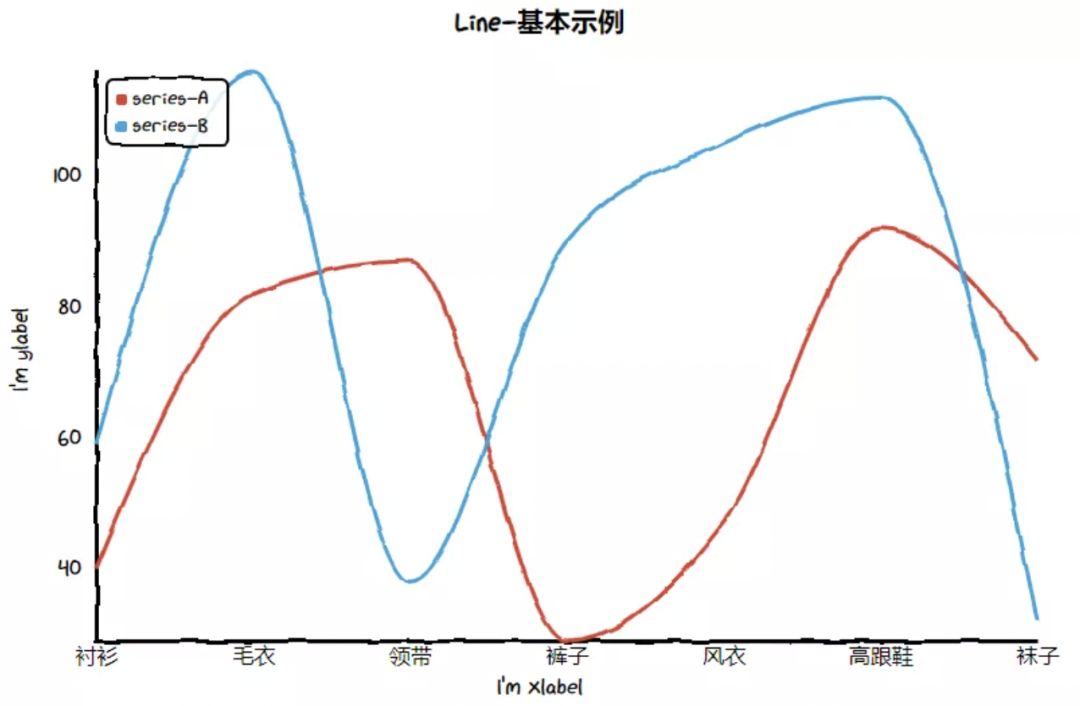
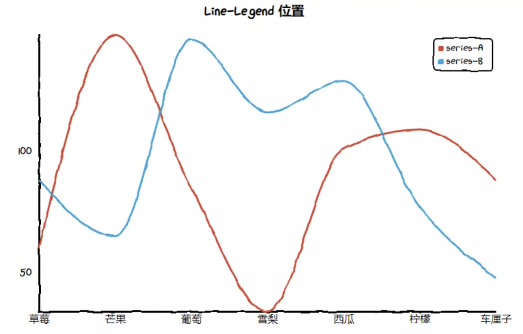
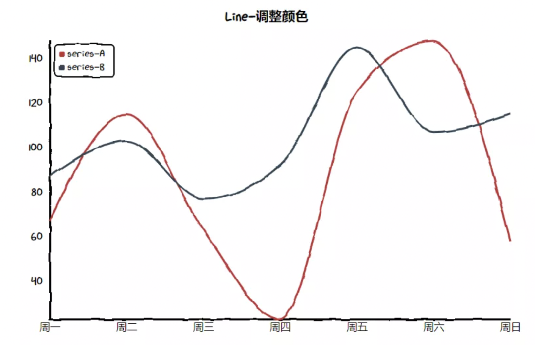
Line(折线图)
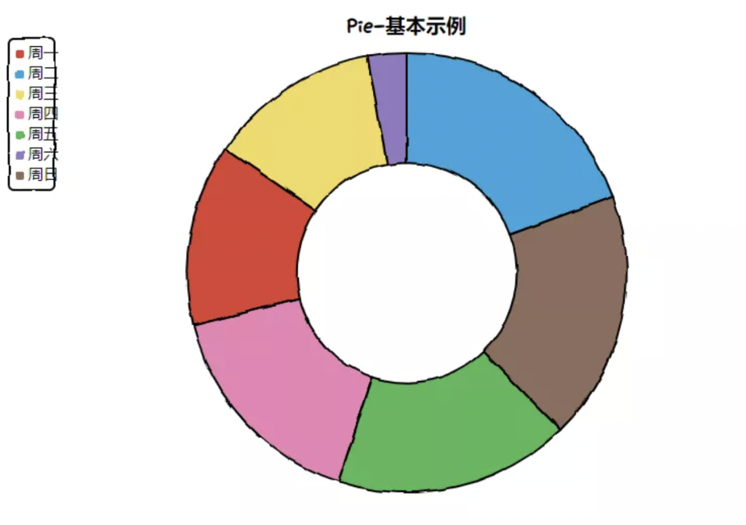
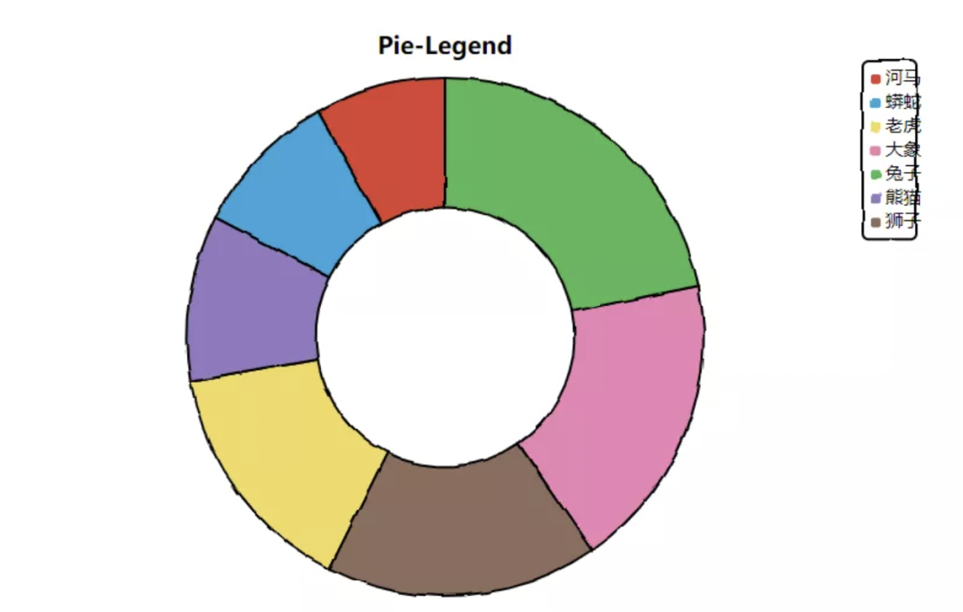
Pie(饼图)
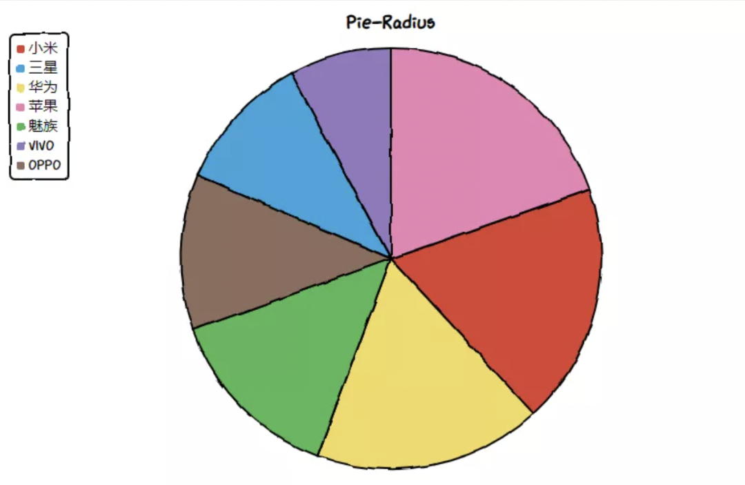
Pie-Radius
def pie_radius():
    chart = Pie("Pie-Radius")
    chart.set_options(
        labels=Faker.choose(),
        inner_radius=0,
    )
    chart.add_series(Faker.values())
    return chart
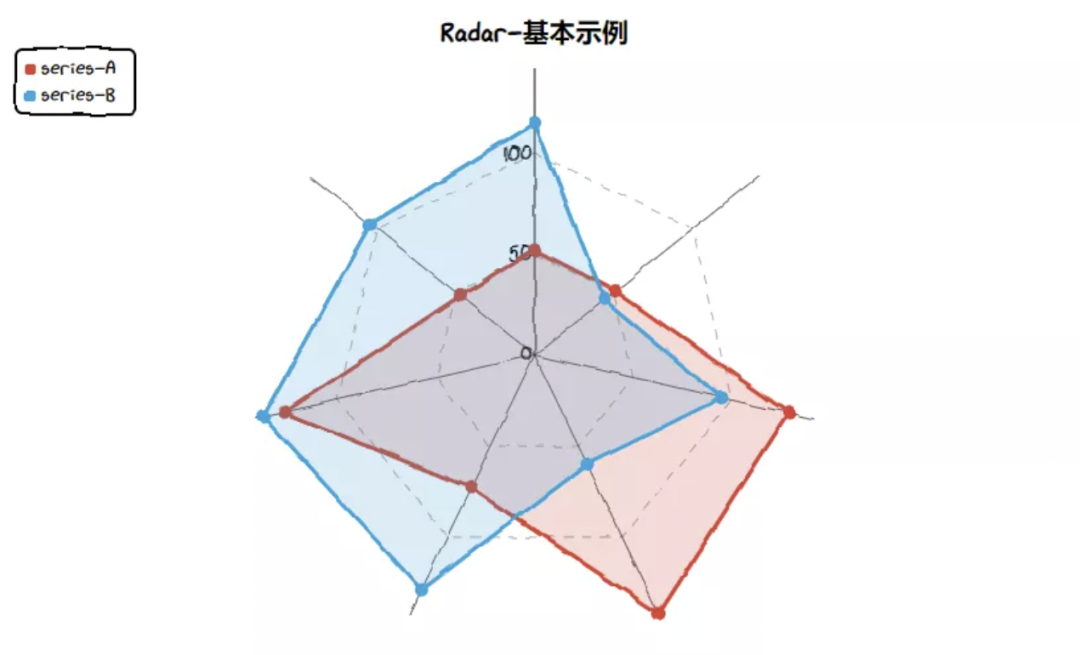
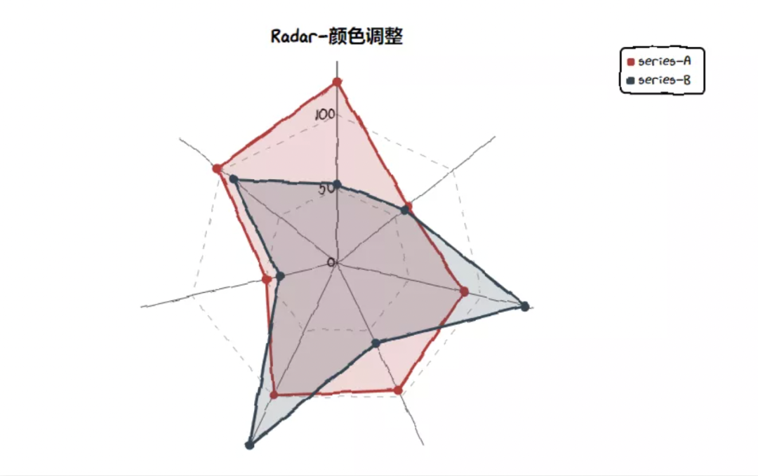
Radar(雷达图)
对这个图表库有兴趣的童鞋,可以试试。
- EOF -
分享、点赞和在看
支持我们分享更多优秀开源项目,谢谢!
评论