
再见,Matplotlib!

如果你经常使用Python进行数据分析,那么对于Pandas一定不会陌生,但是Pandas除了在数据处理上大放异彩,随着版本的不断更新,Pandas的绘图功能在某些情况下甚至要比Matplotlib更加适用,本文就将介绍如何用Pandas更快的进行数据可视化!
基本使用,学会制作套路
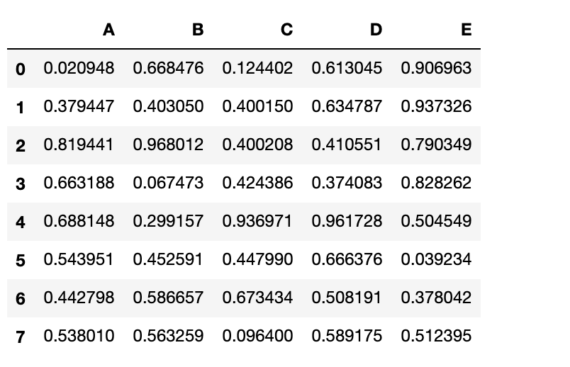
首先我们使用pandas随机生成示例数据
import pandas as pd
df= pd.DataFrame(np.random.rand(8, 4), columns=['A','B','C','D'])
现在只要一行代码,即可完成柱状图的绘制df.plot.bar()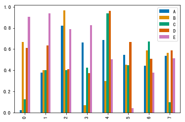
同样是这个图,如果使用Matplotlib制作的话?
import matplotlib.pyplot as plt

x = np.array(df.index.tolist())
y1 = df.A.tolist()
y2 = df.B.tolist()
y3 = df.C.tolist()
y4 = df.D.tolist()
y5 = df.E.tolist()

total_width, n = 0.8, 5
width = total_width / n
x = x - (total_width - width) / 2

plt.bar(x, y1,  width=width, label='A')
plt.bar(x + width, y2, width=width, label='B')
plt.bar(x + 2*width, y3, width=width, label='C')
plt.bar(x + 3*width, y4, width=width, label='D')
plt.bar(x + 4*width, y5, width=width, label='E')

plt.legend()
plt.show()
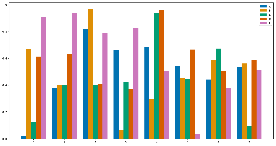
可以看到,虽然结果差不多,不过代码量瞬间就上去了,如果你是Matplotlib高手可能会用更简洁的代码制作,但一定没有pandas一行代码来的方便!
更多图表,一览Pandas强大
下面我们继续看看,一行pandas代码能做出哪些常用的图!
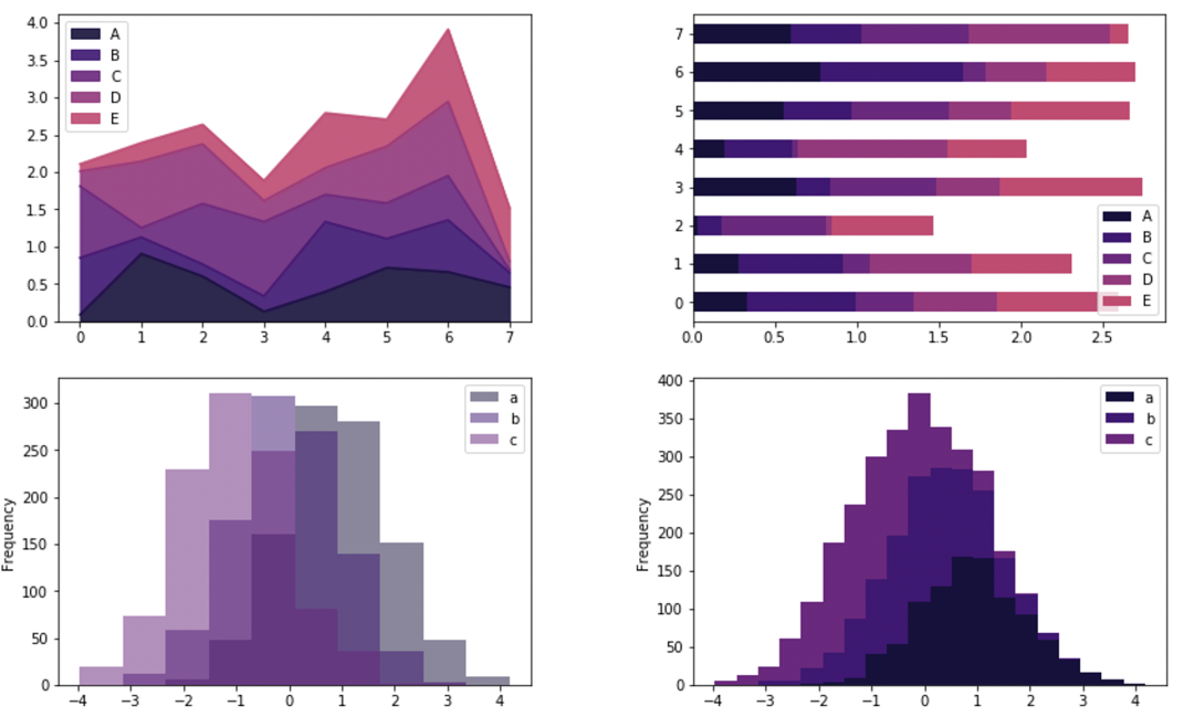
堆叠柱状图,添加一个参数即可df.plot.barh(stacked=True)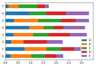
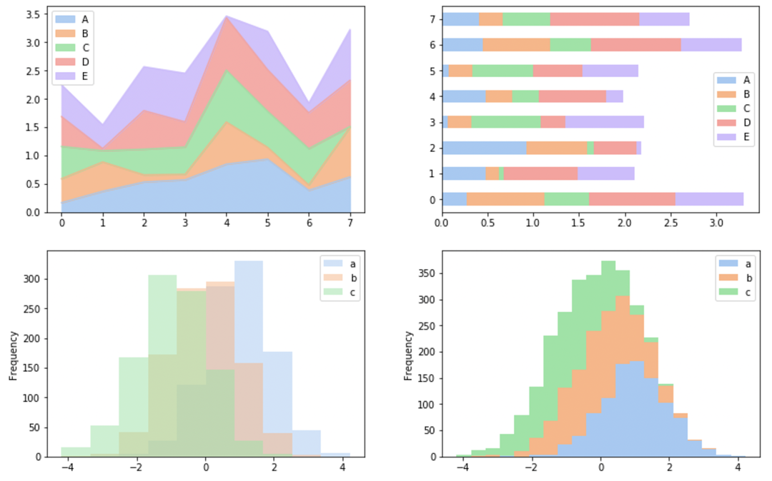
堆叠面积图df.plot.area(stacked=True,alpha = 0.9)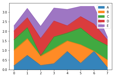
密度估计图df.plot.kde()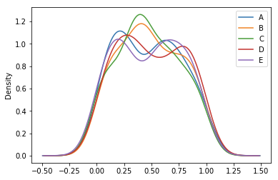
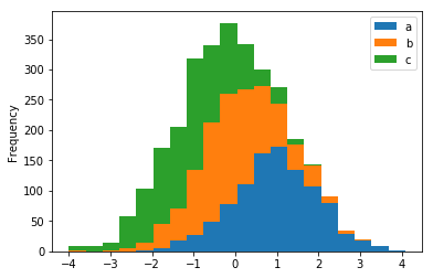
直方图的话,我们需要换一组数据
df = pd.DataFrame({'a': np.random.randn(1000) + 1,
                   'b': np.random.randn(1000),
                   'c': np.random.randn(1000) - 1},
                  columns=['a', 'b', 'c'])
下面,两行代码就能制作堆叠/不堆叠的直方图
df.plot.hist(stacked=True, bins=20)
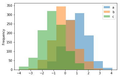
df.plot.hist(alpha=0.5)
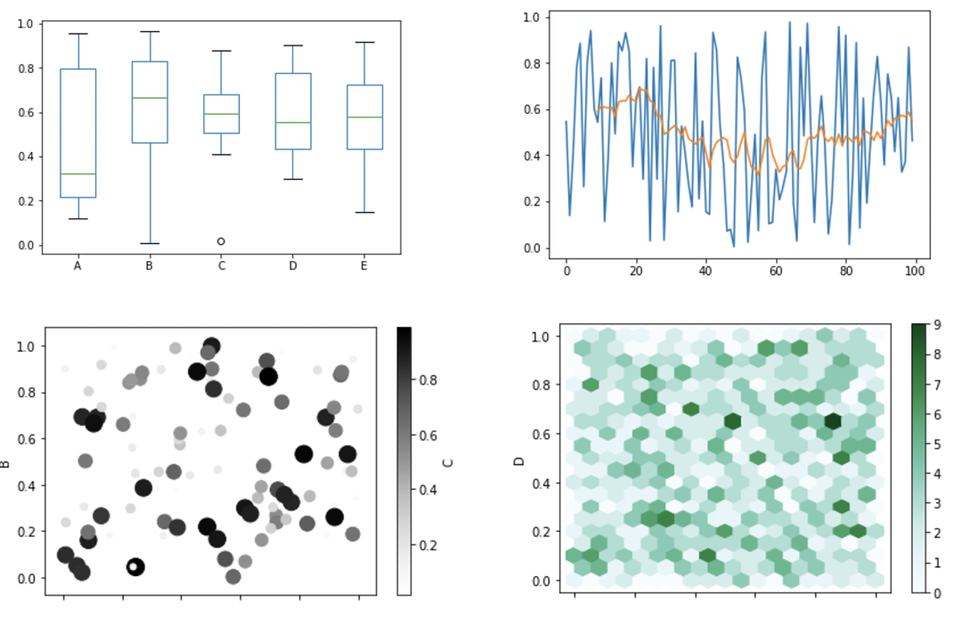
当然包括什么箱线图、散点图等常用图形,都可以通过一行代码轻松搞定?
df.plot.box()
df['value'].plot()
df.plot.scatter()
data.plot.hexbin(x='A',y='B')
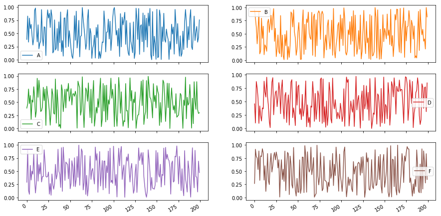
制作子图可以吗? 只需要设置subplots=True就行了,子图位置、大小调整方式和Matplotlib设置一样!
data.plot(subplots=True,layout=(3, 2), figsize=(15, 8));
更多的图表,本文就不再一一展示,从官方文档中可以看到(我的版本是0.23.4),Pandas一共支持14种常见图表的直接绘制,感兴趣的读者可以进一步阅读官方文档!
其实对图片敏感的读者可以发现,这不就是基于Matplotlib做出来的吗?所以它支持像调整Matplotlib图表一样,在作图时修改一些参数来控制图片的大小、图例、颜色、位置等因素。
修改主题,解锁酷炫样式
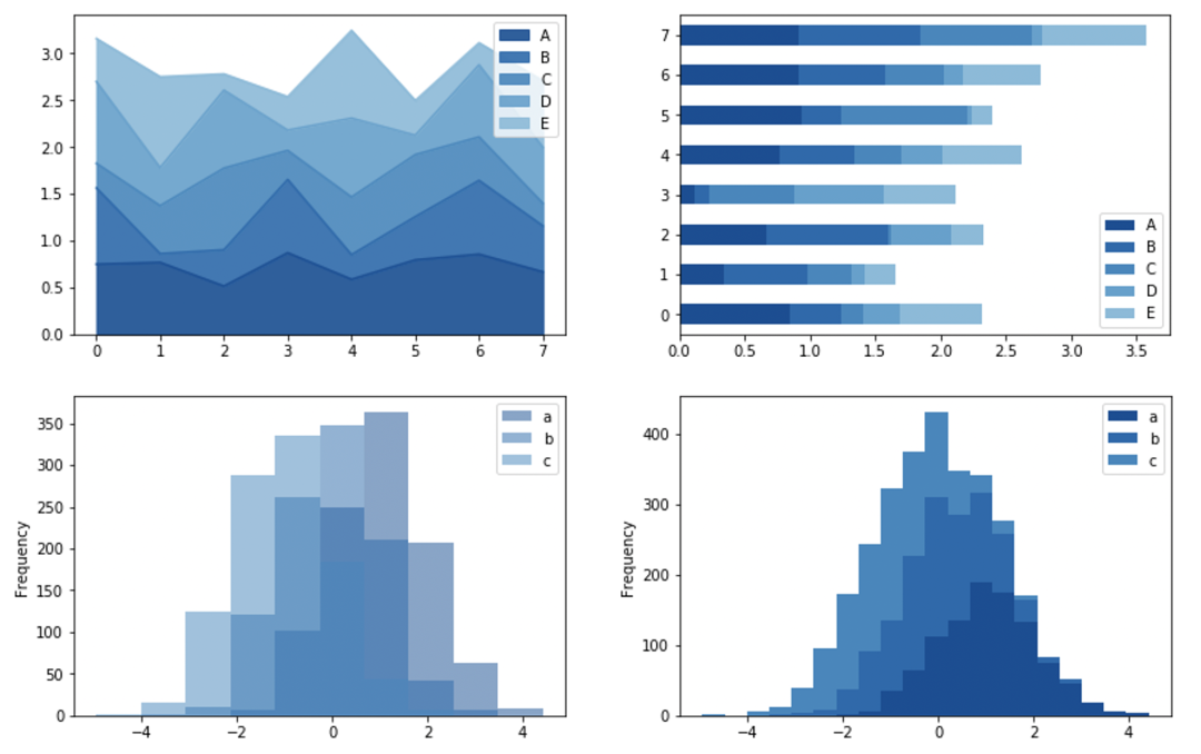
最后,如果你觉得默认生成的图表不够好看(我是这么觉得),而它又是基于Matoplotlib制作的,所以我们可以使用同样套着Matplotlib壳的Seaborn调色板,从而调整图片主题。
还是上面的数据,下面让我们换个主题重新绘制
import seaborn as sns
sns.set_palette("pastel", 8)
import seaborn as sns
sns.set_palette("Blues_r", 8)
import seaborn as sns
sns.set_palette("magma", 8)
上面是我常用的几种配色,更多的颜色搭配你可以在seaborn相关文档中找到并使用!
以上就是关于如何在使用Python更快速的对数据进行可视化,我们可以发现,在很多情况下,使用Pandas直接进行绘图会显得更加高效便捷!
但本文的目的并不是让你彻底放弃Matplotlib,在使用pandas绘图时很多参数设置都需要参考Matplotlib,所以我们应该在点亮这项技能后,能根数据和场景的不同,选择一个最合适的工具来完成可视化!
-END-
文末推荐一本书《趣学Python算法100例》专为Python初学者量身打造!详解100个趣味编程算法实例,培养编程兴趣,拓宽编程思维,提高编程能力和算法设计能力。实例代码完备,注释详尽,均通过了测试可以正常运行,点击下方图片可以直达购买页面查看本书详情!
作为早起Python粉丝的福利,我将送出上方图书5本。但由于留言功能暂时不能使用,如果你想参加活动,请扫码添加早小起微信?,并备注【送书】