
「HTML+CSS」自定义加载动画【021】
效果展示

Demo代码
HTML
<!DOCTYPE html>
<html lang="en">
<head>
    <meta charset="UTF-8">
    <meta http-equiv="X-UA-Compatible" content="IE=edge">
    <meta name="viewport" content="width=device-width, initial-scale=1.0">
    <link rel="stylesheet" href="style.css">
    <title>Document</title>
</head>
<body>
    <section><span></span></section>
</body>
</html>
CSS
html,body{
  margin: 0;
  height: 100%;
}
body{
  display: flex;
  justify-content: center;
  align-items: center;
  background: #263238;
}
section {
    width: 650px;
    height: 300px;
    padding: 10px;
    position: relative;
    display: flex;
    align-items: center;
    justify-content: center;
    border: 2px solid red;
}
span {
  width : 96px;
  height: 96px;
  border-radius: 50%;
  display: inline-block;
  border-top: 10px solid white;
  border-right: 10px solid transparent;
  animation: rotation 2s linear infinite;
}

@keyframes rotation {
  0% { transform: rotate(0deg) }
  100% { transform: rotate(360deg) }
}
原理详解
步骤1
设置span标签
宽度、高度均为96px
  width : 96px;
  height: 96px;
效果图如下
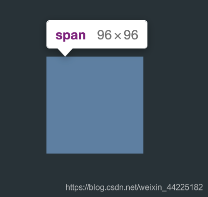
span此时是没有显示出来的
因为没有设置颜色

步骤2
span上边框设置为
10px solid 白色
效果图如下

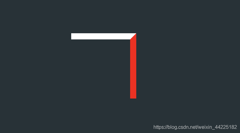
步骤3
span右边框设置为
10px solid 透明色
效果图如下

为什么再设置右边框就会变成这样了呢?
这里设置右边框的颜色为红色
根据下图就可以知道上图是怎么来的了
步骤4
span圆角化
border-radius: 50%;
效果图如下
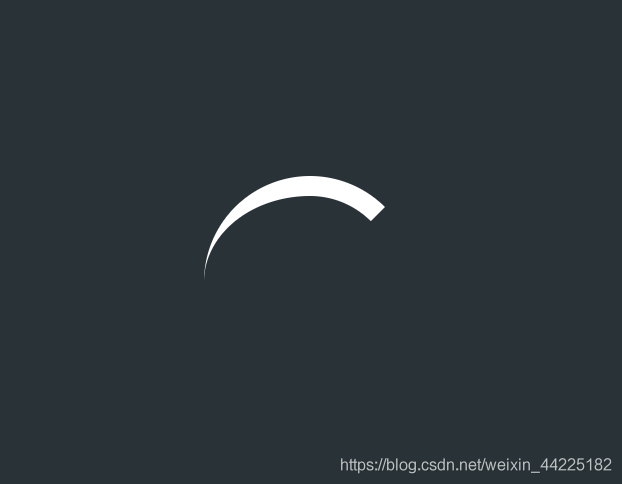
步骤5
为span添加动画
顺时针旋转 2s 无限循环
animation: rotation 2s linear infinite;
@keyframes rotation {
  0% { transform: rotate(0deg) }
  100% { transform: rotate(360deg) }
}
效果图如下
结语
学习来源:
❝https://codepen.io/bhadupranjal/pen/vYLZYqQ
文章仅作为学习笔记,记录从0到1的一个过程。
希望对您有所帮助,如有错误欢迎小伙伴指正~
我是 海轰ଘ(੭ˊᵕˋ)੭
如果您觉得写得可以的话请点个赞吧
谢谢支持❤️
评论