
「HTML+CSS」自定义加载动画【025】
海轰Pro
共 2905字,需浏览 6分钟
·
2021-05-05 13:24
效果展示

Demo代码
HTML
<!DOCTYPE html>
<html lang="en">
<head>
    <meta charset="UTF-8">
    <meta http-equiv="X-UA-Compatible" content="IE=edge">
    <meta name="viewport" content="width=device-width, initial-scale=1.0">
    <link rel="stylesheet" href="style.css">
    <title>Document</title>
</head>
<body>
    <section><span></span></section>
</body>
</html>
CSS
html,body{
  margin: 0;
  height: 100%;
}
body{
  display: flex;
  justify-content: center;
  align-items: center;
  background: #263238;
}
section {
    width: 650px;
    height: 300px;
    padding: 10px;
    position: relative;
    display: flex;
    align-items: center;
    justify-content: center;
    border: 2px solid red;
}
span {
  width : 36px;
  height: 36px;
  border-radius: 50%;
  display: inline-block;
  position: relative;
  border: 20px solid;
  border-color: rgba(255,255,255, .25)  rgba(255,255,255, 0.5)  rgba(255,255,255, .75)  rgba(255,255,255,1);
  animation: rotation 2s linear infinite;
}


@keyframes rotation {
  0% { transform: rotate(0deg) }
  100% { transform: rotate(360deg) }
}
原理详解
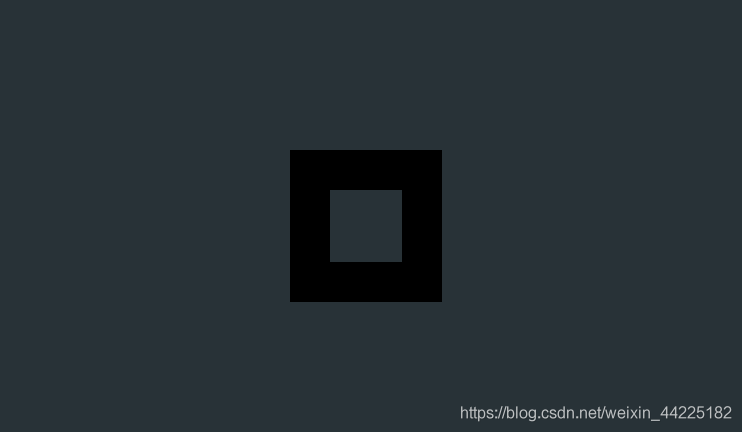
步骤1
使用span标签,设置css样式
宽度、高度均为36px 边框:20px solid
width : 36px;
  height: 36px;
  border: 20px solid;
效果图如下
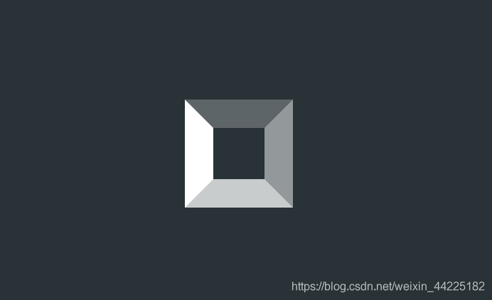
步骤2
设置span边框颜色,分别设置四个边框颜色为
rgba(255, 255,255, .25) rgba(255,255,255, 0.5) rgba(255,255,255, 0.75) rgba(255,255,255, 1)
border-color: rgba(255, 255,255, .25) rgba(255,255,255, 0.5) rgba(255,255,255, .75) rgba(255,255,255,1);
效果图如下
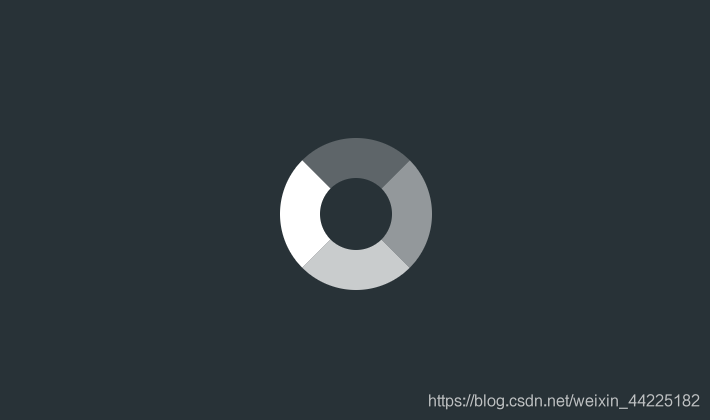
步骤3
span圆角化
border-radius: 50%;
效果图如下
步骤4
为span添加动画
顺时针旋转(0-360度) 2s 无限循环
animation: rotation 2s linear infinite;
/*动画实现*/
@keyframes rotation {
  0% { transform: rotate(0deg) }
  100% { transform: rotate(360deg) }
}
效果图如下
知识点
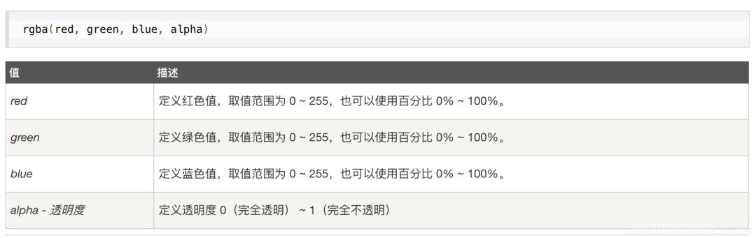
rgba() 函数
定义
❝使用红 ( R )、绿(G)、蓝(B)、透明度(A)的叠加来生成各式各样的颜色。
CSS 语法
结语
学习来源:
❝https://codepen.io/bhadupranjal/pen/vYLZYqQ
文章仅作为学习笔记,记录从0到1的一个过程。
希望对您有所帮助,如有错误欢迎小伙伴指正~
我是 海轰ଘ(੭ˊᵕˋ)੭
如果您觉得写得可以的话请点个赞吧
谢谢支持❤️
评论
BreakOutToRefreshiOS 加载动画
BreakOutToRefresh是iOS下拉刷新的加载动画。安装CocoaPods将此添加到您的Podfile:use_frameworks!pod'BreakOutToRefresh'手册将Bre
BreakOutToRefreshiOS 加载动画
0
GearRefreshControliOS 自定义动画
GearRefreshControl 是一个在 UIRefreshControl 上显示自定义动画的
GearRefreshControliOS 自定义动画
0
GearRefreshControliOS 自定义动画
GearRefreshControl是一个在UIRefreshControl上显示自定义动画的样本项目。用法通过CocoaPods安装pod'GearRefreshControl','~>1.0
GearRefreshControliOS 自定义动画
0
LoadingDrawableAndroid 加载动画
一些酷炫的加载动画,可以与任何View配合使用,作为加载动画或者Progressbar,此外很适合与RecyclerRefreshLayout配合使用作为刷新的loading动画这个项目的思路源于这个
LoadingDrawableAndroid 加载动画
0