
【每日一练】18—搜索框效果的实现

写在前面
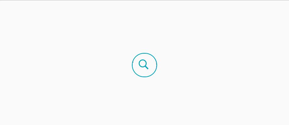
搜索框是很常用的一个功能,因此,今天我们一起来练习写一个搜索框的效果,希望今天的这个练习对你有帮助,下面我们一起来看今天练习的最终效果:
<html><head><meta charset="UTF-8"><title>【每日一练】18—搜索框效果的实现</title></head><body><div class="search"><div class="icon"></div><div class="input"><input type="text" name="" id="SearchInput" placeholder="Search"></div><span class="clear" onclick="document.getElementById('SearchInput').value = ''"></span></div><script type="text/javascript">const icon = document.querySelector('.icon');const search = document.querySelector('.search');icon.onclick = function(){search.classList.toggle('active');}</script></body></html>
*{margin: 0;padding: 0;box-sizing: border-box;font-family: 'Poppins', sans-serif;}body{position: relative;display: flex;justify-content: center;align-items: center;min-height: 100vh;background: #fafafa;}.search{position: relative;width: 60px;height: 60px;background: #fff;border-radius: 60px;overflow: hidden;transition: 0.5s;box-shadow: 0 0 0 2px #00a6bc;}.search.active{width: 360px;}.search .icon{position: absolute;left: 0;top: 0;width: 60px;height: 60px;background: #fff;display: flex;justify-content: center;align-items: center;cursor: pointer;z-index: 1;}.search .icon:before{content: '';position: absolute;width: 15px;height: 15px;border: 3px solid #00a6bc;border-radius: 50%;transform: translate(-4px,-4px);transition: 0.5s;}.search .icon:after{content: '';position: absolute;width: 3px;height: 12px;background:#00a6bc;transform: translate(6px,6px) rotate(315deg);}.search .input{position: relative;width: 300px;height: 60px;left: 60px;background: #f0f;display: flex;justify-content: center;align-items: center;}.search .input input{position: absolute;top: 0;width: 100%;height: 100%;padding: 10px 0;border: none;outline: none;font-size: 18px;}.clear{position: absolute;top: 50%;transform: translateY(-50%);right: 15px;width: 15px;height: 15px;display: block;background: #fff;cursor: pointer;display: flex;justify-content: center;align-items: center;}.clear:before{position: absolute;content: '';width: 1px;height: 15px;background: #999;transform: rotate(45deg);}.clear:after{position: absolute;content: '';width: 1px;height: 15px;background: #999;transform: rotate(315deg);}
写在最后
以上就是每日一练的全部内容,希望今天的小练习对你有用,如果你觉得有帮助的话,请点赞我,关注我,并将它分享给你身边做开发的朋友,也许能够帮助到他。
我是杨小爱,我们明天见。
学习更多技能
请点击下方公众号

评论