
可能是Python最好用的动态图工具了
大邓和他的Python
共 8386字,需浏览 17分钟
· 2021-09-07
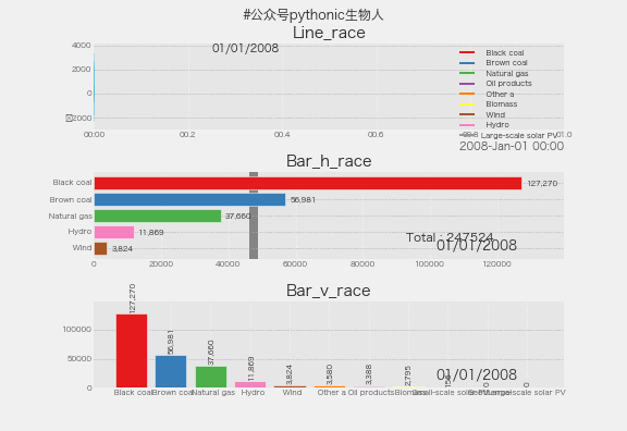
前面介绍过火遍各网站的动态柱状图做法👉来呀!把玩一下条形竞赛图,但是,之前的方法仅限于条形图,有小伙伴说,有没有能让地图、散点图、饼图、散点图、气泡图等也动起来的法子,且看本文,效果图,
安装
pip install pandas_alive

#或者
conda install pandas_alive -c conda-forge
玩起来
支持数据数据格式如下, 使用方法类似pandas👉这些,pandas仅需一行代码解决
支持图形类别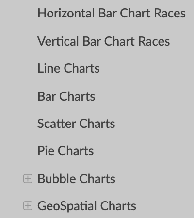 动态地图
动态地图
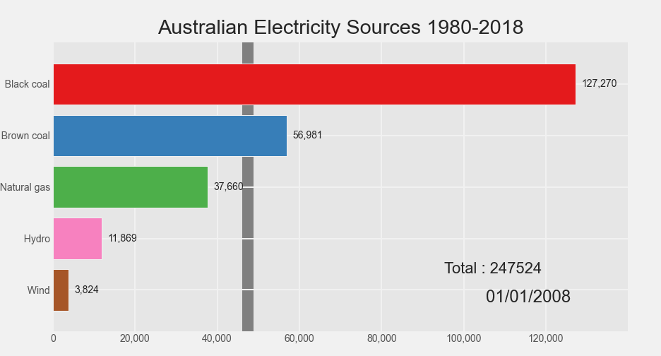
结合geopandas,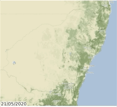 动态水平bar
import pandas as pd
import pandas_alive
import matplotlib.pyplot as plt

plt.style.use('ggplot')

#读入数据
elec_df = pd.read_csv("Aus_Elec_Gen_1980_2018.csv",
                      index_col=0,
                      parse_dates=[0],
                      thousands=',')

#定义求和def
def current_total(values):
    total = values.sum()
    s = f'Total : {int(total)}'
    return {'x': .85, 'y': .2, 's': s, 'ha': 'right', 'size': 11}


#缺省值0填充、绘图
elec_df.fillna(0).tail(n=10).plot_animated(
    'electricity-generated-australia.gif',  #保存gif名称
    period_fmt="%d/%m/%Y",  #动态更新图中时间戳
    title='Australian Electricity Sources 1980-2018',  #标题
    perpendicular_bar_func='mean',  #添加均值辅助线
    period_summary_func=current_total,  #汇总
    cmap='Set1',  #定义调色盘
    n_visible=5,  #柱子显示数
    orientation='h',#柱子方向
)
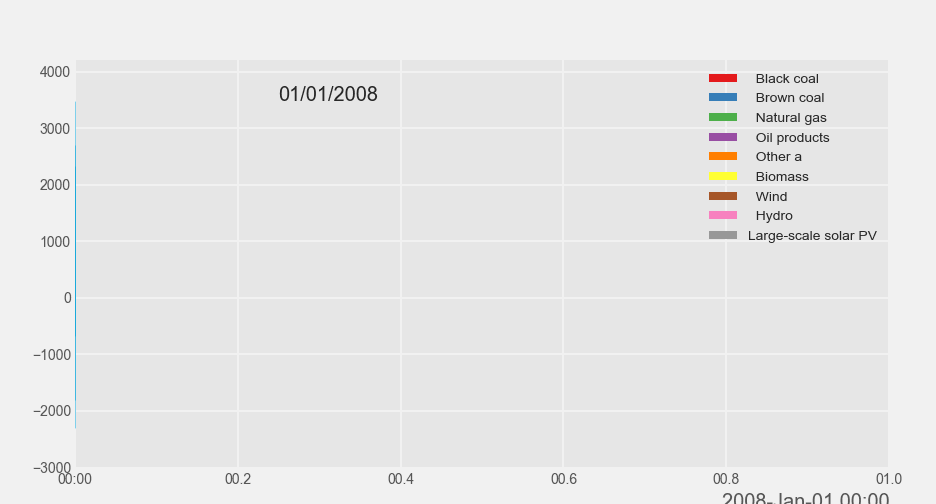
 动态垂直bar
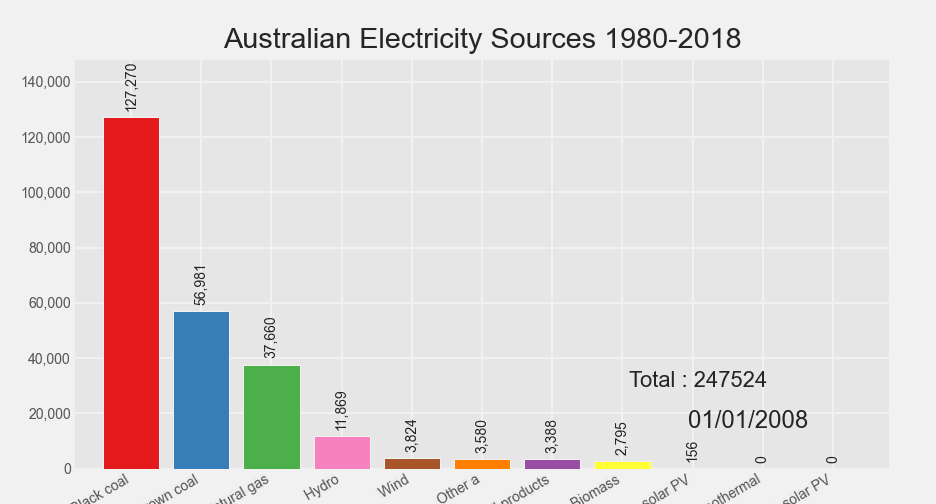 动态折线
动态折线
elec_df.diff().fillna(0).tail(n=10).plot_animated(filename='line-chart.gif',
                                                 kind='line',#指定折线模式
                                                 cmap='Set1',
                                                 period_label={
                                                     'x': 0.25,
                                                     'y': 0.9
                                                 },
                                                 line_width=1,
                                                 add_legend=True,
                                                 fill_under_line_color='#01a2d9')
 动态累积bar
import pandas_alive
covid_df.sum(axis=1).fillna(0).tail(n=10).plot_animated(
    filename='sumbar-chart.gif',
    kind='bar',   #指定bar模式
    cmap='Set1',  #定义调色盘
    period_label={
        'x': 0.1,
        'y': 0.9
    },
    orientation='h',
    enable_progress_bar=True,
    steps_per_period=2,
    interpolate_period=True,
    period_length=200)
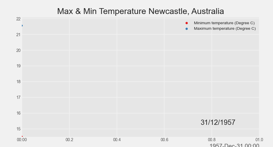
 动态散点图
动态散点图
import pandas as pd
import pandas_alive

#max散点数据
max_temp_df = pd.read_csv(
    "Newcastle_Australia_Max_Temps.csv",
    parse_dates={"Timestamp": ["Year", "Month", "Day"]},
)

#min散点数据
min_temp_df = pd.read_csv(
    "Newcastle_Australia_Min_Temps.csv",
    parse_dates={"Timestamp": ["Year", "Month", "Day"]},
)

#按时间戳merge max/min数据
merged_temp_df = pd.merge_asof(max_temp_df, min_temp_df, on="Timestamp")

merged_temp_df.index = pd.to_datetime(
    merged_temp_df["Timestamp"].dt.strftime('%Y/%m/%d'))

keep_columns = [
    "Minimum temperature (Degree C)", "Maximum temperature (Degree C)"
]

merged_temp_df.head(n=5000)[keep_columns].resample("Y").mean().plot_animated(
    filename='scatter-chart.gif',
    cmap='Set1',
    kind="scatter",#指定散点模式
    size=10,
    title='Max & Min Temperature Newcastle, Australia')
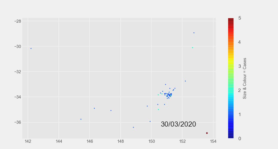
 动态气泡图
动态气泡图
import pandas_alive

multi_index_df = pd.read_csv("multi.csv", header=[0, 1], index_col=0)

multi_index_df.index = pd.to_datetime(multi_index_df.index, dayfirst=True)

map_chart = multi_index_df.tail(n=40).plot_animated(
    kind="bubble",  #指定气泡模式
    filename="bubble-chart.gif",
    x_data_label="Longitude",
    y_data_label="Latitude",
    size_data_label="Cases",
    color_data_label="Cases",
    vmax=5,
    steps_per_period=1,
    interpolate_period=True,
    period_length=500,
    dpi=150)
 多子图一起动
这部分可以结合matplotlib的多子图绘制,实现各种个性化动图,可参考👉matplotlib-多子图绘制(为所欲为版),核心代码如下,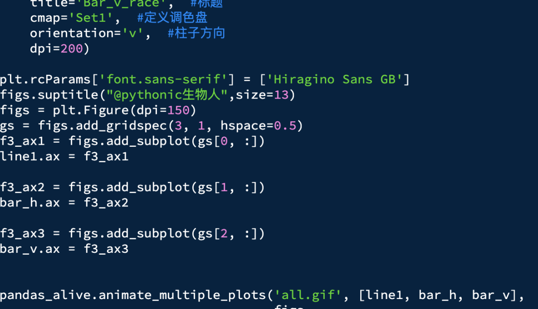 上图完整代码获取关注公众号:pythonic生物人,留言获取!
更多个性化设置
方法一:参考之前的这个文章👉来呀!把玩一下条形竞赛图,参数大同小异。
方法二:https://github.com/JackMcKew/pandas_alive
文中数据获取
https://github.com/JackMcKew/pandas_alive/tree/main/data
近期文章
腾讯课堂 | Python网络爬虫与文本分析 中文金融情感词典发布啦 | 附代码 B站视频 | Python自动化办公 wordexpansion包 | 新增词向量法构建领域词典 语法最简单的微博通用爬虫weibo_crawler hiResearch 定义自己的科研首页 大邓github汇总, 觉得有用记得star whatlies包 | 简单玩转词向量可视化 multistop ~ 多语言停用词库 Jaal 库 轻松绘制动态社交网络关系图 SciencePlots | 科研样式绘图库 使用streamlit上线中文文本分析网站 爬虫实战 | 采集&可视化知乎问题的回答 Clumper | dplyr式的Python数据操作包 Clumper库 | 常用的数据操作函数 Clumper库 | Groupby具体案例用法 Clumper库 | 其他数据分析 plydata库 | 数据操作管道操作符>> plotnine: Python版的ggplot2作图库 读完本文你就了解什么是文本分析 文本分析在经管领域中的应用概述 综述:文本分析在市场营销研究中的应用 plotnine: Python版的ggplot2作图库 Wow~70G上市公司定期报告数据集 漂亮~pandas可以无缝衔接Bokeh YelpDaset: 酒店管理类数据集10+G
评论
真高!比亚迪员工爆料比亚迪在越南的薪资水平:基本工资480万,全勤奖35万,交通补助20万,餐补110万,每周6天,每天10小时
上一篇:某大公司为逼迫员工离职,竟然把他的工位安排到厕所旁,没想到他直接开始记录领导的如厕时间,还发到公司大群...对此,你怎么看?--完--PS:欢迎在留言区留下你的观点,一起讨论提高。如果今天的文章让你有新的启发,欢迎转发分享给更多人。全文完,感谢你的耐心阅读。如果你还想看到我的文章,请一定给本
开发者全社区
0
太敢穿了!透视纱裙!性感火辣的身材
绝了呀今天的厂花:吴宣仪1995年1月26日,吴宣仪出生于海南省海口市,中国内地流行乐女歌手、影视演员。2016年2月,吴宣仪随宇宙少女发行首张迷你专辑正式出道。2018年4月,她参加《创造101》综艺选秀,获得第二名,成功加入火箭少女101组合。吴宣仪的颜值一直备受称赞,她的五官立体精致,皮肤白皙
逆锋起笔
0
某大公司为逼迫员工离职,竟然把他的工位安排到厕所旁,没想到他直接开始记录领导的如厕时间,还发到公司大群...
上一篇:字节的跳动职级与薪资(2024年)我们与公司间的合作,宛如两艘船只在茫茫大海上相互依靠,共同抵御风浪,携手驶向成功的彼岸。然而,当航向开始产生分歧,或是波涛汹涌的风浪改变了我们的初衷,我们或许应当冷静地选择和平分手,而非在风雨中硬撑。最近,一位网友的遭遇引起了广大职场人的关注和热议。这位网友
开发者全社区
0
我看阿里的年终奖总算发了!
到4月底了,这两天看朋友圈,发现阿里的年终奖终于发了,问了问老同学,也从网上检索了不少信息,基本搞清楚了阿里今年的年终奖情况。近来来阿里一些集团对绩效等级做了较大的调整,以前的旧绩效系统中,绩效分为3.25、3.5、3.75、4和5五个等级,其中4和5是较高绩效等级,较少见。而且之前3.5绩效内部划
公子龙
0
CVPR 2024|大视觉模型的开山之作!无需任何语言数据即可打造大视觉模型
↑ 点击蓝字 关注极市平台作者丨科技猛兽编辑丨极市平台极市导读 本文提出一种序列建模 (sequential modeling) 的方法,不使用任何语言数据,训练大视觉模型。>>加入极市CV技术交流群,走在计算机视觉的最前沿本文目录1 序列建模打造大视觉模型(来自 U
极市平台
1
字节的跳动职级与薪资(2024年)
上一篇:阿里公布年终奖,P7, 3.5+,22W年终奖,还有35W长期现金激励,真香字节跳动自2012年3月成立以来,已经迅速成长为一个全球性的科技公司。其产品和服务已经遍布全球150多个国家与地区,并且支持超过75种不同的语言。在字节跳动的官方网站上,列出了一系列引人注目的产品和服务,包括但不限于
开发者全社区
0
国宝级神颜!来自新疆的美人
安排今天的厂花:佟丽娅1983年8月8日,佟丽娅出生于新疆伊犁察布查尔,中国内地影视女演员,舞蹈员。2000年,佟丽娅成为了新疆歌舞团的舞蹈演员,2004年,进入中国歌舞团担任舞蹈演员。丫丫的颜值,相信绝对是收割了一大波粉丝新疆的美女绝对称得上惊艳,迪丽热巴、古力娜扎,而佟丽娅却是美得像另一个境界。
逆锋起笔
0
盘点Lombok的几个骚操作,你绝对没用过!
👉 欢迎加入小哈的星球 ,你将获得: 专属的项目实战 / Java 学习路线 / 一对一提问 / 学习打卡 / 赠书福利全栈前后端分离博客项目 2.0 版本完结啦, 演示链接:http://116.62.199.48/ ,新项目正在酝酿中
小哈学Java
0